

Animations are super important when building an application. They highlight relations between elements, bring attention to what is important and they also can express a brand’s style.
Overall animations give a higher quality look and feel to your app and more importantly they are super cool to build as a developer 🙂
In this post, I’ll show you how to implement a collapsing toolbar with parallax effect in jetpack compose only (no third party library). I’ll also show you how to implement curved motion using quadratic Bézier curve and simple maths 😉
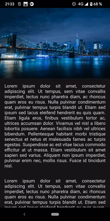
What do we build ?

Collapsing toolbar with parallax effect
There are a lot of things going on there so let’s try to break it down :
- The header is translating on the Y axis using a parallax effect.
- The header also fades out as the list is scrolling up.
- Once the list reaches 56 dp on the Y axis (from the top screen), the toolbar fades in.
- The title translates on both X and Y axis using a quadratic Bézier curve.
- The title also scales down as the list is scrolling up.
Without further ado, let’s dive in 😎
Foundation
Before jumping into the implementation, let’s focus on the layout first. If we take a closer look at the animation above, we can see that the list overlaps the header but scrolls under the toolbar. So we can clearly state that there is a relation between all elements on the Z axis.
So in terms of compose layout choice, Box seems to be appropriate as it allows us to put element on top of the other. Box also supports configuring specific alignment of the elements it contains.
Don’t hesitate to check Box documentation if necessary
Let’s illustrate this layout in 3 dimensions for a better understanding.

The title sits on top of the toolbar composable. The toolbar is put on top of the body (the list) and finally the body lays on top of the header.
Now we can easily build our first composable 🙂
| @Composable | |
| fun CollapsingToolbar() { | |
| Box(modifier = Modifier.fillMaxSize()) { | |
| Header() | |
| Body() | |
| Toolbar() | |
| Title() | |
| } | |
| } |
CollapsingToolbar composable
As a reminder, composables inside a Box are added one of top of the previous as we call them inside the Box composable. So the last composable inside a Box will be the highest on the Z axis.
These composables seem pretty straight forward so let’s implement them now and add animations afterwards.
Header composable
The header is literally just an image. We will wrap it with a Box so we can tweak the translation easily later on. Besides, we will show a transparent to black vertical gradient at the bottom of the image for more readability:

For that we are going to need the header height. Let’s set it to 275 dp and convert it to pixels using LocalDensity:
| private val headerHeight = 275.dp | |
| @Composable | |
| private fun Header() { | |
| val headerHeightPx = with(LocalDensity.current) { headerHeight.toPx() } | |
| Box(modifier = Modifier.fillMaxWidth().height(headerHeight)) { | |
| Image( | |
| painter = painterResource(id = R.drawable.bg_pexel), | |
| contentDescription = "", | |
| contentScale = ContentScale.FillBounds | |
| ) | |
| Box( | |
| Modifier | |
| .fillMaxSize() | |
| .background( | |
| brush = Brush.verticalGradient( | |
| colors = listOf(Color.Transparent, Color(0xAA000000)), | |
| startY = 3 * headerHeightPx / 4 // to wrap the title only | |
| ) | |
| ) | |
| ) | |
| } | |
| } |
Header composable
Body composable
The “Body” composable is as simple as a Column with some Text. But remember, this composable is under the scope of a Box which fills the entire screen (see “CollapsingToolbar” composable above). It means that the “Body” composable overlaps the header while we actually want it to be placed beneath it.
So we are going to use a Spacer (transparent by default) of the same size as the header and fill the remaining space with our Column to do the trick.
| @Composable | |
| private fun Body() { | |
| Column(horizontalAlignment = Alignment.CenterHorizontally) { | |
| Spacer(Modifier.height(headerHeight)) | |
| repeat(5) { | |
| Text( | |
| text = stringResource(R.string.lorem_ipsum), | |
| style = MaterialTheme.typography.body1, | |
| textAlign = TextAlign.Justify, | |
| modifier = Modifier | |
| .background(Color(0XFF161616)) | |
| .padding(16.dp) | |
| ) | |
| } | |
| } | |
| } |
Body composable
Finally we need to make the “body” scrollable. For that, we need to use ScrollState and pass it to the Modifier.verticalScroll. “ScrollState” is also super handy to change the scroll position or get current state by calling methods on the object which we are going to need for the header translation in the next section.
| val scroll: ScrollState = rememberScrollState(0) |
ScrollState
Then we need to pass it to the modifier as follows:
| @Composable | |
| private fun Body(scroll: ScrollState) { | |
| Column( | |
| horizontalAlignment = Alignment.CenterHorizontally, | |
| modifier = Modifier.verticalScroll(scroll) | |
| ) | |
| . | |
| . |
Body composable
The “Body” becomes scrollable and overlaps naturally the header thanks to our Box architecture 🙂

Toolbar composable
For the “toolbar”, we are going to use TopAppBar composable. We simply set the navigation icon and leave the title empty as we handle it in a separate composable.
| @Composable | |
| private fun Toolbar() { | |
| TopAppBar( | |
| modifier = Modifier.background( | |
| brush = Brush.horizontalGradient( | |
| listOf(Color(0xff026586), Color(0xff032C45)) | |
| ) | |
| ), | |
| navigationIcon = { | |
| IconButton( | |
| onClick = {}, | |
| modifier = Modifier | |
| .padding(horizontal = 16.dp) | |
| .size(36.dp) | |
| ) { | |
| Icon( | |
| imageVector = Icons.Default.Menu, | |
| contentDescription = "", | |
| tint = Color.White | |
| ) | |
| } | |
| }, | |
| title = {}, | |
| backgroundColor = Color.Transparent, | |
| elevation = 0.dp | |
| ) | |
| } |
Toolbar composable
Title composable
The title should be distinct from the TopAppBar composable as we want to animate it separately later on. For now, let’s just forget about its placement:
| @Composable | |
| private fun Title() { | |
| Text( | |
| text = "New York", | |
| fontSize = 30.sp, | |
| fontWeight = FontWeight.Bold | |
| ) | |
| } |
Title composable
Now that we have our foundation ready, it’s time to develop some cool animations 🙂
Header parallax effect
To achieve the header translation, we are going to use Modifier.graphicsLayer{}. “GraphicsLayer” allows us to define the effects to apply for the content, such as translation, scaling, opacity and even more.
Make sure to always use the lambda version of “graphicsLayer” to avoid unnecessary recompositions which induce bad performance. More on that here.
As for the parallax effect, we want the header to translate as the user scrolls up but with a lower velocity. Now that we have access to the “body” scroll offset value through “scrollState”, we can apply it to the header to perform the translation. Every time the user scrolls up by 1 pixel, the header scrolls up by only 1/2 pixel:
| @Composable | |
| private fun Header(scroll: ScrollState, headerHeightPx: Float) { | |
| Box(modifier = Modifier | |
| .fillMaxWidth() | |
| .height(headerHeight) | |
| .graphicsLayer { | |
| translationY = -scroll.value.toFloat() / 2f // Parallax effect | |
| } | |
| ) | |
| . | |
| . |
Header composable
After adding this couple line of code, we now have a beautiful parallax effect 🙂
Parallax effect
Header fade animation
The idea here is to fade out the header as the user is scrolling up. Once the scroll offset reaches the top of the screen, then the header should fade out completely. To do so, we are using Modifier.graphicsLayer{} again to control the alpha value. The header is completely visible when alpha property equals “1” and becomes invisible when alpha equals “0”.

Header fade animation spec
As seen above, the alpha value depends on the scroll offset. Let’s model that using affine function 🤓
f(x) = ax + b where “x” is the scroll offset.
To determine this equation, we need 2 points that we actually already know:
Expanded: alpha value equals “1” when no scrolling applies.
Collapsed: alpha value equals “0” when scroll offset reaches the top of the screen which corresponds to the header height.

Now that we have our 2 points, we can calculate slope and y-intercept:

Let’s update the code accordingly:
| @Composable | |
| private fun Header(scroll: ScrollState, headerHeightPx: Float) { | |
| Box(modifier = Modifier | |
| .fillMaxWidth() | |
| .height(headerHeight) | |
| .graphicsLayer { | |
| alpha = (-1f / headerHeightPx) * scroll.value + 1 | |
| } | |
| ) | |
| . | |
| . |
Header fade animation
Alright, we just implemented the header fade animation successfully using affine function. In the “Title” section, we are going to use an awesome Compose api to compute same kind of animation, so stay tuned 😉
Toolbar fade animation
This time we would like the toolbar to fade in only if the user scrolls above the bottom edge of the toolbar:

Toolbar fade animation spec
From that screenshot, we can deduct that the fade in animation should start whenever scroll offset is greater than HeaderHeight — toolbarHeight.
To animate the toolbar, we are going to use AnimatedVisibility composable which animates the appearance and disappearance of its content. It’s a “fire and forget” kind of api which also gives you the possibility to override enter and exit animation.
| @Composable | |
| private fun Toolbar(scroll: ScrollState, headerHeightPx: Float, toolbarHeightPx: Float) { | |
| val toolbarBottom = headerHeightPx - toolbarHeightPx | |
| val showToolbar by remember { | |
| derivedStateOf { scroll.value >= toolbarBottom } | |
| } | |
| AnimatedVisibility( | |
| visible = showToolbar, | |
| enter = fadeIn(animationSpec = tween(300)), | |
| exit = fadeOut(animationSpec = tween(300)) | |
| ) { | |
| . | |
| . |
Toolbar animation
The code is quite straight forward. “AnimatedVisibility” depends on the boolean showToolbar to start the animation. Whenever the user scrolls above toolbar bottom edge, showToolbar equals true and the fade in animation starts. Whenever the user scrolls under, the fade out animation kicks in 🙂
Use “derivedStateOf” when your state is depending on another one to avoid extra calculations (bad performance). More on that here.
Title XY translation animation
Now things are getting very interesting. Let’s focus on the title translation animation. We will implement two types of translation here: a linear translation and then a curved translation.
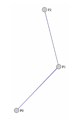
Linear translation

Linear translation
Job Offers
OUR VIDEO RECOMMENDATION


Jobs
Let’s focus on the y axis first. We need to determine 2 points so we can model the animation. There are 2 states in this animation. When the header is expanded and when it’s collapsed. Let’s calculate the 2 points based on these 2 states.
Expanded: the title should be placed at the bottom start of the header with a padding of 16 dp.
Collapsed: the title appears exactly in the middle of the toolbar on the y axis.
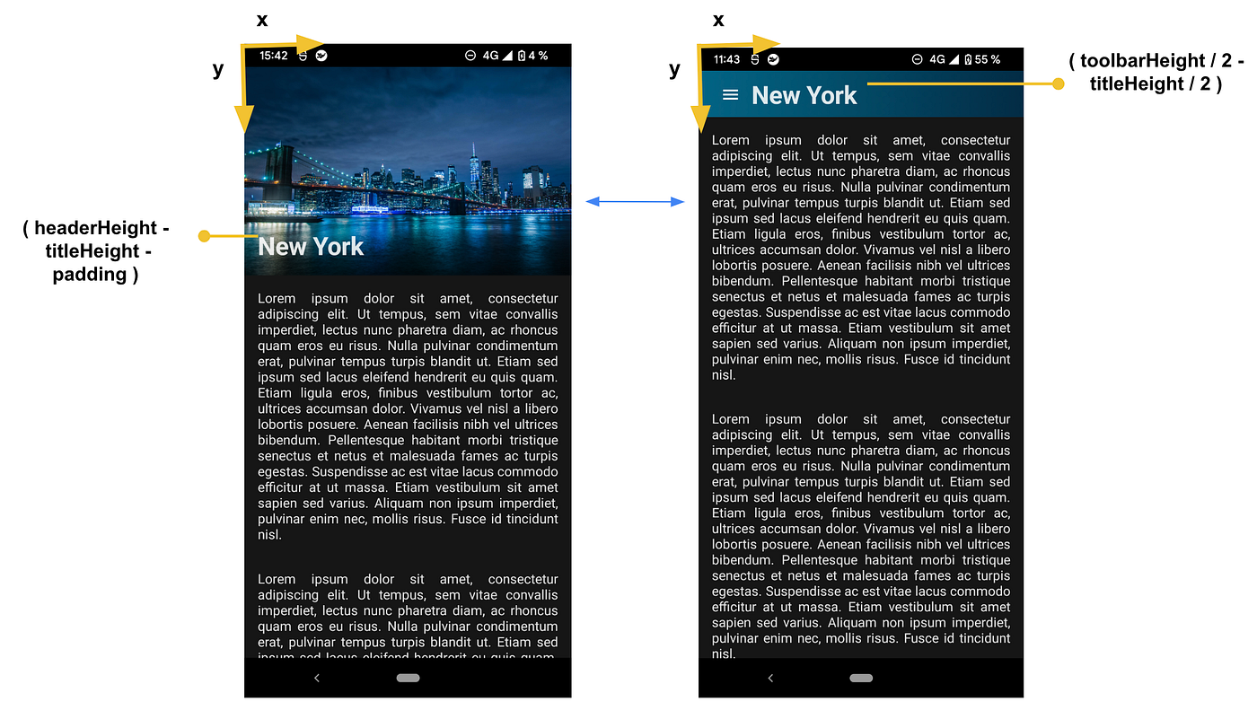
Linear translation spec

Let’s find out X coordinates now:
Expanded: the title has a padding start of 16 dp.
Collapsed: as per the material design specs, the title has a padding start of 72 dp.
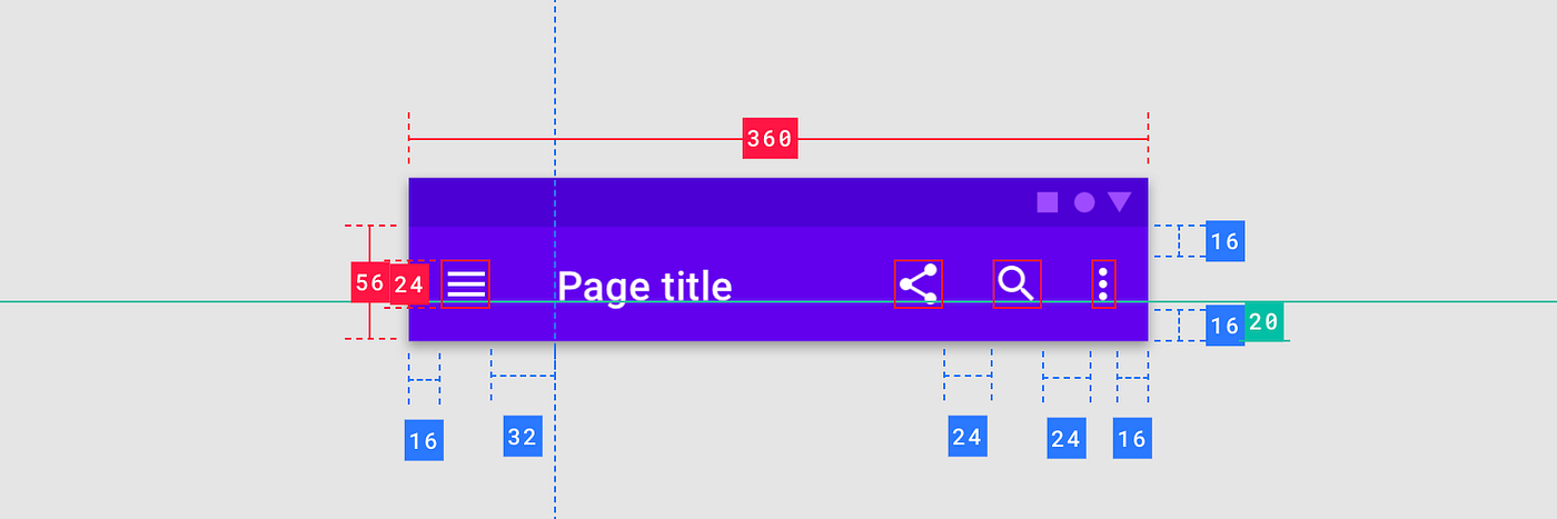 Toolbar spec
Which gives us:

To implement this animation, we are not going to use affine function this time but linear interpolation 🙂.
Let’s connect our 2 points P0 and P1 by a line segment. Now imagine a third point P between these two points. The position of P represents the position of the title during the translation. P also depends on a “t” value which is a value between 0 and 1 similar to the percentage of the animation:

This is called linear interpolation or lerp and we could calculate P based on following formula:

Linear interpolation
But even better, Compose actually exposes an API to compute linear interpolation called lerp 😍
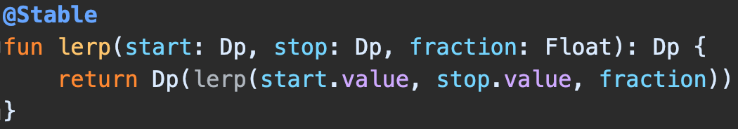
lerp takes 3 parameters: the starting point, the ending point and the “t” value that we mentioned earlier. We already have the starting and ending points so the last thing missing is the “t” value which is the percentage of the animation between 0 and 1. To calculate it, we need to divide the scroll value by the collapsing range. The idea is to represent the ratio of this animation:
| val collapseRange: Float = (headerHeightPx - toolbarHeightPx) | |
| val collapseFraction: Float = (scroll.value / collapseRange).coerceIn(0f, 1f) |
t calculation
Finally let’s calculate lerp on Y and X axis:
| @Composable | |
| private fun Title(scroll: ScrollState, headerHeightPx: Float, toolbarHeightPx: Float) { | |
| var titleHeightPx by remember { mutableStateOf(0f) } | |
| val titleHeightDp = with(LocalDensity.current) { titleHeightPx.toDp() } | |
| Text( | |
| text = "New York", | |
| fontSize = 30.sp, | |
| fontWeight = FontWeight.Bold, | |
| modifier = Modifier | |
| .graphicsLayer { | |
| val collapseRange: Float = (headerHeightPx - toolbarHeightPx) | |
| val collapseFraction: Float = (scroll.value / collapseRange).coerceIn(0f, 1f) | |
| val titleY = lerp( | |
| headerHeight - titleHeightDp - paddingMedium, // start Y | |
| toolbarHeight / 2 - titleHeightDp / 2, // end Y | |
| collapseFraction | |
| ) | |
| val titleX = lerp( | |
| titlePaddingStart, // start X | |
| titlePaddingEnd, // end X | |
| collapseFraction | |
| ) | |
| translationY = titleY.toPx() | |
| translationX = titleX.toPx() | |
| } | |
| .onGloballyPositioned { | |
| // We don't know title height in advance to calculate the lerp | |
| // so we wait for initial composition | |
| titleHeightPx = it.size.height.toFloat() | |
| } | |
| ) | |
| } |
Linear translation animation
See how it becomes so easy to implement an animation using lerp. No need to calculate affine function, simply get the starting and ending point of your animation and reflect the animation amplitude as a ratio and that’s it 😎.
What I did not tell you is that we just built a linear Bézier curve with two points P0 and P1. But lerp beauty does not stop there. Let’s see how we can leverage lerp to build curved animation this time 🙂
Curved translation

Curved translation
Remember the linear curve earlier. What if we add a third point P1 between the two:
Let’s imagine 2 extra points P and P’ one on each line segment “lerping” on their respective line based on the same t value we mentioned earlier.
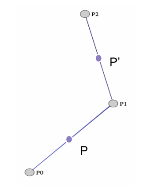
We can now connect these 2 points with another line segment [PP’]:

If we then add a point on that line that “lerps” based on the same t value, you can see that it follows a very specific path: the quadratic Bézier curve 🙂

I had to watch the quadratic Bézier curve animation 5 times before understanding what’s going on, so please take your time 😅
To calculate the point that follows the quadratic Bézier curve, we rely on De Casteljau’s algorithm which basically states that we can calculate a Bézier curve based on nested “lerps”.

Let’s apply this algorithm to build our curved animation 🙂
So basically we have to add a third point. Then we calculate the linear interpolation between [P0-P1] and [P1-P2] using lerp function. Finally we calculate the linear interpolation between these 2 nested linear interpolations and that’s it. Let’s try this out:

Curved translation spec
Let’s start with Y axis:
Let’s first calculate P0P1lerp:
| val titleYFirstInterpolatedPoint = lerp( | |
| headerHeight - titleHeightDp - paddingMedium, | |
| headerHeight / 2, | |
| collapseFraction | |
| ) |
Then let’s calculate P1P2lerp:
| val titleYSecondInterpolatedPoint = lerp( | |
| headerHeight / 2, | |
| toolbarHeight / 2 - titleHeightDp / 2, | |
| collapseFraction | |
| ) |
Finally let’s calculate the quadratic Bézier curve Z based of these two nested “lerps” on the Y axis:
| val titleY = lerp( | |
| titleYFirstInterpolatedPoint, | |
| titleYSecondInterpolatedPoint, | |
| collapseFraction | |
| ) |
We are done 🙂
Let’s do the same on the X axis now.
P0P1 lerp:
| val titleXFirstInterpolatedPoint = lerp( | |
| titlePaddingStart, | |
| titlePaddingEnd * 5 / 4, | |
| collapseFraction | |
| ) |
P1P2 lerp:
| val titleXSecondInterpolatedPoint = lerp( | |
| titlePaddingEnd * 5 / 4, | |
| titlePaddingEnd, | |
| collapseFraction | |
| ) |
Finally let’s calculate the quadratic Bézier curve Z based of these two nested “lerps” on the X axis this time:
| val titleX = lerp( | |
| titleXFirstInterpolatedPoint, | |
| titleXSecondInterpolatedPoint, | |
| collapseFraction | |
| ) |
Finally, we just need to update our composable to make the translation:
| . | |
| . | |
| Text( | |
| text = "New York", | |
| fontSize = 30.sp, | |
| fontWeight = FontWeight.Bold, | |
| modifier = Modifier | |
| .graphicsLayer { | |
| translationY = titleY.toPx() | |
| translationX = titleX.toPx() | |
| } | |
| .onGloballyPositioned { | |
| titleHeightPx = it.size.height.toFloat() | |
| } | |
| ) | |
| } |
We just achieved to build a curved animation using only math thanks to Bézier curve 🙂
What is also great about Bézier curve is that we can also interpret it in polynomial form. For a quadratic Bézier curve, the following formula applies:

Now if we apply this formula and simplify it a little bit, we have:
| . | |
| . | |
| Text( | |
| text = "New York", | |
| fontSize = 30.sp, | |
| fontWeight = FontWeight.Bold, | |
| modifier = Modifier | |
| .graphicsLayer { | |
| val collapseRange: Float = (headerHeightPx - toolbarHeightPx) | |
| val collapseFraction: Float = (scroll.value / collapseRange).coerceIn(0f, 1f) | |
| val titleY: Float = (1f-collapseFraction).pow(2) * | |
| (headerHeightPx - titleHeightPx - paddingPx) + | |
| 2 * collapseFraction * (1-collapseFraction) * headerHeightPx / 2 + | |
| collapseFraction.pow(2) * (toolbarHeightPx / 2 - titleHeightPx / 2) | |
| val titleX: Float = | |
| (1f-collapseFraction).pow(2) * (titlePaddingStartPx) + | |
| 2 * collapseFraction * (1-collapseFraction) * titlePaddingEndPx * | |
| 5 / 4 + collapseFraction.pow(2) * titlePaddingEndPx | |
| translationY = titleY | |
| translationX = titleX | |
| } | |
| .onGloballyPositioned { | |
| titleHeightPx = it.size.height.toFloat() | |
| } | |
| ) | |
| . | |
| . |
A bit verbose I must admit but it works like a charm and it’s so easy to implement as we just need to define 3 points and calculate t 😉
Title scale animation
Have you noticed that the title did not scale in the previous animations? Let’s fix that 🙂
Again let’s define two states, the scaling factor when the header is expanded and when it’s collapsed. According to material design spec, the title measures 20 sp in the TopAppBar:

When the header is expanded, we want the title to be bigger, let’s say 30 sp. So to sum up:
Expanded: title = 30sp, scaling factor = 1 (1 x 30sp = 30sp)
Collapsed: title = 20sp, scaling factor = 0.66 (0.66 x 30sp ≃ 20sp)
Finally let’s calculate the linear interpolation then use “graphicsLayer” to update the scale factor. lerp does not support “Float” as parameter type so we have to be a bit creative here. Since we are only interested in scale values ranging between 1 and 0.66, let’s pretend these values are “dp” by using “value.dp” notation. lerp is going to range between 1.dp and 0.66.dp now. To collect only the value and get rid of the dp type, we simply call “scaleXY.value”:
| private const val titleFontScaleStart = 1f | |
| private const val titleFontScaleEnd = 0.66f | |
| @Composable | |
| private fun Title(scroll: ScrollState, headerHeightPx: Float, toolbarHeightPx: Float) { | |
| val collapseRange: Float = (headerHeightPx - toolbarHeightPx) | |
| val collapseFraction: Float = (scroll.value / collapseRange).coerceIn(0f, 1f) | |
| val scaleXY = lerp( | |
| titleFontScaleStart.dp, | |
| titleFontScaleEnd.dp, | |
| collapseFraction | |
| ) | |
| Text( | |
| text = "New York", | |
| fontSize = 30.sp, | |
| fontWeight = FontWeight.Bold, | |
| modifier = Modifier | |
| .graphicsLayer { | |
| // if scaleXY equals 0.8.dp then scaleXY.value equals 0.8 | |
| scaleX = scaleXY.value | |
| scaleY = scaleXY.value | |
| } | |
| ) | |
| . | |
| . |

The title scales successfully but it seems like there is an issue with the title padding. Indeed, if you take a closer look at the animation, you would see that the title has too much padding when the header is collapsed 🤔

This extra padding seems related to the title scale animation. Let’s add a background to that title, force its position to (0;0) and see what’s going on when we are changing the scale factor:
It appears that the Text composable actually keeps its size but the title itself shrinks and now occupies 66% of the title width. So we need to figure out a way to cancel this extra padding. If the title occupies 66% of the title width at the end of the animation, it means that the title has a 17% inner start padding and a 17% inner end padding. From there, we can deduct that:
| val titleExtraStartPadding = titleWidthPx.toDp() * (1 - scaleXY.value) / 2 |
Finally, we just need to update the linear interpolation on the X axis:
| val titleXFirstInterpolatedPoint = lerp( | |
| titlePaddingStart, | |
| (titlePaddingEnd - titleExtraStartPadding) * 5 / 4, | |
| collapseFraction | |
| ) | |
| val titleXSecondInterpolatedPoint = lerp( | |
| (titlePaddingEnd - titleExtraStartPadding) * 5 / 4, | |
| titlePaddingEnd - titleExtraStartPadding, | |
| collapseFraction | |
| ) |
Everything now works as expected 😎
Wrap up
That’s all for today 🙂
I really hope that you enjoyed this article and learnt something from it.
We have seen the beauty of compose and how to build exciting curved animations. If you are as fascinated as me regarding Bézier curve, I encourage you to watch this video on The Beauty of Bézier Curves.
You can find the source code on GitHub here 😉
Happy coding!
Thanks to Alexandre Peysale, Renaud Mathieu, Titouan Thibaud and Thibault Charriere for the reviews on this post 🙏🏼
References:
- A medium post from Rebecca Franks (Google) on easing functions: link
- The “beauty of Bézier curve” video: link
- Jetsnack project from Google: link
- Compose animation documentation: link
This article was originally published on proandroiddev.com on September 29, 2022


1 Comment. Leave new
If there’s a button in header, how do you click on it? Sicnce header is behind the column?