

Posted by: Yahor Urbanovich
Note: Everything in this post related to Compose 1.0.1 and maybe in the future Google will introduce a new API and approaches like Compose MotionLayout ?
Early this year I started a new pet project for listening to random radio from over the world. The UI at the beginning was very simple and clear, just a logo with the station name and necessary controls. The main functionality is integration with Android Auto, but it is a topic for a separate story (just ask in the comments if you are interested in this theme).
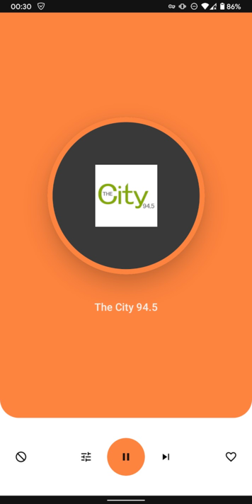
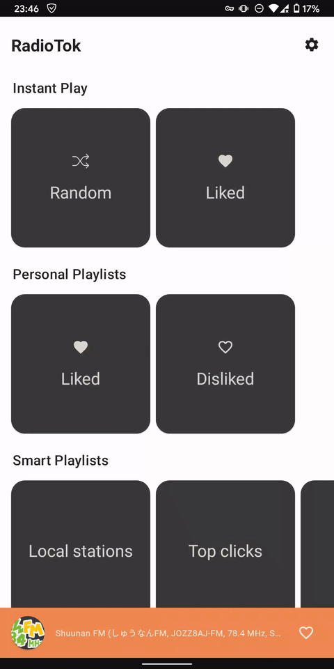
Using the application, it became necessary to see user liked stations, other categories separated by genre and country. The idea is to make a Home screen with a list of different information and player which can be shown and hidden on the screen.
Find available solutions
As a normal developer, I started to research existing compose projects to find already implemented functionality.
The official and community samples contain only the UI part and don’t include any interaction.
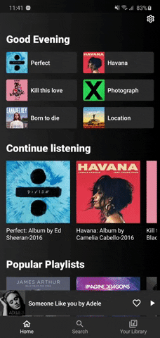
For example, the Spotify UI demo application for me implies a presence player screen, but in source code, it’s just a Row with content.
Another interesting repository I found is a Podcast App. According to the gif looks like what I was looking for.

After inspecting the source code I understood how it works. The PodcastPlayerScreen is a Root composable for the player and it added to the composition of the main screen. By default, it’s not visible for users.
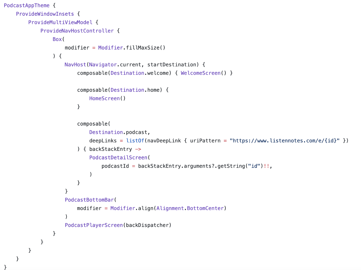
Then if the user clicks on some podcast item it changes the showPlayerFullScreen boolean. Recomposition triggers the AnimatedVisibility logic and the player appears.
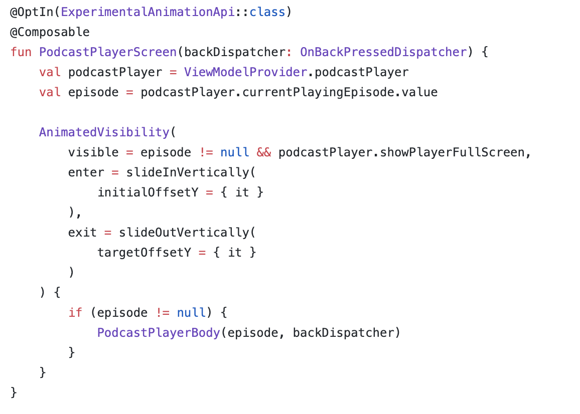
Further interaction refers to listening swipe offset and move the player along the Y-axis on the screen.
From my perspective, it’s not an ideal solution, because it is tied to the ViewModel state, the unobvious showPlayerFullScreen variable which can be changed in different places, also we need manually operate with offset, and so on.
Let’s stop research and try to make a more simple and clear solution.
BottomSheet story
Out of the box, Compose contains two types of BottomSheet implementations:
To make a simple screen with ModalBottomSheetLayout we just need to initialize rememberModalBottomSheetState with initial Hidden state, create coroutine scope for future interaction with visibility and that’s all.
| @Composable | |
| @ExperimentalMaterialApi | |
| fun ModalBottomSheet() { | |
| val modalBottomSheetState = rememberModalBottomSheetState( | |
| initialValue = ModalBottomSheetValue.Hidden | |
| ) | |
| val scope = rememberCoroutineScope() | |
| ModalBottomSheetLayout( | |
| sheetState = modalBottomSheetState, | |
| sheetContent = { | |
| // BottomSheet content | |
| } | |
| ) { | |
| // Content behind BottomSheet | |
| } | |
| } |
Unfortunately, ModalBottomSheetLayout doesn’t have the ability to set peekHeight.
peekHeight — he height of the bottom sheet when it is collapsed. Simply speaking bottom sheet will be on the screen permanently, but in the collapsed state.
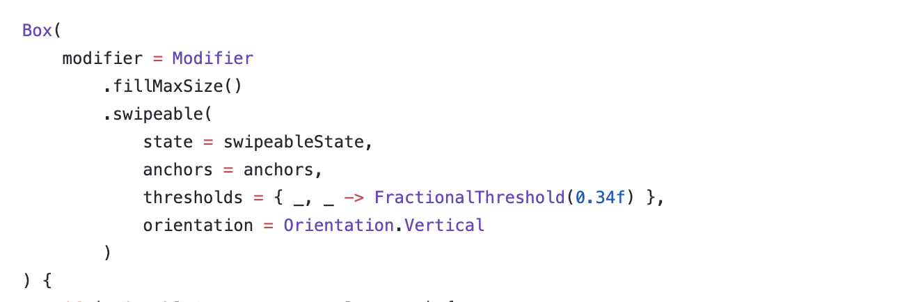
BottomSheetScaffold is trying to solve this issue and introduce this customization. The simple screen setup is pretty the same, but we are able to set peekHeight as a parameter.
Important note:
In different posts I saw wrong initialization of rememberBottomSheetScaffoldState without remember block for bottomSheetState.
It can lead unexpected bottomsheet behaviour after recomposition like non responding to touches, able to drag in different direction and so on.
The correct one should be:
| val scaffoldState = rememberBottomSheetScaffoldState( | |
| bottomSheetState = rememberBottomSheetState(BottomSheetValue.Collapsed) | |
| ) |
Working with BottomSheetScaffold
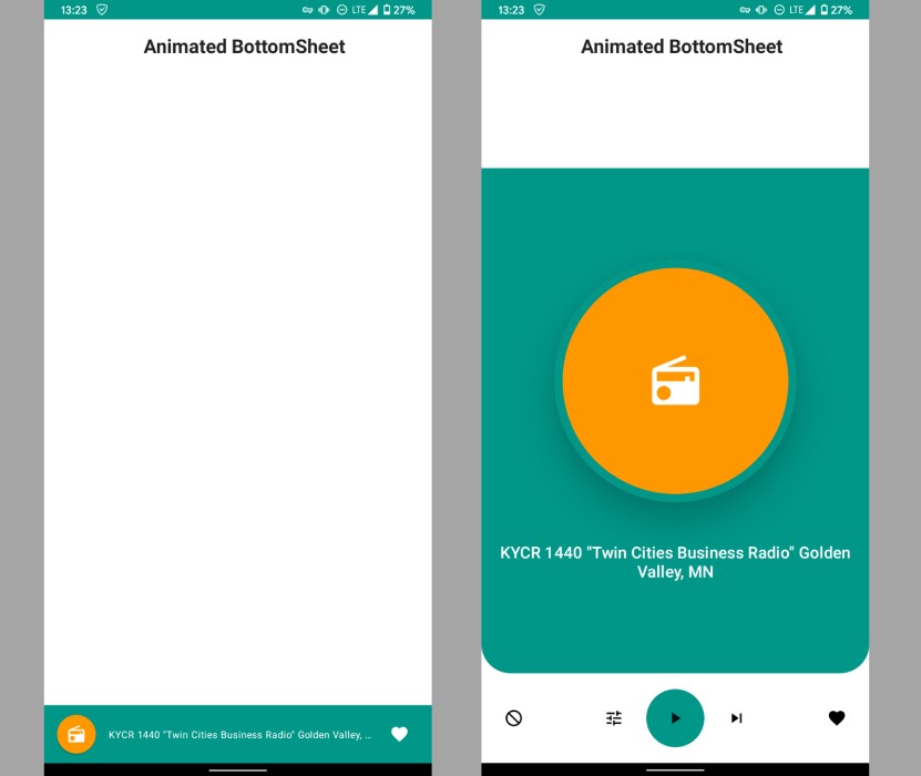
In the sample project, I have added the demo UI for the radio player with collapsed and expanded state. The main goal now is to animate from one state to another one.
tired of reading
Take a break an watch a video
No results found.
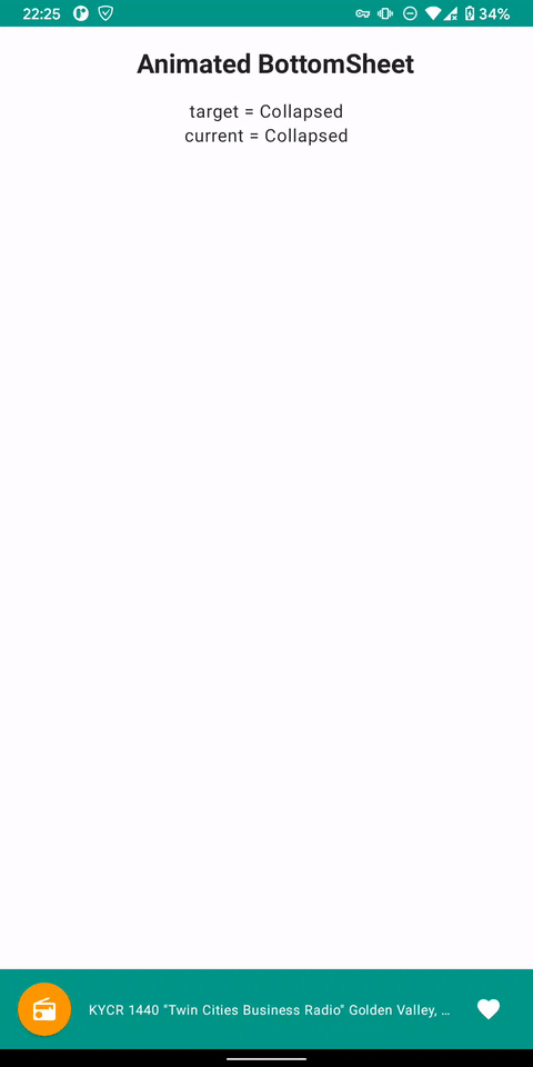
At the first step, we need to know the current BottomSheet state.
The good news for us is that BottomSheetState inherited from SwipeableState and we can try to access fields currentValue andtargetValue.
| @ExperimentalMaterialApi | |
| @Stable | |
| class BottomSheetState( | |
| initialValue: BottomSheetValue, | |
| animationSpec: AnimationSpec<Float> = SwipeableDefaults.AnimationSpec, | |
| confirmStateChange: (BottomSheetValue) -> Boolean = { true } | |
| ) : SwipeableState<BottomSheetValue>( | |
| initialValue = initialValue, | |
| animationSpec = animationSpec, | |
| confirmStateChange = confirmStateChange | |
| ) { | |
| } |
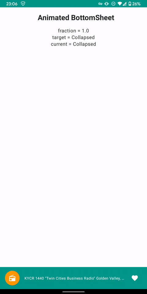
The code will look pretty simple, we just read the necessary data from bottomSheetState and show it on the screen.
| @Composable | |
| @ExperimentalMaterialApi | |
| fun DebugScreen( | |
| scaffoldState: BottomSheetScaffoldState | |
| ) { | |
| Column( | |
| modifier = Modifier.fillMaxWidth(), | |
| verticalArrangement = Arrangement.Top, | |
| horizontalAlignment = Alignment.CenterHorizontally | |
| ) { | |
| val targetValue = scaffoldState.bottomSheetState.targetValue | |
| val currentValue = scaffoldState.bottomSheetState.currentValue | |
| Text("target = $targetValue") | |
| Text("current = $currentValue") | |
| } | |
| } |
Well, now we know the state of our screen and animation direction. But that’s not enough for animation, we need intermediate values between Collapsed and Expanded states.
Digging through the source code I found that Swipeable storing information about the ongoing swipe or animation in a special progress field.
[]gist id=”d8f79e47a1cd7bac5bc996b01a318258″]
SwipeProgress is a class with from/to parameters and fraction. The fraction represents the current position between from and to.
| @Immutable | |
| @ExperimentalMaterialApi | |
| class SwipeProgress<T>( | |
| val from: T, | |
| val to: T, | |
| /*@FloatRange(from = 0.0, to = 1.0)*/ | |
| val fraction: Float | |
| ) { | |
| } |
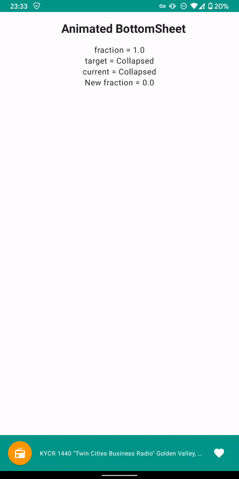
Let’s use this. Updated DebugScreen will look like this.
| @Composable | |
| @ExperimentalMaterialApi | |
| fun DebugScreen( | |
| scaffoldState: BottomSheetScaffoldState | |
| ) { | |
| Column( | |
| modifier = Modifier.fillMaxWidth(), | |
| verticalArrangement = Arrangement.Top, | |
| horizontalAlignment = Alignment.CenterHorizontally | |
| ) { | |
| val fraction = scaffoldState.bottomSheetState.progress.fraction | |
| val targetValue = scaffoldState.bottomSheetState.targetValue | |
| val currentValue = scaffoldState.bottomSheetState.currentValue | |
| Text("fraction = $fraction") | |
| Text("target = $targetValue") | |
| Text("current = $currentValue") | |
| } | |
| } |
Looks nice, but unusable now. If you look closely you will see that fraction starts from 0 every time and finishes with 1.
For beautiful animation, we should definitely assign fraction for states:
- Expanded → 1f
- Collapsed → 0f
A little math and we get this extension.
| @OptIn(ExperimentalMaterialApi::class) | |
| val BottomSheetScaffoldState.currentFraction: Float | |
| get() { | |
| val fraction = bottomSheetState.progress.fraction | |
| val targetValue = bottomSheetState.targetValue | |
| val currentValue = bottomSheetState.currentValue | |
| return when { | |
| currentValue == Collapsed && targetValue == Collapsed -> 0f | |
| currentValue == Expanded && targetValue == Expanded -> 1f | |
| currentValue == Collapsed && targetValue == Expanded -> fraction | |
| else -> 1f - fraction | |
| } | |
| } |

Super, this is already 90% of the result. Now we can apply the calculated fraction to any composable function and dynamically change the alpha.
In this code snippet, I change the alpha of the root collapsed element relatively to a fraction.
| @Composable | |
| fun SheetCollapsed( | |
| currentFraction: Float, | |
| content: @Composable RowScope.() -> Unit | |
| ) { | |
| Row( | |
| modifier = Modifier | |
| .fillMaxWidth() | |
| .height(72.dp) | |
| .background(MaterialTheme.colors.primary) | |
| .graphicsLayer(alpha = 1f - currentFraction), | |
| verticalAlignment = Alignment.CenterVertically | |
| ) { | |
| content() | |
| } | |
| } |

Looks pretty, doesn’t it?
Bonus
We can try to animate BottomSheet corner radius relatively to a fraction.
For example, for the Collapsed state, we won’t have any rounding, but for Expanded we want to have 30.dp.
The below code allows achieving dynamic corner radius change.
The source code of the sample:
GitHub – egorikftp/compose-animated-bottomsheet: A sample implementation Compose BottomSheet with…A sample implementation Compose BottomSheet with animation different states – GitHub … |
The RadioTok app:
GitHub – egorikftp/RadioTok: Random radio from the whole world with Jetpack Compose and Media API… |
________________
Why Android?
Tags: Jetpack Compose, Bottomsheet, Animation, Android, Experience
View original article at:

Originally published: August 09, 2021