

Photo by yinka adeoti on Unsplash
In the first part of this series, we learned about the building blocks of media playback and control using the Android Leanback library and how to add and handle the basic playback controls. We also enhanced the UX of our App by following Google’s Playback controls on TV recommendations.
📺 Android TV Leanback: Playback Controls — Part 1
Now that we have a better understanding of how to control our media playback and handle control actions, let’s improve our controls by adding a video thumbnail close to the content information, a secondary actions row with shuffle, repeat, and a “my list” action, and the “Up Next” row.
Video Thumbnail 🖼
Sometimes, it’s easier to remember what we were watching by looking at the thumbnail of a video than by remembering the video title. That’s the idea behind having this visual information in our controls UI.
To add the movie thumbnail, we first need a way to load it. We’ll be using Glide, a fast and well-known image-loading library for Android but feel free to use the library of your choice. The goal is to load a bitmap to pass it to our controls.
After loading the bitmap, you need to call PlaybackControlsRow.setImageBitmap(). Inside your PlaybackTransportControlGlue, you have access to the controls row instance. Here’s the Glide example:
| Glide.with(context) | |
| .asBitmap() | |
| .load(movie.cardImageUrl) | |
| .into(object : CustomTarget<Bitmap>() { | |
| override fun onResourceReady(bitmap: Bitmap, t: Transition<in Bitmap>?) { | |
| controlsRow.setImageBitmap(context, bitmap) | |
| host.notifyPlaybackRowChanged() | |
| } | |
| override fun onLoadCleared(placeholder: Drawable?) { | |
| controlsRow.setImageBitmap(context, null) | |
| } | |
| }) |
Make sure to call the host.notifyPlaybackRowChanged() so the host can update the PlaybackControlsRow and display the thumbnail. Otherwise, the thumbnail won’t appear.
Overriding dimension attributes
You can customize the thumbnail size by overriding the Leanback resource used to set its height. Add a new <dimen> resource to your resource files named lb_playback_transport_image_height with the height of your choice in dp.
<resources>
  <dimen name="lb_playback_transport_image_height">120dp</dimen>
</resources>
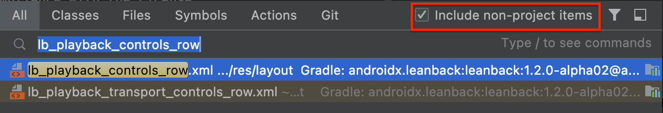
If you need to go even further in the customization of your controls UI, take a look at the layout file called lb_playback_transport_controls_row. If you don’t know how to locate it on Android Studio, quickly press <shift> twice and type the layout name. Make sure to check the “include non-project items” checkbox.
You will see many @dimen properties like margins, paddings, and heights that you can override the same way we did with the lb_playback_transport_image_height.
Note: This approach of overriding resources extends to any resource of your project. If you want to override the entire lb_playback_controls_row layout, go for it. In this case, ensure you create a correspondent layout with the same android:id‘s to the correspondent views so the Leanback components can find and configure those views.
Secondary Controls 🎛
To extend our control abilities, we can override the PlaybackTransportControlGlue.onCreateSecondaryActions() and add more actions to the adapters in the same way we did with the primary actions. The secondary actions are displayed right below the seek bar. This means we have plenty of space to add extra actions.
We’ll add a few built-in actions, repeat, shuffle, and thumbs up, and create a customized “my list” action.
| private val thumbsUpAction = PlaybackControlsRow.ThumbsUpAction(context).apply { | |
| index = PlaybackControlsRow.ThumbsUpAction.INDEX_OUTLINE | |
| } | |
| private val shuffleAction = PlaybackControlsRow.ShuffleAction(context) | |
| private val repeatAction = PlaybackControlsRow.RepeatAction(context) | |
| private val myListAction = MyListAction(context) | |
| override fun onCreateSecondaryActions(secondaryActionsAdapter: ArrayObjectAdapter) { | |
| secondaryActionsAdapter.add(thumbsUpAction) | |
| secondaryActionsAdapter.add(shuffleAction) | |
| secondaryActionsAdapter.add(repeatAction) | |
| secondaryActionsAdapter.add(myListAction) | |
| } |
Jobs
On the thumbsUpAction, we are setting the thumbsAction.index to INDEX_OUTLINE. Visually, this shows an outlined button, i.e., the movie was not liked yet. It’s the opposite of setting to INDEX_SOLID, where the button is filled.
We’ll do something very similar with our custom MyListAction by creating a MultiAction, which is the base class for actions with multiple states — like filled, outlined, or whatever is our needs.
| class MyListAction(context: Context) : MultiAction(R.id.tv_my_list_action) { | |
| init { | |
| val drawables = arrayOf( | |
| context.getDrawable(R.drawable.playback_controls_my_list_add), | |
| context.getDrawable(R.drawable.playback_controls_my_list_remove), | |
| ) | |
| setDrawables(drawables) | |
| val labels = arrayOf( | |
| context.getString(R.string.playback_controls_my_list_add), | |
| context.getString(R.string.playback_controls_my_list_remove), | |
| ) | |
| setLabels(labels) | |
| } | |
| companion object { | |
| const val INDEX_ADD = 0 | |
| const val INDEX_REMOVE = 1 | |
| } | |
| } |
Notice that we added the add and the remove drawable to our action in the same indexes we declared the INDEX_ADD = 0 and INDEX_REMOVE = 1. These indexes must match the indexes of the action drawable and label. Otherwise, its UI won’t be updated as we expect when interacting with the button.
Last, we will create a function called onSecondaryActionsPressed() to handle all secondary actions and then update the PlaybackTransportControlGlue.onActionClicked()to dispatch the new actions click to this function.
| private fun onSecondaryActionPressed(action: Action) { | |
| val adapter = controlsRow.secondaryActionsAdapter as? ArrayObjectAdapter ?: return | |
| if (action is PlaybackControlsRow.MultiAction) { | |
| action.nextIndex() | |
| notifyItemChanged(adapter, action) | |
| } | |
| when (action) { | |
| shuffleAction -> { | |
| playerAdapter.setShuffleAction(shuffleAction.index) | |
| if (shuffleAction.index == PlaybackControlsRow.ShuffleAction.INDEX_ON) { | |
| shuffledPositions.shuffle() | |
| } | |
| } | |
| repeatAction -> playerAdapter.setRepeatAction(repeatAction.index) | |
| thumbsUpAction -> currentMovie.let(LikedMovies::toggle) | |
| myListAction -> currentMovie.let(MyList::toggle) | |
| } | |
| } | |
| override fun onActionClicked(action: Action?) { | |
| when (action) { | |
| thumbsUpAction, | |
| shuffleAction, | |
| repeatAction, | |
| myListAction -> onSecondaryActionPressed(action) | |
| forwardAction -> { | |
| playerAdapter.fastForward() | |
| onUpdateProgress() | |
| } | |
| rewindAction -> { | |
| playerAdapter.rewind() | |
| onUpdateProgress() | |
| } | |
| else -> super.onActionClicked(action) | |
| } | |
| } |
Notice that we are checking if the action is a MultiAction, which will always be true for the secondary actions. We increment its index and call the notifyItemChanged(). This code updates the action UI to correspond with the new state (specified by the new index).
Feel free to check the sample app if you’re interested in the repeat and shuffle implementations (it’s worth it).
Up Next movies row 🎥
Let’s provide our users with a better way to navigate its movie playlist. Instead of them having to go back and forth to check what’s the next piece of content, let’s add a row of movies similar to what we have on the app’s main screen. Our goal is to make the controls look like this:
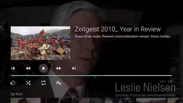 Playback controls with Up Next movies row
The first thing we need to add a regular ListRow to our controls is to ensure our PlaybackSupportFragment.adapter also supports ListRow‘s. We need to add a ListRowPresenter to the adapter PresenterSelector and then add the “Up Next” movies list row like the following:
| override fun onViewCreated(view: View, savedInstanceState: Bundle?) { | |
| super.onViewCreated(view, savedInstanceState) | |
| if (savedInstanceState == null) { | |
| (adapter.presenterSelector as ClassPresenterSelector) | |
| .addClassPresenter(ListRow::class.java, ListRowPresenter()) | |
| upNextAdapter = ArrayObjectAdapter(CardPresenter()) | |
| val upNextRow = ListRow(1L, HeaderItem("Up Next"), upNextAdapter) | |
| (adapter as ArrayObjectAdapter).add(upNextRow) | |
| } | |
| ... | |
| ... | |
| } |
Make sure to keep a reference of the upNextAdapter so you can update its items whenever needed by calling the setItems() function.
upNextAdapter.setItems(newPlaylist, MovieDiffCallback)
After that, the only missing part is to handle the click on the “Up Next” row items. The VideoSupportFragment and any subclass of PlaybackSupportFragment already have a listener for that. Call the setOnItemViewClickedListener() after your fragment is created and handle the click.
| setOnItemViewClickedListener { _, item, _, row -> | |
| if (row is ListRow && row.adapter == upNextAdapter) { | |
| val movie = item as Movie | |
| val movieIndexInPlaylist = transportControlGlue.getPlaylist().indexOf(movie) | |
| transportControlGlue.loadMovie(movieIndexInPlaylist) | |
| } | |
| } |
That’s another wrap!
Thanks again for reading! Follow me to be notified when the next story comes out. Make sure to check the sample app source code here.
Feel free to check another post covering how to update items on a RowsSupportFragment.
Questions or suggestions? Reach me on Twitter @admqueiroga
Thanks!
This article was originally published on proandroiddev.com


