This 2 part blog series covers a dive into the past, present and future of text fields in Jetpack Compose. Discover brand new BasicTextField2.
TL;DR: The Compose text team is building the next generation of
TextField APIs. You can try them out right now.BasicTextField2 is available in latest foundation 1.6.0 alphas, in packagetext2. Give feedback to the team through the various channels described below.
Recap of part 1
In part 1️⃣ we’ve covered how to:
- manage state with the new
BasicTextField2APIs to prevent state synchronicity issues - do basic styling including using decorator and line limits
- solve for common scenarios when observing state and applying business rules
- edit the value of the text field programmatically with
TextFieldBuffer
Find part 1 here: BasicTextField2: A TextField of Dreams [1/2]
Filtering | InputTransformation
Let’s say we’re implementing a text field for a verification code that accepts digits only.

To filter the user’s input e.g. accept digits only or leave out special characters, you define an InputTransformation. This will modify the user input before saving it to the text field state. It is a non reversible operation, so you will lose the input that doesn’t match your transformation. That’s why we call them “filters”.
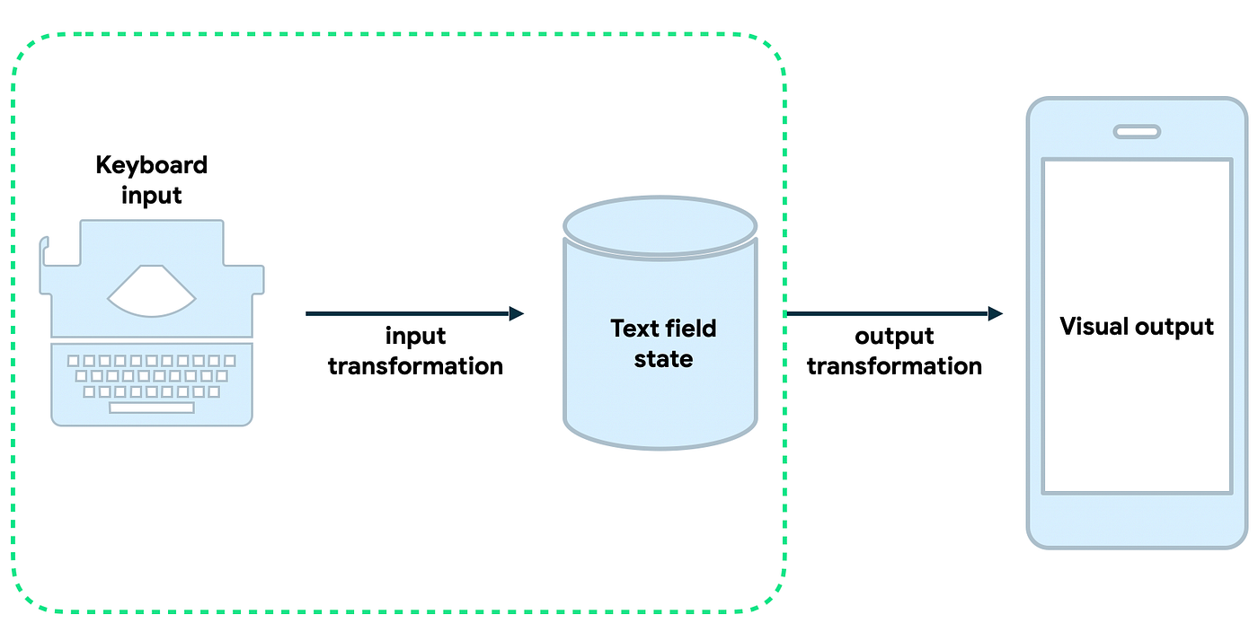
The InputTransformation API shape is as follows:
fun interface InputTransformation {

    val keyboardOptions: KeyboardOptions? get() = null

    fun transformInput(
        originalValue: TextFieldCharSequence,
        valueWithChanges: TextFieldBuffer
    )
}
The transformInput method contains the original typed text and a value with the changes in the form of a TextFieldBuffer, described in part 1 of this blog. TextFieldBuffer API provides a list of changes of type ChangeList.
class TextFieldBuffer {
    // other fields and methods

    val changes: ChangeList get()

    interface ChangeList {
        val changeCount: Int
        fun getRange(changeIndex: Int): TextRange
        fun getOriginalRange(changeIndex: Int): TextRange
    }
}
You could do anything with the changes, including discarding them all.
object DigitsOnlyTransformation : InputTransformation {
    override val keyboardOptions = KeyboardOptions(keyboardType = KeyboardType.Number)

    override fun transformInput(
        originalValue: TextFieldCharSequence,
        valueWithChanges: TextFieldBuffer
    ) {
        if (!valueWithChanges.asCharSequence().isDigitsOnly()) {
            valueWithChanges.revertAllChanges()
        }
    }
}

// Compose

BasicTextField2(
    state = state,
    inputTransformation = DigitsOnlyFilter
)
We define an object that implements the InputTransformation interface. First, we need to implement the transformInput method.
In our example, we check the changes from the TextFieldBuffer. If they contain digits only, we keep the changes. If the characters are not digits, we revert those changes. It is very simple, as the diff is done internally for us.
Note that we’re also setting the corresponding keyboard type, to be Number.
Because InputTransformation is a functional interface, you could pass a lambda where you describe your transformation directly to the BasicTextField2 composable, as follows:
BasicTextField2(
    state = state,
    inputTransformation = { originalValue, valueWithChanges ->
        if (!valueWithChanges.asCharSequence().isDigitsOnly()) {
            valueWithChanges.revertAllChanges()
        }
    },
    // in this case pass the keyboardOptions to the BFT2 directly, which
    // overrides the one from the inputTransformation
    keyboardOptions = KeyboardOptions.Default.copy(keyboardType = KeyboardType.Number
)
This works just fine if you have one text field that needs this particular transformation. If you have more than one, it makes sense to extract the transformation to its own object.
Next, we have to build a verification code field that is max 6 chars in length and all caps.

We have some built in input transformations for such common use cases: maxLengthInChars to limit the field length andallCaps to make the text uppercased.
We can write the verification code like this:
BasicTextField2(
    state = state,
    inputTransformation = InputTransformation.maxLengthInChars(6)
        .then(InputTransformation.allCaps(Locale.current)),
)
We’re using then to chain input transformations, and filters are applied sequentially in order.

Visual transformation | OutputTransformation ⚠️
As of early November 2023: ⚠️ OutputTransformation API is under construction. You can check progress here.
In our verification code text field example, now we want to replace the characters the user hasn’t typed yet with dots and group them in triplets adding a space in between, as follows:

Job Offers
To solve this and other cases in which you need to format the text field content, like formatting a phone or credit card number, you define an OutputTransformation. It will format the internal state when displaying it in the UI. Note that unlike InputTransformation where the result of applying it is saved to the text field state, the result of applying the OutputTransformation changes are not stored.
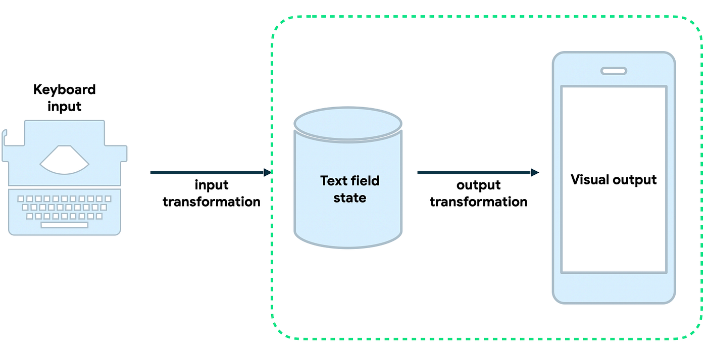
The OutputTransformation API shape is as follows:
fun interface OutputTransformation {

    fun transformOutput(buffer: TextFieldBuffer)
}
The great benefit of the new API is that we don’t need to provide the offset mapping between the original raw text and transformed text. The text field handles this for us implicitly.
In this example, we define an object that implements the OutputTransformation interface and implement transformOutput:
object VerificationCodeOutputTransformation : OutputTransformation {

    override fun transformOutput(buffer: TextFieldBuffer) {
        // Pad the text with placeholder chars if too short
        // ··· ···
        val padCount = 6 - buffer.length
        repeat(padCount) {
            buffer.append('·')
        }

        // 123 456
        if (buffer.length > 3) buffer.insert(3, " ")
    }
}
First, we call append on text field buffer to insert “dots” for any not yet typed characters. Then we call insert method to add a space between triplets of characters. That’s it. No offset mappings that in old API was a great source of confusion and crashes. Pretty sweet right?
SecureTextField
Let’s build the password field in our Sign up screen. Writing a password field is such a common use case that there is a new composable altogether for this, built on top of BasicTextField2 called BasicSecureTextField:
val password = rememberTextFieldState()
BasicSecureTextField(
    state = password
    textObfuscationMode = TextObfuscationMode.RevealLastTyped
)
There are 3 useful modes for textObfuscationMode. RevealLastTyped which is default and matches what EditText in the view system does when configuring input type as textPassword. With this behaviour you briefly see the last character typed before it times out or you type the next character. Then you have Hidden, in which case you never see the character typed, and Visible, useful to temporarily make the password value visible.
Having BasicSecureTextField as a separate composable is very powerful. It allows the team to optimise for security under the hood, making sure the field content is not persisted in memory more than it should, avoiding things like memory spoofing. It comes with predefined UI with mask and textObfuscationModes, and also explicit behaviours that come with it, for instance the text toolbar modifications (you cannot cut or copy the contents of a password field).
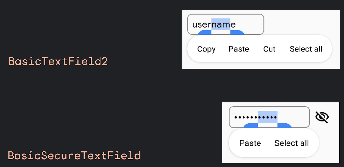 You cannot cut or copy the contents of a password field.
And more…
There’s plenty to talk about, but I’ll pick just 3 more highlights.
The new BasicTextField2 allows you to access internal scroll state.
Hoist the scroll state like you would with any other scrollable composable, like LazyLayout. Pass it to BasicTextField2 and now you can scroll the field programmatically through another composable, for example a vertical Slider acting as scroll bars for the text field:
val scrollState = rememberScrollState()

BasicTextField2(
    state = state,
    scrollState = scrollState,
    // ...
)

Slider(
    value = scrollState.value.toFloat(),
    onValueChange = {
        coroutineScope.launch { scrollState.scrollTo(it.roundToInt()) }
    },
    valueRange = 0f..scrollState.maxValue.toFloat()
)
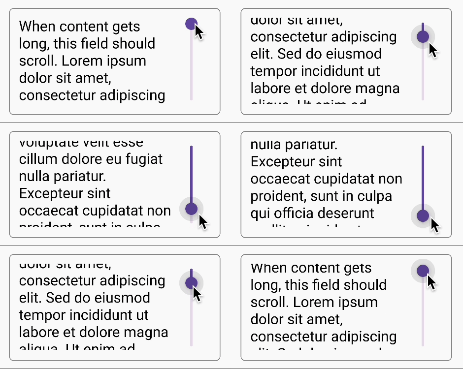
Control scroll of text field programatically
The team added support for more gestures, like double tap to select word.
Lastly, TextFieldState gives you access to the UndoState class. This class holds historical values of the state, and useful methods to undo or redo edit changes, built on top of TextFieldBuffer‘s ChangeList.
In very few lines of code you can implement undo/redo support like this:
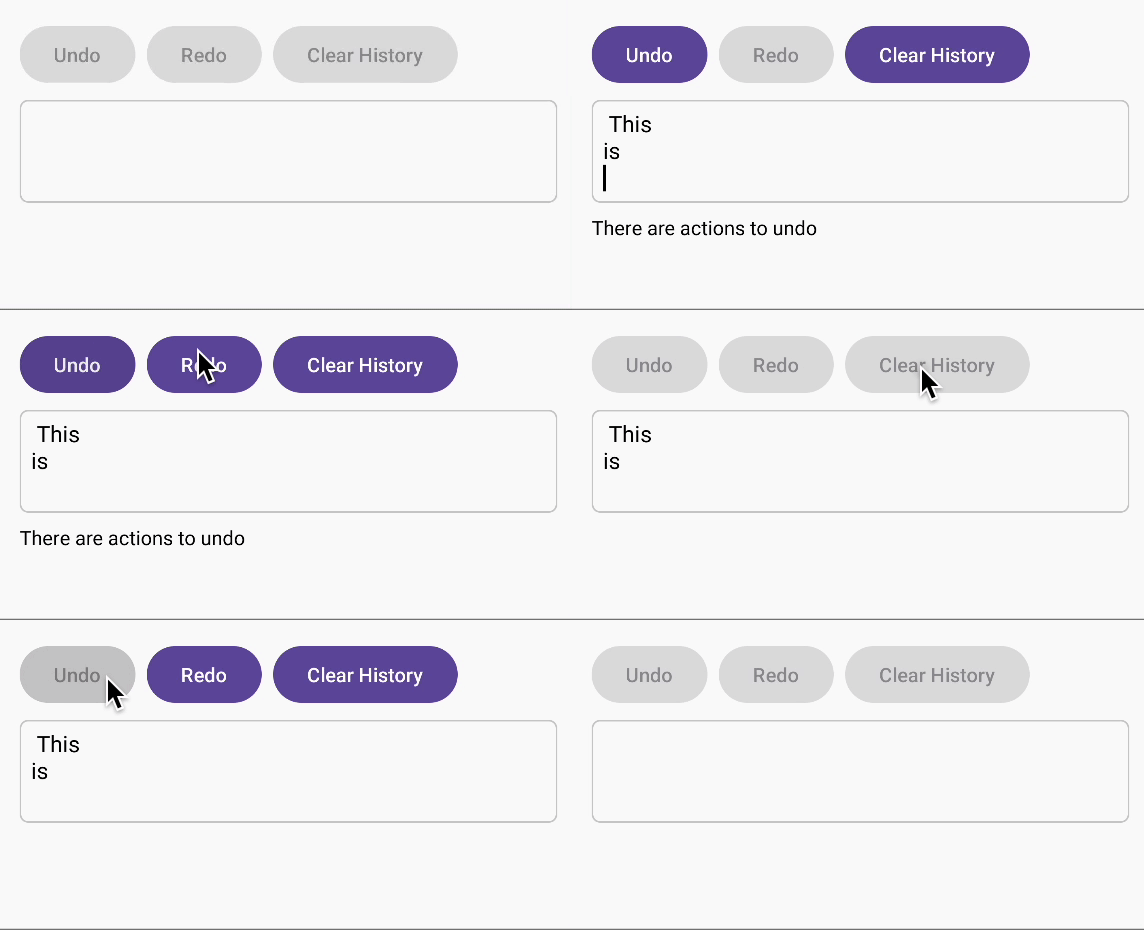
val state: TextFieldState = rememberTextFieldState()

Button(
    onClick = { state.undoState.undo() },
    enabled = state.undoState.canUndo
) {
    Text("Undo")
}

Button(
    onClick = { state.undoState.clearHistory() },
    enabled = state.undoState.canUndo || state.undoState.canRedo
) {
    Text("Clear History")
}
Very powerful API, and all out of the box 😊🎉
For more, see Zach’s talk, one of the main engineers on this project, working on Compose Text at Google, talking about how this project came to be and where it is right now.
We’ve seen how to:
* apply filters withInputTransformation
* apply visual transformations withOutputTransformation
* write password fields withBasicSecureTextFieldThe new API shape will also allow for operations that are not possible today like identifying explicit changes in your editing process and access to text field scroll state.
Future
BasicTextField2 is under construction right now. Try the API out in Compose 1.6.0 alphas, and give feedback to the team. Think about what complex editing use cases you’re working on, what else you’d like the API to support and if the current shape would let you do this.
After you try it out, you can give feedback! 🙏
- File a feature request or bug on Google’s issue tracker @ issuetracker.google.com
- Let’s discuss in Kotlin Lang Slack, channel #compose
- Reach out to the members of the Compose Text team on social:
Zach: androiddev.social/@zachklipp | Mastodon
Halil: androiddev.social/@halil | Mastodon
Anastasia: Anastasia Soboleva @ kotlinlang.org | Slack
BasicTextField2 is in a separate package text2 so it is clearly differentiated. This is only a temporal package and BasicTextField2 is a temporal name while the API is being stabilised.
Next up in the pipeline it’s completing OutputTransformation API.
Multi text style editing is a highly requested feature, and will be possible with this new API shape.
And of course Material wrappers, so it would work like any other Material composable with the correct styling baked in.
Stay tuned for further releases of BasicTextField2 .
Drop me a line on Twitter to chat about what other complex text field use cases you’re building 🙂
Find all the code used for this post in the Github playground repo.
Happy Composing! 👋
BasicTextField2: A TextField of Dreams [1/2]
BasicTextField2: A TextField of Dreams [2/2]
Thank you Anastasia Soboleva, Halil Özercan and Zach Klippenstein on the Jetpack Compose Text team for their thorough reviews.
This post is the written version of the DroidCon London 2023 talk TextField in Jetpack Compose: past, present and future.
This article was previously published on proandroiddev.com


