

There are multiple ways of doing the same thing. You choose which way to go.
 Image by New18
The article covers how can we create a bottom sheet with round corners via XML and Canvas separately. Let’s see what we’re going to build.
First, let’s take the XML approach which is very straightforward to use. We simply create a rectangle shape with top left and right corners with some radius as follows.
| <?xml version="1.0" encoding="utf-8"?> | |
| <shape xmlns:android="http://schemas.android.com/apk/res/android" | |
| android:shape="rectangle"> | |
| <solid android:color="@color/white" /> | |
| <corners android:topLeftRadius="25dp" android:topRightRadius="25dp" /> | |
| </shape> |
Then set this shape as a background to our container layout as follows
| <?xml version="1.0" encoding="utf-8"?> | |
| <LinearLayout | |
| xmlns:android="http://schemas.android.com/apk/res/android" | |
| android:id="@+id/curvedContainer" | |
| android:layout_width="match_parent" | |
| android:layout_height="wrap_content" | |
| android:background="@drawable/button_selector" | |
| android:orientation="horizontal"> | |
| </LinearLayout> |
So far so good and we’re ready with our target. But we encounter an issue which you can easily spot in the image below.
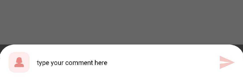 Bottom sheet with round corners
We can see the black area outside of the curved corners. This issue we’ll fix at the end of this article. But for now let’s move on to our second approach which is using the canvas.
So how can we have the same shape if we try to do this via custom drawing. Well! That is also quite easy to achieve but require some understanding of custom view drawing on canvas. In case you want to read more about it you can check out this article of mine.
Now, we need to create a custom view with the same shape as our target. We’ll use LinearLayout as our main container here. Go ahead and create the class CurvedContainer.kt. as follows:
| class CurvedContainer @JvmOverloads constructor( | |
| context: Context, | |
| attrs: AttributeSet? = null, | |
| defStyleAttr: Int = 0 | |
| ): LinearLayout(context, attrs, defStyleAttr) { | |
| /* paint object for coloring the canvas */ | |
| private val mPaint = Paint() | |
| /* path that will be drawn to achieve the shape */ | |
| private val path = Path() | |
| /* arcs will create the effect of curved corners */ | |
| private val leftArc = RectF() | |
| private val rightArc = RectF() | |
| /* offset values for our curved corners */ | |
| private val xAxisOffset = 100f | |
| private val yAxisOffset = 100f | |
| init { | |
| /* setting the background as transparent as we're drawing the view ourself */ | |
| setBackgroundColor(Color.TRANSPARENT) | |
| setLayerType(View.LAYER_TYPE_HARDWARE, null) | |
| mPaint.apply { | |
| style = Paint.Style.FILL | |
| color = Color.WHITE | |
| isAntiAlias = true | |
| clipChildren = true | |
| } | |
| } | |
| override fun onSizeChanged(w: Int, h: Int, oldw: Int, oldh: Int) { | |
| super.onSizeChanged(w, h, oldw, oldh) | |
| } | |
| override fun onDraw(canvas: Canvas?) { | |
| super.onDraw(canvas) | |
| } | |
| } |
CurvedContainer.kt
OUR VIDEO RECOMMENDATION


Jobs
What are we doing here? We’ll draw a path and paint the enclosed area of the path. Simple! Below image shows how the path actually looks like if we simply draw it using stroke/border.
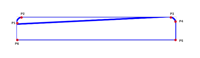 path with style STROKE
The blue line indicates our path and the points indicates the position we’re drawing our path on, in a linear clockwise fashion. We’ll create the path once we know the size of our view i.e. in onSizeChanged function.
| override fun onSizeChanged(w: Int, h: Int, oldw: Int, oldh: Int) { | |
| super.onSizeChanged(w, h, oldw, oldh) | |
| /* curve from P1 to P2 */ | |
| leftArc.set( | |
| 0f, | |
| 0f, | |
| xAxisOffset, | |
| yAxisOffset | |
| ) | |
| path.addArc(leftArc, 180f, 90f) | |
| /* line from P2 to P3 */ | |
| path.lineTo(w.toFloat() - (xAxisOffset * 0.5f), 0f) | |
| /* curve from P3 to P4 */ | |
| rightArc.set( | |
| w.toFloat() - (xAxisOffset), | |
| 0f, | |
| w.toFloat(), | |
| yAxisOffset | |
| ) | |
| path.addArc(rightArc, 270f, 90f) | |
| /* line from P4 to P5 */ | |
| path.lineTo(w.toFloat(), h.toFloat()) | |
| /* line from P5 to P6 */ | |
| path.lineTo(0f, h.toFloat()) | |
| /* line from P6 to P1 */ | |
| path.lineTo(0f, yAxisOffset - (yAxisOffset / 2)) | |
| path.close() | |
| } |
function onSizeChanged
It is evident that we’re drawing our path step by step from one point to other and finally completing the path to the point P1 from where we started. This way we get our curved shape. And once we’ve our path ready, we’ll draw it on our canvas in onDraw function as follows:
| override fun onDraw(canvas: Canvas?) { | |
| super.onDraw(canvas) | |
| canvas?.drawPath(path, mPaint) | |
| } |
We’ll set this CurvedContainer.kt in our bottom sheet layout and the output will be the same as the XML approach output we saw above. We still have the gray area outside of our curved corners.
To address our issue, we’ll create a style as follows:
| <style name="TransparentBackgroundDialog" parent="Theme.Design.Light.BottomSheetDialog"> | |
| <item name="android:colorBackground">@android:color/transparent</item> | |
| </style> |
We’ll set this style to our bottom sheet dialog so that it won’t draw any color to our custom view by setting the color background to transparent.
| override fun onCreate(savedInstanceState: Bundle?) { | |
| super.onCreate(savedInstanceState) | |
| setStyle(STYLE_NORMAL, R.style.TransparentBackgroundDialog) | |
| } |
BottomSheetContainer.kt
We now have our target hit. You can try the same and see how it works.
Hope it’ll help!
Until we meet again…Cheers!
This article was originally published on proandroiddev.com on March 06, 2022


