I’ve been reading and learning about Jetpack Compose since June 2021 but because of my work on KMM side of things, I wasn’t able to spend time or write Jetpack Compose code actively. But things have changed since last month and now I’m focusing a lot more on Jetpack Compose.
Recently I was developing some UI and I had to create a bordered Text composable where the text will be in the center. It sounded very straightforward at the start coming from old View system but it made me spend more than an hour in figuring out that it’s doesn’t work the same way as it used to work with TextView in old View System.
Edit: After doing a bit more research I found that there is a modifier function called
Modifier.wrapContentHeight(align: Alignment.Vertical)which allows us to center align the text content inside a Text composable of any height. Although with this we can achieve our goal of centering the text but it still seems somewhat disjoint as Horizontal alignment is taken care by textAlign (which is a property in Text composable) and Vertical alignment is taken care by wrapContentHeight (which is a Modifier function).
| fun CenterAlignedText() { | |
| Text( | |
| text = "Center", | |
| textAlign = TextAlign.Center, | |
| modifier = Modifier.size(100.dp) | |
| .background(Color.Cyan) | |
| .wrapContentHeight(), | |
| ) | |
| } |
Center Aligned Text composable with Modifier.wrapContentHeight()
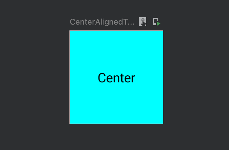 Preview generated using CenterAlignedText
The Issue
To understand the issue I faced let’s go through a very small example first as shown in the below screenshot:
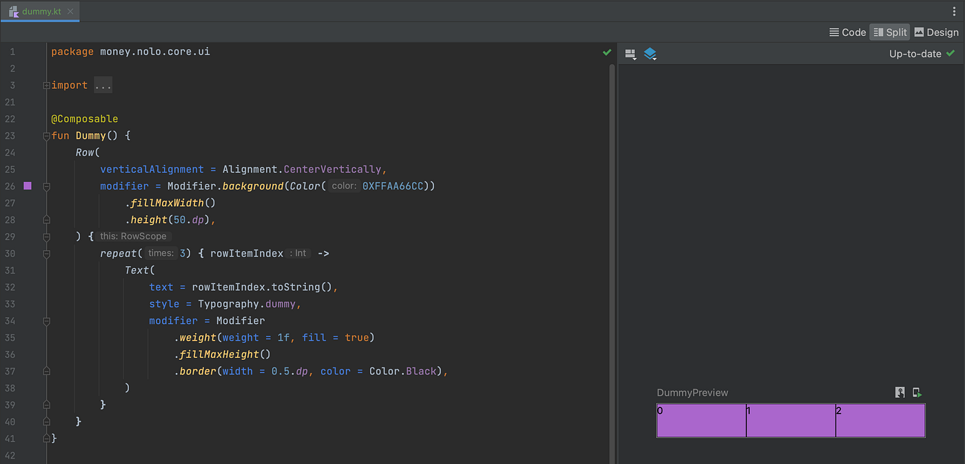 Jetpack Compose example showing a Row having Text components
As you can see in the above screenshot, I needed to have bordered Text composables with the height same as the parent Row and wanted to center align the text. So to achieve the desired alignment I first tried with TextStyle.textAlign property along with TextAlign.Center value. But after the preview refreshed I saw that the text content was only horizontally center aligned and not center aligned in both directions 🤔 i.e. (horizontal & vertical) as shown below:
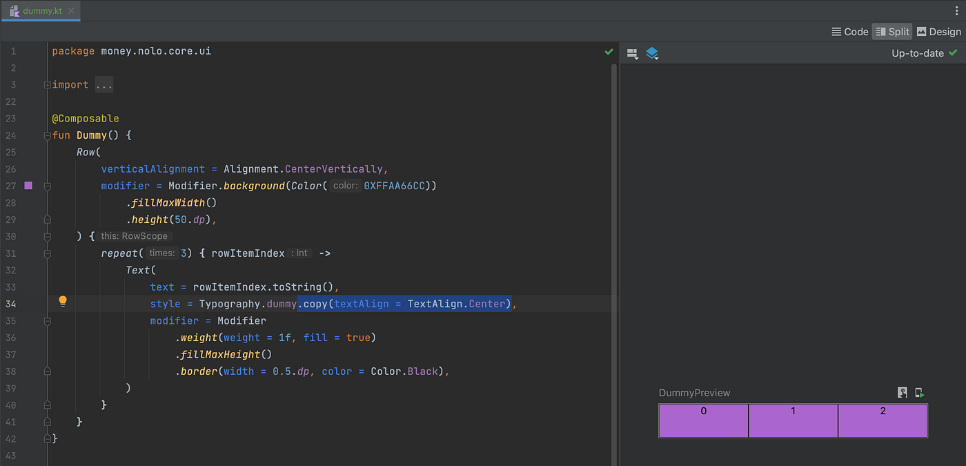 Result after applying textAlign = TextAlign.Center to TextStyle
Maybe some of you might already be thinking that I could’ve used Modifier.align() to achieve the desired behaviour, but it doesn’t work in current use-case because the Text composable is already having max width & height so the Modifier.align doesn’t help here. 😅
This made me re-think how I could’ve achieved the same in old View system. So I ended up writing a sample code as shown below:
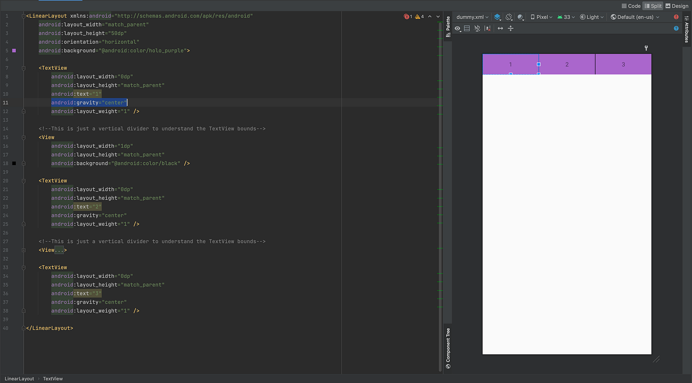 Implementation of somewhat desired behaviour in old View system
As you might already be knowing that achieving the same in View system just requires android:gravity attribute with center flag. If you’re curious below is the list of all the flags that you can use as a value for gravity attribute. And the best part of this attribute was that you can use bitwise or “|” operator to use multiple flags in conjunction as well e.g. “top|center”.
 list of supported flags for gravity attribute
Job Offers
Looking at all the above flags I though about checking the all the supported TextAlign values. So I opened the TextAlign class and the listed options seems very few which seemed like 1-D alignments and the comment above Center was definitely misleading 😅 (as it just does center aligning in only horizontal direction).
 TextAlign supported values
After looking at the content of this I finally realized that I wasn’t doing something wrong from my end but there is a bit of an issue in the documentation i.e. center alignment feature doesn’t work the same as way as you might expect. This also made me curious about all the supported values in Modifier.align(). So I checked Alignment class file and was pleased to see that they even divided different supported values into different sections like 2D Alignments, 1D Vertical & 1D Horizontal which must be related to 1D alignment support in ColumnScope & RowScope 🙂. Ideally I would’ve liked to see all the values supported in Alignment in TextAlign as well but sadly that’s not the case atleast at the moment.
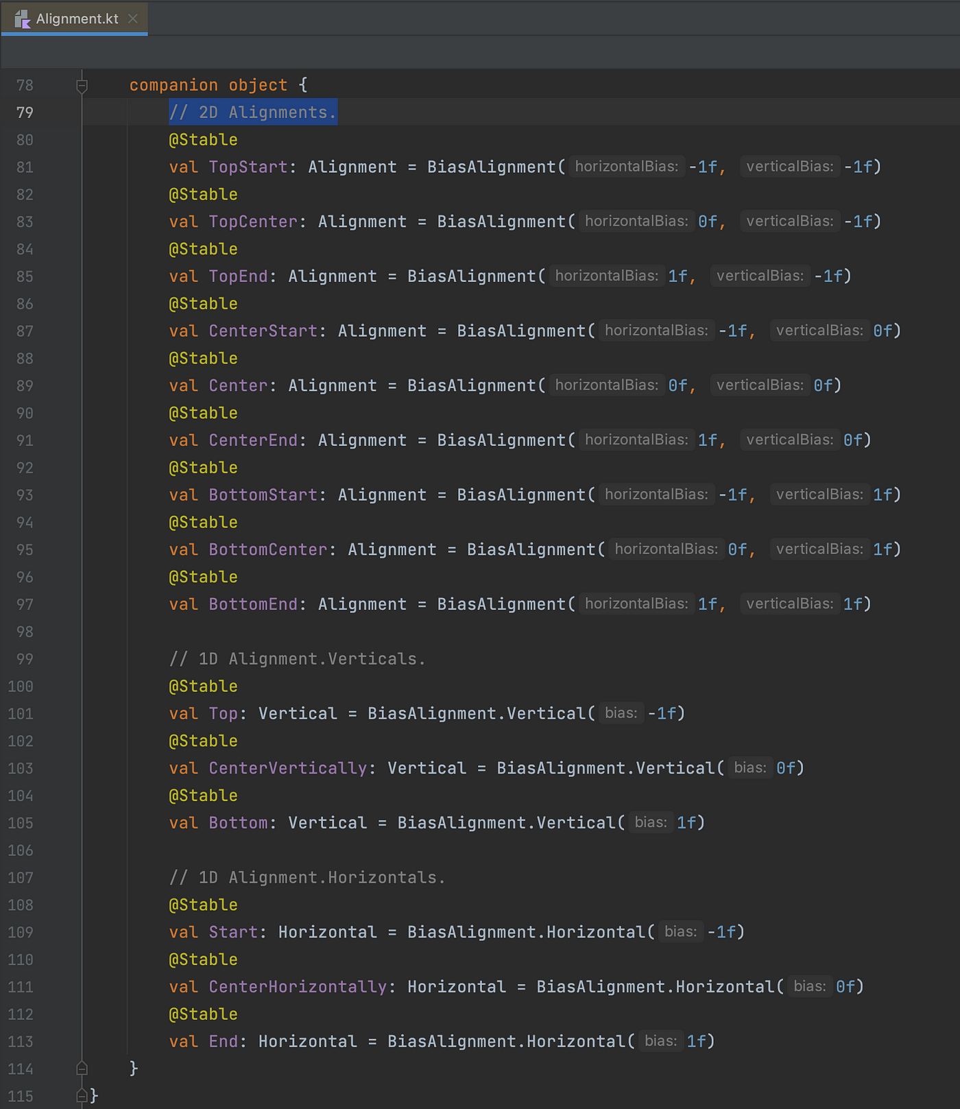 Alignment supported values
Finally to achieve the desired result I ended up wrapping my Text composable in a parent Box composable which will take care of both the alignment and drawing the border. The fix was simple but the wrapping it in another composable seemed redundant even though in the penalty of doing it in compose world might be negligible compared to the old View System.
 Wrapping the Text in Box composable to achieve the desired behaviour
Fun Fact
When I was digging into how exactly the gravity attribute works for TextView, I ended up looking into the contents of TextView.setGravity() and saw an interesting constant named UNKNOWN_BORING.
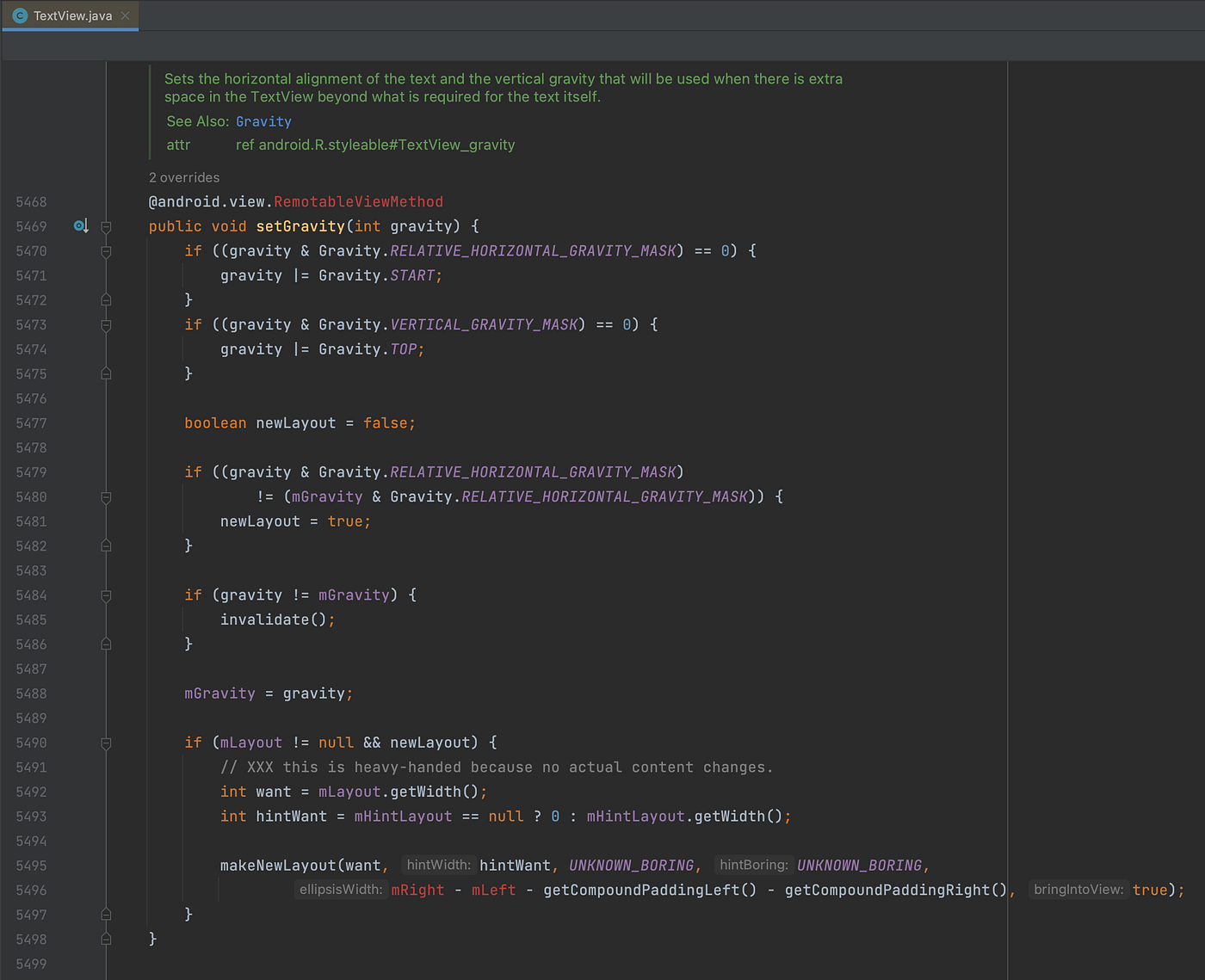 TextView.SetGravity() implementation and UNKNOWN_BORING usage
The first thought that came to my mind was Elon Musk’s The Boring Company, which sounded very weird at first when I heard it a few years back but after learning what they are into it made sense. So it made me curious what might be the reason in this context. So after a little bit of digging, I landed on a class named BoringLayout and looking at the comment made me laugh a bit. 😂
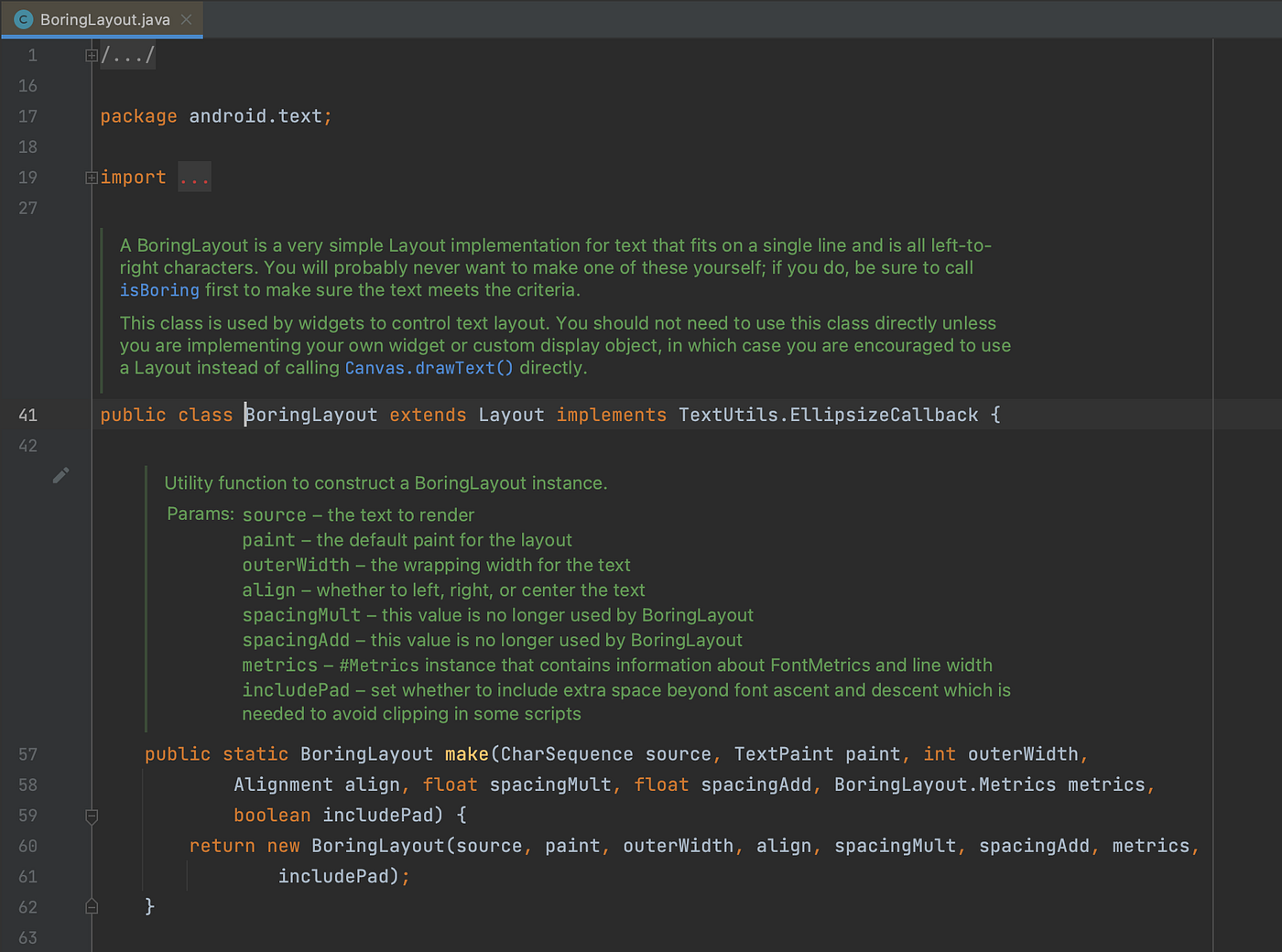 BoringLayout class in android.text package
This made me remember the quote that I read few years back on https://martinfowler.com/bliki/TwoHardThings.html

BoringLayout name proves that naming things in software development is a tough job indeed. 😂
Hope you liked reading the article. Reach out to me on Twitter. Thank You!
This article was originally published on proandroiddev.com on October 10, 2022


