

Posted by: Hongboem
Let’s create an app using compose instead of xml
Compose is part of the Jetpack Library released by Android last spring. Create Android UI faster and more powerfully and by declaring composable functions. I was in a situation where I had to start reorganizing the Android app structure that I was servicing, and I applied it to the Toy project first to think about introducing Compose. So I applied it to the Harry Potter app that I made.
Write UI ✈️
Let’s get a look at how looking at the example of changed. This is the xml that made up the MainActivity.
| <?xml version="1.0" encoding="utf-8"?> | |
| <layout xmlns:bind="http://schemas.android.com/tools" | |
| xmlns:android="http://schemas.android.com/apk/res/android" | |
| xmlns:app="http://schemas.android.com/apk/res-auto" | |
| xmlns:tools="http://schemas.android.com/tools"> | |
| <data> | |
| <variable | |
| name="adapter" | |
| type="com.hongbeomi.harrypotter.ui.main.MainAdapter" /> | |
| </data> | |
| <androidx.constraintlayout.widget.ConstraintLayout | |
| android:layout_width="match_parent" | |
| android:layout_height="match_parent" | |
| android:background="@color/background" | |
| tools:context=".ui.main.MainActivity"> | |
| <com.airbnb.lottie.LottieAnimationView | |
| android:id="@+id/animationView_lightning" | |
| android:layout_width="0dp" | |
| android:layout_height="0dp" | |
| android:scaleType="centerCrop" | |
| app:lottie_autoPlay="true" | |
| app:lottie_loop="true" | |
| app:lottie_rawRes="@raw/lightning" | |
| app:layout_constraintStart_toStartOf="parent" | |
| app:layout_constraintEnd_toEndOf="parent" | |
| app:layout_constraintTop_toTopOf="parent" | |
| app:layout_constraintBottom_toBottomOf="parent"/> | |
| <ImageView | |
| android:id="@+id/imageView_main_logo" | |
| android:layout_width="288dp" | |
| android:layout_height="120dp" | |
| android:layout_marginTop="128dp" | |
| android:src="@drawable/logo" | |
| android:scaleType="fitXY" | |
| app:layout_constraintStart_toStartOf="parent" | |
| app:layout_constraintEnd_toEndOf="parent" | |
| app:layout_constraintTop_toTopOf="parent" | |
| app:layout_constraintBottom_toTopOf="@id/scrollView_main_list"/> | |
| <com.yarolegovich.discretescrollview.DiscreteScrollView | |
| android:id="@+id/scrollView_main_list" | |
| android:layout_width="match_parent" | |
| android:layout_height="0dp" | |
| android:layout_marginTop="24dp" | |
| app:layout_constraintStart_toStartOf="parent" | |
| app:layout_constraintEnd_toEndOf="parent" | |
| app:layout_constraintTop_toBottomOf="@id/imageView_main_logo" | |
| app:layout_constraintBottom_toBottomOf="parent" | |
| bind:adapter="@{adapter}" | |
| bind:transformer="@{true}" | |
| tools:listitem="@layout/item_house"/> | |
| </androidx.constraintlayout.widget.ConstraintLayout> | |
| </layout> |
LottiAnimationView was used for background animation and had logo images and horizontal scroll views (using RecyclerView adapter). Let’s look at how it changed in Compose.
| @ExperimentalPagerApi | |
| @Composable | |
| fun MainScreen(onItemSelected: (HouseType) -> Unit) { | |
| val itemList = remember { | |
| listOf( | |
| HouseType.Gryffindor, | |
| HouseType.Slytherin, | |
| HouseType.Ravenclaw, | |
| HouseType.Hufflepuff | |
| ) | |
| } | |
| Box( | |
| modifier = Modifier | |
| .background(colorResource(id = R.color.background)) | |
| .fillMaxSize() | |
| ) { | |
| LoopLottieAnimation(rawId = R.raw.lightning) | |
| Column(Modifier.fillMaxSize()) { | |
| Spacer(modifier = Modifier.height(128.dp)) | |
| Image( | |
| painterResource(id = R.drawable.logo), | |
| contentDescription = "", | |
| contentScale = ContentScale.Fit, | |
| modifier = Modifier | |
| .width(288.dp) | |
| .height(120.dp) | |
| .align(Alignment.CenterHorizontally) | |
| ) | |
| Spacer(modifier = Modifier.height(24.dp)) | |
| MainPager( | |
| list = itemList, | |
| onItemSelected = onItemSelected, | |
| modifier = Modifier | |
| .fillMaxSize() | |
| .padding(horizontal = 16.dp) | |
| ) | |
| } | |
| } | |
| } |
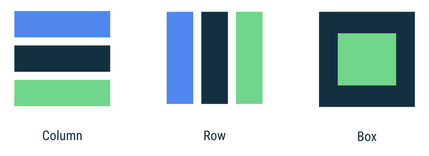
Box work as a FrameLayout, stacking them up in the order they are written. So I wrote a Lotti for compose (composable function wrapped to infinitely animate) and used a Column. A Column is a widget that has a vertical structure of an existing LinearLayout. It replaced the xml margin written on top by a Spacer margin in the Column.
Now let’s look at how you replaced the existing horizontal scroll view. I replaced the existing horizontal scroll view with the Appcompanist-Page rwithout using the LazyColumn because it contained a snap function.
⚠️ Accompanist Pager is experimental. The API may be changed in the future.
| @ExperimentalPagerApi | |
| @Composable | |
| fun MainPager( | |
| list: List<HouseType>, | |
| modifier: Modifier = Modifier, | |
| onItemSelected: (HouseType) -> Unit | |
| ) { | |
| val pagerState = rememberPagerState(pageCount = list.size) | |
| HorizontalPager( | |
| state = pagerState, | |
| modifier = modifier, | |
| itemSpacing = 16.dp | |
| ) { page -> | |
| val logo = list[page].logo | |
| val name = list[page].name | |
| Column( | |
| Modifier.clickable( | |
| true, | |
| onClick = { onItemSelected.invoke(list[page]) } | |
| ).graphicsLayer { | |
| val pageOffset = calculateCurrentOffsetForPage(page).absoluteValue | |
| lerp( | |
| start = ScaleFactor(0.55f, 0.55f), | |
| stop = ScaleFactor(1f, 1f), | |
| fraction = 1f - pageOffset.coerceIn(0f, 1f) | |
| ).also { scale -> | |
| scaleX = scale.scaleX | |
| scaleY = scale.scaleY | |
| } | |
| alpha = lerp( | |
| start = ScaleFactor(0.5f, 0.5f), | |
| stop = ScaleFactor(1f, 1f), | |
| fraction = 1f - pageOffset.coerceIn(0f, 1f) | |
| ).scaleX | |
| }, | |
| horizontalAlignment = Alignment.CenterHorizontally | |
| ) { | |
| Spacer(modifier = Modifier.height(16.dp)) | |
| Image( | |
| painter = painterResource(id = logo), | |
| contentDescription = "", | |
| modifier = Modifier.size(320.dp), | |
| contentScale = ContentScale.Fit | |
| ) | |
| Spacer(modifier = Modifier.height(16.dp)) | |
| Text( | |
| text = name, | |
| fontSize = 24.sp, | |
| fontWeight = FontWeight.Medium, | |
| fontFamily = harryPotterFont, | |
| color = colorResource(id = R.color.white), | |
| modifier = Modifier.align(Alignment.CenterHorizontally) | |
| ) | |
| Spacer( | |
| modifier = Modifier.height(16.dp) | |
| ) | |
| } | |
| } | |
| } |

As you can see from the name, Pager are more like traditional ViewPager. By calculating the offset of the current page in the graphics Layer, the existing scale animation effect was reproduced. graphicsLayer can be used to apply effects to content, such as scaling, rotation, opacity, shadow, and clipping.
In addition, if you read the state inside the block with animation value, no recomposition and relayout are executed, only the properties of the layer are updated.
When showing a compose in the activity, simply declare it within the setContent block ?
| @AndroidEntryPoint | |
| class MainActivity : BaseActivity() { | |
| @ExperimentalPagerApi | |
| override fun onCreate(savedInstanceState: Bundle?) { | |
| super.onCreate(savedInstanceState) | |
| setContent { | |
| MainScreen { type -> | |
| val intent = Intent(this, DetailActivity::class.java) | |
| intent.putExtra(DetailActivity.KEY_HOUSE, type) | |
| startActivity(intent) | |
| } | |
| } | |
| } | |
| } |
Manage State ?
Now let’s take a look at the DetailScreen. The DetailScreen contains a list of HarryPotter characters, and a dialog appears when you click the item. and this screen It contain a little animation.
| @ExperimentalAnimationApi | |
| @ExperimentalFoundationApi | |
| @Composable | |
| fun DetailScreen( | |
| houseType: HouseType, | |
| viewModel: DetailViewModel = viewModel() | |
| ) { | |
| val isLoadingState by getLifecycleAwareState( | |
| flow = viewModel.isLoadingFlow, | |
| initialValue = false, | |
| ) | |
| val selectedCharacter by getLifecycleAwareState( | |
| flow = viewModel.selectedCharacter, | |
| initialValue = null | |
| ) | |
| ... // parent compose | |
| if (isLoadingState) { | |
| Box( | |
| modifier = Modifier.fillMaxSize(), | |
| contentAlignment = Alignment.Center | |
| ) { | |
| LoopLottieAnimation(rawId = R.raw.wingardium_leviosa) | |
| } | |
| } else { | |
| CharacterList( | |
| characterFlow = viewModel.characterListFlow, | |
| modifier = Modifier.fillMaxSize(), | |
| onClickItem = { viewModel.showCharacterDialogEvent(it) } | |
| ) | |
| } | |
| ... | |
| selectedCharacter?.let { | |
| CharacterDialog( | |
| character = it, | |
| houseType = houseType | |
| ) { | |
| viewModel.hideCharacterDialogEvent() | |
| } | |
| } | |
| } |
On the 6 line, the viewModel is injected through the Hilt, and on the 8 to 15 lines, the State is passed to the variable.
getLifecycleAwareState Block is extension method that initiates consumption and production of flows when the current lifecycle state of the compose is Lifecycle.State.STARTED and stops when it is in the background state. also remember composable can be used inside the composable function to store objects in memory. The original look is as follows.
| @Composable | |
| fun <T> getLifecycleAwareState( | |
| flow: Flow<T>, | |
| initialValue: T, | |
| lifecycleOwner: LifecycleOwner = LocalLifecycleOwner.current, | |
| minActiveState: Lifecycle.State = Lifecycle.State.STARTED | |
| ): State<T> { | |
| return remember(flow, lifecycleOwner) { | |
| flow.flowWithLifecycle(lifecycleOwner.lifecycle, minActiveState) | |
| }.collectAsState(initialValue) | |
| } |
The selectedCharacter of the DetailViewModel is SharedFlow, which triggers the received value when an event occurs. In addition, the isLoadingFlow state of the DetailViewModel is StateFlow, which receives the value and changes it to State. See this post for information on how to safely collect Flow in the lifecycle.
| @HiltViewModel | |
| class DetailViewModel @Inject constructor( | |
| savedStateHandle: SavedStateHandle, | |
| private val repository: Repository | |
| ) : ViewModel() { | |
| private val houseName = savedStateHandle.get<HouseType>(KEY_HOUSE)?.name | |
| private val _isLoadingFlow = MutableStateFlow(false) | |
| val isLoadingFlow: StateFlow<Boolean> = _isLoadingFlow.asStateFlow() | |
| private val _selectedCharacter = MutableSharedFlow<Character?>() | |
| val selectedCharacter: SharedFlow<Character?> = _selectedCharacter.asSharedFlow() | |
| val characterListFlow: StateFlow<List<Character>> = flow { | |
| houseName?.let { | |
| _isLoadingFlow.emit(true) | |
| emit(repository.getCharacters(it)) | |
| } | |
| _isLoadingFlow.emit(false) | |
| }.stateIn( | |
| scope = viewModelScope, | |
| started = WhileSubscribed(5000), | |
| initialValue = emptyList() | |
| ) | |
| fun showCharacterDialogEvent(character: Character) = viewModelScope.launch { | |
| _selectedCharacter.emit(character) | |
| } | |
| fun hideCharacterDialogEvent() = viewModelScope.launch { | |
| _selectedCharacter.emit(null) | |
| } | |
| } |
OUR VIDEO RECOMMENDATION


Jobs
RecyclerView ♺
Let’s talk about it again DetailScreen. I had to use GridLayoutManager in traditional RecyclerView because I used grid-formatted lists . So it replaced it with LazyVerticalGrid compose.
⚠️ This foundation API is experimental and is likely to change or be removed in the future.
| @ExperimentalFoundationApi | |
| @Composable | |
| fun CharacterList( | |
| characterFlow: Flow<List<Character>>, | |
| modifier: Modifier = Modifier, | |
| onClickItem: (Character) -> Unit = {} | |
| ) { | |
| val characterList by getLifecycleAwareState(flow = characterFlow, initialValue = listOf()) | |
| LazyVerticalGrid( | |
| cells = GridCells.Fixed(3), | |
| modifier = modifier | |
| ) { | |
| items(characterList) { | |
| CharacterItem( | |
| character = it, | |
| modifier = Modifier.height(240.dp), | |
| onClick = onClickItem | |
| ) | |
| } | |
| } | |
| } |
Lazy composables makes it easier to create a list that behaves the same as a RecyclerView without an adapter!?
ConstraintLayout ⛓
How did the ConstraintLayout, which was previously useful? It’s easier to use than you think.✨ I used the ConstraintLayout on the list item.
| @Composable | |
| fun CharacterItem( | |
| character: Character, | |
| modifier: Modifier = Modifier, | |
| onClick: (Character) -> Unit = {} | |
| ) { | |
| Surface( | |
| modifier = modifier.padding(PaddingValues(2.dp)), | |
| color = colorResource(id = R.color.transparent), | |
| ) { | |
| ConstraintLayout( | |
| modifier = modifier | |
| .clip(RoundedCornerShape(4.dp)) | |
| .background(color = colorResource(id = R.color.background)) | |
| .clickable { onClick.invoke(character) } | |
| ) { | |
| val (image, name) = createRefs() | |
| Image( | |
| modifier = Modifier | |
| .constrainAs(image) { | |
| linkTo( | |
| start = parent.start, | |
| top = parent.top, | |
| end = parent.end, | |
| bottom = name.top | |
| ) | |
| width = Dimension.fillToConstraints | |
| height = Dimension.fillToConstraints | |
| }, | |
| painter = rememberCoilPainter( | |
| request = character.image, | |
| fadeIn = true | |
| ), | |
| contentDescription = "", | |
| contentScale = ContentScale.FillBounds | |
| ) | |
| Text( | |
| modifier = Modifier | |
| .constrainAs(name) { | |
| linkTo( | |
| start = parent.start, | |
| end = parent.end, | |
| top = image.bottom, | |
| bottom = parent.bottom | |
| ) | |
| width = Dimension.fillToConstraints | |
| height = Dimension.wrapContent | |
| }, | |
| text = character.name, | |
| color = colorResource(id = R.color.white), | |
| textAlign = TextAlign.Center, | |
| fontSize = 16.sp, | |
| fontFamily = FontFamily(Font(R.font.girassol_regular)) | |
| ) | |
| } | |
| } | |
| } |
After declaring a ConstraintLayout, create a reference variable through a createRefs() inside the block. And pass it over to the parameter of Modifier.constrainAs() and create a constraint through linkTo method.
You can also dynamically specify the height and width by using Dimension(preferredWrapContent, wrapContent, fillToConstraints). Each Dimension is described as follows.
– preferredWrapContent : A Dimension with suggested wrap content behavior. The wrap content size will be respected unless the constraints in the ConstraintSet do not allow it. To make the value fixed (respected regardless the ConstraintSet), wrapContent should be used instead.
– wrapContent : A Dimension with fixed wrap content behavior. The size will not change according to the constraints in the ConstraintSet.
– fillToConstraints : A Dimension that spreads to match constraints. Links should be specified from both sides corresponding to this dimension, in order for this to work.
Dialog ☎️
Dialog is show and dismiss through Effect. If you look at the internal code first, it looks like this. Among the parameters, callbacks of dismiss events are available through onDismissRequest, and use DialogProperties to can control the dismissOnBackPress, dismissOnClickOutside.
| @Composable | |
| fun Dialog( | |
| onDismissRequest: () -> Unit, | |
| properties: DialogProperties = DialogProperties(), | |
| content: @Composable () -> Unit | |
| ) { | |
| val view = LocalView.current | |
| val density = LocalDensity.current | |
| val layoutDirection = LocalLayoutDirection.current | |
| val composition = rememberCompositionContext() | |
| val currentContent by rememberUpdatedState(content) | |
| val dialogId = rememberSaveable { UUID.randomUUID() } | |
| val dialog = remember(view, density) { | |
| DialogWrapper( | |
| onDismissRequest, | |
| properties, | |
| view, | |
| layoutDirection, | |
| density, | |
| dialogId | |
| ).apply { | |
| setContent(composition) { | |
| // TODO(b/159900354): draw a scrim and add margins around the Compose Dialog, and | |
| // consume clicks so they can't pass through to the underlying UI | |
| DialogLayout( | |
| Modifier.semantics { dialog() }, | |
| ) { | |
| currentContent() | |
| } | |
| } | |
| } | |
| } | |
| DisposableEffect(dialog) { | |
| dialog.show() | |
| onDispose { | |
| dialog.dismiss() | |
| dialog.disposeComposition() | |
| } | |
| } | |
| SideEffect { | |
| dialog.updateParameters( | |
| onDismissRequest = onDismissRequest, | |
| properties = properties, | |
| layoutDirection = layoutDirection | |
| ) | |
| } | |
| } |
I put the event of the DetailViewModel in onDismissRequest so that the dialog can be dismiss normally.
| @Composable | |
| fun CharacterDialog( | |
| ..., | |
| onDismissRequest: () -> Unit | |
| ) { | |
| Dialog(onDismissRequest = onDismissRequest) { | |
| // | |
| } | |
| } | |
| // using | |
| CharacterDialog(...) { | |
| viewModel.hideCharacterDialogEvent() | |
| } |

Conclusion
Although there are features and bugs that have not been used all the functions in the Compose and are not supported because they are still in beta, this nevertheless seems quite good. It felt that xml was not needed and very easy to reuse and maintain. The official version, which will be released in July, is expected to be more stable and convenient.
Thank you for reading my post and feedback is always welcome ? All source code can be found at the link below!?
hongbeomi/HarryPotter |
Reference
- https://developer.android.com/jetpack/compose/documentation
- https://google.github.io/accompanist/
- https://medium.com/androiddevelopers/a-safer-way-to-collect-flows-from-android-uis-23080b1f8bda
- https://github.com/airbnb/lottie/blob/master/android-compose.md
Tags: Android, Compose, Jetpack Compose, Flow, Android Studio
View original article at:

Originally published: January 16, 2021


