

Creating an expandable view with state using “remember”
- Part 1 — Integrating a new tool in a production product.
- Part 2 — Designing your first composable.
- Part 3 — Creating a custom button with Jetpack Compose.
- Part 4 — Creating an expandable view with state using “remember”.
In this part of our series on introducing Jetpack Compose into an existing project, we will build an expandable list item to use in our list of claims, a feature we are building using Jetpack Compose UI in our app at
.
First, let’s have a look again at the screen we are building.
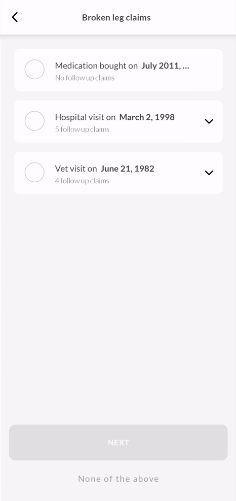
We have already built the bottom buttons: “None of the above” and the “NEXT” Lemonade pink button.
Today we will learn how to build the expandable list item representing a group of claims for a pet insurance policy.
Let’s get started
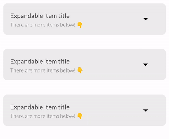
Let’s start by looking at an isolated case of the item we are building.
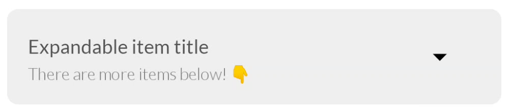
Looking at our item at its collapsed state we can identify three components:
- Text containing the title of the item.
- Text containing the subtitle of the item.
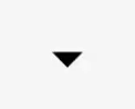
- An arrow icon on the right (Which will animate to rotate vertically when we expand the item).
The first thing we do, as always, is starting a composable:
@Composable
ExpandableListItem() {
   Card(...) {
      Row(...) {
         TitleAndSubtitle(...)
         Icon(...)
      }
   }
}
As we have seen many times before, when writing declarative UI’s, we first write as little as possible just to describe the result, or, what we want to see on the screen.
So to describe our expandable item we first write a Card that will contain aRow and inside we placeTitleAndSubtitle and the Icon.
The Card
Card is a composable supplied by the system, it can takeelevation and shape as parameters, and we can supply it with amodifier for anything else we need.
The Card is the container for our expandable list item so we will supply it with elevation , and somemodifiers :
fillMaxWidth()— will stretch our card the full width of the screen just likeandroid:layout_width=”match_parent”would.padding()— will give us space from the edges.clip(RoundedCornerShape(*.dp))— will clip the card to the suppliedRoundedCornerShape .clickable()— will supply a lambda we can later use to change the State of the composable
Card(
    elevation = 4.dp,
    modifier = Modifier
        .fillMaxWidth()
        .padding(start = 15.dp, top = 15.dp, end = 15.dp)
        .clip(RoundedCornerShape(8.dp))
        .clickable { // We will deal with the click event later }
)
The Row
In our Card we have a Row (Equivalent of a horizontal LineraLayout) that contains the titles and the icon.
The Row will take a horizontalArrangment parameter to space out the icon and the titles.
Row(
    horizontalArrangement = Arrangement.SpaceBetween,
    modifier = Modifier.fillMaxWidth()
) {...}
The title and subtitle
In the Row we place the TitleAndSubtitle and the Icon which will be aligned horizontally.
Row(...) {
    TitleAndSubtitle(
        title = "Expandable item title",
        subtitle = "There are more items below! 👇"
    )
    Icon(...)
}
The TitleAndSubtitle is a composable we wrote that has a Column(Equivalent of a vertical LineraLayout) with two Text composables
@Composable
fun TitleAndSubtitle(
    title: String,
    subtitle: String
) {
    Column(verticalArrangement = Arrangement.Center) {
        Text(text = title)
        Text(text = subtitle)
    }
}
OUR VIDEO RECOMMENDATION


Jobs
The Icon
The Icon is a system composable, we will give it an imageVector which we get as part of the compose dependency, an align modifier and something new we haven’t seen before.. a graphicsLayer.
Icon(
    imageVector = Icons.Default.ArrowDropDown,
    modifier = Modifier
        .align(CenterVertically)
        .graphicsLayer(...)
)
The graphicsLayer modifier
GraphicsLayer is a modifier that is used to apply effects to content, such as scaling, rotation, opacity, shadow, and clipping.
In our case, we want to rotate the arrow icon so that when the item is expanding, the arrow will rotate to face up.
Inside graphicsLayer we can use animateFloatAsState which we have covered in the last article regarding the Lemonade pink button.
We will assign the rotationZ property here to achieve the rotation from 0to 180 degrees.
Icon(
   modifier = Modifier
      .graphicsLayer(
          rotationZ = animateFloatAsState(
                         if (expanded) 180f else 0f).value,
      )
)
The rotation is decided based on a boolean named expanded, this will be our components state.
Let’s talk about State
In Jetpack Compose, the declarative UI framework will render again only elements that had their state changed, when we talk about state in Compose UI context we usually refer to some function variables that hold or represents, that specific state.
This could be a primitive or an object.
and for our composable function to hold state, it needs to remember it across recomposition (re-rendering), otherwise, the state will be reset on each composition.
Our item is expandable, therefore it needs to hold a state that declares whether or not it is expanded.
To do that we will go back to our initial composable definition and add a state variable
@Composable
ExpandableListItem() {
var expanded by remember { mutableStateOf(false) }
   Card(modifier = Modifier.clickable { expanded = !expanded}) {
      Row(...) {
         TitleAndSubtitle(...)
         Icon(...)
      }
   }
}
mutableStateOf
We will take the initial state of the item which is false (expanded = false) and pass it as a default value to mutableStateOf:
var expanded by remember { mutableStateOf(false) }
mutableStateOf is a reactive stream, similar to LiveDate or StateFlow and will emit boolean values as we change the expanded variable.
remember
We wrap the mutableStateOf stream in a remember block so that it will be remembered across recompositions, otherwise, the state will default to falseevery time ExpandableListItem is called.
We change the state when clicking the Card using the clickable modifier:
Card(modifier = Modifier.clickable { expanded = !expanded})

Now let’s implement the expandable part of the component.
The expanded state
Now we need to add another section on the bottom of our component,
Let’s wrap the Row element in a Column so we can place the extra items element below it.
@Composable
ExpandableListItem() {
var expanded
   Card(...) {
        /// Wrap the row in a Column
        Column {
            Row(...) {
               TitleAndSubtitle(...)
               Icon(...)
            }

        // And add the extra items sections
            Column {
              ExtraItem(item = Item())
              ExtraItem(item = Item())
            }
        }
    }
}
data class Item (
   val title: String,
   val date: String
)
Where ExtraItemis just a Row with two Text composables.
@Composable
fun ExtraItem(item: Item) {
    Row(horizontalArrangement = Arrangement.SpaceBetween) {
        Text(text = item.title)
        Text(text = item.date)
    }
}
Now let’s add some styling to our expandable content with some Dividers and Spacers:
//// Extra items sections

    Divider(modifier = Modifier.height(1.dp))
    Column(modifier = Modifier.padding(...)) {

        Spacer(modifier = Modifier.height(10.dp))
        ExtraItem(item = Item())

        Spacer(modifier = Modifier.height(10.dp))
        Divider(modifier = Modifier.height(1.dp))
        Spacer(modifier = Modifier.height(10.dp))

        ExtraItem(item = Item())

        Spacer(modifier = Modifier.height(10.dp))
        Divider(modifier = Modifier.height(1.dp))
        Spacer(modifier = Modifier.height(10.dp))

        ExtraItem(item = Item())

    }
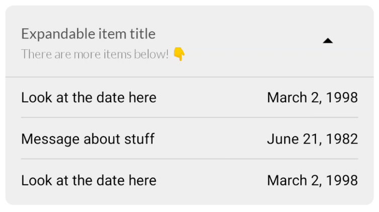
And now we get this beautiful component!
But clicking on this does nothing 😩, we are still missing that key ingredient in our component’s magic!.
Animate visibility with ease
One of the most delightful components that the compose UI dependency includes is the AnimatedVisibility composable.
@Composable
fun ExpandableListItem() {
    var expanded by remember { mutableStateOf(false) }
    Card() {
        Row() {
            TitleAndSubtitle()
            Icon()
        }
        AnimatedVisibility(visible = expanded) {
            Column {
                ExtraItem(item = Item())
                ExtraItem(item = Item())
            }
        }
    }
}
The AnimatedVisibility allows us to have visibility animation changes to layouts like Column or LazyColumn, and according to the declarative UI paradigm, we will not have to define any custom animations to get this behavior.
However, we can easily add customizations to it if we would like by using AnimationSpec.
AnimationSpec
The AnimationSpec stores the specification of animations, we can use it to define easing, duration, delays, and other specs regarding animation customizations.
If we want animations such as expand and shrink animations for our UI we can use it like.
AnimatedVisibility(
    visible = expanded,
    enter = expandVertically(
        animationSpec = tween(
              durationMillis = 300, easing = FastOutLinearInEasing)
    ),
    exit = shrinkVertically(
        animationSpec = tween(
             durationMillis = 300, easing = FastOutLinearInEasing)
    )
)
And by adding these specifications to our AnimatedVisibility we can get the animation we desire for our expandable item!
Here is the complete code for our expandable item!
| @Composable | |
| fun ExpandableListItem() { | |
| var expanded by remember { mutableStateOf(true) } | |
| Card( | |
| elevation = 4.dp, | |
| modifier = Modifier | |
| .fillMaxWidth() | |
| .padding(start = 15.dp, top = 15.dp, end = 15.dp) | |
| .clip(RoundedCornerShape(8.dp)) | |
| .clickable(onClick = { expanded = !expanded }) | |
| ) { | |
| Column(modifier = Modifier.fillMaxWidth().background(colorResource(id = R.color.lemonade_glass))) { | |
| Row(horizontalArrangement = Arrangement.SpaceBetween, | |
| modifier = Modifier | |
| .padding(end = 32.dp) | |
| .fillMaxWidth() | |
| ) { | |
| TitleAndSubtitle( | |
| title = "Expandable item title", | |
| subtitle = "There are more items below! 👇" | |
| ) | |
| Icon( | |
| imageVector = Icons.Default.ArrowDropDown, | |
| contentDescription = "ArrowIcon", | |
| modifier = Modifier | |
| .align(CenterVertically) | |
| .graphicsLayer( | |
| rotationZ = animateFloatAsState( | |
| if (expanded) 180f else 0f | |
| ).value, | |
| ) | |
| ) | |
| } | |
| AnimatedVisibility( | |
| visible = expanded, | |
| enter = expandVertically( | |
| animationSpec = tween(durationMillis = 300, easing = FastOutLinearInEasing) | |
| ), | |
| exit = shrinkVertically( | |
| animationSpec = tween(durationMillis = 300, easing = FastOutLinearInEasing) | |
| ) | |
| ) { | |
| Divider(modifier = Modifier.height(1.dp)) | |
| Column(modifier = Modifier.padding(start = 15.dp, end = 15.dp, bottom = 15.dp)) { | |
| Spacer(modifier = Modifier.height(10.dp)) | |
| ExtraItem(item = Item( | |
| "Look at the date here", | |
| "March 2, 1998") | |
| ) | |
| Spacer(modifier = Modifier.height(10.dp)) | |
| Divider(modifier = Modifier.height(1.dp)) | |
| Spacer(modifier = Modifier.height(10.dp)) | |
| ExtraItem(item = Item( | |
| "Message about stuff", | |
| "June 21, 1982") | |
| ) | |
| Spacer(modifier = Modifier.height(10.dp)) | |
| Divider(modifier = Modifier.height(1.dp)) | |
| Spacer(modifier = Modifier.height(10.dp)) | |
| ExtraItem(item = Item( | |
| "Look at the date here", | |
| "March 2, 1998") | |
| ) | |
| } | |
| } | |
| } | |
| } | |
| } |
And that’s it!
We learned a lot today! we animated the arrow using graphicsLayermodifier, we animated visibility with AnimatedVisibility, and we learned how to use state in Jetpack Compose with remember and mutableStateOf.
In the next part, we will add a custom radio button to the expandable item!
Don’t forget to clap and subscribe, but only if you think I deserve it!.


