App launcher icons, the very first interaction that someone has with your app is something that we make quickly and soon forget as the more fun and complex features are prioritised. With new developments in Android 13 and other useful techniques you can make sure users like seeing your app take up some valuable home screen real estate!
Themed App Icons
Sorry anyone not yet on Android 12 or 13 Pixel device. (Source: https://developer.android.google)
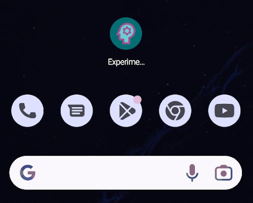
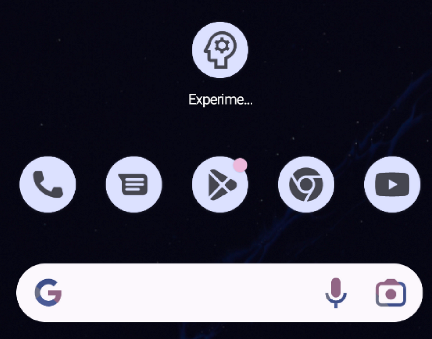
The release of Android 13 has brought even more awesome styling and customisations to the Material You interface. One of the features that will make your home screen look beautiful and consistent is the implementation of themed app icons. These were around in Android 12 for some Google built apps and some Samsung specific apps, but Android 13 is the first time third party apps can implement them.
If you haven’t yet checked out themed app icons, you can easily enable them by long pressing on your home screen, going to Wallpaper & style and selecting Themed icons. If you are not using a Pixel device or using a custom launcher, your milage may vary.
I was reading an article from 9to5Google that lists all the apps that support themed icons and I was surprised how relatively short that list is (I am aware they are only listing the top apps that are popular in the US market — they can’t go and check every app out there), given how easy themed icons are to implement. When I checked my own home screen I was so disappointed on how few of my frequently used apps implemented the. So I thought I would share the steps on how to do this in the hope that more apps get on board and give their app icons a makeover!
There are official docs on the topic, but the best place to start is by making sure the icon you are using is an AdaptiveIconDrawable and ideally uses a vector image (although, this is possible with a png as well).
Create a Adaptive App icon
Something to note before you start, the full colour adaptive app icon can be completely different to your monochrome, themed, icon that we will discuss below, this could be useful if your app icon is a complex graphic comprised of many colours that may not be appropriate when themed as one colour.
This could cause a problem for your users when they are trying to find your app when the icon is themed so it should be a consideration when you are designing your app icon so that the differences are minor and a monochrome icon still makes sense for your app.
To create your adaptive app icon:
- Navigate to the Asset Studio in Android Studio by opening
File=>New=>Image Asset. Make sureLauncher Icons (Adaptive and Legacy)is set for the Icon Type. - Foreground Layer:
Choose the svg you want to be at the centre of your icon by selecting the Path in the Source Asset section, you can then resize it as needed using the provided slider.
Make sure you look at how your graphic is represented here, I have found that some svgs when exported don’t import well and you may need to adjust them in your graphics program (or get a friendly UI designer to help).
When using Figma I found that using Outline Stroke before exporting will help fix some of these issues. - Background Layer:
Switch to the Background Layer tab and select a colour or an image for the background. I am going with a simple colour. - Once you are happy, select Next and Finish on the next two screens, you will see that the tool will override any existing launcher files (if you have used the default names).
Please excuse the colours…I’m no designer if you can’t tell!
Test it out! You will see, when you have themed icons selected your icon is still coloured.

This is fine I suppose…
Theme your icon!
Let’s take a look at how the icon is defined, if we look at ic_launcher.xml (and ic_launcher_round.xml if your device is using round icons like in my screenshot above — all the below changes need to be made to both files).
| <?xml version="1.0" encoding="utf-8"?> | |
| <adaptive-icon xmlns:android="http://schemas.android.com/apk/res/android"> | |
| <background android:drawable="@color/ic_launcher_background"/> | |
| <foreground android:drawable="@drawable/ic_launcher_foreground"/> | |
| </adaptive-icon> |
Job Offers
Here we can see there is a background and foreground item. To make a themed icon, all you have to to is add a monochrome item to the adaptive-icon object. And what should this monochrome icon be? Simply your existing foreground icon just using a single colour. For a themed icon the background will be ignored completely.
Note — if you had to do some scaling for your adaptive app icon you will need to do the same for your monochrome version
This can be added into ic_launcher.xml like so:
| <?xml version="1.0" encoding="utf-8"?> | |
| <adaptive-icon xmlns:android="http://schemas.android.com/apk/res/android"> | |
| <background android:drawable="@color/ic_launcher_background"/> | |
| <foreground android:drawable="@drawable/ic_launcher_foreground"/> | |
| <monochrome android:drawable="@drawable/ic_launcher_monochrome"/> | |
| </adaptive-icon> |
Now try it out! Looking so much better!
 Yay! Nice and neat.
But what about some style? What if my icon has a lot of colours or a complex shape?
Transparency and gradients in themed app icons
You can use semi-transparent elements or gradients in your monochrome icon to add a little more interest or help your users see your icon shape a little more. Just add the icon in just the same way:
Sorry, I didn’t get very creative here!
 Looking cool now…
You might then find yourself asking:
If we can have gradients, can I just use my regular coloured icon?
The way this works is that if you have multiple solid colours they will be treated as the same for your monochrome icon and you will just end up with a silhouette of your shape (which might indeed be okay depending on what your app is!). If you look at the YouTube icon in the screenshot above, if the coloured version of that icon was used we would just see a solid rounded rectangle without the recognisable play button to tell us which app it is. So make sure you test out your icons in all modes to make sure they look the best they can be!
Programatically changing app icons
It is understandable that some apps are associated with an iconic brand and iconic brand colour and having an app icon that conveys that it of upmost importance. In this instance having a themed icon may not be suitable (although — I would argue that Android should enable themed icons by default so users can make the choice — but I am not Google!) but what if the brand could give users a choice of app icons. Perhaps one in the iconic colour, another in a more muted or dark mode friendly colour, or perhaps one celebrating a time of year or movement such as Halloween or Pride.
How can a user change the app icon on request? It is not very well documented (in fact, when researching this some Stack Overflow posts and this blog post by Jake Lee were my best resources rather than official documentation) and does feel like a bit of a hack but it can be done.
Indeed many answers in Stack Overflow said that it was impossible — which gave me the motivation to investigate and write this blog post!
The first thing to note, is that when the app icon is changed the app will be relaunched, so you only want to do this when the user requests it and is made aware that the app will restart (so changing the app icon based on a date or other non-user triggered event would cause unexpected relaunches which would be jarring to the user). If you want the app icon to change automatically or very frequently, perhaps creating a widget that launches your app would be more appropriate.
To programatically change your app icon, the first step is to modify your manifest.
Android Manifest & Activity Aliases
- Remove the
<action android:name="android.intent.action.MAIN" />item from the intent filter of yourLAUNCHERactivity. - Create an
activity-aliasfor each new type of icon you want. These each need a uniquenameand theirtargetActivityset to theLAUNCHERactivity that you modified in step 1. Of course, each needs a differenticonwhich can be created using the adaptive icon process discussed above (just make sure you keep renaming the files, otherwise they will be overridden each time you run the wizard).
One of these need to be enabled for your app to launch — this will be the default icon.
You can even have a different app title for each alias if you like.
You should end up with something like this:
| <activity | |
| android:name="dev.katiebarnett.experiments.appicon.MainActivity" | |
| android:exported="true" | |
| android:theme="@style/Theme.Experiments"> | |
| <intent-filter> | |
| <category android:name="android.intent.category.LAUNCHER" /> | |
| </intent-filter> | |
| </activity> | |
| <activity-alias | |
| android:label="@string/app_name" | |
| android:icon="@mipmap/ic_launcher" | |
| android:name=".DEFAULT" | |
| android:enabled="true" | |
| android:exported="true" | |
| android:targetActivity=".MainActivity"> | |
| <intent-filter> | |
| <action android:name="android.intent.action.MAIN" /> | |
| <category android:name="android.intent.category.LAUNCHER" /> | |
| </intent-filter> | |
| </activity-alias> | |
| <activity-alias | |
| android:label="@string/app_name_dark" | |
| android:icon="@mipmap/ic_launcher_dark" | |
| android:name=".DARK" | |
| android:exported="true" | |
| android:targetActivity=".MainActivity"> | |
| <intent-filter> | |
| <action android:name="android.intent.action.MAIN" /> | |
| <category android:name="android.intent.category.LAUNCHER" /> | |
| </intent-filter> | |
| </activity-alias> |
In this code above, I have my DEFAULT and DARK aliases, giving my user the option of having a more dark mode friendly icon.
The next step is to enable and disable the aliases to switch between icons.
Switching Icons
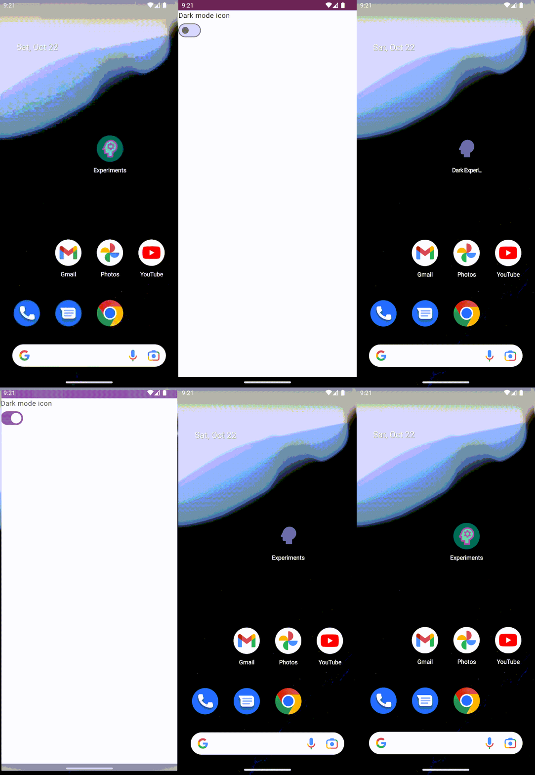
In my example code, I have the icon change triggered by a simple switch, when the user changes the switch, the app will relaunch and the icon will change.
To make this work, we loop through the names of the activity-alias items created in the previous step and set the enabled state on each. It is important to make sure that only one is enabled at one time otherwise you will end up with two app icons!
| enum class IconStatus { | |
| DEFAULT, DARK | |
| } | |
| fun updateAppIcon(packageManager: PackageManager, status: IconStatus) { | |
| for (value in IconStatus.values()) { | |
| val action = if (value == status) { | |
| PackageManager.COMPONENT_ENABLED_STATE_ENABLED | |
| } else { | |
| PackageManager.COMPONENT_ENABLED_STATE_DISABLED | |
| } | |
| packageManager.setComponentEnabledSetting( | |
| ComponentName(BuildConfig.APPLICATION_ID, "${BuildConfig.APPLICATION_ID}.${value.name}"), | |
| action, PackageManager.DONT_KILL_APP | |
| ) | |
| } | |
| } |
Even though in the above the DONT_KILL_APP flag is set, I found in my testing that none of my devices respected this and the app was relaunched each time anyway.
And that’s it! You can now switch between multiple app icons!

Light mode…dark mode…light mode…dark mode…
Some caveats though:
- If you remove aliases or change the alias names and update the app, the app may not be able to be launched if the previously enabled alias is not found. Make sure to test all scenarios before publishing your update.
- Your default app icon and title may appear in other places such as the app info screen.
- If the user is not using a stock Android device or is using a custom launcher then the behaviour may be unexpected.
- Given this is not really a documented thing, expect the unexpected as new versions of Android are released! I consider this a nice to have and a cool feature but is not something that I would make key to my app’s functionality.
- As I mentioned, the app does need to be relaunched so you will need the user’s interaction, so in my light mode / dark mode example above I would not hook in to detect the device light or dark mode as this could cause unexpected app closures if the user has changed mode since last time the opened the app.
Will this work with themed app icons?
Yes it will! Just make sure you provide an appropriate monochrome icon for each of your new icons (it could be the same one if desired).
Go forth now and check in on your app icons and make sure they are looking fine in all available modes! Even if it is just to make me happy and my home screen look a lot prettier and more consistent!
 😍
😍
You can find the example code in my Github here.
Some useful resources on app icon best practices:
Icons from https://fonts.google.com/ & (badly) edited by me.
This article was originally published on proandroiddev.com on October 24, 2022


