


In this article we’ll go over the implementation of a custom Modal bottom sheet in Compose for Material 2. But first let’s start with a not-so-short intro about why would you want to do that, considering there is already a modal bottom sheet component in the standard library.
Why use a custom implementation?
Even thought compose has been out for quite some time and with each release we see more and more components being added to the standard library, sometimes their API is far from being ideal. In my opinion, the modal sheet is one of those components. In Material 2, you can show a modal sheet by using ModalBottomSheetLayout:
@Composable
fun Material2SheetExample() {
    val coroutineScope = rememberCoroutineScope()
    val sheetState = rememberModalBottomSheetState(ModalBottomSheetValue.Hidden)
    ModalBottomSheetLayout(
        sheetContent = { /* sheet content... */ },
        sheetState = sheetState,
    ) {
        Button(
            onClick = { coroutineScope.launch { sheetState.show() } }
        ) { Text("Show sheet") }
    }
}
And while this definitely works for many cases it has several problems:
- You must use
ModalBottomSheetLayoutas the root composable of the screen. This can be a problem for complex screens where the root Composable is acting as a container that holds several nested Composable functions, each of which can have their own ViewModel. Being forced to use a specific composable as the root might not always be an option and makes the root composable aware of logic related to it’s children. - To show the sheet, you must call
sheetState.show(). This makes controlling the visibility of the screen harder from the ViewModel as you’d have to rely onLaunchedEffector similar methods to change the visibility of the sheet based on the state of the ViewModel which adds boilerplate code and unnecessarily increased complexity.
A better API in Material 3
It would be a lot nicer to have an API, similar to AlertDialog, where you can just use a boolean in the state to control the visibility of the dialog or, in our case, a bottom sheet:
@Composable
fun AlertDialogExample() {
    var showDialog by remember { mutableStateOf(false) }
    Button(
        onClick = { showDialog = true }
    ) { Text("Show sheet") }
    if (showDialog) {
        AlertDialog(...)
    }
}
The AlertDialog composable function can be called from anywhere, it’ll render correctly by showing a scrim that occupies the whole screen and changing it’s visibility based on state is also very easy. In fact, this is the exact approach that was used for the Material 3 version of ModalBottomSheet:
@Composable
fun Material3SheetExample() {
    var showSheet by remember { mutableStateOf(false) }
    Button(
        onClick = { showSheet = true }
    ) { Text("Show sheet") }
    if (showSheet) {
        ModalBottomSheet( // androidx.compose.material3.ModalBottomSheet
            onDismissRequest = { showSheet = false },
        ) {
            // sheet content...
        }
    }
}
The sad news is that, as mentioned earlier, this is a Material 3 component, and that might not be an option if your app uses Material 2. Also, at the moment of writing this article ModalBottomSheet is not available in the stable version of the library (but it’s included in the 1.1.0-rc01 version).
That said, Jetpack Compose does offer a lot of flexibility and a rich public API which makes creating a custom ModalBottomSheet not that complicated, so let’s jump straight into the implementation details of our custom sheet!
Building a custom modal sheet
We want our sheet to have a similar API to the standard one from Material 3 to allow us an easier migration in the future and we’ll start by defining the 3 possible states that our sheet can have:
enum class SheetPosition { HIDDEN, PARTIALLY_EXPANDED, EXPANDED }
To control the gestures used to move and dismiss the sheet we’ll use Modifier.swipeable, but before going into any details about how it works, let’s first create the state for our sheet. Besides storing the SwipeableState, that we’ll use for Modifier.swipable, we also need to store a boolean to control if we’re showing the partially expanded state:
class SheetState(
    val skipPartiallyExpanded: Boolean,
    initialPosition: SheetPosition = SheetPosition.HIDDEN,
    confirmPositionChange: (SheetPosition) -> Boolean = { true },
) {
    val swipeableState: SwipeableState<SheetPosition> = SwipeableState(
        initialValue = initialPosition,
        confirmStateChange = confirmPositionChange,
    )
}
Note that the initial position is
HIDDEN, the reason for this is that we want to manually change the state to eitherPARTIALLY_EXPANDEDorEXPANDEDafter adding the sheet to the screen so that it appears with an animation.
Since we want the state of the sheet to persist across configuration changes, let’s also create a function to init and remember the state. For this, we’ll use rememberSaveable. Note that according to the Compose API guidelines, we’ll add the remember prefix to the function name:
@Composable
fun rememberSheetState(
    skipPartiallyExpanded: Boolean = false,
    confirmPositionChange: (SheetPosition) -> Boolean = { true },
): SheetState {
    return rememberSaveable(
        skipPartiallyExpanded, confirmPositionChange,
        saver = ...
    ) {
        SheetState(
            skipPartiallyExpanded = skipPartiallyExpanded,
            initialPosition = SheetPosition.HIDDEN,
            confirmPositionChange = confirmPositionChange,
        )
    }
}
Since SheetState is a custom class, we’ll need to provide a Saver instance to be able to save and restore the state across recompositions:
class SheetState(...) {
    companion object {
        fun Saver(
            skipPartiallyExpanded: Boolean,
            confirmPositionChange: (SheetPosition) -> Boolean,
        ) = Saver<SheetState, SheetPosition>(
            save = { ... },
            restore = { savedValue -> ... }
        )
    }
}
For the implementation of Saver<Original, Saveable : Any>, we need to specify the Original object that we’ll save and restore using the save and restore functions (in our case SheetState) and the actual data that we’ll be saving – by default, this can be anything that can be stored in a Bundle and we’ll use the current position of the sheet as this is the only parameter of the state that the user can change.
For the save function, we’ll just take the current value from SwipeableState:
save = { sheetState: SheetState -> sheetState.swipeableState.currentValue }
In restore, we’ll receive the saved SheetPosition and create a new instance of SheetState:
restore = { savedValue: SheetPosition ->
    SheetState(
        skipPartiallyExpanded = skipPartiallyExpanded,
        initialPosition = savedValue,
        confirmPositionChange = confirmPositionChange
    )
}
Making the sheet swipeable
If we wanted to always show the sheet expanded and occupying the full screen, adding the swipeable Modifier would be a very straightforward task and an example implementation was already shown in an article from Angelo Marchesin along with a great explanation about how it works.
In short, we need to provide a map of anchors to swipeable, that’ll define the height of the sheet for any given state and use Modifier.offset to change the position of the content based on the value from SwipeableState. The main issue, is for the anchor values calculation we need to know the total height available and the height of the sheet itself.
For the total height, BoxWithConstraints can be used to get the height with BoxWithContsraintsScope.constraints.maxHeight, and for the height of the sheet itself, we can use the onPlaced Modifier to find out the height of the sheet’s content after it’s been placed. We’ll use a helper state variable sheetHeightPx, initially set to UNKNOWN (a constant with a value of -1) and only add the swipeable and offset modifiers after we find out the real size:
BoxWithConstraints(
    contentAlignment = Alignment.BottomCenter,
    modifier = Modifier.fillMaxSize()
) {
    var sheetHeightPx by remember(sheetState) { mutableStateOf(UNKNOWN) }
    val anchors: Map<Float, SheetPosition> by remember(...) { ... }

    Surface(
        modifier = Modifier
            .fillMaxWidth()
            .onPlaced { sheetHeightPx = it.size.height }
            .let {
                if (sheetHeightPx == UNKNOWN) {
                    it
                } else {
                    it.swipeable(
                           state = sheetState.swipeableState,
                           anchors = anchors,
                           orientation = Orientation.Vertical
                        )
                       .offset {
                           IntOffset(
                               x = 0,
                               y = sheetState.swipeableState.offset.value
                                   .toInt()
                                   .coerceIn(0, sheetHeightPx)
                            )
                        }
                }
            }
    ) {
        // sheet content goes here
    }
}
The anchors for swipeableState will be calculated based on the total height constaints.maxHeight, sheetHeightPx and wether or not we want (and can) show the partially expanded state:
val anchors: Map<Float, SheetPosition> by remember(
    sheetHeightPx,
    constraints.maxHeight,
    sheetState.skipPartiallyExpanded,
) {
    mutableStateOf(
        if (sheetHeightPx == UNKNOWN) {
            emptyMap()
        } else {
            buildMap {
                put(0f, SheetPosition.EXPANDED)
                if (constraints.maxHeight / 2 < sheetHeightPx && sheetState.skipPartiallyExpanded.not()) {
                    put((sheetHeightPx - constraints.maxHeight / 2).toFloat(), SheetPosition.PARTIALLY_EXPANDED)
                }
                put(sheetHeightPx.toFloat(), SheetPosition.HIDDEN)
            }
        }
    )
}
To trigger the animation we can use LaunchedEffect and animate to either PARTIALLY_EXPANDED or to the EXPANDED state once we know the height of the sheet. We’ll animate only if the current position is HIDDEN to avoid changing the sheet’s position after a configuration change.
// Show the sheet with animation once we know it's size
LaunchedEffect(sheetHeightPx) {
  if (sheetHeightPx != UNKNOWN && sheetState.swipeableState.currentValue == SheetPosition.HIDDEN) {
        val target = if (anchors.containsValue(SheetPosition.PARTIALLY_EXPANDED)) {
            SheetPosition.PARTIALLY_EXPANDED
        } else {
            SheetPosition.EXPANDED
        }
        sheetState.swipeableState.animateTo(target)
    }
}
Jobs
The last piece of work with swipeable is to allow the user to dismiss the sheet when swiping down. Because the initial state of our sheet was HIDDEN, we’ll ignore that state for the first time, but invoke onDismissRequest() afterwards so that the parent can react to it accordingly.
@Composable
fun ModalBottomSheet(
    onDismissRequest: () -> Unit,
    ...
) {
    ...

    // Prevent the sheet from being dismissed during the initial animation when the state is HIDDEN
    var wasSheetShown by remember(sheetState) { mutableStateOf(false) }
    LaunchedEffect(sheetState.swipeableState.currentValue) {
        when (sheetState.swipeableState.currentValue) {
            SheetPosition.PARTIALLY_EXPANDED -> wasSheetShown = true
            SheetPosition.EXPANDED -> wasSheetShown = true
            SheetPosition.HIDDEN -> if (wasSheetShown) onDismissRequest()
        }
    }
}
So far we’ve build our sheet and made it swipeable, but there’s a few things missing: it has no scrim, doesn’t support nested scrolling and can’t be called from anywhere and still take up all the availalbe screen space.

Making the sheet a Popup
We wanted to be able to call the sheet from any Composable so that it occupies the whole screen. This can be easily achieved by using the same approach as in the Material 3 implementation by wrapping our code with a Popup composable:
@Composable
fun ModalBottomSheet(
    onDismissRequest: () -> Unit,
    sheetState: SheetState = rememberSheetState(),
    content: @Composable () -> Unit,
) {
    val coroutineScope = rememberCoroutineScope()

    val closeSheet: () -> Unit = {
        coroutineScope.launch { sheetState.swipeableState.animateTo(SheetPosition.HIDDEN) }
    }

    Popup(
        onDismissRequest = closeSheet,
        properties = PopupProperties(focusable = true),
    ) {
        BoxWithConstraints(...) {
           Surface(...) {
                content()
            }
        }
    }
}
We use closeSheet to hide the sheet with an animation when the user attempts to dismiss the popup. focusable is set to true so that our Popup can receive and handle IME events and key presses — for example when pressing the back key, which would cause the closeSheet lambda to be called.
Adding a background
For the scrim, we can use a custom Composable added in the BoxWithConstraints that holds the Surface with the sheet’s content.
Popup(onDismissRequest = closeSheet, ...) {
    BoxWithConstraints(...) {
        ScrimBackground(
            swipeableState = sheetState.swipeableState,
            onClick = closeSheet
        )

        Surface(...) {
            content()
        }
    }
}
We can use SwipeableState to control it’s visibility and invoke the same closeSheet lambda used in the Popup to close the sheet if the user taps on the scrim:
@Composable
private fun ScrimBackground(
    swipeableState: SwipeableState<SheetPosition>,
    onClick: () -> Unit,
) {
    val showScrim by remember {
        derivedStateOf { swipeableState.targetValue != SheetPosition.HIDDEN }
    }
    val scrimAlpha by animateFloatAsState(targetValue = if (showScrim) SCRIM_ALPHA else 0f)
    Canvas(
        modifier = Modifier
            .fillMaxSize()
            .pointerInput(Unit) { detectTapGestures { onClick() } }
    ) {
        drawRect(color = Color.Black, alpha = scrimAlpha)
    }
}
Note that we’re using pointerInput instead of clickable to avoid playing the ripple animation when the user taps on the scrim.
Final touches
After adding a scrim, we can add support for nested scroll with NestedScrollConnection in a way similar to the implementation in Angelo’s article. Also we want to expose some additional parameters to the caller so that the shape and colors of the sheet can be customised:
@Composable
fun ModalBottomSheet(
    onDismissRequest: () -> Unit,
    sheetState: SheetState = rememberSheetState(),
    shape: Shape = RectangleShape,
    color: Color = MaterialTheme.colors.surface,
    contentColor: Color = contentColorFor(color),
    border: BorderStroke? = null,
    content: @Composable () -> Unit,
) {
    Popup(...) {
        BoxWithConstraints(...) {
            ScrimBackground(...)
            Surface(
                shape = shape,
                color = color,
                contentColor = contentColor,
                border = border,
                modifier = ...
            ) {
                content()
            }
        }
    }
}
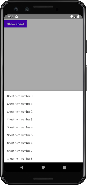
After applying the final changes, you can see the full code here, and this is what the final result looks like:

Links
- Full custom ModalBottomSheet implementation with example
- How to master Swipeable and NestedScroll modifiers in Jetpack Compose by Angelo Marchesin
This article was previously published on proandroiddev.com


