

For my first article in medium, I would like to start by showing you how to create a color picker in pure compose.
 Photo by Frans van Heerden on Pexels
Usually color pickers will have 3 components,
- Hue — The color of the picker
- Saturation — The intensity of the color
- Value — The lightness of the color
We are going to have 2 panels. One will contain the hue selector and other panel will have both saturation and value in it.
First we will start by having hue panel. The output should look something like this.
(Since it would not look nice to have to write android.graphics.Color or androidx.compose.ui.graphics.Color in all the places that we use. We will import android.graphics.Color as AndroidColor)

For that we would have to draw in canvas.
| Canvas( | |
| modifier = Modifier | |
| .height(40.dp) | |
| .width(300.dp) | |
| .clip(RoundedCornerShape(50)) | |
| ) { | |
| ... | |
| } |
We will be drawing this hue gradient in bitmap using android.graphics.Canvas.
| val bitmap = Bitmap.createBitmap(size.width.toInt(), size.height.toInt(), Bitmap.Config.ARGB_8888) | |
| val hueCanvas = Canvas(bitmap) | |
| val huePanel = RectF(0f, 0f, bitmap.width.toFloat(), bitmap.height.toFloat()) |
Now we will split these colors across the width of the huePanel.
| val hueColors = IntArray((huePanel.width()).toInt()) | |
| var hue = 0f | |
| for (i in hueColors.indices) { | |
| hueColors[i] = AndroidColor.HSVToColor(floatArrayOf(hue, 1f, 1f)) | |
| hue += 360f / hueColors.size | |
| } |
Drawing each line of color in canvas would look like
| val linePaint = Paint() | |
| linePaint.strokeWidth = 0F | |
| for (i in hueColors.indices) { | |
| linePaint.color = hueColors[i] | |
| hueCanvas.drawLine(i.toFloat(), 0F, i.toFloat(), huePanel.bottom, linePaint) | |
| } |
Finally drawing this into our compose canvas
| drawIntoCanvas { | |
| it.nativeCanvas.drawBitmap( | |
| bitmap, | |
| null, | |
| panel.toRect(), | |
| null | |
| ) | |
| } |
Next step is to have a offset state to observe where user is touching and drawing a circle to that area.
Note: We have to draw this circle after drawing bitmap, else it will just be overdrawn by bitmap.
| val pressOffset = remember { | |
| mutableStateOf(Offset.Zero) | |
| } | |
| Canvas( | |
| modifier = Modifier | |
| .height(40.dp) | |
| .width(300.dp) | |
| .clip(RoundedCornerShape(50)) | |
| ) { | |
| ..... | |
| drawCircle( | |
| Color.White, | |
| radius = size.height/2, | |
| center = Offset(pressOffset.value.x, size.height/2), | |
| style = Stroke( | |
| width = 2.dp.toPx() | |
| ) | |
| ) | |
| } |
We have to send a callback for when hue is changed with click and also with drag.
Luckily we can not only get click position using InteractionSource but also send pressPosition to it. This way we only need to observe for it in one place.
We will write a custom Modifier to achieve this.
| private fun Modifier.emitDragGesture( | |
| interactionSource: MutableInteractionSource | |
| ): Modifier = composed { | |
| val scope = rememberCoroutineScope() | |
| pointerInput(Unit) { | |
| detectDragGestures { input, _ -> | |
| scope.launch { | |
| interactionSource.emit(PressInteraction.Press(input.position)) | |
| } | |
| } | |
| }.clickable(interactionSource, null) { | |
| } | |
| } |
We have to observe for click and drag to find out exactly which hue is user picking.
| scope.launch { | |
| interactionSource.interactions.collect { interaction -> | |
| when(interaction) { | |
| PressInteraction.Press -> { | |
| val pressPos = pressPosition.x.coerceIn(0f..drawScopeSize.width) | |
| pressOffset.value = Offset(pressPos, 0f) | |
| val selectedHue = pointToHue(pressPos) | |
| } | |
| } | |
| } |
Now the hue panel is all set. After a little bit of cleaning code will look something like this.
| @Composable | |
| fun HueBar( | |
| setColor: (Float) -> Unit | |
| ) { | |
| val scope = rememberCoroutineScope() | |
| val interactionSource = remember { | |
| MutableInteractionSource() | |
| } | |
| val pressOffset = remember { | |
| mutableStateOf(Offset.Zero) | |
| } | |
| Canvas( | |
| modifier = Modifier | |
| .height(40.dp) | |
| .width(300.dp) | |
| .clip(RoundedCornerShape(50)) | |
| .emitDragGesture(interactionSource) | |
| ) { | |
| val drawScopeSize = size | |
| val bitmap = Bitmap.createBitmap(size.width.toInt(), size.height.toInt(), Bitmap.Config.ARGB_8888) | |
| val hueCanvas = Canvas(bitmap) | |
| val huePanel = RectF(0f, 0f, bitmap.width.toFloat(), bitmap.height.toFloat()) | |
| val hueColors = IntArray((huePanel.width()).toInt()) | |
| var hue = 0f | |
| for (i in hueColors.indices) { | |
| hueColors[i] = AndroidColor.HSVToColor(floatArrayOf(hue, 1f, 1f)) | |
| hue += 360f / hueColors.size | |
| } | |
| val linePaint = Paint() | |
| linePaint.strokeWidth = 0F | |
| for (i in hueColors.indices) { | |
| linePaint.color = hueColors[i] | |
| hueCanvas.drawLine(i.toFloat(), 0F, i.toFloat(), huePanel.bottom, linePaint) | |
| } | |
| drawBitmap( | |
| bitmap = bitmap, | |
| panel = huePanel | |
| ) | |
| fun pointToHue(pointX: Float): Float { | |
| val width = huePanel.width() | |
| val x = when { | |
| pointX < huePanel.left -> 0F | |
| pointX > huePanel.right -> width | |
| else -> pointX - huePanel.left | |
| } | |
| return x * 360f / width | |
| } | |
| scope.collectForPress(interactionSource) { pressPosition -> | |
| val pressPos = pressPosition.x.coerceIn(0f..drawScopeSize.width) | |
| pressOffset.value = Offset(pressPos, 0f) | |
| val selectedHue = pointToHue(pressPos) | |
| setColor(selectedHue) | |
| } | |
| drawCircle( | |
| Color.White, | |
| radius = size.height/2, | |
| center = Offset(pressOffset.value.x, size.height/2), | |
| style = Stroke( | |
| width = 2.dp.toPx() | |
| ) | |
| ) | |
| } | |
| } | |
| fun CoroutineScope.collectForPress( | |
| interactionSource: InteractionSource, | |
| setOffset: (Offset) -> Unit | |
| ) { | |
| launch { | |
| interactionSource.interactions.collect { interaction -> | |
| (interaction as? PressInteraction.Press) | |
| ?.pressPosition | |
| ?.let(setOffset) | |
| } | |
| } | |
| } | |
| private fun Modifier.emitDragGesture( | |
| interactionSource: MutableInteractionSource | |
| ): Modifier = composed { | |
| val scope = rememberCoroutineScope() | |
| pointerInput(Unit) { | |
| detectDragGestures { input, _ -> | |
| scope.launch { | |
| interactionSource.emit(PressInteraction.Press(input.position)) | |
| } | |
| } | |
| }.clickable(interactionSource, null) { | |
| } | |
| } | |
| private fun DrawScope.drawBitmap( | |
| bitmap: Bitmap, | |
| panel: RectF | |
| ) { | |
| drawIntoCanvas { | |
| it.nativeCanvas.drawBitmap( | |
| bitmap, | |
| null, | |
| panel.toRect(), | |
| null | |
| ) | |
| } | |
| } |
OUR VIDEO RECOMMENDATION


Jobs
Next is a panel which is used to select saturation and value.
The basic upto creating a Canvas for bitmap is same as that of HuePanel.
| val interactionSource = remember { | |
| MutableInteractionSource() | |
| } | |
| val scope = rememberCoroutineScope() | |
| var sat: Float | |
| var value: Float | |
| val pressOffset = remember { | |
| mutableStateOf(Offset.Zero) | |
| } | |
| Canvas( | |
| modifier = Modifier | |
| .size(300.dp) | |
| .emitDragGesture(interactionSource) | |
| .clip(RoundedCornerShape(12.dp)) | |
| ) { | |
| val cornerRadius = 12.dp.toPx() | |
| val satValSize = size | |
| val bitmap = Bitmap.createBitmap(size.width.toInt(), size.height.toInt(), Bitmap.Config.ARGB_8888) | |
| val canvas = Canvas(bitmap) | |
| val satValPanel = RectF(0f, 0f, bitmap.width.toFloat(), bitmap.height.toFloat()) | |
| } |
Since we are creating a panel that contains both saturation and value, we will create saturation gradient from top-left to top-right and value gradient from top-left to bottom-left.
| val rgb = AndroidColor.HSVToColor(floatArrayOf(hue, 1f, 1f)) | |
| val satShader = LinearGradient( | |
| satValPanel.left, satValPanel.top, satValPanel.right, satValPanel.top, | |
| -0x1, rgb, Shader.TileMode.CLAMP | |
| ) | |
| val valShader = LinearGradient( | |
| satValPanel.left, satValPanel.top, satValPanel.left, satValPanel.bottom, | |
| -0x1, -0x1000000, Shader.TileMode.CLAMP | |
| ) |
The rgb value is calculated under the assumption that hue is passed to this composable.
Next we will draw a rounded rectangle by combining the satShader and valShader using Compose Shader.
| canvas.drawRoundRect( | |
| satValPanel, | |
| cornerRadius, | |
| cornerRadius, | |
| Paint().apply { | |
| shader = ComposeShader( | |
| valShader, | |
| satShader, | |
| PorterDuff.Mode.MULTIPLY | |
| ) | |
| } | |
| ) |
Drawing the Saturation + Value panel is over. Now we need to observe and draw a circle where our user will click/drag and then convert that position into saturation and value.
| fun pointToSatVal(pointX: Float, pointY: Float): Pair<Float, Float> { | |
| val width = satValPanel.width() | |
| val height = satValPanel.height() | |
| val x = when { | |
| pointX < satValPanel.left -> 0f | |
| pointX > satValPanel.right -> width | |
| else -> pointX - satValPanel.left | |
| } | |
| val y = when { | |
| pointY < satValPanel.top -> 0f | |
| pointY > satValPanel.bottom -> height | |
| else -> pointY - satValPanel.top | |
| } | |
| val satPoint = 1f / width * x | |
| val valuePoint = 1f - 1f / height * y | |
| return satPoint to valuePoint | |
| } | |
| scope.collectForPress(interactionSource) { pressPosition -> | |
| val pressPositionOffset = Offset( | |
| pressPosition.x.coerceIn(0f..satValSize.width), | |
| pressPosition.y.coerceIn(0f..satValSize.height) | |
| ) | |
| pressOffset.value = pressPositionOffset | |
| val (satPoint, valuePoint) = pointToSatVal(pressPositionOffset.x, pressPositionOffset.y) | |
| sat = satPoint | |
| value = valuePoint | |
| setSatVal(sat, value) | |
| } | |
| drawCircle( | |
| color = Color.White, | |
| radius = 8.dp.toPx(), | |
| center = pressOffset.value, | |
| style = Stroke( | |
| width = 2.dp.toPx() | |
| ) | |
| ) | |
| drawCircle( | |
| color = Color.White, | |
| radius = 2.dp.toPx(), | |
| center = pressOffset.value, | |
| ) |
Finally our composable will look like this.
| @Composable | |
| fun SatValPanel( | |
| hue: Float, | |
| setSatVal: (Float, Float) -> Unit | |
| ) { | |
| val interactionSource = remember { | |
| MutableInteractionSource() | |
| } | |
| val scope = rememberCoroutineScope() | |
| var sat: Float | |
| var value: Float | |
| val pressOffset = remember { | |
| mutableStateOf(Offset.Zero) | |
| } | |
| Canvas( | |
| modifier = Modifier | |
| .size(300.dp) | |
| .emitDragGesture(interactionSource) | |
| .clip(RoundedCornerShape(12.dp)) | |
| ) { | |
| val cornerRadius = 12.dp.toPx() | |
| val satValSize = size | |
| val bitmap = Bitmap.createBitmap(size.width.toInt(), size.height.toInt(), Bitmap.Config.ARGB_8888) | |
| val canvas = Canvas(bitmap) | |
| val satValPanel = RectF(0f, 0f, bitmap.width.toFloat(), bitmap.height.toFloat()) | |
| val rgb = AndroidColor.HSVToColor(floatArrayOf(hue, 1f, 1f)) | |
| val satShader = LinearGradient( | |
| satValPanel.left, satValPanel.top, satValPanel.right, satValPanel.top, | |
| -0x1, rgb, Shader.TileMode.CLAMP | |
| ) | |
| val valShader = LinearGradient( | |
| satValPanel.left, satValPanel.top, satValPanel.left, satValPanel.bottom, | |
| -0x1, -0x1000000, Shader.TileMode.CLAMP | |
| ) | |
| canvas.drawRoundRect( | |
| satValPanel, | |
| cornerRadius, | |
| cornerRadius, | |
| Paint().apply { | |
| shader = ComposeShader( | |
| valShader, | |
| satShader, | |
| PorterDuff.Mode.MULTIPLY | |
| ) | |
| } | |
| ) | |
| drawBitmap( | |
| bitmap = bitmap, | |
| panel = satValPanel | |
| ) | |
| fun pointToSatVal(pointX: Float, pointY: Float): Pair<Float, Float> { | |
| val width = satValPanel.width() | |
| val height = satValPanel.height() | |
| val x = when { | |
| pointX < satValPanel.left -> 0f | |
| pointX > satValPanel.right -> width | |
| else -> pointX - satValPanel.left | |
| } | |
| val y = when { | |
| pointY < satValPanel.top -> 0f | |
| pointY > satValPanel.bottom -> height | |
| else -> pointY - satValPanel.top | |
| } | |
| val satPoint = 1f / width * x | |
| val valuePoint = 1f - 1f / height * y | |
| return satPoint to valuePoint | |
| } | |
| scope.collectForPress(interactionSource) { pressPosition -> | |
| val pressPositionOffset = Offset( | |
| pressPosition.x.coerceIn(0f..satValSize.width), | |
| pressPosition.y.coerceIn(0f..satValSize.height) | |
| ) | |
| pressOffset.value = pressPositionOffset | |
| val (satPoint, valuePoint) = pointToSatVal(pressPositionOffset.x, pressPositionOffset.y) | |
| sat = satPoint | |
| value = valuePoint | |
| setSatVal(sat, value) | |
| } | |
| drawCircle( | |
| color = Color.White, | |
| radius = 8.dp.toPx(), | |
| center = pressOffset.value, | |
| style = Stroke( | |
| width = 2.dp.toPx() | |
| ) | |
| ) | |
| drawCircle( | |
| color = Color.White, | |
| radius = 2.dp.toPx(), | |
| center = pressOffset.value, | |
| ) | |
| } | |
| } |
Getting value from both of those panel and set it where ever you like.
| Column( | |
| modifier = Modifier | |
| .fillMaxSize(), | |
| horizontalAlignment = Alignment.CenterHorizontally, | |
| verticalArrangement = Arrangement.Center | |
| ) { | |
| val hsv = remember { | |
| val hsv = floatArrayOf(0f, 0f, 0f) | |
| AndroidColor.colorToHSV(Color.Blue.toArgb(), hsv) | |
| mutableStateOf( | |
| Triple(hsv[0], hsv[1], hsv[2]) | |
| ) | |
| } | |
| val backgroundColor = remember(hsv.value) { | |
| mutableStateOf(Color.hsv(hsv.value.first, hsv.value.second, hsv.value.third)) | |
| } | |
| SatValPanel(hue = hsv.value.first) { sat, value -> | |
| hsv.value = Triple(hsv.value.first, sat, value) | |
| } | |
| Spacer(modifier = Modifier.height(32.dp)) | |
| HueBar { hue -> | |
| hsv.value = Triple(hue, hsv.value.second, hsv.value.third) | |
| } | |
| Spacer(modifier = Modifier.height(32.dp)) | |
| Box( | |
| modifier = Modifier | |
| .size(100.dp) | |
| .background(backgroundColor.value) | |
| ) | |
| } |
Our output will look like this.
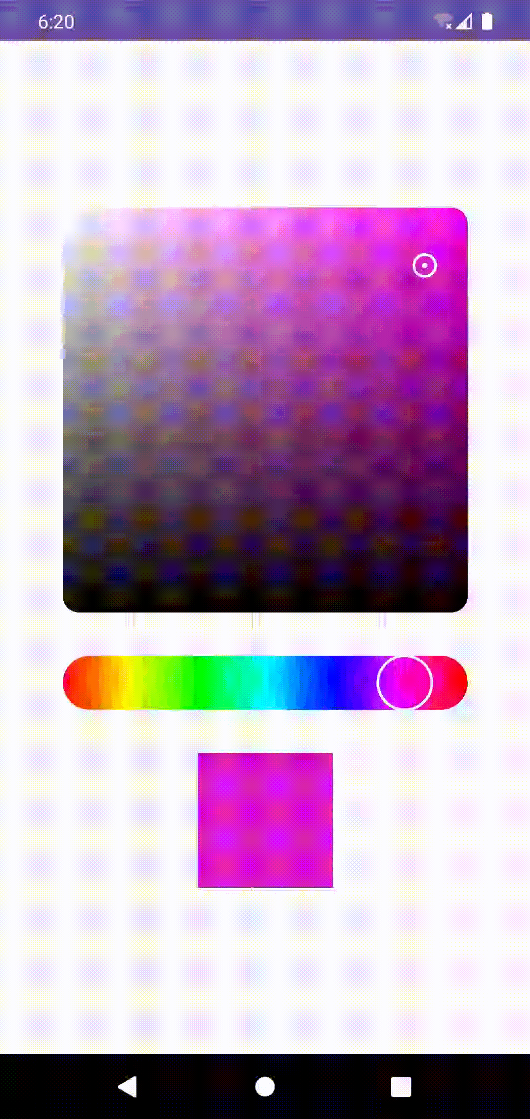 Compose Color picker in Emulator
Any criticism is welcomed. Kindly post it in comments.
Check out the code at my github.
#HappyCoding
This article was previously published on proandroiddev.com


