

In this article, we will discuss what Accessibility is, how to use Accessibility in Jetpack Compose, and how to write an Accessibility test.

What is Accessibility?
Accessibility is the ability of software or a digital service to enable all types of users to access and use it effectively. This includes diverse user groups such as individuals with physical, cognitive, or emotional disabilities, elderly people, or those with different language or cultural backgrounds.
Accessibility enhances the usability of software and digital services and improves the user experience. Below, you can find some important aspects of accessibility:
Inclusivity: Accessible software ensures inclusivity by being available to all users, regardless of their abilities or disabilities, enabling everyone to access information, products, or services.
Legal Compliance: Many countries have accessibility laws or regulations. By developing accessible software, you can comply with these legal requirements and prevent potential legal issues.
User Experience: Accessibility allows users to use software more effectively and efficiently. Adaptations made for users with disabilities improve user-friendly interfaces, readability, navigation, and interaction.
Good Reputation and Customer Loyalty: Accessible software provides equal opportunities to users and demonstrates responsiveness to their needs. This enhances brand reputation and fosters customer loyalty.
Market Opportunities: Accessibility enables software to reach a wider user base. Products targeting users with disabilities can have significant market potential and provide a competitive advantage.
Social Responsibility: Developing accessible software reflects a sense of social responsibility. Ensuring equal access to information and digital participation for everyone creates a more equitable and inclusive society.
Accessibility should be considered in the early stages of software development. Understanding the diverse needs of users and implementing appropriate design and technical solutions to meet accessibility requirements is essential.
Accessibility in Jetpack Compose
Jetpack Compose has important features related to accessibility. Some of these features may include:
Screen Reader Support: Jetpack Compose supports UI components that work seamlessly with screen readers. This enables visually impaired users to hear the content of your application.
High Contrast Mode Support: Compose can automatically detect and enhance the appearance of your application in high contrast mode. This provides a better experience for users with low vision.
Keyboard Navigation and Focus Management: Compose has features that facilitate navigation and interaction using the keyboard. Users can navigate between components and interact with them using the keyboard. Combined with focus management, keyboard support enhances accessibility.
Text Readability and Scaling: Jetpack Compose offers flexible text features to improve readability. By adjusting text size, color, and contrast, you can provide a better reading experience for users with visual difficulties.
Jetpack Compose provides a solid foundation for building accessible user interfaces. By leveraging these accessibility features, you can ensure that your application is inclusive and usable for a wide range of users, regardless of their abilities or disabilities.
What is the Semantics in Jetpack Compose?
In Jetpack Compose, the term “semantic” refers to the structural information that defines the meaning and interaction of UI components in the user interface. Semantic information supports important factors such as accessibility, readability, and understandability.
Jetpack Compose uses the following methods to provide semantic information:
Attributes: It provides attributes that give semantic meaning to UI components. For example, assigning a text to a Text component as a “label” helps the user understand the text and interact with it correctly.
Annotations: You can add annotations to UI components. This allows users to have more information about how to use and the purpose of the components. For example, adding an annotation to a Button component can provide users with additional information about the function of the button.
Focus Management: Semantic information is also associated with focus management. Focus represents the current position during keyboard navigation and interaction. Jetpack Compose supports focus management to ensure users interact correctly.
Providing semantic information is important for accessibility as it helps users understand how to use a component and what type of interaction is expected. It is also important for readability and understandability as semantic information makes the user interface of the application more understandable and user-friendly.
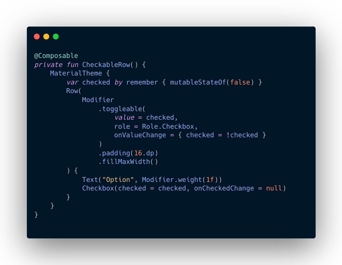
Touch Sizes
Any screen element that a person can click, tap, or interact with should be large enough for reliable interaction. When sizing these elements, it is recommended to set the minimum size to 48.dp to accurately follow the Material Design Accessibility Guidelines.
Material components such as Checkbox, RadioButton, Switch, Slider, and Surface determine this minimum size internally but only when the component can receive user actions. For example, when the onCheckedChange parameter of a Checkbox is set to a non-null value, it will add padding to have a minimum width and height of 48dp.

When the onCheckedChange parameter is set to null, padding is not included because the component cannot be directly interacted with.

When implementing selection controls like Switch, RadioButton, or Checkbox, it is often necessary to move the clickable behavior to a parent element. You would set the click callback of the component to null and add a toggleable or selectable modifier to the parent element.
OUR VIDEO RECOMMENDATION


Jobs
Click Label
Accessibility is an important factor in ensuring that applications can be used by everyone. Jetpack Compose supports accessibility features, and one of these features is the “click label.”
A click label is the text or description added to a clickable component such as an image or button. It helps visually impaired users or individuals using screen readers understand the purpose or nature of the component. The click label also assists users with limited motor skills in selecting the correct component.
We can follow the steps below to add a click label in Jetpack Compose:
- First, you need to create a clickable component. For example, let’s create a Button
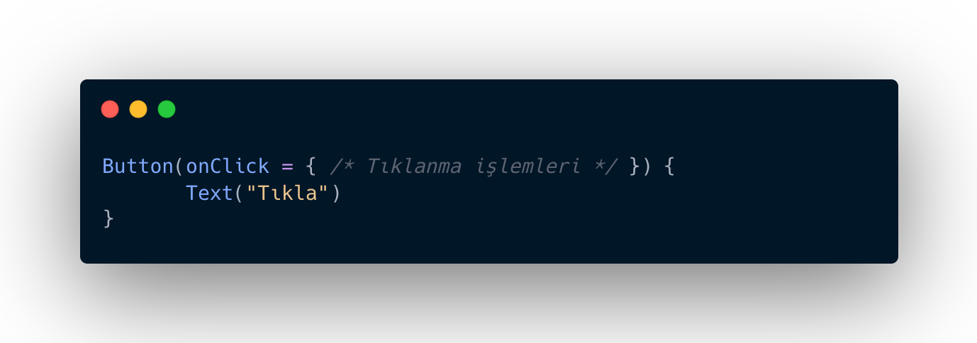
- Now we can use the semantics function to add the click label to the button. The semantics function allows us to set accessibility properties. Let’s add the function to the button and specify the click label:

When creating the Button component, we add the semantics function to the modifier parameter. We define the description of the clickable button using the contentDescription property.
Using it, visually impaired users or screen readers can understand what a clickable button is or what it does.
In this way, you can provide accessibility features by adding a click label with Jetpack Compose. Click labels are an important tool for meeting accessibility requirements and improving the user experience.
Describe Visual Elements
To set accessibility properties for Image and Icon components in Jetpack Compose, we can use the semantics function. The semantics function allows us to specify accessibility labels and descriptions.Here are examples showing how to write accessibility code in Image and Icon components;
Accessibility code for Image component:
It is not possible to set accessibility properties using the semantics function in the Image component in Jetpack Compose. Instead, we use the contentDescription parameter to annotate the Image component.

In the above example, we specify the contentDescription parameter as “My Image” in the Image component. This will help visually impaired users or people using screen readers to understand what the image is.
Accessibility code for Icon component:
In Jetpack Compose it is possible to set accessibility properties using the semantics function in the Icon component. The semantics function allows us to specify accessibility tags and descriptions.

In the above example, we specify the contentDescription parameter as “My Icon” in the Icon component. This will help visually impaired users or people using screen readers understand what the icon is. You can also add a text component (for example, the Text component) that contains the Icon component so that the icon appears with a label or description. This can help users better understand the meaning of the icon.
Merge Elements
mergeDescendants parameter is used to combine the accessibility features of a component’s subcomponents. By default, the mergeDescendants parameter is set to false and does not combine the accessibility properties of child components. However, if set to true, the accessibility properties of the child components are combined with the accessibility properties of the parent component.
For example, we can use the mergeDescendants parameter to combine the accessibility properties of subcomponents within a Column component:
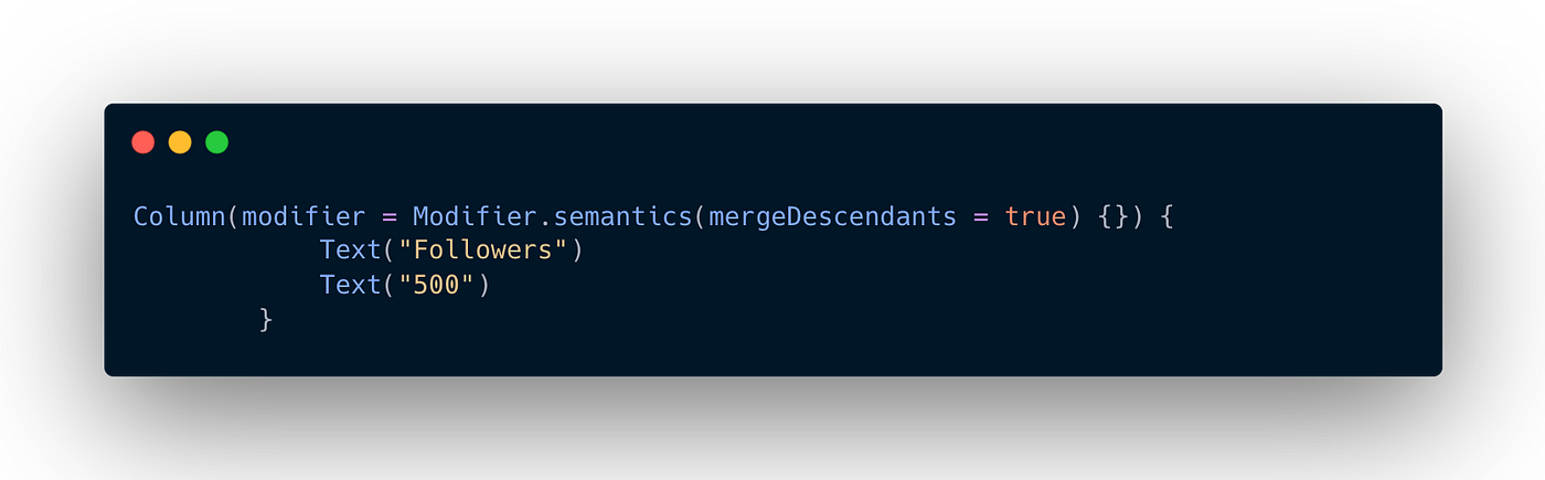
In the example above, we set the mergeDescendants parameter to true within the Column component to merge the accessibility properties of the two Text components inside it. This way, when accessing the Column component, the accessibility properties of both Text components will be applied.
By using the mergeDescendants parameter, you can merge the accessibility properties of a component’s descendant components to provide a better accessibility experience. However, you should be careful with performance and use this parameter when necessary, as it can have performance implications in complex component hierarchies since the accessibility properties of all descendant components will be merged.
Describe the state of an element
As an accessibility property, the stateDescription parameter provides text describing the state of a component. This status description informs users about the current status of the component.
Let’s set the stateDescription parameter inside the semantics function. This provides text describing the current state of the component:
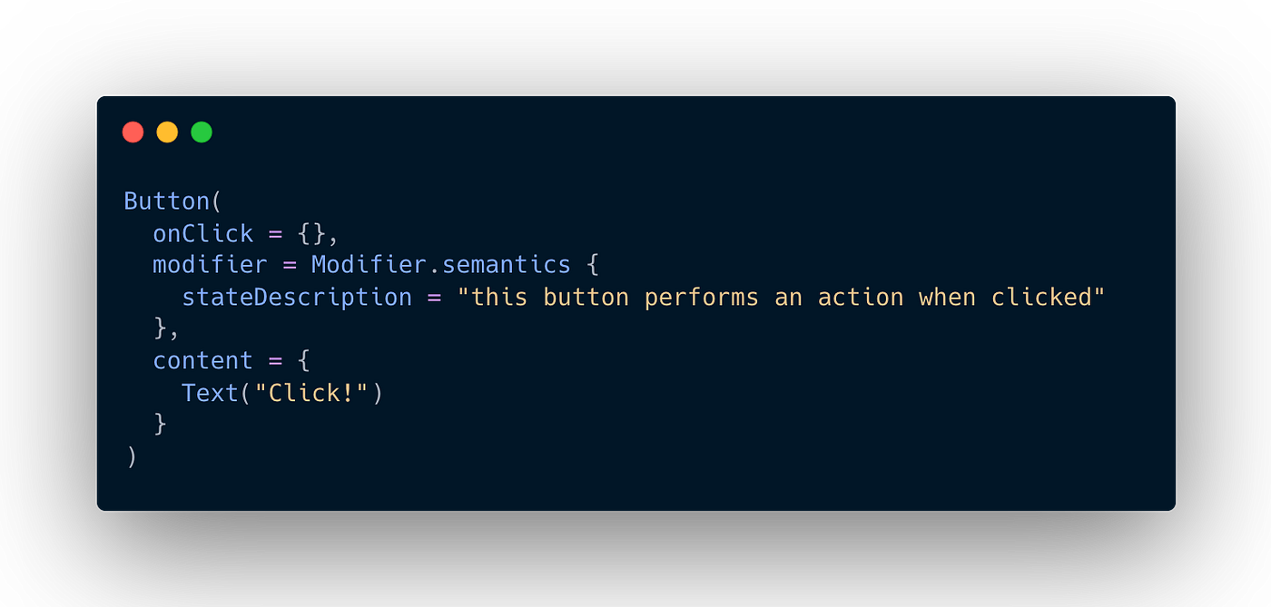
In the example above, we set the stateDescription parameter within the semantics function to “Performs an action when this button is clicked.” This is a text that describes the state of the component and informs users about what it does.
By using the stateDescription parameter to add an accessibility feature to a component, you can provide users with information about the current state of the component. This is important to meet accessibility requirements and improve the user experience.
When using components with state such as Checkbox in Jetpack Compose, we can provide information about the state with semantic:

In the example above, we added the semantics function to the Checkbox component and set the mergeDescendants parameter to true. This way, we combined the accessibility features of the Checkbox component and its child components.
By using the stateDescription parameter within a conditional statement, we set the state description based on the isChecked condition. If isChecked is true, the state description is set to “Selected”; otherwise, it is set to “Not Selected”.
This way, as an accessibility feature, we provide users with a text that describes the current state of the Checkbox component. This allows users who are using screen readers or have visual impairments to understand the state of the component and manage their interactions accordingly.
Define Title
In Jetpack Compose, you can use the semantics function to define a Text component as a header. This is important for accessibility because headers can be used by assistive technologies to understand the structure and hierarchy of a document or page.
You can define the Text component as a title using an example like this:

In the given example, we used the semantics function by applying it to the Modifier to invoke the heading function. This defines the Text component as a header.
By defining the Text component as a header, it can be emphasized and understood as the title of a document or page by users who utilize screen readers or have visual impairments. Additionally, it provides convenience in understanding the structure of the document or page in certain assistive technologies.
By defining the Text component as a header in this manner, you can effectively convey important information to users in terms of accessibility.
Testing Accessibility in Jetpack Compose
Let’s consider an application that contains table information. In this application, each row will consist of the name of a country and its capital. Users will be able to access and read the data in the table using assistive technologies.
Example Code:
@Composable
fun AccessibilityExample() {
    val countryList = listOf(
        Country("Turkey", "Ankara"),
        Country("USA", "Washington, D.C."),
        Country("France", "Paris"),
        // Other countries...
    )

    Column {
        for (country in countryList) {
            CountryRow(country)
        }
    }
}

@Composable
fun CountryRow(country: Country) {
    Row(
        modifier = Modifier
            .clickable { /* Click action */ }
            .padding(16.dp)
            .semantics {
                // Set the country name and capital as the accessibility description
                contentDescription = "Country: ${country.name}, Capital: ${country.capital}"
            }
    ) {
        Text(text = country.name, style = MaterialTheme.typography.body1)
        Spacer(modifier = Modifier.width(16.dp))
        Text(text = country.capital, style = MaterialTheme.typography.body2)
    }
}

data class Country(val name: String, val capital: String)
In this example, we define a main component called AccessibilityExample, which creates CountryRow components that represent the country data as a list.
CountryRow represents a row for each country. The Modifier is used to make the row clickable, and the semantics function is used to provide the accessibility description. The country name and capital are combined using contentDescription to set the accessibility description.
Test Code:
@Test
fun testAccessibilityExample() {
    val countryList = listOf(
        Country("Turkey", "Ankara"),
        Country("USA", "Washington, D.C."),
        Country("France", "Paris")
    )

    // Use CompositionLocalProvider to test the application
    compositionTestRule.setContent {
        Column {
            for (country in countryList) {
                CountryRow(country)
            }
        }
    }

    // Check if each country has the correct accessibility description
    countryList.forEach { country ->
        val accessibilityDescription =
            "Country: ${country.name}, Capital: ${country.capital}"

        // Verify that the semantics of CountryRow are correctly set
        composeTestRule.onNodeWithText(country.name).assertSemantics {
            assert(hasClickAction())
            assert(hasContentDescription(accessibilityDescription))
        }

        composeTestRule.onNodeWithText(country.capital).assertSemantics {
            assert(hasClickAction())
            assert(hasContentDescription(accessibilityDescription))
        }
    }
}
This test example checks if the CountryRow component has the correct accessibility properties. It validates whether the accessibility description is properly set and if it is clickable for each country.
In the example test, the application is configured for testing using composeTestRule and CompositionLocalProvider. Then, it verifies if each country has the correct accessibility description and clickability.
This way, you can create an accessible component using Jetpack Compose and write a test to ensure that it functions correctly.
That’s it for the important issue of accessibility. I hope it was a useful article. See you next time!
This article was previously published on proandroiddev.com


