

 The JetPack Compose logo inside the Jetpack Compose logo inside the Jetpack Compose logo inside the Jetpack Compose logo …
Let’s create a Compose Button from scratch and apply Separation of Concerns.
Design Language Systems are becoming an increasing trend among Mobile designers. Your lovely designer follows such a trend and provides you with the below specifications for buttons. They are not really Material buttons. They do not use elevation changes or ripples. Reusing a Material button would require us to manually disable such features, which is bug-prone and may require maintenance on each Compose update. You then decide to implement a button from scratch. How would you go about it?
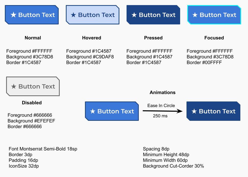 Your designer following new trends provided you with these specs for a button
You might be tempted at first to write a single and huge Composable function that implements the button and encompasses all of its aspects. That might result in very complex code that will be pretty hard to maintain. Is there a structured way in which we can implement the button?
When implementing the button we have four major concerns:
- We need to draw the button;
- The way we draw the button will change according to the animation parameters;
- Animations are triggered in response to state changes;
- We should be able to customize the representation of the different states of a button;
Could we implement each of those concerns in an independent way? Looks like each concern affects the other. Could we arrange them in a pipeline so all the data flows among them in a single direction as required by Compose? That is what I am proposing here:

The button rendering pipeline
Each concern will be a stage in our data pipeline. Let’s describe each stage.
Drawing
In the drawing stage, our only concern is ensuring we correctly draw the button. Everything like colors, sizes, and text styles are passed as parameters so it can be affected by the upper stages.
The Compose naming conventions say “MUST name any function that returns Unit and bears the @Composable annotation using PascalCase, and the name MUST be that of a noun”. However, I will be breaking them for the name of a @Composable function that implements a stage, using camelCase instead of PascalCase. The rationale for that is that those functions do not implement a full and self-sufficient Component, whose View counterpart would be a class, and hence the usage of PascalCase. Those functions are more like methods of a class with very well-defined objectives that together will build the component. Hence camelCase like it is for any method of a class. Besides they are file private and they will not be part of the public API.
@SuppressLint("ComposableNaming")
@Composable
private fun drawButton(
    text: String,
    icon: ImageVector?,
    backgroundColor: Color,
    foregroundColor: Color,
    borderColor: Color,
    shape: Shape,
    iconSize: Dp,
    borderSize: Dp,
    spacing: Dp,
    minWidth: Dp,
    minHeight: Dp,
    paddings: PaddingValues,
    textStyle: TextStyle,
    modifier: Modifier = Modifier
) {
    Row(
        verticalAlignment = Alignment.CenterVertically,
        horizontalArrangement = Arrangement.Center,
        modifier = modifier
            .border(
                width = borderSize,
                color = borderColor,
                shape = shape
            )
            .background(
                color = backgroundColor,
                shape = shape
            )
            .padding(paddings)
            .defaultMinSize(minWidth = minWidth, minHeight = minHeight)
    ) {
        if (icon != null) {
            Icon(
                imageVector = icon,
                contentDescription = null,
                tint = foregroundColor,
                modifier = Modifier.size(iconSize)
            )
            Spacer(modifier = Modifier.width(spacing))
        }
        Text(text = text, color = foregroundColor, style = textStyle)
    }
}
We can then write several previews for drawButton to verify the rendering for various situations like when the button has no icon, the text is very long, or even when it is used with RTL scripts like the old Phoenician alphabet.
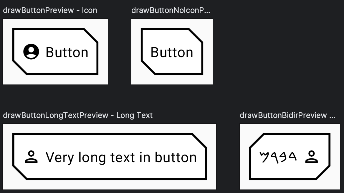 Several previews to ensure we are drawing our button correctly.
OUR VIDEO RECOMMENDATION


Jobs
Animation
This is the second lowest stage in the pipeline and it is responsible for setting up the animations. You can clearly see that animateButton is organized into three sections:
- Receiving parameters: some will be used by the animations, others will pass through reaching the drawing stage;
- Setting up animations: in this case, we want to animate the colors and content size changes in case the text changes or whenever we hide or show the icon;
- Passing data to the next stage in the pipeline.
@SuppressLint("ComposableNaming")
@Composable
private fun animateButton(
    text: String,
    icon: ImageVector?,
    backgroundColor: Color,
    foregroundColor: Color,
    borderColor: Color,
    shape: Shape,
    iconSize: Dp,
    borderSize: Dp,
    spacing: Dp,
    minWidth: Dp,
    minHeight: Dp,
    paddings: PaddingValues,
    textStyle: TextStyle,
    animationDuration: Int,
    animationEasing: Easing,
    modifier: Modifier = Modifier
) {
    val colorAnimationSpec =
        tween<Color>(durationMillis = animationDuration, easing = animationEasing)
    val animatedBorderColor by animateColorAsState(
        animationSpec = colorAnimationSpec,
        targetValue = borderColor,
        label = "border"
    )
    val animatedBackgroundColor by animateColorAsState(
        animationSpec = colorAnimationSpec,
        targetValue = backgroundColor,
        label = "background"
    )
    val animatedForegroundColor by animateColorAsState(
        animationSpec = colorAnimationSpec,
        targetValue = foregroundColor,
        label = "foreground"
    )

    val localModifier = modifier.animateContentSize(
        animationSpec = tween(
            durationMillis = animationDuration,
            easing = animationEasing
        )
    )
    drawButton(
        text = text,
        icon = icon,
        backgroundColor = animatedBackgroundColor,
        foregroundColor = animatedForegroundColor,
        borderColor = animatedBorderColor,
        shape = shape,
        iconSize = iconSize,
        borderSize = borderSize,
        spacing = spacing,
        minWidth = minWidth,
        minHeight = minHeight,
        paddings = paddings,
        textStyle = textStyle,
        modifier = localModifier
    )
}
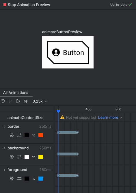
Luckily again, Compose preview tooling can help us verify if we are on the right track. Note that setting the labels for the animations in the code above became really handy with the Animation Preview, where one can pick any colors he or she wants for the tests.
State
This stage will manage the button state: when it is pressed, clicked, focused, and whatnot, and the consequences to other parameters such as the colors. It is very loosely inspired by the Material Button implementation.
The number of parameters in the stages is growing considerably. To tidy things up let’s create some data structures to group them.
object ButtonInteractionState {
    @JvmStatic
    val HOVER = 1.shl(0)

    @JvmStatic
    val PRESSED = 1.shl(1)

    @JvmStatic
    val FOCUSED = 1.shl(2)
}

interface ButtonColors {
    @Stable
    @Composable
    fun borderColor(interactionState: Int, enabled: Boolean): State<Color>

    @Stable
    @Composable
    fun foregroundColor(interactionState: Int, enabled: Boolean): State<Color>

    @Stable
    @Composable
    fun backgroundColor(interactionState: Int, enabled: Boolean): State<Color>
}

@Immutable
interface ButtonSizes {
    val iconSize: Dp
    val borderSize: Dp
    val contentPadding: PaddingValues
    val spacing: Dp
    val minWidth: Dp
    val minHeight: Dp
}

@Immutable
interface ButtonAnimation {
    val duration: Int
    val easing: Easing
}
ButtonInteractionState defines constants in a bitfield manner because a button can focused, hovered, and pressed, all at the same time.
ButtonColors defines the signature for methods that will give the color to be used with the current button state provided by the parameters. The @Stable annotation tells the Compose compiler that those functions will return the same result if the same parameters are passed in, so it can do some optimizations.
I believe that ButtonSizes and ButtonAnimation are self-explanatory.
Similarly to animateButton, stateButton is divided into sections:
- Figuring out the current state using the interaction source;
- Defining our button as clickable, and passing the
enabledstate and theonClickcallback; - Calculating the colors to be used according to the state
There are some important things to note when setting the clickable modifier:
- We are forwarding the
MutableInteractionSource; - We are not using Indication;
- We set the
roletoRole.Button, which will help Compose accessibility, focus management, etc.
Discussing Indication is out of the scope of this article. Indication “represents visual effects that occur when certain interactions happen”. For instance, the Surface component always sets the characteristic Material ripple effect using Indication. For a really deep dive into Interaction Sources and Indication read this article published in Android Developers.
@SuppressLint("ComposableNaming")
@Composable
private fun stateButton(
    text: String,
    onClick: () -> Unit,
    icon: ImageVector?,
    colors: ButtonColors,
    sizes: ButtonSizes,
    shape: Shape,
    textStyle: TextStyle,
    animation: ButtonAnimation,
    modifier: Modifier = Modifier,
    enabled: Boolean = true,
    interactionSource: MutableInteractionSource = remember { MutableInteractionSource() }
) {
    val isHovered by interactionSource.collectIsHoveredAsState()
    val isPressed by interactionSource.collectIsPressedAsState()
    val isFocused by interactionSource.collectIsFocusedAsState()

    var interactionState = 0
    if (isHovered) interactionState = interactionState.or(ButtonInteractionState.HOVER)
    if (isPressed) interactionState = interactionState.or(ButtonInteractionState.PRESSED)
    if (isFocused) interactionState = interactionState.or(ButtonInteractionState.FOCUSED)

    val currentModifier = modifier.clickable(
        interactionSource = interactionSource,
        indication = null,
        enabled = enabled,
        onClick = onClick
    )

    val backgroundColor = colors.backgroundColor(interactionState, enabled).value
    val foregroundColor = colors.foregroundColor(interactionState, enabled).value
    val borderColor = colors.borderColor(interactionState, enabled).value

    animateButton(
        text = text,
        icon = icon,
        backgroundColor = backgroundColor,
        foregroundColor = foregroundColor,
        borderColor = borderColor,
        shape = shape,
        iconSize = sizes.iconSize,
        borderSize = sizes.borderSize,
        spacing = sizes.spacing,
        minWidth = sizes.minWidth,
        minHeight = sizes.minHeight,
        paddings = sizes.contentPadding,
        textStyle = textStyle,
        animationDuration = animation.duration,
        animationEasing = animation.easing,
        modifier = currentModifier
    )
}
Theming
In this stage, we are finally implementing the specifications given by our designer. Considering that we are using a custom font, Monstserrat, we need to define a FontFamily:
val MontserratFont = FontFamily(
    Font(R.font.montserrat_thin, weight = FontWeight.Thin, style = FontStyle.Normal),
    Font(R.font.montserrat_thin_italic, weight = FontWeight.Thin, style = FontStyle.Italic),
    Font(R.font.montserrat_extra_light, weight = FontWeight.ExtraLight, style = FontStyle.Normal),
    Font(R.font.montserrat_extra_light_italic, weight = FontWeight.ExtraLight, style = FontStyle.Italic),
    Font(R.font.montserrat_light, weight = FontWeight.Light, style = FontStyle.Normal),
    Font(R.font.montserrat_light_italic, weight = FontWeight.Light, style = FontStyle.Italic),
    Font(R.font.montserrat_regular, weight = FontWeight.Normal, style = FontStyle.Normal),
    Font(R.font.montserrat_italic, weight = FontWeight.Normal, style = FontStyle.Italic),
    Font(R.font.montserrat_medium, weight = FontWeight.Medium, style = FontStyle.Normal),
    Font(R.font.montserrat_medium_italic, weight = FontWeight.Medium, style = FontStyle.Italic),
    Font(R.font.montserrat_semi_bold, weight = FontWeight.SemiBold, style = FontStyle.Normal),
    Font(R.font.montserrat_semi_bold_italic, weight = FontWeight.SemiBold, style = FontStyle.Italic),
    Font(R.font.montserrat_bold, weight = FontWeight.Bold, style = FontStyle.Normal),
    Font(R.font.montserrat_bold_italic, weight = FontWeight.Bold, style = FontStyle.Italic),
    Font(R.font.montserrat_extra_bold, weight = FontWeight.ExtraBold, style = FontStyle.Normal),
    Font(R.font.montserrat_extra_bold_italic, weight = FontWeight.ExtraBold, style = FontStyle.Italic),
    Font(R.font.montserrat_black, weight = FontWeight.Black, style = FontStyle.Normal),
    Font(R.font.montserrat_black_italic, weight = FontWeight.Black, style = FontStyle.Italic),
)
In ui.theme.Colors we define constants for the colors we will use:
val ButtonBorderFocused = Color(0xFF00FFFF)
val ButtonBorderNormal = Color(0xFF1C4587)
val ButtonForegroundNormal = Color.White
val ButtonForegroundHovered = Color(0xFF1C4587)
val ButtonForegroundDisabled = Color(0xFF666666)
val ButtonBackgroundNormal = Color(0XFF3C78D8)
val ButtonBackgroundHovered = Color(0xFFC9DAF8)
val ButtonBackgroundPressed = Color(0xFF1C4587)
val ButtonBackgroundDisabled = Color(0xFFEFEFEF)
ObjectDefaults will group all the specs together into a single object:
private infix fun Int.has(bit: Int) = this.and(bit) != 0

object ButtonDefaults {
    val colors = object : ButtonColors {
        @Composable
        override fun borderColor(interactionState: Int, enabled: Boolean): State<Color> {
            return rememberUpdatedState(
                when {
                    !enabled -> ButtonForegroundDisabled
                    interactionState has ButtonInteractionState.FOCUSED -> ButtonBorderFocused
                    interactionState has ButtonInteractionState.HOVER -> ButtonForegroundHovered
                    else -> ButtonBorderNormal
                }
            )
        }

        @Composable
        override fun foregroundColor(interactionState: Int, enabled: Boolean): State<Color> {
            return rememberUpdatedState(
                when {
                    !enabled -> ButtonForegroundDisabled
                    interactionState has ButtonInteractionState.HOVER -> ButtonForegroundHovered
                    else -> ButtonForegroundNormal
                }
            )
        }

        @Composable
        override fun backgroundColor(interactionState: Int, enabled: Boolean): State<Color> {
            return rememberUpdatedState(
                when {
                    !enabled -> ButtonBackgroundDisabled
                    interactionState has ButtonInteractionState.PRESSED -> ButtonBackgroundPressed
                    interactionState has ButtonInteractionState.HOVER -> ButtonBackgroundHovered
                    else -> ButtonBackgroundNormal
                }
            )
        }
    }

    val sizes = object : ButtonSizes {
        override val iconSize = 32.dp
        override val borderSize = 3.dp
        override val contentPadding = PaddingValues(all = 16.dp)
        override val spacing = 8.dp
        override val minWidth = 60.dp
        override val minHeight = 48.dp

    }

    val animation = object : ButtonAnimation {
        override val duration = 250
        override val easing = EaseInCirc
    }

    val shape = CutCornerShape(topEndPercent = 30, bottomStartPercent = 30)

    val textStyle = TextStyle(
        fontFamily = MontserratFont,
        fontWeight = FontWeight.SemiBold,
        fontSize = 24.sp
    )
}
Putting everything together
We can now finally put everything together and create our Button component. We use the specs defined in ButtonDefaults as our default values, so we still allow some local customization:
@Composable
fun Button(
    text: String,
    onClick: () -> Unit,
    modifier: Modifier = Modifier,
    icon: ImageVector? = null,
    enabled: Boolean = true,
    colors: ButtonColors = ButtonDefaults.colors,
    sizes: ButtonSizes = ButtonDefaults.sizes,
    shape: Shape = ButtonDefaults.shape,
    textStyle: TextStyle = ButtonDefaults.textStyle,
    animation: ButtonAnimation = ButtonDefaults.animation,
    interactionSource: MutableInteractionSource = remember { MutableInteractionSource() }
) {
    stateButton(
        text,
        onClick,
        icon,
        colors,
        sizes,
        shape,
        textStyle,
        animation,
        modifier,
        enabled,
        interactionSource
    )
}
Let’s write some previews:
Enabled state
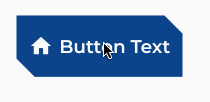
@Preview(name = "Enabled", group = "Button", showBackground = true)
@Composable
fun ButtonPreview() {
    ComposeButtonTheme {
        var showIcon by remember { mutableStateOf(true) }
        Box(modifier = Modifier.padding(24.dp)) {
            Button(
                text = "Button Text",
                onClick = { showIcon = !showIcon },
                icon = if (showIcon) Icons.Default.Home else null
            )
        }
    }
}
Static preview for the enabled state
Animated preview to show the animation and state changes.
Disabled State
@Preview(name = "Disabled", group = "Button", showBackground = true)
@Composable
fun ButtonDisabledPreview() {
    ComposeButtonTheme {
        var showIcon by remember { mutableStateOf(true) }
        Box(modifier = Modifier.padding(24.dp)) {
            Button(
                text = "Button Text",
                onClick = { showIcon = !showIcon },
                icon = if (showIcon) Icons.Default.Home else null,
                enabled = false
            )
        }
    }
}
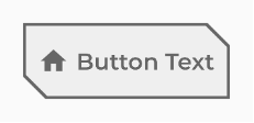
Static preview for the disabled state
Source Code
The entire source code for this article is available at:
https://github.com/aoriani/ComposeButton
References
- Material Compose Button source code https://cs.android.com/androidx/platform/frameworks/support/+/androidx-main:compose/material/material/src/commonMain/kotlin/androidx/compose/material/Button.kt
- Stable | Android Developers https://developer.android.com/reference/kotlin/androidx/compose/runtime/Stable
- PULLEN-FREILICH, Louis — Illuminating Interactions: Visual State in Jetpack Compose in Android Developers https://medium.com/androiddevelopers/illuminating-interactions-visual-state-in-jetpack-compose-188fa041b791
- ULANOVSKY, Julia — Montserrat Font https://fonts.google.com/specimen/Montserrat/about?query=Mont
https://github.com/JulietaUla/Montserrat - API Guidelines for Jetpack Compose https://github.com/androidx/androidx/blob/androidx-main/compose/docs/compose-component-api-guidelines.md
This article was previously published on proandroiddev.com


