


Have you ever wondered how to display an element with an overlay while keeping it in the same position? The same way that, for example, many messaging apps highlight the message you want to react to.
I had this type of challenge in one of my work projects. It took some trial and error to get it working, but I was so proud of myself when I finally found the correct modifiers (and numbers). I want to share one way to do it with you in this blog post.
The Example App
Okay, I must say that I maybe, just maybe, got a little bit carried away with this example app. But it’s a CatGPT — a chat client where you can ask anything from a cat. Here’s a short video:
This app is simple; It doesn’t use any third-party APIs, so the cat in question lives in the code. The app has one Room database, where it stores messages, and it has one screen called ChatScreen which displays messages.
If you want to see the code, the starting point for the app is in the starting-point-branch, and the final code is in CatGPT-repository’s main-branch.
Showing Reaction with Message
To simplify this app, each message can have only one reaction. In the Message data class, the reaction is already present:
// data/Message.kt

@Entity
data class Message(
    @PrimaryKey(autoGenerate = true)
    val id: Long = 0,
    val text: String = "",
    val sender: Sender = Sender.ME,
    @TypeConverters(ReactionConverter::class)
    val reaction: Reaction? = null,
)
OUR VIDEO RECOMMENDATION


Jobs
And it’s a nullable Reaction-enum. The complete code and converters for Reaction are in Message.kt.
Let’s first add code for showing that reaction before building the actual reaction picker. In the MessageRow.kt-file, there is already a ConstraintLayout, which contains the component for the message. We want to show the reaction in the bottom right corner of that component, so we’ll add the reaction inside the constraint layout.
The component for reaction looks like this:
// ui/components/MessageRow.kt

message.reaction?.let {
    Text(
        modifier = Modifier
            .clip(ChatScreen.shape)
            .background(MaterialTheme.colorScheme.surface)
            .padding(MessageRow.reactionPadding)
        text = it.emoji,
    )
}
As the reaction is a nullable string, we first check if it’s available with Kotlin’s let, and inside its block, we add the reaction as Text-element.
Now, the reaction is visible. We still want to position it correctly, so we’ll first add the reaction as a reference for constraint:
// ui/components/MessageRow.kt

// From
val (text) = createRefs()
// To
val (text, reaction) = createRefs()
And then for the Text-component we just added, we’ll add the constrainAs-modifier:
// ui/components/MessageRow.kt

message.reaction?.let {
    Text(
        modifier = Modifier
            ...
            .constrainAs(reaction) {
            end.linkTo(text.end, MessageRow.reactionPadding)
            bottom.linkTo(text.bottom)
            },
        text = it,
    )
}
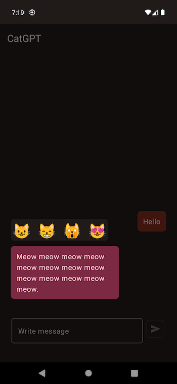
Inside the constrainAs-modifier, we constrain the end of the component to the end of the message text with a bit of padding and the bottom of the reaction to the bottom of the message text. After these changes, the message component with a reaction would look like this:

All the changes for showing the reaction with the message are in this commit.
The Reaction Picker
Alright. Now we’re showing the reactions — but to have something to display, there should be a way to add a reaction. We will do it with an overlay with a blurred background and a component that shows the selected message and available reactions.
Getting the Message’s Y-Position
We first want to get the y-position of the message component in the conversation to position the element correctly in the overlay we’re adding. We can do it by using the onGloballyPositioned-modifier and storing the y-value to a state variable. For that, we also need to know the density of the user’s phone so that we can convert between the pixels and density-independent pixels:
// MessageRow.kt

val density = LocalDensity.current
var yPosition by remember { mutableStateOf(0.dp) }
If you’re wondering about the need for density or need a refresher on density-independent pixels, I’ve written a blog post about them: Understanding Density-Independent Pixels.
Okay, now we have what we need to get the actual position:
// MessageRow.kt

ConstraintLayout(
    modifier = Modifier.
        .fillMaxWidth()
        .onGloballyPositioned {
            yPosition = with (density) {
                it.positionInParent().y.toDp() +
                  MessageRow.reactionDialogOffset +
                  MessageRow.reactionPadding
            }
        }
) { ... }
We use the .onGloballyPositioned-modifier to get the y-position. positionInParent() returns pixels, and to get the density-independent pixels for position, we use the with-scope function to convert them. We also add a bit of offset and padding to match the position because the original message component has those offset and padding.
Reaction Picker Component
After the changes in the previous section, we have the y-position of the message. The next thing we need to do is to create the reaction picker component and pass the y-position to that component. After that, we can actually place the element in the overlay.
The component inside the overlay is a ConstraintLayout, which wraps a MessageBlock that contains a message text, and Reactions, which displays the available reactions. It also has a Box used as overlay/background, covering the whole screen. You can find the complete component from ReactionPicker.kt
Okay, now we have the component, which takes the y-position of the message as a parameter. Let’s move on to placing the elements.
Placing Elements on the Screen
To place the message block and reactions correctly within the screen, we use a custom modifier that takes the y-position of the message from the message screen and finds the correct position for the message and reactions:
fun Modifier.positionReactionsPicker(yPosition: Dp) = layout { measurable, constraints ->
    val placeable = measurable.measure(constraints)

    layout(placeable.width, placeable.height) {
        placeable.place(0, yPosition.roundToPx())
    }
}
To accomplish what we want, we use the layout-modifier. It’s a lambda with two parameters: measurable and constraints. We first measure the element presented by the measurable parameter (the component on which the custom modifier is called) and store the value in the placeable variable.
Then, we create the layout with measured height and width and place the element with placeable.place(). For the x-value, we use “0” because the component fills the whole width, and we can place it on the left edge of the screen. For the y-value, we use the yPosition passed to the modifier and round it to pixels.
Finally, we call the custom modifier on the ConstraintLayout that is wrapping the message and reactions:
ConstraintLayout(
    modifier = Modifier.positionReactionsPicker(yPosition)
) { ... }
In this way, we have positioned the reactions picker:
Wrapping Up
In this blog post, we’ve looked at how to position elements on screen. We’ve done that by getting the y-position of that message and then creating an overlay where we’ve placed the opened message with the help of a custom layout modifier.
This code is a good starting place visually but has some accessibility problems. Not everyone who uses different assistive technologies can use it, so I will write a second blog post tackling some of the accessibility issues this code has.
Do you have any comments or questions? Please share and/or ask!
This article was previously published on proandroiddev.com


