In this publication, I’m addressing the challenges faced when creating a widget that requires custom fonts.
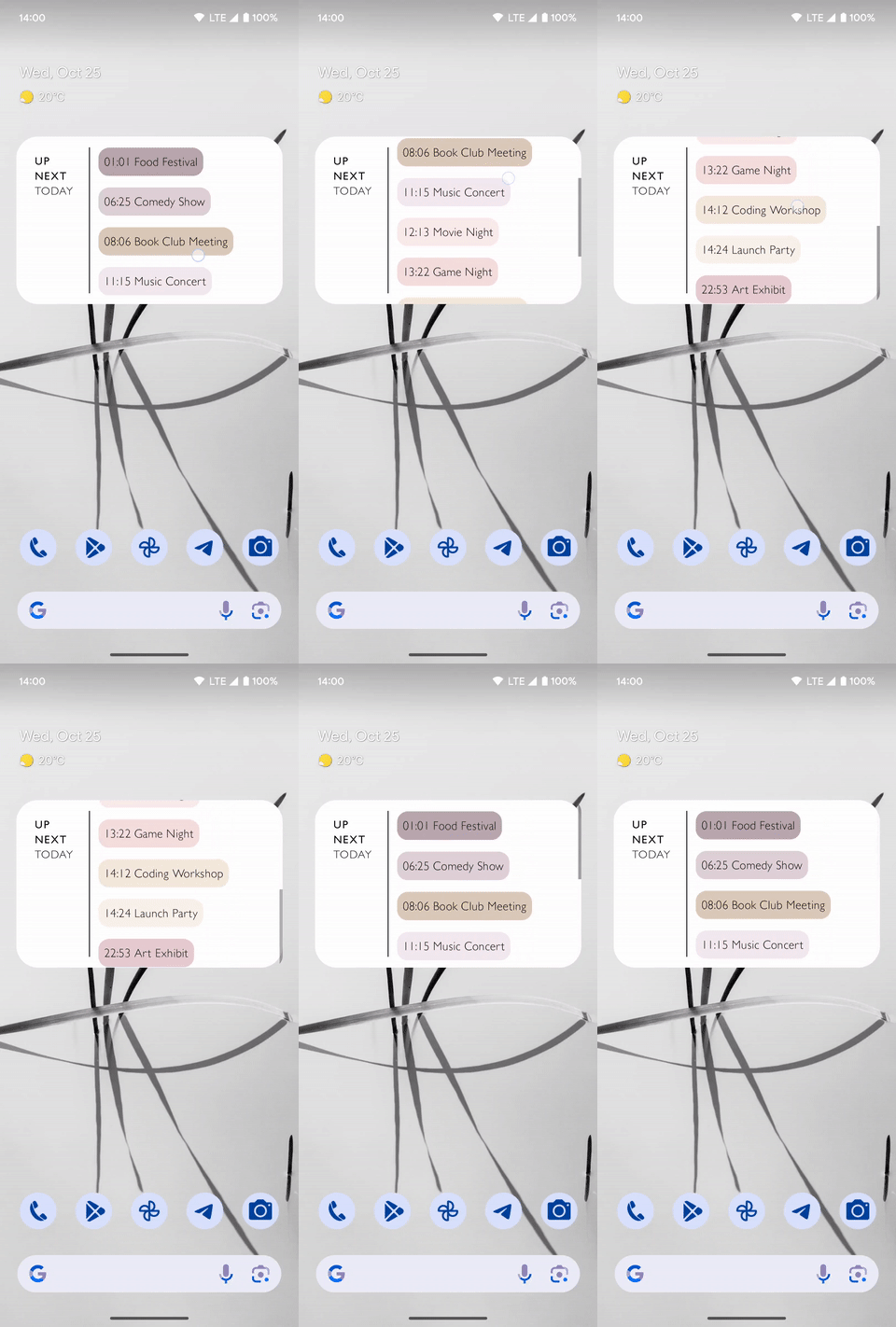
Let’s begin by introducing the results of what we will get. The idea is to show the upcoming events in a list, which are using custom fonts.
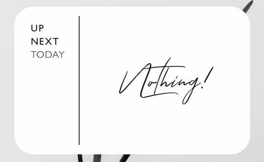
And the empty state, which should show “Nothing” text, using the Tuesday Night Font.
The bad guy
After reading the Glance documentation, I discovered that it allows font customization, but it’s limited to a few fonts and font families existing in the system. The documentation says.
Defaults are provided, but it is also possible to supply a custom family. If this is found on the system it will be used, otherwise it will fallback to a system default.
Can I provide a custom font? It has a simple answer, no, limitations with widgets prevent Glance from displaying custom fonts. There are only a few built-in fonts which we can use.
The solution
In this example, I’m using the version 1.0.0.
Basically, if the system does not provide a built-in UI or widget, we can draw it with Canvas and fortunately, this helps me to draw a custom font with Canvas. Let’s move forward to see how it actually happens.
At first, we should create a simple widget.
With the first step, you should declare the receiver inside the AndroidManifest
| <receiver | |
| android:name=".widget.event.EventsWidgetReceiver" | |
| android:enabled="@bool/glance_appwidget_available" | |
| android:exported="true"> | |
| <intent-filter> | |
| <action android:name="android.appwidget.action.APPWIDGET_UPDATE" /> | |
| </intent-filter> | |
| <meta-data | |
| android:name="android.appwidget.provider" | |
| android:resource="@xml/event_widget_info" /> | |
| </receiver> |
Job Offers
Next, we need to add information to the widget by creating a straightforward XML file inside the res/xml folder and naming it event_widget_info.xml. This XML file should include specific parameters that we need to define for the widget.
| <?xml version="1.0" encoding="utf-8"?> | |
| <appwidget-provider xmlns:android="http://schemas.android.com/apk/res/android" | |
| android:description="@string/up_next_medium" | |
| android:initialLayout="@layout/glance_default_loading_layout" | |
| android:minWidth="200dp" | |
| android:minHeight="80dp" | |
| android:previewImage="@drawable/medium_up_next_widget" | |
| android:resizeMode="horizontal|vertical" | |
| android:widgetCategory="home_screen" /> |
After we are done with the XML, let’s move forward to the code part.
At first, we need to create a GlanceAppWidgetReceiver
| class EventsWidgetReceiver : GlanceAppWidgetReceiver() { | |
| override val glanceAppWidget: GlanceAppWidget = EventsWidget() | |
| } |
Then actually the EventsWidget
| class EventsWidget : GlanceAppWidget() { | |
| override suspend fun provideGlance(context: Context, id: GlanceId) { | |
| provideContent { | |
| Box( | |
| modifier = GlanceModifier | |
| .fillMaxSize() | |
| .background(Color.White), | |
| contentAlignment = Alignment.Center | |
| ) { | |
| Text( | |
| text = "Welcome to App Widget", | |
| style = TextStyle( | |
| color = ColorProvider(Color.Black), | |
| fontSize = 20.sp | |
| ) | |
| ) | |
| } | |
| } | |
| } | |
| } |
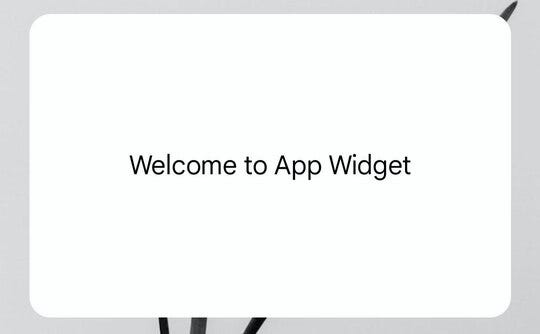
After this, you will see a simple widget with simple text.
Let’s dig deeper to understand how we can actually apply the custom fonts for the widget.
For that purpose, I have created a GlanceText, which we can use in this simple way.
| Box( | |
| modifier = GlanceModifier | |
| .fillMaxSize() | |
| .background(Color.White), | |
| contentAlignment = Alignment.Center | |
| ) { | |
| GlanceText( | |
| modifier = GlanceModifier.padding(horizontal = 20.dp), | |
| text = "Welcome to App Widget", | |
| font = R.font.good_times_rg, | |
| fontSize = 15.sp, | |
| color = Color.Black | |
| ) | |
| } |
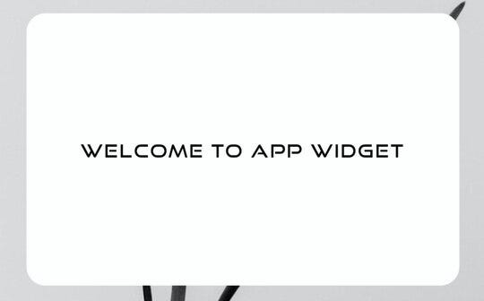
Here is the result using the GlanceText.
Old friends are coming to help

How actually GlanceText works under the hood, it uses Canvas to overcome custom font limitations in Jetpack Glance, at first I’m creating a TextPaint and then giving it the custom font and then actually drawing it with the paint. Here is the whole code, which makes it happen. Basically, you can control letterSpacing, textColor, fontSize and any other properties, which TextPaint can handle.
| fun Context.textAsBitmap( | |
| text: String, | |
| fontSize: TextUnit, | |
| color: Color = Color.Black, | |
| letterSpacing: Float = 0.1f, | |
| font: Int | |
| ): Bitmap { | |
| val paint = TextPaint(Paint.ANTI_ALIAS_FLAG) | |
| paint.textSize = spToPx(fontSize.value, this) | |
| paint.color = color.toArgb() | |
| paint.letterSpacing = letterSpacing | |
| paint.typeface = ResourcesCompat.getFont(this, font) | |
| val baseline = -paint.ascent() | |
| val width = (paint.measureText(text)).toInt() | |
| val height = (baseline + paint.descent()).toInt() | |
| val image = Bitmap.createBitmap(width, height, Bitmap.Config.ARGB_8888) | |
| val canvas = Canvas(image) | |
| canvas.drawText(text, 0f, baseline, paint) | |
| return image | |
| } |
And the code of the GlanceText which uses an Image under the hood.
| @Composable | |
| fun GlanceText( | |
| text: String, | |
| @FontRes font: Int, | |
| fontSize: TextUnit, | |
| modifier: GlanceModifier = GlanceModifier, | |
| color: Color = Color.Black, | |
| letterSpacing: TextUnit = 0.1.sp | |
| ) { | |
| Image( | |
| modifier = modifier, | |
| provider = ImageProvider( | |
| LocalContext.current.textAsBitmap( | |
| text = text, | |
| fontSize = fontSize, | |
| color = color, | |
| font = font, | |
| letterSpacing = letterSpacing.value | |
| ) | |
| ), | |
| contentDescription = null, | |
| ) | |
| } |
Basically, here you can draw anything with the canvas.
In our next article, I will try to share my experiments of creating an animation inside the widget. And in the end, I want to share one more example, where I used the GlanceText.
You can find the full code of this example in my Github repository.
And that’s it for today 🤩
Jetpack Glance gives us a new way to reimagine the Widgets. I have some ideas which will be covered in upcoming articles, stay tuned and clap if you like the article.
You can find me on X @chatikyan
Thanks for reading this article. I hope you enjoyed it.
THE END
This article was previously published on proandroiddev.com


