Blog Infos
Author
Published
Topics
, , , ,
Published

The Shared Element Transition or Container Transform is an animation that forges a visual connection between two UI elements, significantly enhancing the app’s aesthetic and user experience. By implementing transitions between screens to appear seamless and integrated, shared element transitions help maintain user engagement and spatial awareness within the app.

Using shared element transition animations retains the user’s focus on important elements, thereby reducing cognitive load and confusion and enhancing the overall user experience. These animations make app navigation more intuitive and lend a dynamic and engaging feel, significantly improving interaction quality.

In Jetpack Compose, implementing shared element transitions can be accomplished using libraries like LookaheadScope or Orbital. However, integrating these animations with the Compose Navigation library still presents some limitations.

Fortunately, the Compose UI version 1.7.0-alpha07 introduced new APIs for shared element transitions. In this article, you’ll explore how to seamlessly implement shared element transitions and the container transform across various use cases using the latest version of Compose UI.

Dependency Configuration

To use the new shared element transition APIs, make sure you use the recent version of Jetpack Compose UI and animation (after 1.7.0-alpha07) like the example below:

dependencies {
    implementation(androidx.compose.ui:ui:1.7.0-alpha07)
    implementation(androidx.compose.animation:animation:1.7.0-alpha07)
}
SharedTransitionLayout and Modifier.sharedElement

The Compose UI and animation version 1.7.0-alpha07 introduces primary APIs that allow you to implement the shared element transition, which are SharedTransitionLayout and Modifier.sharedElement:

  • SharedTransitionLayout: This Composable acts as a container providing SharedTransitionScope, which enables the use of Modifier.sharedElement among other relevant APIs. The core functionalities of shared element transitions occur within this Composable. Underneath, the SharedTransitionScope leverages the LookaheadScope API to facilitate these transitions. However, detailed knowledge of LookaheadScope is not necessary, as the new APIs effectively encapsulate this complexity.
  • Modifier.sharedElement: This modifier identifies which Composable within the SharedTransitionLayout should undergo a transformation with another Composable in the same SharedTransitionScope. It effectively marks the elements that participate in the shared element transition.

Now, let’s see the example how we can utilize both APIs:

SharedTransitionLayout {
var isExpanded by remember { mutableStateOf(false) }
val boundsTransform = { _: Rect, _: Rect -> tween<Rect>(550) }
AnimatedContent(targetState = isExpanded) { target ->
if (!target) {
Row(
modifier = Modifier
.fillMaxSize()
.padding(6.dp)
.clickable {
isExpanded = !isExpanded
}
) {
Image(
modifier = Modifier
.sharedElement(
state = rememberSharedContentState(key = "image"),
animatedVisibilityScope = this@AnimatedContent,
boundsTransform = boundsTransform,
)
.size(130.dp),
painter = painterResource(id = R.drawable.pokemon_preview),
contentDescription = null
)
Text(
modifier = Modifier
.sharedElement(
state = rememberSharedContentState(key = "name"),
animatedVisibilityScope = this@AnimatedContent,
boundsTransform = boundsTransform,
)
.fillMaxWidth()
.padding(12.dp),
text = "Lorem Ipsum is simply dummy text of the printing and typesetting industry. Lorem Ipsum has been the industry's standard dummy text ever since the 1500s, when an unknown printer took a galley of type and scrambled it to make a type specimen book. ",
fontSize = 12.sp,
)
}
} else {
Column(
modifier = Modifier
.fillMaxSize()
.clickable {
isExpanded = !isExpanded
}
) {
Image(
modifier = Modifier
.sharedElement(
state = rememberSharedContentState(key = "image"),
animatedVisibilityScope = this@AnimatedContent,
boundsTransform = boundsTransform,
)
.fillMaxWidth()
.height(320.dp),
painter = painterResource(id = R.drawable.pokemon_preview),
contentDescription = null
)
Text(
modifier = Modifier
.sharedElement(
state = rememberSharedContentState(key = "name"),
animatedVisibilityScope = this@AnimatedContent,
boundsTransform = boundsTransform,
)
.fillMaxWidth()
.padding(21.dp),
text = "Lorem Ipsum is simply dummy text of the printing and typesetting industry. Lorem Ipsum has been the industry's standard dummy text ever since the 1500s, when an unknown printer took a galley of type and scrambled it to make a type specimen book. ",
fontSize = 12.sp,
)
}
}
}
}

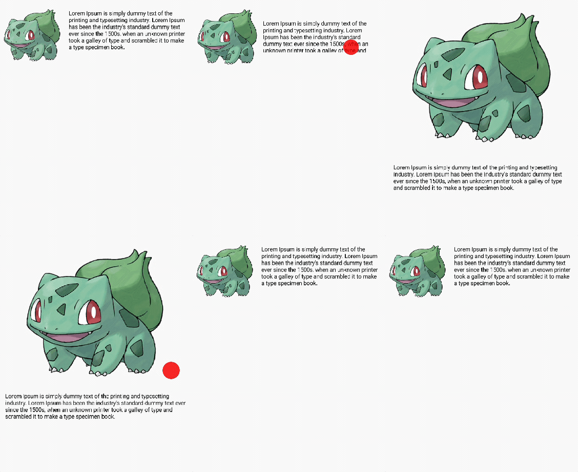
Let’s examine the example in detail. The Row contains an image and text displayed horizontally. When you click on the Row, it transforms into a Column where the image and text are arranged vertically. You may have noticed that the sharedElement modifier is used within the SharedTransitionLayout. It receives the following three parameters:

  • state: SharedContentState is designed to allow access to the properties of sharedBounds/sharedElement, such as whether a match of the same key has been found in the SharedTransitionScope. You can create a SharedContentState instance by using the rememberSharedContentState API. Provide a key that identifies which component should be matched during the animation. This key ensures the correct components are linked when the transition occurs.
  • animatedVisibilityScope: This parameter defines the bounds of the shared element based on the target state of animatedVisibilityScope. It can be integrated with the NavGraphBuilder.composable function to work seamlessly with the Compose navigation library. We will explore this in more detail in a later section.
  • boundsTransform: This lambda function takes and returns a FiniteAnimationSpec, which is used to apply the appropriate animation specifications for the shared element transition.

After running the code above, you’ll see the result below:
Shared Element Transition With Navigation

In the new shared element transition APIs, there is compatibility with the Compose Navigation library. This enhancement allows you to implement shared element transitions between Composable functions located in different navigation graphs, enabling smoother navigational flows across your app.

Let’s explore how to integrate shared element transitions with the navigation library by creating two simple screens: a home screen (including a list) and a details screen. This will demonstrate how to smoothly transition elements between these two different navigation graphs with LazyColum.

First, you should set up a NavHost with empty composable screens as shown in the example below:

@Composable
fun NavigationComposeShared() {
SharedTransitionLayout {
val navController = rememberNavController()
NavHost(navController = navController, startDestination = "home") {
composable(route = "home") {
}
composable(
route = "details/{pokemon}",
arguments = listOf(navArgument("pokemon") { type = NavType.IntType })
)
{ backStackEntry ->
}
}
}
}

To implement shared element transitions using the navigation library, it’s important to enclose the NavHost within a SharedTransitionLayout. This setup ensures that the shared element transitions are properly handled across different navigation destinations.

Then, define a sample data class called Pokemon, which includes properties for name and image. Then, create a list of mock Pokemon data as illustrated in the example below:

data class Pokemon(
val name: String,
@DrawableRes val image: Int
)
SharedTransitionLayout {
val pokemons = remember {
listOf(
Pokemon("Pokemon1", R.drawable.pokemon_preview),
Pokemon("Pokemon2", R.drawable.pokemon_preview),
Pokemon("Pokemon3", R.drawable.pokemon_preview),
Pokemon("Pokemon4", R.drawable.pokemon_preview)
)
}
val boundsTransform = { _: Rect, _: Rect -> tween<Rect>(1400) }
..

Next, let’s implement the home screen composable, which features a list of Pokemon. Each item in the list will be displayed as a row containing an image and text arranged horizontally:

composable("home") {
LazyColumn(
modifier = Modifier
.fillMaxSize()
.padding(8.dp),
verticalArrangement = Arrangement.spacedBy(8.dp)
) {
itemsIndexed(pokemons) { index, item ->
Row(
modifier = Modifier.clickable {
navController.navigate("details/$index")
}
) {
Image(
painter = painterResource(id = item.image),
contentDescription = null,
contentScale = ContentScale.Crop,
modifier = Modifier
.sharedElement(
rememberSharedContentState(key = "image-$index"),
animatedVisibilityScope = this@composable,
boundsTransform = boundsTransform
)
.padding(horizontal = 20.dp)
.size(100.dp)
)
Text(
text = item.name,
fontSize = 18.sp,
modifier = Modifier
.sharedElement(
rememberSharedContentState(key = "text-$index"),
animatedVisibilityScope = this@composable,
boundsTransform = boundsTransform
)
.align(Alignment.CenterVertically)
)
}
}
}
}

Job Offers

Job Offers

There are currently no vacancies.

OUR VIDEO RECOMMENDATION

No results found.

Jobs

In the example provided, you’ll notice that the modifiers for both the image and text components use the Modifier.sharedElement function. Each element is assigned a unique key value, allowing them to be distinguished among multiple items in the list.

To ensure the shared element transition functions correctly, the specific key values assigned to elements in the originating screen must match those used in the corresponding elements on the destination screen within the navigation flow. This matching is crucial for enabling a seamless transition between composables as you navigate through different screens.

Finally, let’s implement the details screen. This screen will simply display an image and text. Additionally, it will include functionality to navigate back to the home screen when the screen is clicked:

composable(
route = "details/{pokemon}",
arguments = listOf(navArgument("pokemon") { type = NavType.IntType })
) { backStackEntry ->
val pokemonId = backStackEntry.arguments?.getInt("pokemon")
val pokemon = pokemons[pokemonId!!]
Column(
Modifier
.fillMaxSize()
.clickable {
navController.navigate("home")
}) {
Image(
painterResource(id = pokemon.image),
contentDescription = null,
contentScale = ContentScale.Crop,
modifier = Modifier
.aspectRatio(1f)
.fillMaxWidth()
.sharedElement(
rememberSharedContentState(key = "image-$pokemonId"),
animatedVisibilityScope = this@composable,
boundsTransform = boundsTransform
)
)
Text(
pokemon.name, fontSize = 18.sp, modifier =
Modifier
.fillMaxWidth()
.sharedElement(
rememberSharedContentState(key = "text-$pokemonId"),
animatedVisibilityScope = this@composable,
boundsTransform = boundsTransform
)
)
}
}

So, the entire code will be like the one below:

@Composable
fun NavigationComposeShared() {
SharedTransitionLayout {
val pokemons = remember {
listOf(
Pokemon("Pokemon1", R.drawable.pokemon_preview),
Pokemon("Pokemon2", R.drawable.pokemon_preview),
Pokemon("Pokemon3", R.drawable.pokemon_preview),
Pokemon("Pokemon4", R.drawable.pokemon_preview)
)
}
val boundsTransform = { _: Rect, _: Rect -> tween<Rect>(1400) }
val navController = rememberNavController()
NavHost(navController = navController, startDestination = "home") {
composable("home") {
LazyColumn(
modifier = Modifier
.fillMaxSize()
.padding(8.dp),
verticalArrangement = Arrangement.spacedBy(8.dp)
) {
itemsIndexed(pokemons) { index, item ->
Row(
modifier = Modifier.clickable {
navController.navigate("details/$index")
}
) {
Image(
painter = painterResource(id = item.image),
contentDescription = null,
contentScale = ContentScale.Crop,
modifier = Modifier
.sharedElement(
rememberSharedContentState(key = "image-$index"),
animatedVisibilityScope = this@composable,
boundsTransform = boundsTransform
)
.padding(horizontal = 20.dp)
.size(100.dp)
)
Text(
text = item.name,
fontSize = 18.sp,
modifier = Modifier
.sharedElement(
rememberSharedContentState(key = "text-$index"),
animatedVisibilityScope = this@composable,
boundsTransform = boundsTransform
)
.align(Alignment.CenterVertically)
)
}
}
}
}
composable(
"details/{pokemon}",
arguments = listOf(navArgument("pokemon") { type = NavType.IntType })
) { backStackEntry ->
val pokemonId = backStackEntry.arguments?.getInt("pokemon")
val pokemon = pokemons[pokemonId!!]
Column(
Modifier
.fillMaxSize()
.clickable {
navController.navigate("home")
}) {
Image(
painterResource(id = pokemon.image),
contentDescription = null,
contentScale = ContentScale.Crop,
modifier = Modifier
.aspectRatio(1f)
.fillMaxWidth()
.sharedElement(
rememberSharedContentState(key = "image-$pokemonId"),
animatedVisibilityScope = this@composable,
boundsTransform = boundsTransform
)
)
Text(
pokemon.name, fontSize = 18.sp, modifier =
Modifier
.fillMaxWidth()
.sharedElement(
rememberSharedContentState(key = "text-$pokemonId"),
animatedVisibilityScope = this@composable,
boundsTransform = boundsTransform
)
)
}
}
}
}
}

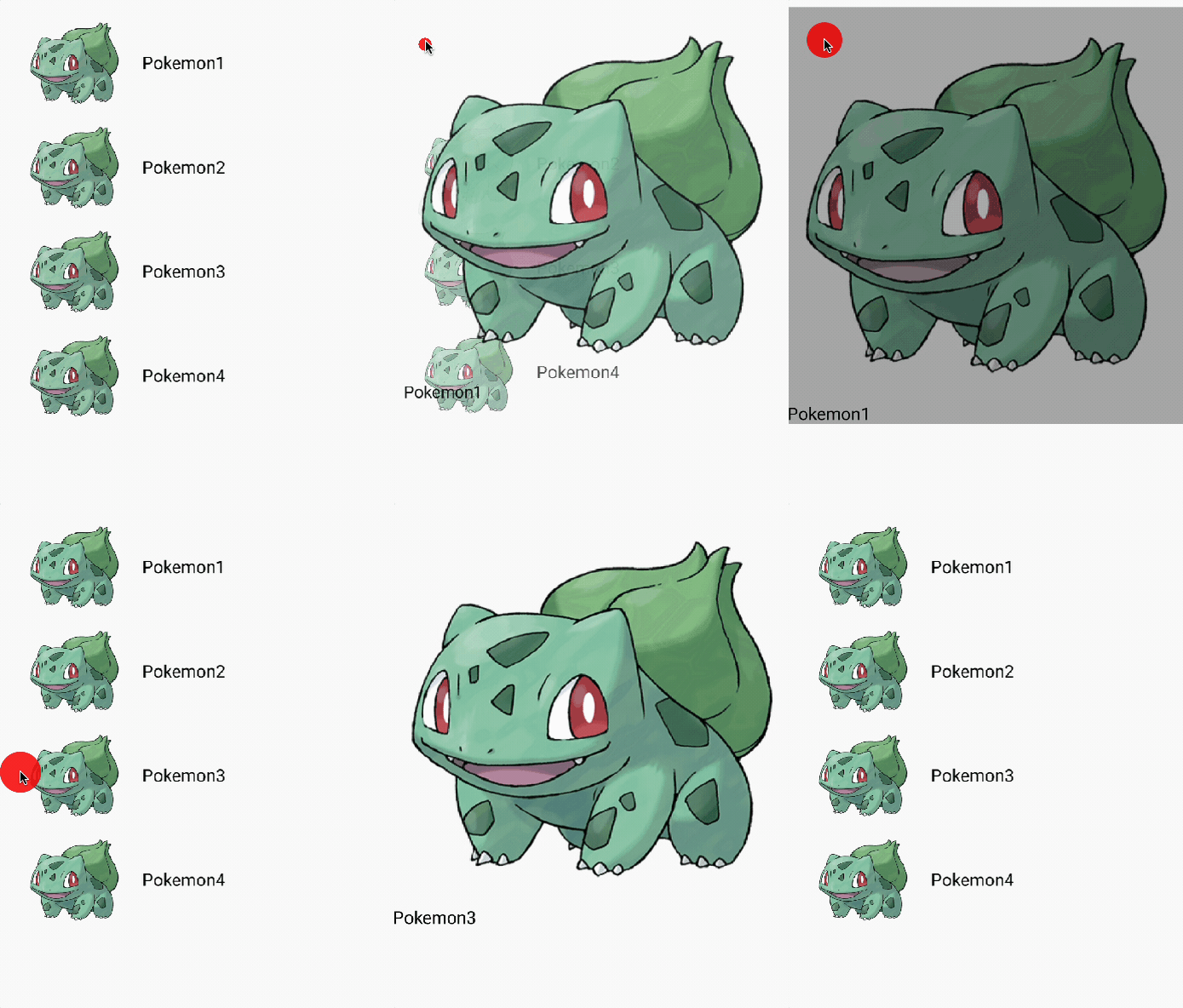
Once you run the example code provided, you will observe the following result:

If you’re interested in seeing real-world use cases, you can explore the Pokedex-Compose open-source project on GitHub, which demonstrates the shared element transition APIs in action.

Container Transform With Modifier.sharedBounds

Now, let’s explore the container transform. The Modifier.sharedBounds() is akin to Modifier.sharedElement(), but with a key difference: Modifier.sharedBounds() is intended for content that appears visually distinct across transitions, whereas Modifier.sharedElement() is used when the content remains visually consistent, such as with images. This distinction is particularly useful in scenarios like the container transform pattern.

Implementing the container transformation using the previous example is straightforward. You remove the Modifier.sharedElement() functions and add Modifier.sharedBounds() in the root hierarchy of your Composable tree. This modification allows for transitions between visually different elements across your UI components.

Let’s tweak the code from the previous section like the one below:

@Composable
fun NavigationComposeShared() {
SharedTransitionLayout {
val pokemons = remember {
listOf(
Pokemon("Pokemon1", R.drawable.pokemon_preview),
Pokemon("Pokemon2", R.drawable.pokemon_preview),
Pokemon("Pokemon3", R.drawable.pokemon_preview),
Pokemon("Pokemon4", R.drawable.pokemon_preview)
)
}
val navController = rememberNavController()
NavHost(navController = navController, startDestination = "home") {
composable("home") {
LazyColumn(
modifier = Modifier
.fillMaxWidth()
.padding(8.dp),
verticalArrangement = Arrangement.spacedBy(8.dp)
) {
itemsIndexed(pokemons) { index, item ->
Row(
modifier = Modifier.clickable {
navController.navigate("details/$index")
}
.sharedBounds(
rememberSharedContentState(key = "pokemon-$index"),
animatedVisibilityScope = this@composable,
)
.fillMaxWidth()
) {
Image(
painter = painterResource(id = item.image),
contentDescription = null,
contentScale = ContentScale.Crop,
modifier = Modifier
.padding(horizontal = 20.dp)
.size(100.dp)
)
Text(
text = item.name,
fontSize = 18.sp,
modifier = Modifier
.align(Alignment.CenterVertically)
)
}
}
}
}
composable(
"details/{pokemon}",
arguments = listOf(navArgument("pokemon") { type = NavType.IntType })
) { backStackEntry ->
val pokemonId = backStackEntry.arguments?.getInt("pokemon")
val pokemon = pokemons[pokemonId!!]
Column(
Modifier
.fillMaxWidth()
.clickable {
navController.navigate("home")
}
.sharedBounds(
rememberSharedContentState(key = "pokemon-$pokemonId"),
animatedVisibilityScope = this@composable,
)
) {
Image(
painterResource(id = pokemon.image),
contentDescription = null,
contentScale = ContentScale.Crop,
modifier = Modifier
.aspectRatio(1f)
.fillMaxWidth()
)
Text(
pokemon.name, fontSize = 18.sp, modifier =
Modifier
.fillMaxWidth()
)
}
}
}
}
}

If you examine the details, you’ll notice that the Row in the home composable and the Column in the details composable both utilize Modifier.sharedBounds(), as demonstrated in the example above. That’s all there is to it! When you run the code, you’ll be able to see the resulting animation as shown below:
Conclusion

In this article, you’ve learned how to implement shared element transitions and container transforms using various examples. It’s impressive to see how much Jetpack Compose has evolved, allowing us to easily create complex animations. Both types of animations can significantly enhance user experience by making screen navigation more intuitive and dynamic. However, it’s important to use these animations judiciously. Employing them appropriately, rather than excessively, ensures a natural and engaging user experience.

Again, if you’re interested in seeing real-world use cases, you can explore the Pokedex-Compose open-source project on GitHub, which demonstrates the shared element transition APIs and several Jetpack libraries in action.

If you have any questions or feedback on this article, you can find the author on Twitter @github_skydoves or GitHub if you have any questions or feedback. If you’d like to stay up to date with Stream, follow us on Twitter @getstream_io for more great technical content.

As always, happy coding!

— Jaewoong

This article is previously published on proandroiddev.com

YOU MAY BE INTERESTED IN

YOU MAY BE INTERESTED IN

blog
It’s one of the common UX across apps to provide swipe to dismiss so…
READ MORE
blog
In this part of our series on introducing Jetpack Compose into an existing project,…
READ MORE
blog
In the world of Jetpack Compose, where designing reusable and customizable UI components is…
READ MORE
blog

How to animate BottomSheet content using Jetpack Compose

Early this year I started a new pet project for listening to random radio…
READ MORE
Menu