

In this article we will adopt animate*asState from Jetpack Compose for using with regular Android Views
Working with user interfaces sometimes is not an easy job. On Android you have a bunch of presentation layer architectural patterns like MVP, MVI, MVVM, which are managing a view in a slightly different manner.
But in the end you are just changing a view state, no matter what pattern you are using.
You might want to show or hide something, change color, height, scale or whatever else. The easiest way to do that is just set required value, then invalidate the view and on the next frame Android framework will try to re render your view tree.
There are actually some advantages of this approach:
- View tree is always in actual state as you not launching any transitions/animations. If for whatever reason you showed some view, but later in a 100ms you want to hide it — no problem, just call view.setVisibility(View.GONE) and that’s it.
- Easy and fast to develop/modify/maintain the code as you don’t need to carry about animations. For whatever input you get from your business logic you are just immediately change view state and everything working as expected.
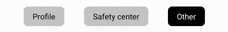
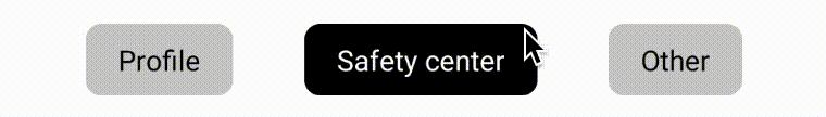
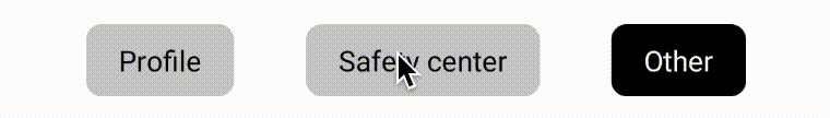
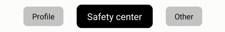
Here is an example of the UI that is using this approach:

Note how chip change its background and text color instantly, without any animation. Probably a code to implement something similar would look like this:
Lorem ipsum dolor sit amet, consectetuer adipiscing elit. Aenean commodo ligula eget dolor. Aenean massa. Cum sociis natoque penatibus et magnis dis parturient montes, nascetur ridiculus mus. Donec quam felis, ultricies nec, pellentesque eu, pretium quis, sem. Nulla consequat massa quis enim. Donec pede justo, fringilla vel, aliquet nec, vulputate eget, arcu. In enim justo, rhoncus ut, imperdiet a, venenatis vitae, justo. Nullam dictum felis eu pede mollis pretium. Integer tincidunt. Cras dapibus. Vivamus elementum semper nisi. Aenean vulputate eleifend tellus. Aenean leo ligula, porttitor eu, consequat vitae, eleifend ac, enim. Aliquam lorem ante, dapibus in, viverra quis, feugiat a, tellus. Phasellus viverra nulla ut metus varius laoreet. Quisque rutrum. Aenean imperdiet. Etiam ultricies nisi vel augue. Curabitur ullamcorper ultricies nisi. Nam eget dui. Etiam rhoncus. Maecenas tempus, tellus eget condimentum rhoncus, sem quam semper libero, sit amet adipiscing sem neque sed ipsum. Nam quam nunc, blandit vel, luctus pulvinar, hendrerit id, lorem. Maecenas nec odio et ante tincidunt tempus. Donec vitae sapien ut libero venenatis faucibus. Nullam quis ante. Etiam sit amet orci eget eros faucibus tincidunt. Duis leo. Sed fringilla mauris sit amet nibh. Donec sodales sagittis magna. Sed consequat, leo eget bibendum sodales, augue velit cursus nunc,
| class SelectableChipView | |
| @JvmOverloads constructor( | |
| context: Context, | |
| attributeSet: AttributeSet? = null, | |
| defStyleAttr: Int = 0 | |
| ) : AppCompatTextView(context, attributeSet, defStyleAttr) { | |
| init { | |
| clipToOutline = true | |
| outlineProvider = object : ViewOutlineProvider() { | |
| override fun getOutline(view: View, outline: Outline) { | |
| outline.setRoundRect(0, 0, view.width, view.height, 20f) | |
| } | |
| } | |
| // here we are just adding round rect or "chip" shape to our view | |
| } | |
| fun bind(isSelected: Boolean) { | |
| setBackgroundColor(if (isSelected) Color.BLACK else Color.LTGRAY) | |
| setTextColor(if (isSelected) Color.WHITE else Color.BLACK) | |
| // here we are changing a colors depending on isSelectedFlag | |
| } | |
| } |
Inside of the bind(isSelected) method we are just changing internal properties of a text view depending on a boolean flag. So we might say that our view has 2 states: selected and not selected.
But what if we want to make this a bit more pleasant for the user?
We could at least try to add a color animation to change background and text color. A main point to take care of here is that the
animation must be cancelable and reversible
This means that if we are currently animating one tab, when another tab is selected we should be able to cancel animation on a first tab, animate it back to un selected state, while animating second tab to selected state. Therefore you should have some kind of animation state.
A Jetpack Compose can be inspiration for this. It introduced a bunch of animate*asState functions which are managing state of the animation internally.
| val color by animateColorAsState( | |
| targetValue = if (isSelected) { | |
| Color.White | |
| } else { | |
| Color.Black | |
| }, | |
| animationSpec = tween(durationMillis = 100, easing = LinearEasing) | |
| ) |
When you update isSelected property this function will cancel current animation (if any) and animate from current animation state to target state with specific animation spec.
This is cool for compose based UI, but what with “legacy” android views? When adopting compose to your app not all screens can be refactored instantly and you might want to just modify existing view implementation.
Let’s try to achieve something similar with ValueAnimators.
AnimatedColor
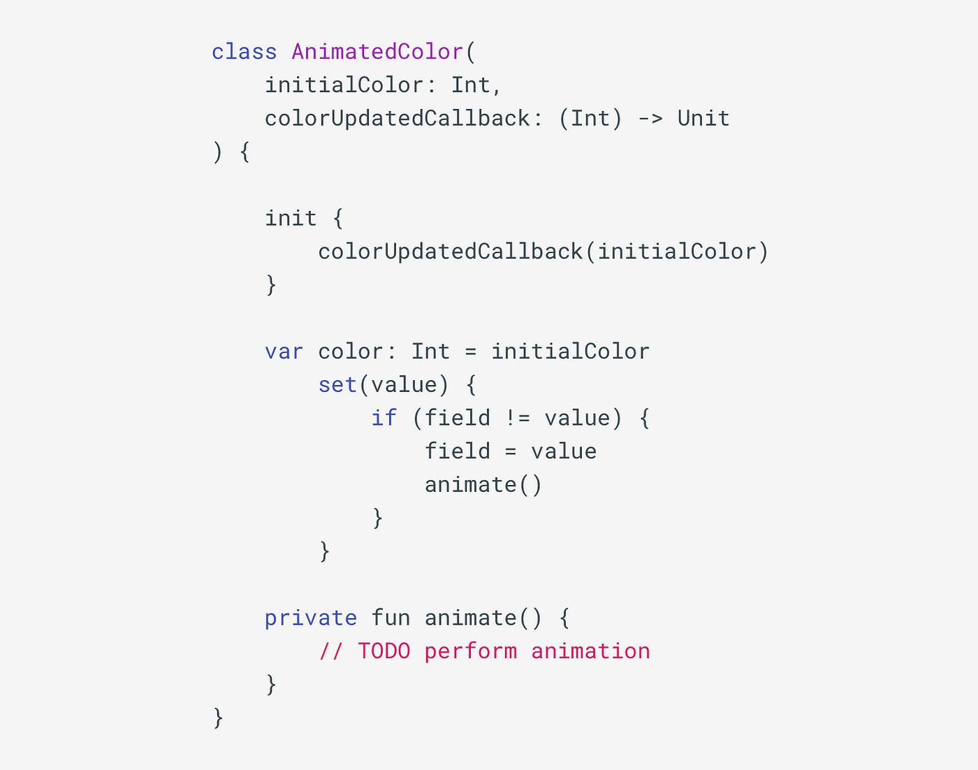
An AnimatedColor class with animation state managing could look like this:
An AnimatedColor class with animation state managing could look like this:
 animated color #1
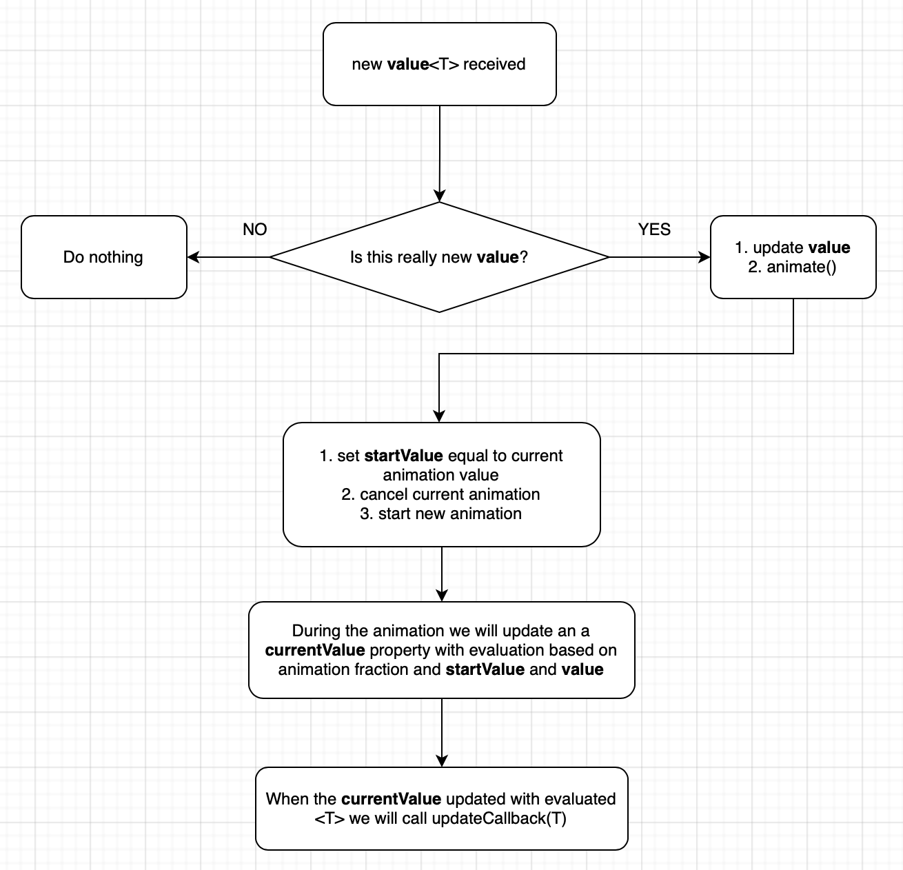
We will have a single public property called color, and an update callback. Update callback will be called immediately after creating this class to set initial color and later it will be called when animation is running. When new color will be set, AnimatedColor will check if this color is the same, if not it will start an animation.
 animated color #2 animation part
Now the animation part. There will be a property called animator which will represent a current animator. And when the new target color value is set and animation triggered, we will
- get current color from the animation state
- cancel current running animator
- create a new animator which will animate previously retrieved color to target
- launch new animator
- call colorUpdatedCallback with new value retrieved from animation update
This is how we will create this animation from code:
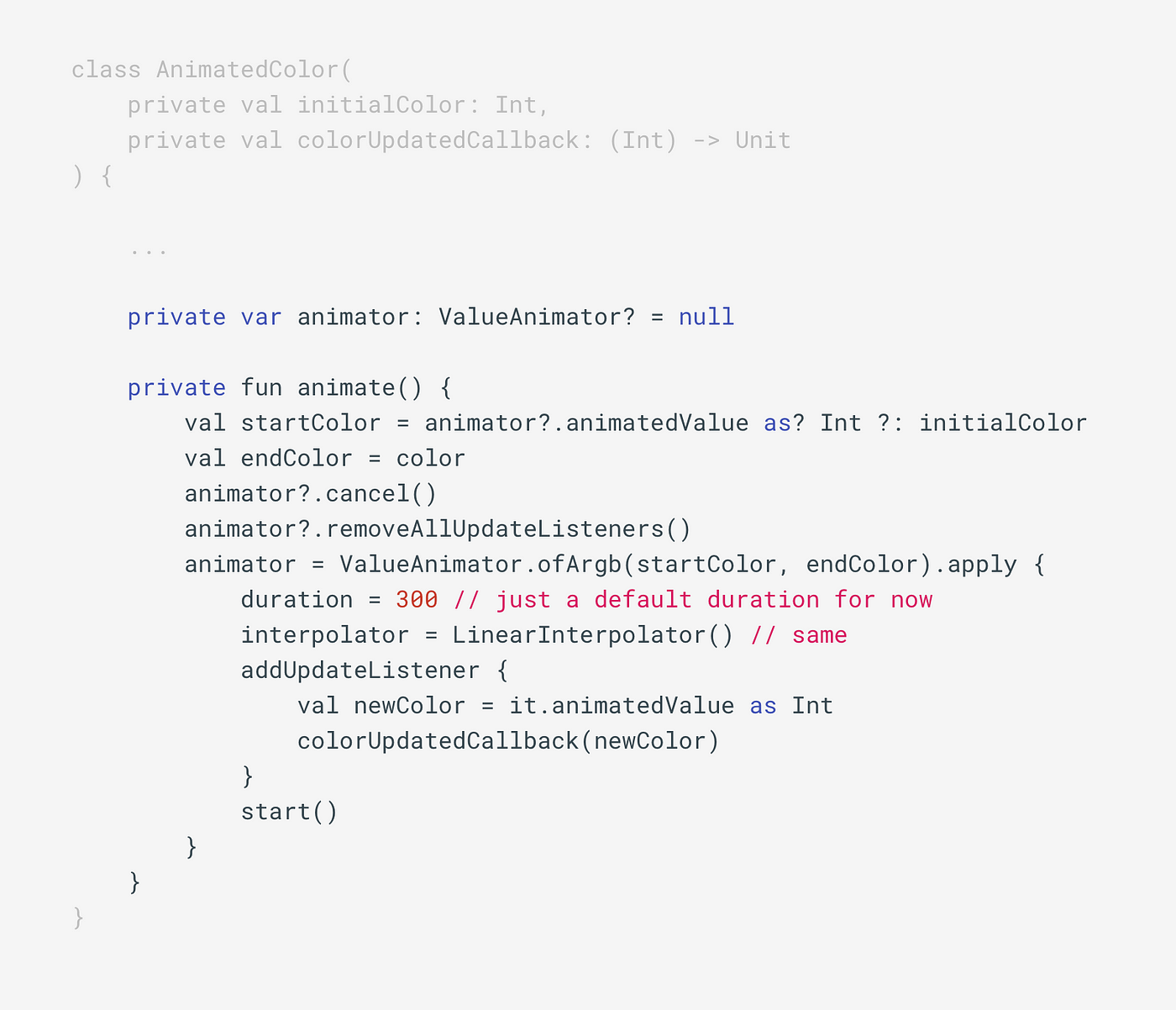
 usage of AnimatedColor class
As you see using this is pretty easy, you just assign a new target color to color property of AnimatedColor class and it will animate a color automatically. Also notice how AnimatedColor is storing current state of the animation and no additional work required. Here is current animation result:
I intentionally slowed down the animation speed so we can see that this animation is cancelable and reversible.
AnimatedValue
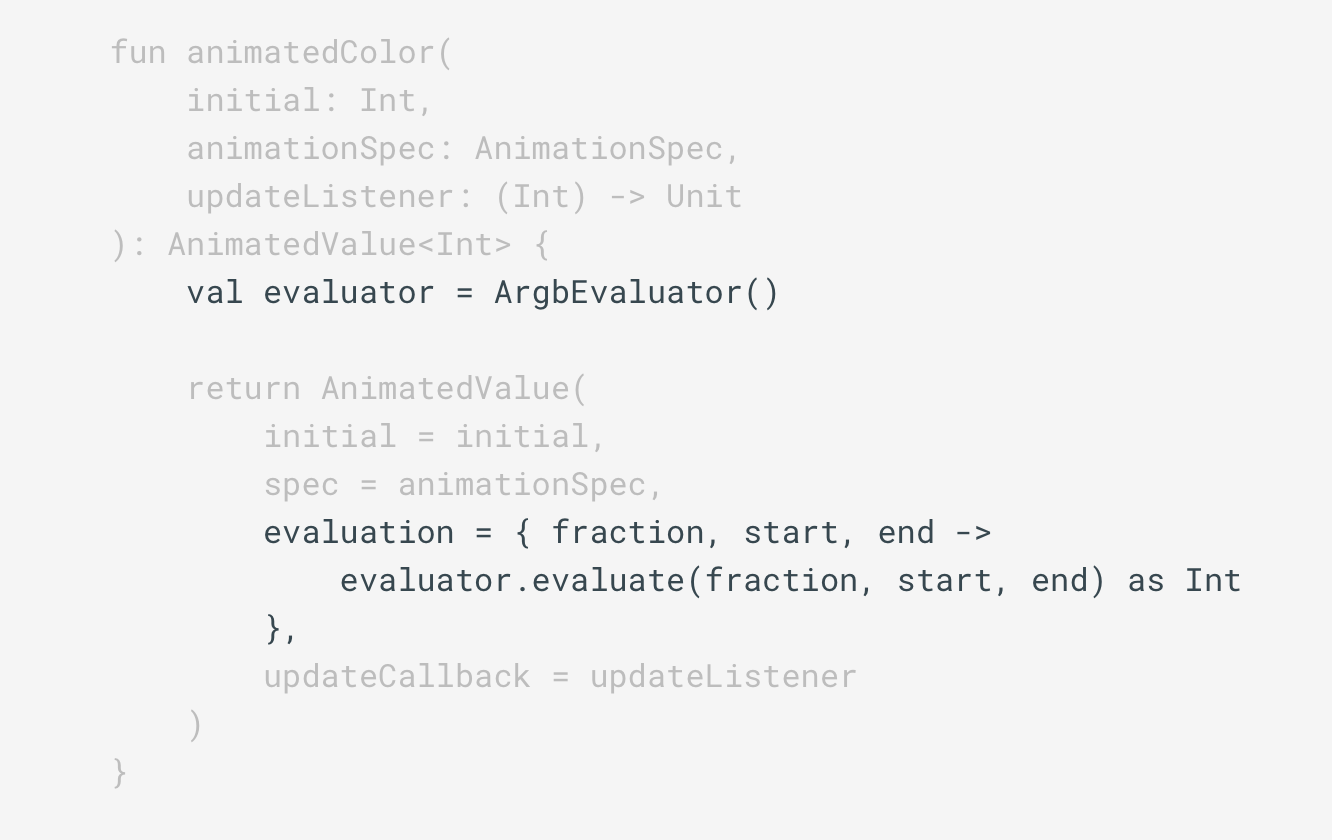
Actually we can abstract more and create more generic class for handling this. Instead of a color we will have a <T> generic value, and instead of creating new ValueAnimator each time we need to run animation, we can reuse existing animator.
And actually we don’t need to animate between a color values to animate color. We could just always animate between 0f and 1f with specified time and interpolation, and later just convert somehow this animated float value into <T>. And this “T” could be any type, it could be an Int representing a color, or Int representing a x coordinate of a view, we really don’t care. All we need is to evaluate a float between 0f and 1f into this “T”.
For this purposes Android animation framework provides us with TypeEvaluator<T>. This interface has only one method:
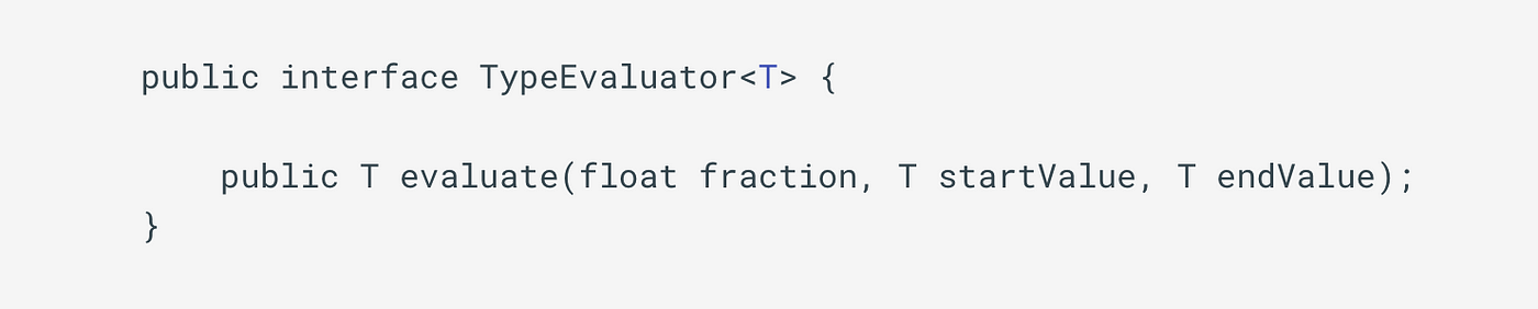 TypeEvaluator interface
Evaluate method based on current animation fraction (float) and start and end values will return a value T. That’s what we need. And Android framework already provides us with few implementations of this TypeEvaluator. There are an ArgbEvaluator for evaluating colors, FloatEvaluator, IntEvaluator and a few others.
One last thing we need to solve is to store current state of animation. Our AnimatedValue class will have 3 fields:
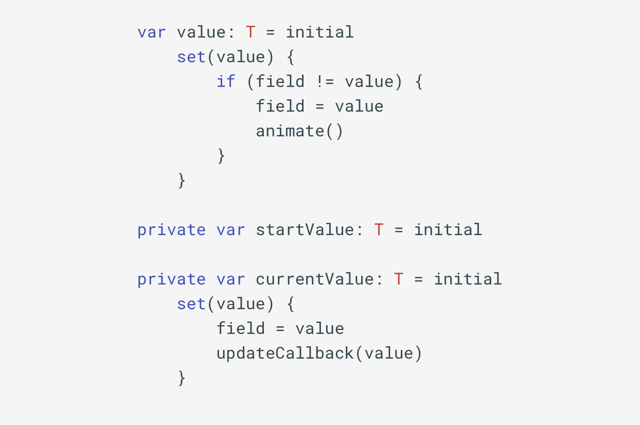
- value is needed for updating target state
- startValue is needed for storing startValue of a new animation when previous animation canceled
- currentValue represents current state of the animation
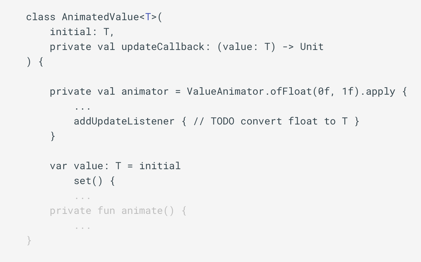
| class AnimatedValue<T>( | |
| initial: T, | |
| private val spec: AnimationSpec, | |
| private val updateCallback: (value: T) -> Unit, | |
| private val evaluation: (fraction: Float, startValue: T, endValue: T) -> T | |
| ) { | |
| private var animator = ValueAnimator.ofFloat(0f, 1f).apply { | |
| duration = spec.duration | |
| interpolator = spec.interpolator | |
| addUpdateListener { currentValue = evaluation(it.animatedFraction, startValue, value) } | |
| } | |
| init { | |
| updateCallback(initial) | |
| } | |
| var value: T = initial | |
| set(value) { | |
| if (field != value) { | |
| field = value | |
| animate() | |
| } | |
| } | |
| private var startValue: T = initial | |
| private var currentValue: T = initial | |
| set(value) { | |
| field = value | |
| updateCallback(value) | |
| } | |
| private fun animate() { | |
| startValue = currentValue | |
| animator.cancel() | |
| animator.start() | |
| } | |
| fun dispose() { | |
| animator.cancel() | |
| animator.removeAllListeners() | |
| } | |
| } |
AnimatedValue<T> full code
OUR VIDEO RECOMMENDATION


Jobs
How all this are going to work:
For all animating values we could introduce a functions with using own evaluator just for convenience.
In terms of animation UI currently nothing changed. We still have our 60 fps smooth cancelable and reversible animation.
But what if we wanted to add something like animating a change of scale for currently selected tab? How difficult would that be? You are right! Easy-peasy.
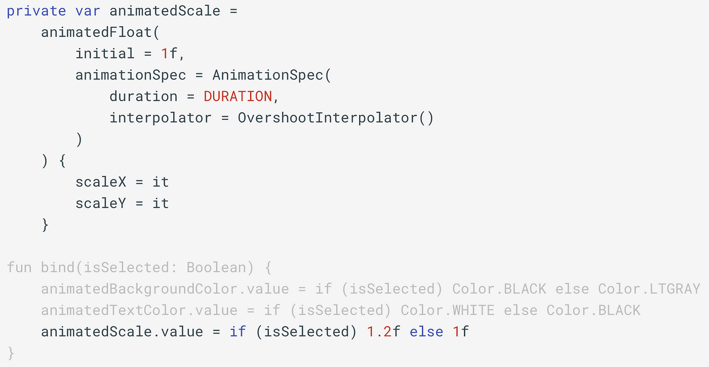
With only few lines of code we again created cancelable state based animation.
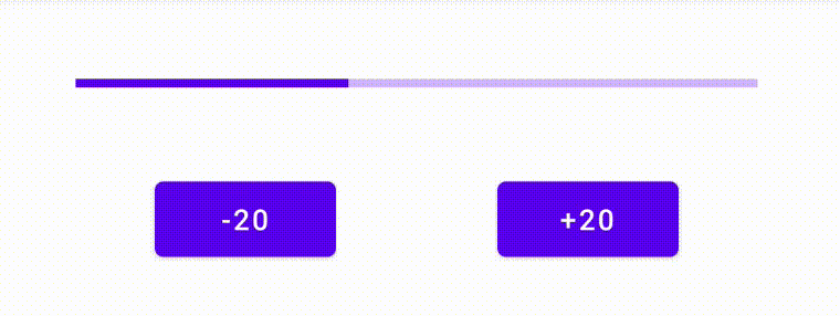
A few other things that can be animated with this:
Hope you enjoyed the reading and will consider to apply this approach into your applications. As always all of the source code is available on GitHub. Cheers!


