

In this blog post, we will explore the ScalingLazyColumn composable. It makes adding scaling and alpha animations in a scrollable container really easy.
If you are interested in exploring other components in Compose for Wear OS you can check out other blogs that I have written.
Series pitstops
- Compose for Wear OS: Scaffold
- Compose for Wear OS: ScalingLazyColumn (You’re here)
- Compose for Wear OS: Navigation
If you have used LazyColumn in Jetpack Compose, you will find this composable similar to it. In fact, internally ScalingLazyColumn uses LazyColumn. Let’s understand the differences between these two composables and when to use which one while making apps in Wear OS.
Let’s add the required dependencies
| def wearVersion = "1.0.0-alpha08" | |
| implementation "androidx.wear.compose:compose-material:$wearVersion" |
Let’s have a look at the method signature of ScalingLazyColumn
| @Composable | |
| public fun ScalingLazyColumn( | |
| modifier: Modifier = Modifier, | |
| scalingParams: ScalingParams = ScalingLazyColumnDefaults.scalingParams(), | |
| reverseLayout: Boolean = false, | |
| verticalArrangement: Arrangement.Vertical = | |
| Arrangement.spacedBy( | |
| space = 4.dp, | |
| alignment = if (!reverseLayout) Alignment.Top else Alignment.Bottom | |
| ), | |
| horizontalAlignment: Alignment.Horizontal = Alignment.Start, | |
| contentPadding: PaddingValues = PaddingValues(horizontal = 8.dp), | |
| state: ScalingLazyListState = rememberScalingLazyListState(), | |
| content: ScalingLazyListScope.() -> Unit | |
| ) |
If you have used LazyColumn before, most of these parameters would look familiar to you. reverseLayout will lay the items of the list from bottom to top and reverse the direction of scrolling if given the true value. verticalArrangement lays the items of the list with a top or bottom alignment based on the reverseLayout value and gives a default spacing to all the items of the list. horizontalAlignment as the name suggests lays the the items of the list horizontally. Similar to other composables you can provide modifier, contentPadding, state and content to it.
scalingParams is the parameter responsible for adding the scaling and alpha animations for the list items that are at the top or bottom edge of the screen. The gif later in the blog will help you to visualise this animation. The method ScalingLazyColumnDefaults.scalingParams() takes a bunch of parameters that have default values. This is how the method signature of the above method looks like
| fun scalingParams( | |
| edgeScale: Float = 0.5f, | |
| edgeAlpha: Float = 0.5f, | |
| minElementHeight: Float = 0.2f, | |
| maxElementHeight: Float = 0.8f, | |
| minTransitionArea: Float = 0.2f, | |
| maxTransitionArea: Float = 0.6f, | |
| scaleInterpolator: Easing = CubicBezierEasing(0.25f, 0.00f, 0.75f, 1.00f), | |
| viewportVerticalOffsetResolver: (Constraints) -> Int = { (it.maxHeight / 5f).toInt() } | |
| ) |
OUR VIDEO RECOMMENDATION


Jobs
I won’t go into detail about what each of these parameters is, I would suggest to just play around with these values to get the desired scaling and alpha animations for your list. All these float values are between 0f and 1f which represents the percentage of the normal values so if edgeScale has a value of 0.5f, its size will be 50% of its normal size when animated along the edge.
Let’s have a look at this video to see the difference between LazyColumn and ScalingLazyColumn
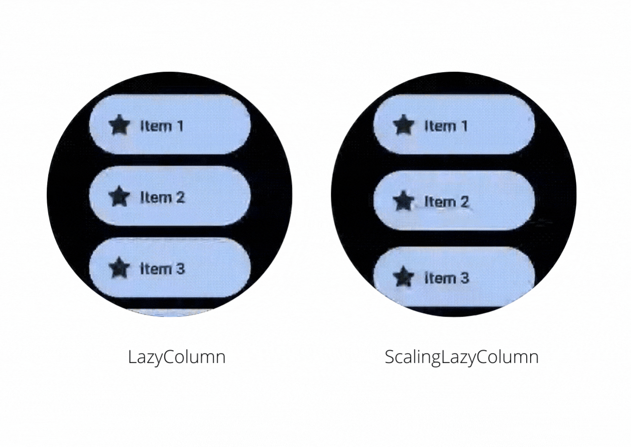
On the right, you will notice that the ScalingLazyColumn adds a subtle animation on the edges when you scroll the content inside it. While making an app in Wear OS if you want to have such animations then you should use the ScalingLazyColumn otherwise you can use LazyColumn and avoid the cost of calculating the scaling and alpha animations required for the list items.
This is the code required to implement ScalingLazyColumn like the one shown in the video
| ScalingLazyColumn( | |
| modifier = Modifier.fillMaxSize(), | |
| contentPadding = PaddingValues( | |
| top = 10.dp, | |
| start = 10.dp, | |
| end = 10.dp, | |
| bottom = 40.dp | |
| ), | |
| horizontalAlignment = Alignment.CenterHorizontally, | |
| state = scalingLazyListState | |
| ) { | |
| items(10) { index -> | |
| Chip( | |
| modifier = Modifier | |
| .width(140.dp) | |
| .padding(top = 10.dp), | |
| icon = { | |
| Icon( | |
| painter = painterResource(id = android.R.drawable.btn_star_big_on), | |
| contentDescription = "Star", | |
| modifier = Modifier | |
| .size(24.dp) | |
| .wrapContentSize(align = Alignment.Center), | |
| ) | |
| }, | |
| label = { | |
| Text( | |
| modifier = Modifier.fillMaxWidth(), | |
| color = MaterialTheme.colors.onPrimary, | |
| text = "Item ${index + 1}" | |
| ) | |
| }, | |
| onClick = {} | |
| ) | |
| } | |
| } |
The composable used inside ScalingLazyColumn is Chip, it is another composable that is part of the Compose for Wear OS library. You can use it to add a material design chip in your wearable apps.
If you have feedback, feel free to tweet/message me on Twitter.


