

I’ve spent the last few weeks learning about compose and decided to write a post to share my notes. This post is not meant to teach you everything about Compose but rather it’ll be more like a cheat sheet that you can use to learn Compose or to see what you still don’t know about Compose.
This article will be constantly updated as I learn new things.
State hoisting
State hoisting is a pattern of moving state up to make a component stateless.
When applied to composables, this often means introducing two parameters to the composable.
- value: T — the current value to display
- onValueChange: (T) -> Unit — an event that requests the value to change, where T is the proposed new value
CompositionLocal
Tool for passing data down through the Composition implicitly.
| CompositionLocalProvider(LocalContentAlpha provides ContentAlpha.medium) { | |
| Text(...) | |
| } | |
| CompositionLocalProvider(LocalContentAlpha provides ContentAlpha.disabled) { | |
| Icon(...) | |
| Text(...) | |
| } |
compositionLocalOf
Changing the value provided during recomposition invalidates only the content that reads its current value.
| data class Elevations(val card: Dp = 0.dp, val default: Dp = 0.dp) | |
| val LocalElevations = compositionLocalOf { Elevations() } // Create composition with default value | |
| val elevations = Elevations(card = 4.dp, default = 2.dp) // Provide different value here | |
| CompositionLocalProvider(LocalElevations provides elevations) { ... } |
staticCompositionLocalOf
Reads of a staticCompositionLocalOf are not tracked by Compose. Changing the value causes the entirety of the content lambda where the CompositionLocal is provided to be recomposed.
If the value provided to the CompositionLocal is highly unlikely to change or will never change, use staticCompositionLocalOf to get performance benefits.
Keeping track of changes
remember
A value computed by remember will be stored in the composition tree, and only be recomputed if the keys to remember change.
When adding memory to a composable, always ask yourself “will some caller reasonably want to control this?”
- If the answer is yes, make a parameter instead.
- If the answer is no, keep it as a local variable.
Remember stores values in the Composition, and will forget them if the composable that called remember is removed. This means you shouldn’t rely upon remember to store important things inside of composables that add and remove children such as LazyColumn.
rememberSaveable
It behaves similarly to remember, but the stored value will survive the activity or process recreation using the saved instance state mechanism
rememberUpdatedState
In some situations you might want to capture a value in your effect that, if it changes, you do not want the effect to restart. Create a reference to this value which can be captured and updated.
rememberLauncherForActivityResult
| val result = remember { mutableStateOf<Bitmap?>(null) } | |
| val launcher = rememberLauncherForActivityResult(ActivityResultContracts.TakePicturePreview()) { | |
| result.value = it | |
| } | |
| Button(onClick = { launcher.launch() }) { ... } | |
| result.value?.let { image -> | |
| Image(image.asImageBitmap(), null, modifier = Modifier.fillMaxWidth()) | |
| } |
rememberCoroutineScope
In order to launch a coroutine outside of a composable, but scoped so that it will be automatically canceled once it leaves the composition
LaunchedEffect is used for scoping jobs initiated by the composition.rememberCoroutineScope is for scoping jobs initiated by a user interaction.
LaunchedEffect
Call suspend functions safely from inside a composable.
The coroutine will be cancelled if LaunchedEffect leaves the composition.
If LaunchedEffect is recomposed with different keys, the existing coroutine will be cancelled and the new suspend function will be launched in a new coroutine.
| val currentOnTimeout by rememberUpdatedState(onTimeout) | |
| LaunchedEffect(true) { | |
| delay(SplashWaitTimeMillis) | |
| currentOnTimeout() | |
| } |
snapshotFlow
Convert Compose State<T> objects into a Flow.
DisposableEffect
DisposableEffect is meant for side effects that need to be cleaned up after the keys change or the composable leaves the Composition.
| DisposableEffect(dispatcher) { | |
| dispatcher.addCallback(backCallback) | |
| onDispose { | |
| backCallback.remove() | |
| } | |
| } |
derivedStateOf
derivedStateOf is used when you want a Compose State that’s derived from another State.
State Holder
State holders always need to be remembered in order to keep them in the Composition and not create a new one every time. It’s a good practice to create a method in the same file that does this to remove boilerplate and avoid any mistakes that might occur.
Layouts

LazyColumn and LazyRow
Don’t recycle their children like RecyclerView. It emits new Composables as you scroll through it and is still performant as emitting Composables is relatively cheap compared to instantiating Android Views.
| val listState = rememberLazyListState() | |
| LazyColumn( | |
| contentPadding, | |
| verticalArrangement / horizontalArrangement = Arrangement.spacedBy | |
| ) { | |
| stickyHeader { Header() } // Experimental | |
| items(5) { index -> Text(text = "Item: $index") } // key = ... | |
| item { Text(text = "Last item") } | |
| } | |
| LaunchedEffect(listState) { | |
| snapshotFlow { listState.firstVisibleItemIndex } | |
| } | |
| firstVisibleItemIndex | |
| firstVisibleItemScrollOffset | |
| scrollToItem() | |
| animateScrollToItem() |
ConstraintLayout
| ConstraintLayout { | |
| val (button, text) = createRefs() | |
| Button( | |
| modifier = Modifier.constrainAs(button) { | |
| top.linkTo(parent.top, margin = 16.dp) | |
| } | |
| ) | |
| Text("Text", Modifier.constrainAs(text) { | |
| top.linkTo(button.bottom, margin = 16.dp) | |
| }) | |
| } | |
| ConstraintSet { | |
| val button = createRefFor("button") | |
| val text = createRefFor("text") | |
| constrain(button) { ... } | |
| constrain(text) { ... } | |
| } |
Layout
Instead of controlling how a single composable gets measured and laid out on the screen, you might have the same necessity for a group of composables. For that, you can use the Layout composable to manually control how to measure and position the layout’s children.
| Layout( | |
| modifier = modifier, | |
| content = content | |
| ) { measurables, constraints -> | |
| // Don't constrain child views further, measure them with given constraints | |
| val placeables = measurables.map { measurable -> measurable.measure(constraints) } | |
| // Set the size of the layout as big as it can | |
| layout(constraints.maxWidth, constraints.maxHeight) { | |
| var yPosition = 0 | |
| placeables.forEach { placeable -> | |
| placeable.placeRelative(x = 0, y = yPosition) | |
| yPosition += placeable.height | |
| } | |
| } | |
| } |
Intrinsic measurements
Row(modifier = modifier.height(IntrinsicSize.Min))
Navigation
ViewModel
| @HiltViewModel | |
| class ExampleViewModel @Inject constructor( | |
| ... | |
| ) : ViewModel() { /* ... */ } | |
| @AndroidEntryPoint | |
| class ExampleActivity : AppCompatActivity() | |
| @Composable | |
| fun ExampleScreen( | |
| exampleViewModel: ExampleViewModel = viewModel() | |
| ) { /* ... */ } |
Animation
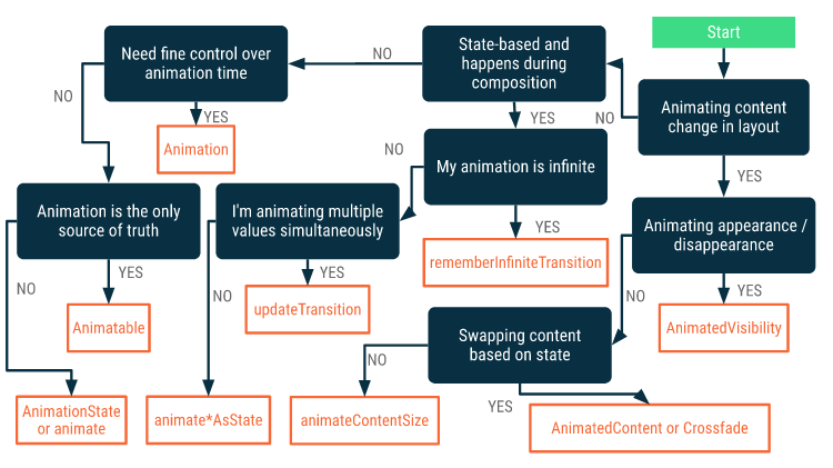
You can create an animation value by simply wrapping the changing value with the corresponding variant of animate*AsState composables.
You can combine multiple transition objects with a + operator.
| MutableTransitionState(false).apply { | |
| targetState = true // Start the animation immediately | |
| // isIdle, currentState | |
| } |
OUR VIDEO RECOMMENDATION


Jobs
AnimatedVisibility
- Content within
AnimatedVisibility(direct or indirect children) can use the animateEnterExit modifier to specify different animation behavior for each of them.
AnimatedContent
SizeTransformdefines how the size should animate between the initial and the target contents.
animateContentSize
- Animates a size change
Crossfade
- Animates between two layouts with a crossfade animation
Animatable
- Animatable is a value holder that can animate the value as it is changed via
animateTo. snapTosets the current value to the target value immediately.animateDecaystarts an animation that slows down from the given velocity.
| val color = remember { Animatable(Color.Gray) } | |
| LaunchedEffect(ok) { color.animateTo(if (ok) Color.Green else Color.Red) } |
InfiniteTransition
- Holds one or more child animations like Transition, but the animations start running as soon as they enter the composition and do not stop unless they are removed.
- Use the
rememberInfiniteTransitionfunction.
Transition
Transition manages one or more animations as its children and runs them simultaneously between multiple states.
| var currentState by remember { mutableStateOf(BoxState.Collapsed) } | |
| val transition = updateTransition(currentState) | |
| // Start in collapsed state and immediately animate to expanded | |
| var currentState = remember { MutableTransitionState(BoxState.Collapsed) } | |
| currentState.targetState = BoxState.Expanded | |
| val transition = updateTransition(currentState) | |
| transition.AnimatedVisibility | |
| transition.AnimatedContent |
AnimationSpec
| spring( | |
| dampingRatio = Spring.DampingRatioHighBouncy, | |
| stiffness = Spring.StiffnessMedium | |
| ) | |
| tween( | |
| durationMillis = 300, | |
| delayMillis = 50, | |
| easing = LinearOutSlowInEasing | |
| ) | |
| // animates based on the snapshot values specified at different timestamps | |
| keyframes { | |
| durationMillis = 375 | |
| 0.0f at 0 with LinearOutSlowInEasing // for 0-15 ms | |
| 0.2f at 15 with FastOutLinearInEasing // for 15-75 ms | |
| 0.4f at 75 // ms | |
| 0.4f at 225 // ms | |
| } | |
| // runs a animation repeatedly until it reaches the specified iteration count | |
| repeatable( | |
| iterations = 3, | |
| animation = tween(durationMillis = 300), | |
| repeatMode = RepeatMode.Reverse | |
| ) | |
| // like repeatable, but it repeats for an infinite amount of iterations | |
| infiniteRepeatable( | |
| animation = tween(durationMillis = 300), | |
| repeatMode = RepeatMode.Reverse | |
| ) | |
| // immediately switches the value to the end value | |
| snap(delayMillis = 50) |
Theming
When defining colors, we name them “literally”, based on the color value, rather than “semantically” e.g. Red500 not primary. This enables us to define multiple themes e.g. another color might be considered primary in dark theme or on a differently styled screen.
isSystemInDarkTheme() / MaterialTheme.colors.isLight
color: Color = MaterialTheme.colors.surface, contentColor: Color = contentColorFor(color)
When setting the color of any elements, prefer using a Surface to do this as it sets an appropriate content color CompositionLocal value, be wary of direct Modifier.background calls which do not set an appropriate content color.
TextFieldDefaults
textFieldColors
outlinedTextFieldColors
ProvideTextStyle
So how do components set a theme typography style? Under the hood they use the ProvideTextStyle composable (which itself uses a CompositionLocal) to set a “current” TextStyle. The Text composable defaults to querying this “current” style if you do not provide a concrete textStyle parameter.
Resources
| stringResource(R.string.congratulate, "New Year", 2021) | |
| dimensionResource(R.dimen.padding_small) | |
| painterResource(id = R.drawable.ic_logo) | |
| animatedVectorResource(id = R.drawable.animated_vector) | |
| Icon(Icons.Rounded.Menu) |
Fonts
buildAnnotatedString
| buildAnnotatedString { | |
| append("This is some unstyled text\\n") | |
| withStyle(SpanStyle(color = Color.Red)) { | |
| append("Red text\\n") | |
| } | |
| pushStringAnnotation(tag = "URL", annotation = "<https://developer.android.com>") | |
| withStyle(SpanStyle(fontSize = 24.sp)) { | |
| append("Large text") | |
| } | |
| pop() | |
| } |
Generic Modifiers
| align | |
| alignBy | |
| // animateEnterExit modifier can be used for any direct or indirect children | |
| // of AnimatedVisibility to create a different enter/exit animation than | |
| // what's specified in AnimatedVisibility. | |
| animateEnterExit(enter, exit) | |
| border | |
| background | |
| clip | |
| clipToBounds | |
| drawBehind | |
| drawWithCache | |
| drawWithContent | |
| // The draw layer can be invalidated separately from parents. | |
| // scaleX, scaleY, rotationXYZ, alpha, shadowElevation, shape, clip, shape | |
| // Use with state values such as ScrollState or LazyListState | |
| graphicsLayer | |
| shadow | |
| zIndex | |
| onKeyEvent | |
| // Creates a LayoutModifier that allows changing how the wrapped element is | |
| // measured and laid out. | |
| layout | |
| absoluteOffset | |
| offset | |
| fillMaxHeight, fillMaxWidth, fillMaxSize | |
| // matches the size of the Box after all other children have been measured | |
| // to obtain the Box's size. | |
| matchParentSize | |
| heighIn(min, max), widthIn(min, max) |
Gesture Modifiers
| combinedClickable(onLongClick, onDoubleClick, onClick) | |
| draggable( | |
| orientation = Orientation.Horizontal, | |
| state = rememberDraggableState { delta -> | |
| val newValue = offsetPosition.value + delta | |
| offsetPosition.value = newValue.coerceIn(minPx, maxPx) | |
| } | |
| ) | |
| swipeable( | |
| state = swipeableState, | |
| anchors = anchors, | |
| thresholds = { _, _ -> FractionalThreshold(0.3f) }, | |
| orientation = Orientation.Horizontal | |
| ) | |
| pointerInput(Unit) { | |
| detectTapGestures(onPress, onDoubleTap, onLongPress, onTap) | |
| detectDragGestures { change, dragAmount -> | |
| change.consumeAllChanges() | |
| offsetX += dragAmount.x | |
| offsetY += dragAmount.y | |
| } | |
| } | |
| horizontalScroll, verticalScroll | |
| // Detects the scroll gestures, but does not offset its contents. | |
| // Has nested scroll built in | |
| scrollable | |
| nestedScroll(nestedScrollConnection, nestedScrollDispatcher) |
Miscelaneous
LocalSoftwareKeyboardController
| val keyboardController = LocalSoftwareKeyboardController.current | |
| // Calling this function is considered a side-effect and should not be called directly from recomposition | |
| keyboardController.hide() |
LocalOnBackPressedDispatcherOwner and BackHandler
| var backHandlingEnabled by remember { mutableStateOf(true) } | |
| var backPressedCount by remember { mutableStateOf(0) } | |
| BackHandler(backHandlingEnabled) { backPressedCount++ } | |
| val dispatcher = LocalOnBackPressedDispatcherOwner.current!!.onBackPressedDispatcher | |
| Button(onClick = { dispatcher.onBackPressed() }) { | |
| Text("Press Back count $backPressedCount") | |
| } |
LocalDensity
| val sizeInPx = with(LocalDensity.current) { 16.dp.toPx() } | |
| val (minPx, maxPx) = with(LocalDensity.current) { min.toPx() to max.toPx() } |
FocusRequester
| val focusRequester = remember { FocusRequester() } | |
| var color by remember { mutableStateOf(Black) } | |
| Box( | |
| Modifier | |
| .clickable { focusRequester.requestFocus() } | |
| .border(2.dp, color) | |
| // The focusRequester should be added BEFORE the focusable. | |
| .focusRequester(focusRequester) | |
| // The onFocusChanged should be added BEFORE the focusable that is being observed. | |
| .onFocusChanged { color = if (it.isFocused) Green else Black } | |
| .focusable() | |
| ) |
Thank you for reading. If you have any suggestions feel free to contact me.
Resources
https://developer.android.com/jetpack/compose/architecture
https://developer.android.com/jetpack/compose/resources
https://developer.android.com/jetpack/compose/animation
https://developer.android.com/jetpack/compose/gestures
https://developer.android.com/jetpack/compose/navigation
https://developer.android.com/jetpack/compose/modifiers-list
https://developer.android.com/jetpack/compose/mental-model
https://developer.android.com/jetpack/compose/compositionlocal
https://developer.android.com/codelabs/jetpack-compose-basics
https://developer.android.com/codelabs/jetpack-compose-layouts
https://developer.android.com/codelabs/jetpack-compose-state
https://developer.android.com/codelabs/jetpack-compose-theming
https://developer.android.com/codelabs/jetpack-compose-animation
https://developer.android.com/codelabs/jetpack-compose-navigation
https://developer.android.com/codelabs/jetpack-compose-advanced-state-side-effects
https://developer.android.com/reference/kotlin/androidx/compose/runtime/
Originally published at https://victorbrandalise.com on October 19, 2021.


