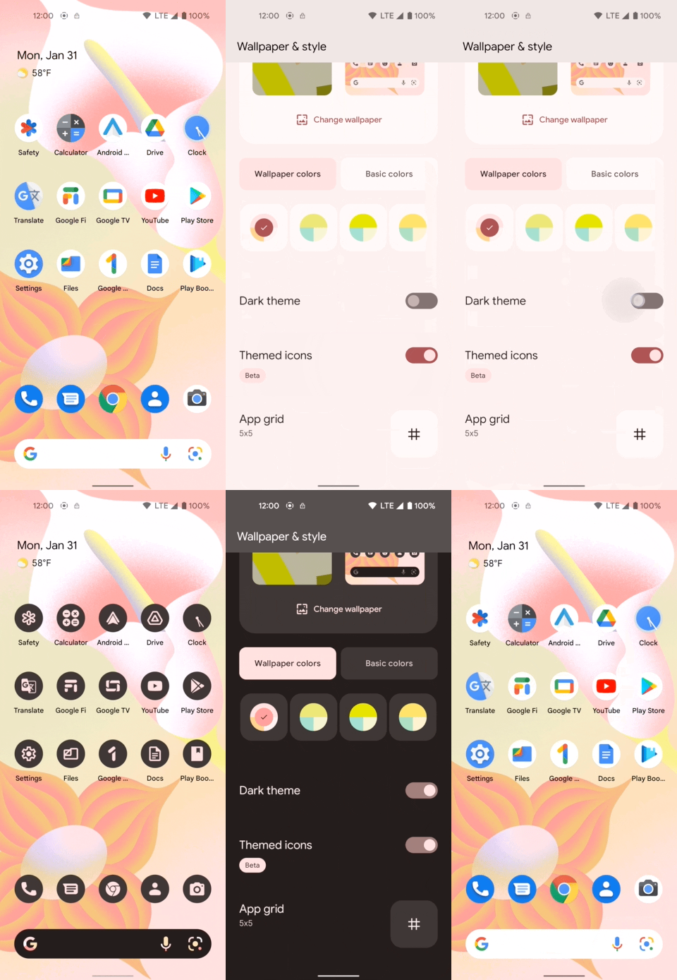
Since the introduction of Android 12 (SDK 31) last Fall, some Android devices have been blessed with a new initiative at Google called Material You. With Material You, Google introduced a new way of approaching the overall design paradigm and feel for Android devices, with the aim of increasing the flexibility and customization that individual Users can have on their phones.
One way that Android is attempting to reach this goal, is with the introduction of the Themed Icons feature in Android 13. This feature gives Users the ability to tint all the supported application icons with the same color palette, in an attempt to unify the overall theme of the mobile phone and its experience.

Image from Android developers website
In this article, I will guide you on how to implement the new Themed Icons feature into your app, with the goal of adapting your application’s icon into this new initiative and join into the trend that Material You is setting all across the Google ecosystem and Android devices.
Adaptive Icons
The first step to implementing the Themed Icons feature is to make sure that your application is already using an Adaptive Icon as its main icon asset.
If your application has an implemented Adaptive Icon already, feel free to scroll down to the next section.
If that’s not the case, no problem! Creating an Adaptive Icon can be done in just a few steps.
Creating an Adaptive Icon
You can get this process started by going into File > New > Image Asset inside Android Studio, and then finding the option Launcher Icons (Adaptive and Legacy) in the top drop-down menu to get yourself started.
From here, you may simply import your regular application’s icon, and take the editor for a spin. Make sure to check out Google’s official requirements for Adaptive Icons in order to get the most out of this new feature.
Once the Adaptive Icon is created, as well as all the new resource files, go into you project’s Manifest.xml and add this new XML file as the icon attribute of your <application> .
| <application | |
| ... | |
| android:name=".app.MainApplication" | |
| android:label="@string/app_name" | |
| android:icon="@mipmap/ic_launcher" | |
| ...> | |
| </application> |
Example of the icon attribute in the Manifest.xml
If you run your app at this point, you should see no visible changes in your application icon, other than any quirks and tweaks you might’ve made to your application’s icon in the Adaptive Icon creation process.
What about the roundIcon?
If you already have an Adaptive Icon in place , then feel free to omit or even delete the
roundIconattribute from theManifest.
The roundIcon attribute from the Manifest was introduced prior to the Android O release that saw the inception of Adaptive Icons into the Android ecosystem. According to Google, the only reason to use a roundIcon while having an Adaptive Icon is only if you require a different icon asset for circular masks. An example of this case would be whenever your icon relies on or consists of a circular shape.
| <application | |
| ... | |
| android:name=".app.MainApplication" | |
| android:label="@string/app_name" | |
| android:icon="@mipmap/ic_launcher" | |
| android:roundIcon="@mipmap/ic_launcher_round" | |
| ...> | |
| </application> |
Example of the roundIcon attribute in the Manifest.xml
Job Offers
If the case above doesn’t apply to your project, then feel free to omit or even delete the roundIcon attribute from the Manifest if it is already there. The Adaptive Icon implementation should take care of providing the appropriate icon asset to the devices that require a round icon as part of their native OEM implementation.
Enabling Themed Icons
At this point, your application should have an Adaptive Icon as the main icon asset that is being used, and not that old and regular icon. Nevertheless, a couple of more steps will be needed before we can opt into the Themed Icons initiative directly from your application.
Creating the required asset
The first step in enabling the Themed Icons feature is to create a monochromatic version of your application icon and import that into the project.
monochromatic: containing or using only one color
– encyclopedia.com
If your icon is one or two colors only, a black and white version of it should suffice for the monochrome version of it. On the other hand, if your icon contains a variety of colors and hues, it would be best to contact your designer for ideas or help with this step!
If you already have a monochromatic icon at hand to use as part of your Adaptive Icon implementation, then make sure to skip to the next sub-section!
There are a few considerations to be taken when creating the monochromatic version of your application’s icon. Namely, and as found in this section of Android’s official documentation, the following criteria should be taken into consideration while creating the monochrome asset:
- Provide a single layer for the icon
- All layers must be sized at 108x108dp
- The icons should be clean edges — the layers must not have masks or background shadows around the outline of the icon
- The logo must be at least 48x48dp, and it must not exceed 72x72dp
- The outer 18dp on each of the four sides of the layers are reserved for masking and creating visual effects
Adding the new asset into our code
Now that we’ve got the monochrome drawable asset ready for our Adaptive Icon, we can proceed to the final step of implementing a Themed Icon.
You should find the resource file res/mipmap-anydpi-v26/ic_launcher.xml from the Project view (located at res/mipmap/ic_launcher.xml (anydpi-v26) in the Android view) where we would be able to find the Adaptive Icon definition in XML.
This XML file should already have <foreground> and <background> tags detailed for us, which set the two main layers of your Adaptive Icon. Create a new <monochrome> tag adjacent to the other two tags, and add the new monochrome drawable asset into this tag’s drawable field, as shown below.
| <adaptive-icon xmlns:android="http://schemas.android.com/apk/res/android"> | |
| <background android:drawable="@mipmap/ic_launcher_background"/> | |
| <foreground android:drawable="@drawable/ic_launcher_foreground"/> | |
| <monochrome android:drawable="@drawable/ic_launcher_monochrome"/> | |
| </adaptive-icon> |
Example of an Adaptive Icon XML file.
Run your application and, Voila! You should now be able to enjoy of your new themed, Adaptive Icon sporting the same colorway and feel as all of the other Themed Icons in your personal device!
This article was originally published on proandroiddev.com on September 05, 2022


1 Comment. Leave new
good