

In recent years, Jetpack Compose has become more and more popular when making Android UI. The reason mainly being that it simplifies and accelerates UI development. The adoption has also become quite useful when making applications for wearables.
In this article, I will show a practical example of how you can use the Canvas APIs in compose to make a square segmented progress indicator (SSPI) perfectly fitting for square-shaped wearables.
Photo by Justyn Warner on Unsplash
Canvas in Compose?
The Canvas in Jetpack Compose is a Composable function that wraps the native canvas APIs from the UI toolkit. This means you can easily integrate a canvas into your composable layout code by just calling the canvas composable. If you want to know more about canvas in Compose, I would recommend checking out this article which goes quite deeply into how it works.
What are we going to build?
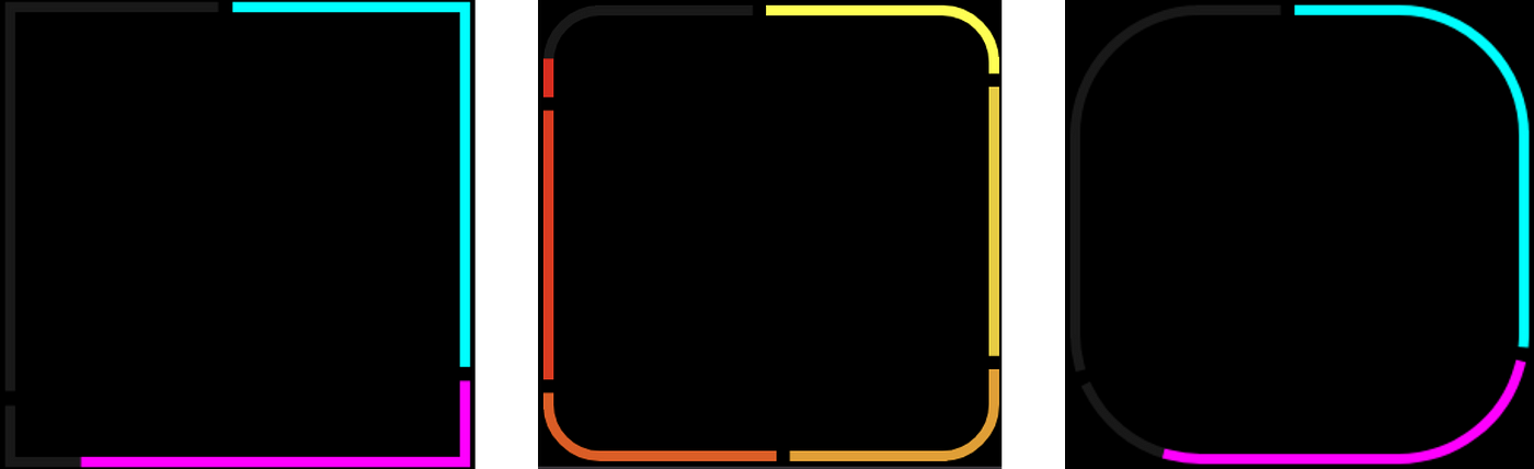
In this article, we are going to build a square-segmented progress indicator (SSPI). Yeah I know, it’s a mouthful! The main idea is to make a composable that is indicating a progress of some sort. It should fulfil these criteria:
- The API should take a list of segments that can have different colour and weight.
- It should get a track colour to paint the track behind.
- It should be able to adjust the corner radius, stroke-width and progress.
- The padding between the segments should be adjustable.
This should result in something like this:
 Caption of the square segmented progress indicators
This can also be extended with a cool animation, indicating a progress going in this example from 0% to 100%.
 Square segmented progress indicator animation GIF
As you can see, here the user has provided 3 track segments with the same weight and different colour.
Where do we start?
Initially, we need to implement a function that uses the Canvas composable. My initial thought was that since I knew there existed a drawRoundedRect extension function on the drawScope that we could use that. However, after a lot of googling, I found that because we need to implement different segments, drawRoundedRect would not work. The reason is that by usingdrawRoundedRect we can’t just draw parts of the square.
This means that we have to utilise the drawLine anddrawArch extension functions to make this. We have to make an algorithm to calculate when to draw the different components of the rectangle. Then we have to first draw the track segment, and then draw the progress segment on top of this.
We can use the drawPath API from Canvas to draw a set of individual paths. Then we can just draw the path that the list of segments contains. Using drawPath also makes sure that the line ends and arch ends are lined up correctly.
| Canvas( | |
| modifier = Modifier | |
| .fillMaxSize() | |
| .progressSemantics(progress) | |
| ) { | |
| calculatedSegments.forEach { segmentGroups -> | |
| drawPath( | |
| path = Path().apply { | |
| segmentGroups.calculatedSegments.forEach { | |
| it.drawIncomplete(this, progress) | |
| } | |
| }, | |
| color = segmentGroups.trackColor, | |
| style = stroke | |
| ) | |
| drawPath( | |
| path = Path().apply { | |
| segmentGroups.calculatedSegments.forEach { | |
| it.drawCompleted(this, progress) | |
| } | |
| }, | |
| color = segmentGroups.indicatorColor, | |
| style = stroke | |
| ) | |
| } | |
| } |
In the above code, we have added the Canvas composable with the progress provided by the user. We are then looping through the calculated segments and drawing first the track path, then the progress path.
These segment groups are calculated based on the list of indicator segments that the user provides. It also takes into account the height/width of the canvas and the provided corner radius.
| private fun calculateSegments( | |
| height: Float, | |
| width: Float, | |
| trackSegments: List<ProgressIndicatorSegment>, | |
| trackColor: Color, | |
| cornerRadiusDp: Dp, | |
| strokeWidth: Dp, | |
| paddingDp: Dp, | |
| localDensity: Density | |
| ): List<SegmentGroups> { | |
| val cornerRadius = with(localDensity) { cornerRadiusDp.toPx() } | |
| val stroke = with(localDensity) { Stroke(width = strokeWidth.toPx()) } | |
| val padding = with(localDensity) { paddingDp.toPx() } | |
| val naturalWeight = trackSegments.sumOf { it.weight.toDouble() }.toFloat() | |
| val edgeLength = | |
| (2 * (height - 2 * cornerRadius)) + (2 * (width - 2 * cornerRadius)) + (2 * Math.PI.toFloat() * cornerRadius) | |
| val paddingWeight = padding / edgeLength * naturalWeight | |
| val paddedWeight = (paddingWeight * trackSegments.size) + naturalWeight | |
| val measures = Measures(width, height, cornerRadius, stroke) | |
| var startWeight = 0f | |
| var startPaddingWeight = 0f | |
| return buildList { | |
| trackSegments.forEachIndexed { segmentIndex, trackSegment -> | |
| val localTrackColor = trackSegment.trackColor ?: trackColor | |
| val indicatorColor = trackSegment.indicatorColor | |
| val paddedRange = | |
| ((startWeight + startPaddingWeight) / paddedWeight)..((startWeight + startPaddingWeight + trackSegment.weight) / paddedWeight) | |
| val splitSegments = measures.splitSegments( | |
| indicatorColor = indicatorColor, | |
| trackColor = localTrackColor, | |
| range = paddedRange | |
| ) | |
| add( | |
| SegmentGroups( | |
| groupNumber = segmentIndex, | |
| indicatorColor = indicatorColor, | |
| trackColor = localTrackColor, | |
| calculatedSegments = splitSegments | |
| ) | |
| ) | |
| startWeight += trackSegment.weight | |
| startPaddingWeight += paddingWeight | |
| } | |
| } | |
| } |
| // The provided segments are a list of these | |
| public data class ProgressIndicatorSegment( | |
| val weight: Float, | |
| val indicatorColor: Color, | |
| val trackColor: Color? = null, | |
| val inProgressTrackColor: Color? = null | |
| ) |
This returns a list of the segment groups that each contain a set of segments. These are calculated using the width, height and corner radii of the canvas. We need this to know where the different sections are going to be defined. This is helpful information when we are going to draw a straight horizontal line, a straight vertical line or an arch.
| private val straightWidth: Float = width - (2 * cornerRadius) | |
| private val straightHeight: Float = height - (2 * cornerRadius) | |
| private val cornerArcLength: Float = (0.5 * Math.PI * cornerRadius).toFloat() | |
| private val total = (2 * straightWidth) + (2 * straightHeight) + (4 * cornerArcLength) | |
| internal val topRightPercent = straightWidth / 2 / total | |
| internal val rightTopCornerPercent = topRightPercent + (cornerArcLength / total) | |
| private val rightPercent = rightTopCornerPercent + (straightHeight / total) | |
| private val rightBottomCornerPercent = rightPercent + (cornerArcLength / total) | |
| private val bottomPercent = rightBottomCornerPercent + (straightWidth / total) | |
| internal val leftBottomCornerPercent = bottomPercent + (cornerArcLength / total) | |
| private val leftPercent = leftBottomCornerPercent + (straightHeight / total) | |
| private val leftTopCornerPercent = leftPercent + (cornerArcLength / total) | |
| internal val topLeftPercent = leftTopCornerPercent + (straightWidth / 2 / total) | |
| private val topRightRange = 0f..topRightPercent | |
| private val rightTopCornerRange = topRightPercent..rightTopCornerPercent | |
| private val rightRange = rightTopCornerPercent..rightPercent | |
| private val rightBottomCornerRange = rightPercent..rightBottomCornerPercent | |
| private val bottomRange = rightBottomCornerPercent..bottomPercent | |
| private val leftBottomCornerRange = bottomPercent..leftBottomCornerPercent | |
| private val leftRange = leftBottomCornerPercent..leftPercent | |
| private val leftTopCornerRange = leftPercent..leftTopCornerPercent | |
| private val topLeftRange = leftTopCornerPercent..topLeftPercent | |
OUR VIDEO RECOMMENDATION


Jobs
After defining where the sections should be we can then calculate the segmented sections and add them to their segment group.
| internal fun splitSegments( | |
| indicatorColor: Color, | |
| trackColor: Color, | |
| range: ClosedFloatingPointRange<Float> | |
| ): List<CalculatedSegment> { | |
| return buildList { | |
| range.intersect(topRightRange)?.let { | |
| if (!it.isZeroWidth()) { | |
| add(CalculatedSegment(indicatorColor, trackColor, topRight, it)) | |
| } | |
| } | |
| range.intersect(rightTopCornerRange)?.let { | |
| if (!it.isZeroWidth()) { | |
| add(CalculatedSegment(indicatorColor, trackColor, rightTopCorner, it)) | |
| } | |
| } | |
| range.intersect(rightRange)?.let { | |
| if (!it.isZeroWidth()) { | |
| add(CalculatedSegment(indicatorColor, trackColor, right, it)) | |
| } | |
| } | |
| range.intersect(rightBottomCornerRange)?.let { | |
| if (!it.isZeroWidth()) { | |
| add(CalculatedSegment(indicatorColor, trackColor, rightBottomCorner, it)) | |
| } | |
| } | |
| range.intersect(bottomRange)?.let { | |
| if (!it.isZeroWidth()) { | |
| add(CalculatedSegment(indicatorColor, trackColor, bottom, it)) | |
| } | |
| } | |
| range.intersect(leftBottomCornerRange)?.let { | |
| if (!it.isZeroWidth()) { | |
| add(CalculatedSegment(indicatorColor, trackColor, leftBottomCorner, it)) | |
| } | |
| } | |
| range.intersect(leftRange)?.let { | |
| if (!it.isZeroWidth()) { | |
| add(CalculatedSegment(indicatorColor, trackColor, left, it)) | |
| } | |
| } | |
| range.intersect(leftTopCornerRange)?.let { | |
| if (!it.isZeroWidth()) { | |
| add(CalculatedSegment(indicatorColor, trackColor, leftTopCorner, it)) | |
| } | |
| } | |
| range.intersect(topLeftRange)?.let { | |
| if (!it.isZeroWidth()) { | |
| add(CalculatedSegment(indicatorColor, trackColor, topLeft, it)) | |
| } | |
| } | |
| } | |
| } | |
Here we then check if the range is intersecting with the points that we have calculated above. If it is, we can add a calculated segment to the list. This calculated segment contains a segment drawable characteristic for each segment depending on the type of path we want to draw together with its track colour, indicator colour and the section range.
| private val topRight: SegmentDrawable = { range -> | |
| lineRange( | |
| drawRange = range, | |
| segmentRange = topRightRange, | |
| x1 = width / 2, | |
| y1 = 0f, | |
| x2 = width - cornerRadius, | |
| y2 = 0f | |
| ) | |
| } | |
| private val rightTopCorner: SegmentDrawable = { range -> | |
| arcRange( | |
| drawRange = range, | |
| segmentRange = rightTopCornerRange, | |
| center = Offset(width - cornerRadius, cornerRadius), | |
| startDegrees = 270f | |
| ) | |
| } | |
| private val right: SegmentDrawable = { range -> | |
| lineRange( | |
| drawRange = range, | |
| segmentRange = rightRange, | |
| x1 = width, | |
| y1 = cornerRadius, | |
| x2 = width, | |
| y2 = height - cornerRadius | |
| ) | |
| } | |
| private val rightBottomCorner: SegmentDrawable = { range -> | |
| arcRange( | |
| drawRange = range, | |
| segmentRange = rightBottomCornerRange, | |
| center = Offset(width - cornerRadius, height - cornerRadius), | |
| startDegrees = 0f | |
| ) | |
| } | |
| val bottom: SegmentDrawable = { range -> | |
| lineRange( | |
| drawRange = range, | |
| segmentRange = bottomRange, | |
| x1 = width - cornerRadius, | |
| y1 = height, | |
| x2 = cornerRadius, | |
| y2 = height | |
| ) | |
| } | |
| private val leftBottomCorner: SegmentDrawable = { range -> | |
| arcRange( | |
| drawRange = range, | |
| segmentRange = leftBottomCornerRange, | |
| center = Offset(cornerRadius, height - cornerRadius), | |
| startDegrees = 90f | |
| ) | |
| } | |
| private val left: SegmentDrawable = { range -> | |
| lineRange( | |
| drawRange = range, | |
| segmentRange = leftRange, | |
| x1 = 0f, | |
| y1 = height - cornerRadius, | |
| x2 = 0f, | |
| y2 = cornerRadius | |
| ) | |
| } | |
| private val leftTopCorner: SegmentDrawable = { range -> | |
| arcRange( | |
| drawRange = range, | |
| segmentRange = leftTopCornerRange, | |
| center = Offset(cornerRadius, cornerRadius), | |
| startDegrees = 180f | |
| ) | |
| } | |
| private val topLeft: SegmentDrawable = { range -> | |
| lineRange( | |
| drawRange = range, | |
| segmentRange = topLeftRange, | |
| x1 = cornerRadius, | |
| y1 = 0f, | |
| x2 = width / 2, | |
| y2 = 0f | |
| ) | |
| } |
This then makes the path that is drawn when calling the drawCompleted/drawIncompleted functions on the CalculatedSegment class.
If you want to check out the full code for this, you can find the implementation here.
Let’s make a cool animation!
Square segmented progress indicator animation GIF
After making the SSPI composable, it leaves us with an API like this
| @Composable | |
| public fun SquareSegmentedProgressIndicator( | |
| modifier: Modifier = Modifier, | |
| progress: Float, | |
| strokeWidth: Dp = ProgressIndicatorDefaults.StrokeWidth, | |
| trackColor: Color = MaterialTheme.colors.onBackground.copy(alpha = 0.1f), | |
| cornerRadiusDp: Dp = 10.dp, | |
| trackSegments: List<ProgressIndicatorSegment>, | |
| paddingDp: Dp = ProgressIndicatorDefaults.StrokeWidth | |
| ) |
By using the preview tooling in Android Studio, we can add a preview to check this out.
| val previewProgressSections = listOf( | |
| ProgressIndicatorSegment( | |
| weight = 3f, | |
| indicatorColor = Color.Cyan | |
| ), | |
| ProgressIndicatorSegment( | |
| weight = 3f, | |
| indicatorColor = Color.Magenta | |
| ), | |
| ProgressIndicatorSegment( | |
| weight = 3f, | |
| indicatorColor = Color.Yellow | |
| ) | |
| ) | |
| @WearSquareDevicePreview | |
| @Composable | |
| fun PreviewHighCornerRadius() { | |
| Box( | |
| modifier = Modifier | |
| .fillMaxSize() | |
| .background(Color.Black) | |
| ) { | |
| SquareSegmentedProgressIndicator( | |
| modifier = Modifier | |
| .height(300.dp) | |
| .width(300.dp), | |
| progress = 0.5f, | |
| trackSegments = previewProgressSections, | |
| cornerRadiusDp = 50.dp | |
| ) | |
| } | |
| } |
This will make a basic first preview catered to a square Wear OS device. If you want to use the @WearSquareDevicePreview custom annotation, you can get it from the horologist project or make your own.
Since the API exposes the progress, it makes a great variable for animation. We can use this to make a cool animation where the state starts from 0f representing 0% to 1f representing 100%. We can then use the update transition API and the animateFloat extension to update the progress based on a tween with LinearEasing . This will make the progress go from 0 to 100 in a linear duration of time.
| enum class PreviewAnimationState(val target: Float) { | |
| Start(0f), End(1f) | |
| } | |
| @WearSquareDevicePreview | |
| @Composable | |
| fun PreviewProgressAnimation() { | |
| var progressState by remember { mutableStateOf(PreviewAnimationState.Start) } | |
| val transition = updateTransition( | |
| targetState = progressState, | |
| label = "Square Progress Indicator" | |
| ) | |
| val progress by transition.animateFloat( | |
| label = "Progress", | |
| targetValueByState = { it.target }, | |
| transitionSpec = { | |
| tween(durationMillis = 1000, easing = LinearEasing) | |
| } | |
| ) | |
| val cornerRadiusDp = 10.dp | |
| Box(modifier = Modifier.size(300.dp)) { | |
| SquareSegmentedProgressIndicator( | |
| modifier = Modifier | |
| .align(Alignment.Center) | |
| .height(300.dp) | |
| .width(300.dp) | |
| .clickable { | |
| progressState = if (progressState == PreviewAnimationState.Start) { | |
| PreviewAnimationState.End | |
| } else { | |
| PreviewAnimationState.Start | |
| } | |
| }, | |
| progress = progress, | |
| trackSegments = previewProgressSections, | |
| cornerRadiusDp = cornerRadiusDp, | |
| paddingDp = 8.dp | |
| ) | |
| Text( | |
| modifier = Modifier.align(Alignment.Center), | |
| text = "${(progress * 100).toInt()}%", | |
| color = Color.White | |
| ) | |
| val cornerRadiusPx: Float = with(LocalDensity.current) { cornerRadiusDp.toPx() } | |
| Canvas(modifier = Modifier.fillMaxSize()) { | |
| drawLine( | |
| Color.LightGray, | |
| Offset(size.width / 2, 0f), | |
| Offset(size.width / 2, size.height), | |
| strokeWidth = 0.2f | |
| ) | |
| drawLine( | |
| Color.LightGray, | |
| Offset(0f, size.height / 2), | |
| Offset(size.width, size.height / 2), | |
| strokeWidth = 0.2f | |
| ) | |
| drawLine( | |
| Color.LightGray, | |
| Offset(cornerRadiusPx, 0f), | |
| Offset(cornerRadiusPx, size.height), | |
| strokeWidth = 0.2f | |
| ) | |
| drawLine( | |
| Color.LightGray, | |
| Offset(size.width - cornerRadiusPx, 0f), | |
| Offset(size.width - cornerRadiusPx, size.height), | |
| strokeWidth = 0.2f | |
| ) | |
| drawLine( | |
| Color.LightGray, | |
| Offset(0f, cornerRadiusPx), | |
| Offset(size.width, cornerRadiusPx), | |
| strokeWidth = 0.2f | |
| ) | |
| drawLine( | |
| Color.LightGray, | |
| Offset(0f, size.height - cornerRadiusPx), | |
| Offset(size.width, size.height - cornerRadiusPx), | |
| strokeWidth = 0.2f | |
| ) | |
| } | |
| } | |
| LaunchedEffect(Unit) { | |
| while (true) { | |
| progressState = PreviewAnimationState.End | |
| delay(1000) | |
| progressState = PreviewAnimationState.Start | |
| } | |
| } | |
| } |
After drawing our SSPI with the animation, we can add a Canvas on top of the function. Here we can draw horizontal and vertical lines to get reference points through the animation. This will result in something like this

Square segmented progress indicator with progress animation on a square Wear device.
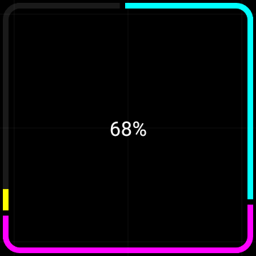
Square segmented progress indicator with progress animation 68% on a square Wear OS device.
Square segmented progress indicator animation GIF
Wrap it up 🌯
I think this component looks great on a square Wear OS device! If you would like to check the source code for this article, you can find it here.
When making this I got to experience the beauty of making Compose code, and interacting with the canvas APIs. I also think the preview tooling of animations are amazing. Here you can inspect the animation in detail which was super helpful!
Furthermore, if you are interested in Wear OS development, I highly recommend checking out the Horologist project. It is truly an amazing asset when working with Wear OS.
Helpful resources
- Horologist github
- Canvas playground
- Preview code
- Code for Round SegmentedProgressIndicator
- Canvas Android developer docs working with graphics
Thanks for reading this article! I hope this helps somebody!
I would also like to thank Yuri Schimke for all the help, inspiration, review and mentorship! Furthermore, I would also like to thank Ataul Munim for great review! You’re the best! 🙏
This article was originally published on proandroiddev.com on December 12, 2022


