

Although Jetpack Compose provides a wide range of components for creating a beautiful UI, one day you may find that your following layout needs to be implemented with a custom component. Jetpack Compose for example doesn’t have a ready-to-use convenient component to work with grid-based UI. What we understand by convenience:
- flexible possibility to define row and column sizes
- сontent placement in any specified location without the need to place neighbors
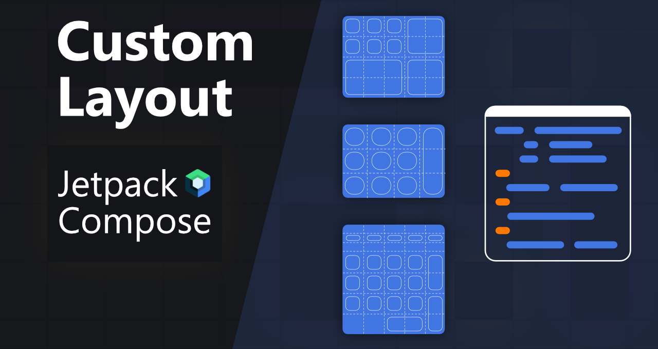
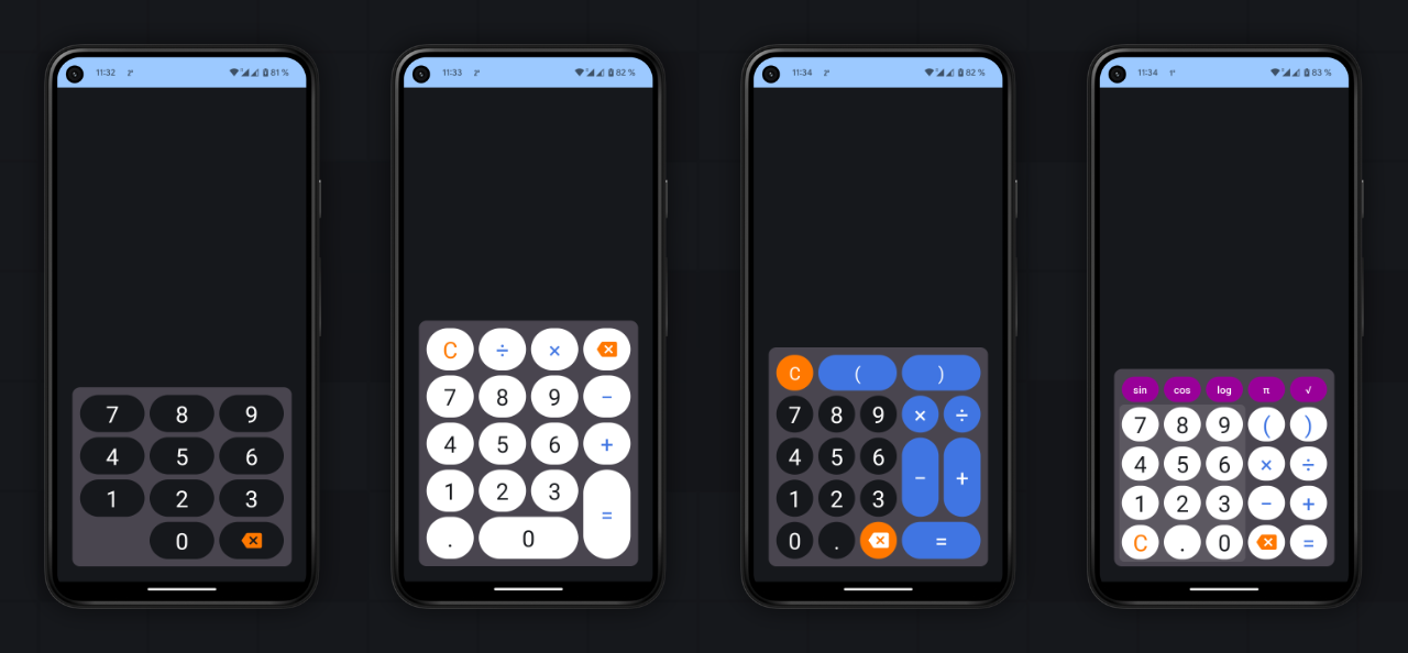
We would like to have a component that allows us to create UI like in the following image:
In Jetpack Compose we already have similar components: LazyVerticalGrid and LazyHorizontalGrid. Here is a common usage of LazyHorizontalGrid:
| LazyHorizontalGrid(rows = GridCells.Fixed(3)) { | |
| item { | |
| // content | |
| } | |
| } |
Look close but not the same as what we need. Lazy grids operate only with rows and columns count and place items sequentially. Whereas we would like to control not only counts but sizes. In addition, we need to have the possibility to place an item in any position.
API definition
Based on the lazy grids API, we’ll define our component API and call it GridPad:
| GridPad( | |
| // defining the grid API | |
| cells = GridPadCells( | |
| rowSizes = listOfRowSized, | |
| columnSizes = listOfColumnSizes | |
| ) | |
| ) { | |
| // placement the cell API | |
| item(row = rowIndex, column = columnIndex, rowSpan = hSpan, columnSpan = wSpan) { | |
| // content | |
| } | |
| } |
Because we would like to control content placement our component will manage to add items with Kotlin DSL via item sections.
Grid definition
Let’s take a closer look at GridPadCells. This class contains information about row and column sizes.
| public data class GridPadCells( | |
| val rowSizes: ImmutableList<GridPadCellSize>, | |
| val columnSizes: ImmutableList<GridPadCellSize> | |
| ) { | |
| val rowCount: Int = rowSizes.size | |
| val columnCount: Int = columnSizes.size | |
| internal val rowsTotalSize: TotalSize = rowSizes.calculateTotalSize() | |
| internal val columnsTotalSize: TotalSize = columnSizes.calculateTotalSize() | |
| } |
Let’s go a little back and remember what we need. We need to have the possibility to specify a size for each row and column in a grid.

Therefore, GridPadCells cover all our requirements. You might notice, for storing rowSizes and columnSizes using ImmutableList. Thanks to this implementation of a list, the compose compiler marks this class as stable and we don’t need to mark GridPadCells with @Immutable or @Stable annotation. Why it is important? Here’s what the official documentation says:
Not all classes need to be stable, but a class being stable unlocks a lot of flexibility for the compose compiler to make optimizations when a stable type is being used in places, which is why it is such an important concept for compose.
Here is a great article that explains in more detail Jetpack Compose core concepts such as stability, skippability, and restartability. I recommend reading it to better understand the basic concepts of Jetpack Compose and what they can affect.
There are two more classes that we have not covered yet: GridPadCellSize and TotalSize. The GridPadCellSize is just a container that contains information about the size of a specific row or column:
| public sealed class GridPadCellSize { | |
| public data class Fixed(val size: Dp) : GridPadCellSize() { | |
| init { | |
| check(size.value > 0) { "size have to be > 0" } | |
| } | |
| } | |
| public data class Weight(val size: Float = 1f) : GridPadCellSize() { | |
| init { | |
| check(size > 0) { "size have to be > 0" } | |
| } | |
| } | |
| } |
The TotalSize is a helper class that contains information about the sum of all types of sizes for a row or column and is used in a measuring stage:
| internal data class TotalSize( | |
| val weight: Float, | |
| val fixed: Dp | |
| ) |
And the final class here is a builder class. This class is not necessary, but it helps to reduce boilerplate code. Our GridPad requires two lists of sizes, which in the basic use case will be the same. For that reason, we should create a mutable class with default initialization and with the ability to override selected sizes:
| public data class GridPadCells( | |
| val rowSizes: ImmutableList<GridPadCellSize>, | |
| val columnSizes: ImmutableList<GridPadCellSize> | |
| ) { | |
| public constructor( | |
| rowSizes: Iterable<GridPadCellSize>, columnSizes: Iterable<GridPadCellSize> | |
| ) : this(rowSizes = rowSizes.toImmutableList(), columnSizes = columnSizes.toImmutableList()) | |
| //... | |
| public class Builder(rowCount: Int, columnCount: Int) { | |
| private val rowSizes: MutableList<GridPadCellSize> = GridPadCellSize.weight(rowCount) | |
| private val columnSizes: MutableList<GridPadCellSize> = GridPadCellSize.weight(columnCount) | |
| public fun rowSize(index: Int, size: GridPadCellSize): Builder = apply { | |
| rowSizes[index] = size | |
| } | |
| public fun columnSize(index: Int, size: GridPadCellSize): Builder = apply { | |
| columnSizes[index] = size | |
| } | |
| public fun build(): GridPadCells { | |
| return GridPadCells( | |
| rowSizes = rowSizes, columnSizes = columnSizes | |
| ) | |
| } | |
| } | |
| } |
OUR VIDEO RECOMMENDATION


Jobs
Content placement
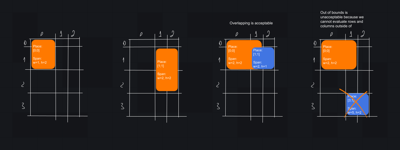
The second major goal that we would like to achieve is placement content in any cell on the grid with any span width and height.
Few important edge cases that we will handle:
- a cell may contain more than one element
- the content may overlap with each other
- content that goes outside the grid would be ignored
Here is the signature of GridPad:
| @Composable | |
| public fun GridPad( | |
| cells: GridPadCells, modifier: Modifier = Modifier, content: GridPadScope.() -> Unit | |
| ) { | |
| // implementation | |
| } |
Let’s take a look in detail at GridPadScope. GridPadScope is the DSL scope that limits what users can put into our composable layouts. Only content with the item are acceptable:
| GridPad( | |
| cells = GridPadCells(2, 2) | |
| ) { | |
| // valid content placement | |
| item(row = 0, column = 0, rowSpan = 1, columnSpan = 1) { | |
| // content | |
| } | |
| // invalid content placement | |
| Text(text = "Text") | |
| // valid content placement | |
| item(row = 1, column = 1) { | |
| // invalid content placement | |
| item(row = 1, column = 1) { | |
| // content | |
| } | |
| } | |
| } |
Looks pretty easy on the top but is a little bit tricky in the details. Here is GridPadScope definition:
| @GridPadScopeMarker | |
| public sealed interface GridPadScope { | |
| public fun item( | |
| row: Int? = null, | |
| column: Int? = null, | |
| rowSpan: Int = 1, | |
| columnSpan: Int = 1, | |
| itemContent: @Composable GridPadItemScope.() -> Unit | |
| ) | |
| } |
Here are two meaningful things: @GridPadScopeMarker and GridPadItemScope. The @GridPadScopeMarke is a @DslMarker:
| @DslMarker | |
| public annotation class GridPadScopeMarker |
The GridPadItemScope is a context receiver:
| @Stable | |
| @GridPadScopeMarker | |
| public interface GridPadItemScope |
The above combination helps to make strict use of our API: a developer cannot place other composables without wrapping them into an item. Nor can the developer put an item inside another item. If you would like to learn more about context receivers I recommend you read this article.
As you can notice, everything that we have just explored is an interface. Let’s take a look in detail at implementations. Before moving on, remember what the composable lifecycle looks like. For custom layout, we need to implement three sub-stages of the layout stage:
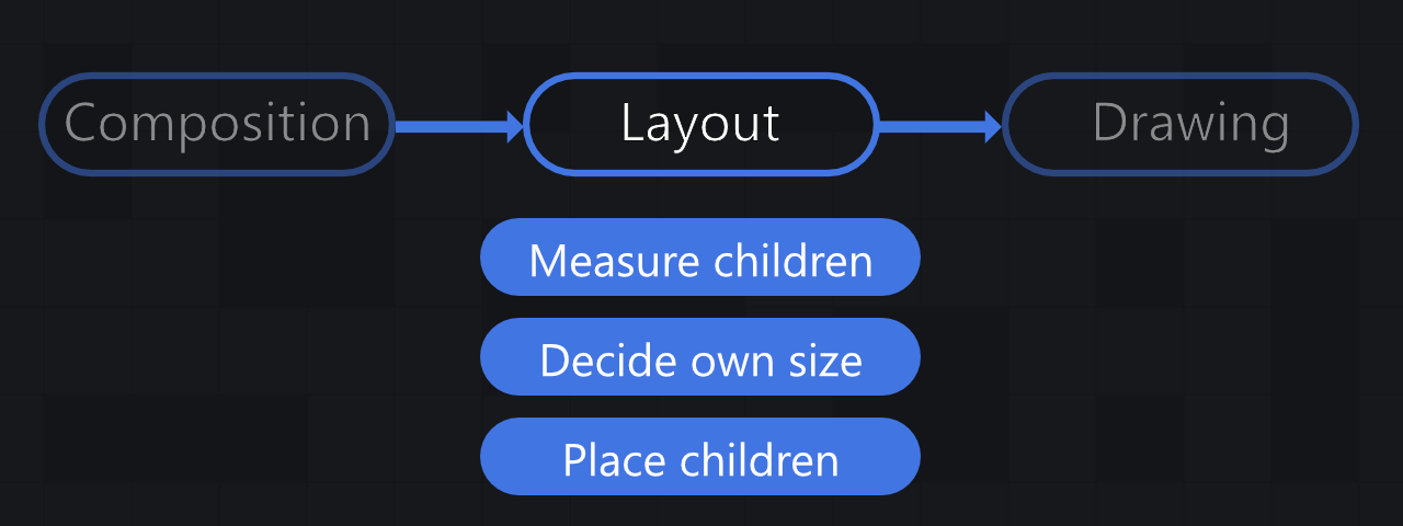
Thus we need to measure the children, determine the size of the layout and place the content. Here is a very top-level of the GridPad implementation:
| @Composable | |
| public fun GridPad( | |
| cells: GridPadCells, modifier: Modifier = Modifier, content: GridPadScope.() -> Unit | |
| ) { | |
| val scopeContent: GridPadScopeImpl = GridPadScopeImpl(cells).apply(content) | |
| Layout(modifier = modifier, content = { | |
| scopeContent.data.forEach { | |
| it.item(GridPadItemScopeImpl) | |
| } | |
| }) { measurables, constraints -> | |
| // measure and placement | |
| } | |
| } |
The only interface definition isn’t enough to implement the logic of adding content. For that reason, we need to have some implementation, and that implementation is GridPadScopeImpl. Here is where all calls from using GridPad are redirected to the interface implementation:
| val scopeContent: GridPadScopeImpl = GridPadScopeImpl(cells).apply(content) |
The GridPadScopeImpl is like a container that collects all emits from top-level DSL, builds a list to display, and provides the ability to get added composables:
| internal class GridPadScopeImpl(private val cells: GridPadCells) : GridPadScope { | |
| // list of composables to future measurement and placement | |
| internal val data: MutableList<GridPadContent> = mutableListOf() | |
| override fun item( | |
| row: Int?, column: Int?, rowSpan: Int, columnSpan: Int, | |
| itemContent: @Composable GridPadItemScope.() -> Unit | |
| ) { | |
| findPlaceForContent( | |
| row = row, column = column, rowSpan = rowSpan, columnSpan = columnSpan | |
| ) { cellRow, cellColumn -> | |
| this.data.add( | |
| GridPadContent( | |
| row = cellRow, | |
| column = cellColumn, | |
| rowSpan = rowSpan, | |
| columnSpan = columnSpan, | |
| item = { itemContent() } | |
| ) | |
| ) | |
| } | |
| } | |
| private fun findPlaceForContent( | |
| row: Int?, column: Int?, rowSpan: Int, columnSpan: Int, | |
| callback: (row: Int, column: Int) -> Unit | |
| ): Boolean { | |
| // some logic for locating in the grid in cases where no row or column is specified | |
| } | |
| } | |
| internal class GridPadContent( | |
| val row: Int, val column: Int, val rowSpan: Int, val columnSpan: Int, | |
| val item: @Composable GridPadItemScope.() -> Unit | |
| ) |
In the code above, the most significant part is a transformation from DSL call item {} inside GridPad to meta-class GridPadContent that stores information for future measurement and placement.
Let’s go back to GridPad and finish the component. After we collect all information about placement content everything that we need is accurate calculate sizes for each cell, measure composables, and place them into the proper position. Here we wouldn’t deep dive into placement logic calculation, will focus on Jetpack Compose-related API. The first step is to measure children according to their location and span size:
| @Composable | |
| public fun GridPad( | |
| cells: GridPadCells, modifier: Modifier = Modifier, content: GridPadScope.() -> Unit | |
| ) { | |
| val scopeContent: GridPadScopeImpl = GridPadScopeImpl(cells).apply(content) | |
| Layout(modifier = modifier, content = { | |
| scopeContent.data.forEach { | |
| it.item(GridPadItemScopeImpl) | |
| } | |
| }) { measurables, constraints -> | |
| // ... | |
| val cellPlaces = calculateCellPlaces(cells, width = constraints.maxWidth, height = constraints.maxHeight) | |
| // list of measured children | |
| val placeables = measurables.mapIndexed { index, measurable -> | |
| val contentMetaInfo = scopeContent.data[index] | |
| // calculate the actual maximum cell width in pixels based on the span size | |
| val maxWidth = (0 until contentMetaInfo.columnSpan).sumOf { | |
| cellPlaces[contentMetaInfo.row][contentMetaInfo.column + it].width | |
| } | |
| // calculate the actual maximum cell height in pixels based on the span size | |
| val maxHeight = (0 until contentMetaInfo.rowSpan).sumOf { | |
| cellPlaces[contentMetaInfo.row + it][contentMetaInfo.column].height | |
| } | |
| // measurement of children with cell boundary constraints, not the parent | |
| measurable.measure( | |
| constraints.copy( | |
| minWidth = min(constraints.minWidth, maxWidth), | |
| maxWidth = maxWidth, | |
| minHeight = min(constraints.minHeight, maxHeight), | |
| maxHeight = maxHeight | |
| ) | |
| ) | |
| } | |
| // ... | |
| } | |
| } |
Most of the above code works by calculating boundaries for composables to call the measure for the placed item.
The last touch after measurement of all children is to define the component size and place items:
| @Composable | |
| public fun GridPad( | |
| cells: GridPadCells, modifier: Modifier = Modifier, content: GridPadScope.() -> Unit | |
| ) { | |
| val scopeContent: GridPadScopeImpl = GridPadScopeImpl(cells).apply(content) | |
| Layout(modifier = modifier, content = { | |
| scopeContent.data.forEach { | |
| it.item(GridPadItemScopeImpl) | |
| } | |
| }) { measurables, constraints -> | |
| // ... | |
| val placeables = measurables.mapIndexed { index, measurable -> | |
| // ... | |
| } | |
| //define component size | |
| layout(layoutWidth, layoutHeight) { | |
| placeables.forEachIndexed { index, placeable -> | |
| val contentMetaInfo = scopeContent.data[index] | |
| val cellPlaceInfo = cellPlaces[contentMetaInfo.row][contentMetaInfo.column] | |
| // placement the item in the desired location | |
| placeable.placeRelative(x = cellPlaceInfo.x, y = cellPlaceInfo.y) | |
| } | |
| } | |
| } | |
| } |
Conclusion
A lot of work has been done here. The above examples might look a bit complicated, but Jetpack Compose combined with Kotlin DSL provides possibilities to implement elegant APIs for your custom layouts. When you are faced with a problem, feel free to look into the source code of already completed components and take inspiration there, it’s the best way to learn something new.
This article was originally published on proandroiddev.com on December 21, 2022


