

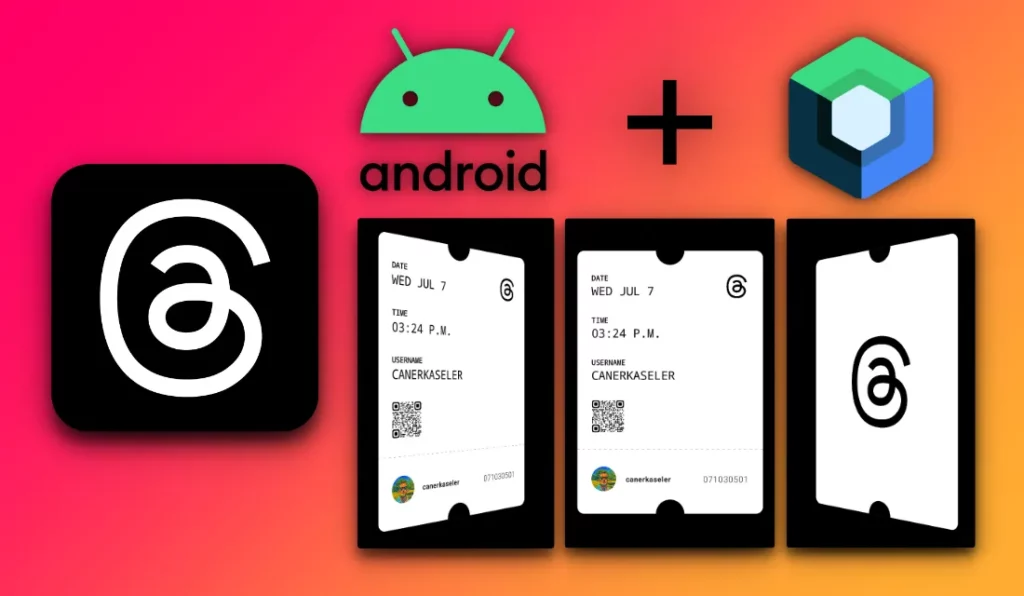
This article aims to create an animation and UI copy of the Threads Invitation Card with Jetpack Compose in the Android project. This project includes a combination of these three (3) different animations; Always Turning Animation, Rotating Card to near Axis-Y Animation after Dragging, Animation Rotating after Quick Dragging.
The story has a GitHub project. You can follow the topic commit by commit: https://github.com/canerkaseler/jetpack-compose-threads-card
Note: If you are a new android developer or not familiar with Jetpack Compose, starting from Necessary Topics might be helpful. If you feel comfortable, you can jump Main Topics part.
Table of contents:
A) Necessary topics:
- User Data Model & Design Images
- Front Side of the Card
- Back Side of the Card
B) Main Topics:
- Card Turning with Dragging
- Always Turning Animation & Stop Animation
- Rotating Card to near Axis-Y Animation after Dragging
- Animation Rotating after Quick Dragging then Infinite Turning Animation
Final output will be this:
A) Part 1/3 — User Data Model & Design Images
Firstly, related commit is here. I would like to skip this part quickly. I added user image and QR code image in android project. Then, there is a hardcoded user data model for card:
data class User(
    val username: String = "CANERKASELER",
    val instagram: String = "canerkaseler",
    val userId: String = "071030501",
    val date: String = "WED JUL 7",
    val time: String = "03:24 P.M.",
    val userImage: Int = R.drawable.ic_user_avatar,
    val userQrCode: Int = R.drawable.ic_qr_code,
)
A) Part 2/3 — Front Side of the Card
Related commit is here. In the commit, We create an UI for front side card. I tried to create separated composable functions. Code is a little long. You check the code on commit.
import androidx.compose.foundation.Canvas
import androidx.compose.foundation.Image
import androidx.compose.foundation.background
import androidx.compose.foundation.border
import androidx.compose.foundation.layout.Arrangement
import androidx.compose.foundation.layout.Box
import androidx.compose.foundation.layout.Column
import androidx.compose.foundation.layout.Row
import androidx.compose.foundation.layout.Spacer
import androidx.compose.foundation.layout.fillMaxSize
import androidx.compose.foundation.layout.fillMaxWidth
import androidx.compose.foundation.layout.height
import androidx.compose.foundation.layout.padding
import androidx.compose.foundation.layout.size
import androidx.compose.foundation.shape.CircleShape
import androidx.compose.material3.Text
import androidx.compose.runtime.Composable
import androidx.compose.ui.Alignment
import androidx.compose.ui.Modifier
import androidx.compose.ui.draw.clip
import androidx.compose.ui.geometry.Offset
import androidx.compose.ui.graphics.Color
import androidx.compose.ui.graphics.PathEffect
import androidx.compose.ui.layout.ContentScale
import androidx.compose.ui.res.painterResource
import androidx.compose.ui.text.TextStyle
import androidx.compose.ui.text.font.FontFamily
import androidx.compose.ui.text.font.FontWeight
import androidx.compose.ui.tooling.preview.Preview
import androidx.compose.ui.unit.dp
import androidx.compose.ui.unit.sp
import com.canerkaseler.threadscard.R
import com.canerkaseler.threadscard.entity.User


private val spaceBetweenItems = 28.dp
private val framePadding = 24.dp

@Composable
fun CardFrontSide(
    user: User
) {

    // All card surface.
    Box(
        modifier = Modifier
            .fillMaxSize()
            .background(Color.White),
        contentAlignment = Alignment.Center,
    ) {

        // Top black half circle.
        CardBlackHalfCircles(modifier = Modifier.align(alignment = Alignment.TopCenter))


        // Card content.
        CardContent(
            date = user.date,
            time = user.time,
            instagram = user.instagram,
            userId = user.userId,
            username = user.username,
            userImage = user.userImage,
            userQrCode = user.userQrCode,
        )

        // Bottom black half circle.
        CardBlackHalfCircles(modifier = Modifier.align(alignment = Alignment.BottomCenter))
    }
}

@Composable
fun CardBlackHalfCircles(
    modifier: Modifier
) {
    Canvas(
        modifier = modifier
            .border(color = Color.Magenta, width = 2.dp)
    ) {
        drawCircle(
            color = Color.Black,
            radius = 24.dp.toPx()
        )
    }
}

@Composable
fun CardContent(
    date: String,
    time: String,
    instagram: String,
    userId: String,
    username: String,
    userImage: Int,
    userQrCode: Int,
) {
    Column (
        modifier = Modifier
    ) {

        Spacer(modifier = Modifier.height(spaceBetweenItems))

        Row(
            modifier = Modifier.fillMaxWidth(),
            horizontalArrangement = Arrangement.SpaceBetween
        ) {

            CardTitleText(title = "DATE", info = date)

            CardBrand(modifier = Modifier.align(alignment = Alignment.Bottom))
        }

        Spacer(modifier = Modifier.height(spaceBetweenItems))

        CardTitleText(title = "TIME", info = time)

        Spacer(modifier = Modifier.height(spaceBetweenItems))

        CardTitleText(title = "USERNAME", info = username)

        Spacer(modifier = Modifier.height(spaceBetweenItems))

        CardUserQrCode(userQrCode = userQrCode, modifier = Modifier.align(alignment = Alignment.Start))

        Spacer(modifier = Modifier.height(spaceBetweenItems))

        CardDashDivider()

        Spacer(modifier = Modifier.height(spaceBetweenItems))

        Row(
            modifier = Modifier.fillMaxWidth(),
            horizontalArrangement = Arrangement.SpaceBetween,
            verticalAlignment = Alignment.CenterVertically
        ) {
            Row (
                verticalAlignment = Alignment.CenterVertically
            ) {

                CardUserImage(userImage = userImage)

                CardInstagram(text = instagram)
            }

            CardUserId(text = userId)
        }
    }
}

@Composable
fun CardTitleText(title: String, info: String) {
    Column {
        Text(
            modifier = Modifier.padding(
                horizontal = framePadding
            ),
            text = title,
            color = Color.Black,
            fontWeight = FontWeight.ExtraBold,
            style = TextStyle(
                fontSize = 12.sp,
                fontFamily = FontFamily.Monospace,
            )
        )

        Text(
            modifier = Modifier.padding(
                horizontal = framePadding
            ),
            text = info,
            color = Color.Black,
            style = TextStyle(
                fontSize = 20.sp,
                fontFamily = FontFamily.Monospace
            )
        )
    }
}

@Composable
fun CardBrand(
    modifier: Modifier
) {
    Image(
        modifier = modifier
            .padding(
                end = framePadding
            )
            .size(size = 42.dp),
        painter = painterResource(id = R.drawable.ic_threads_black),
        contentDescription =""
    )
}

@Composable
fun CardDashDivider() {
    Canvas(
        Modifier
            .fillMaxWidth()
            .height(1.dp)) {
        drawLine(
            color = Color.DarkGray,
            start = Offset(0f, 0f),
            end = Offset(size.width, 0f),
            pathEffect = PathEffect.dashPathEffect(floatArrayOf(10f, 14f), 0f)
        )
    }
}

@Composable
fun CardUserQrCode(userQrCode: Int, modifier: Modifier) {
    Image(
        modifier = modifier
            .padding(horizontal = framePadding)
            .size(size = 56.dp),
        painter = painterResource(id = userQrCode),
        contentDescription =""
    )
}

@Composable
fun CardUserImage(userImage: Int) {
    Image(
        modifier = Modifier
            .padding(start = framePadding)
            .size(size = 42.dp)
            .clip(CircleShape) ,
        contentScale = ContentScale.Crop,
        painter = painterResource(id = userImage),
        contentDescription = ""
    )
}

@Composable
fun CardInstagram(text: String) {
    Text(
        modifier = Modifier.padding(start = 16.dp),
        text = text,
        color = Color.Black,
        fontWeight = FontWeight.SemiBold,
        style = TextStyle(
            fontSize = 12.sp,
            fontFamily = FontFamily.Default,
            letterSpacing = 0.7.sp,
        )
    )
}

@Composable
fun CardUserId(text: String) {
    Text(
        modifier = Modifier.padding(end = framePadding),
        text = text,
        color = Color.Black,
        fontWeight = FontWeight.Light,
        style = TextStyle(
            fontSize = 14.sp,
            fontFamily = FontFamily.Default,
            letterSpacing = 1.sp,
        )
    )
}

@Composable
@Preview
fun CardFrontSidePreview() {
    CardFrontSide(
        User(
            username = "CANERKASELER",
            instagram = "canerkaseler",
            userId = "071030501",
            date = "WED JUL 7",
            time = "03:24 P.M.",
            userImage = R.drawable.ic_user_avatar,
            userQrCode = R.drawable.ic_qr_code,
        )
    )
}
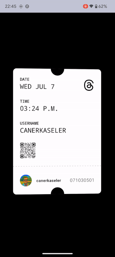
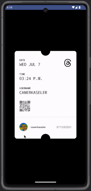
Expected preview is:
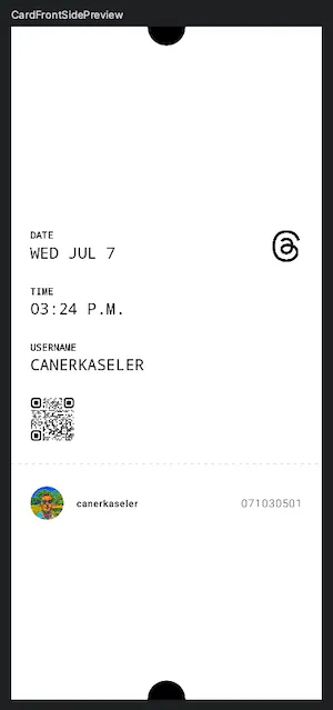
Yes, screen seems a little different but we will have a card holder. The card holder will resize our front and back sides views. That is why we can continue with design of the back side.
A) Part 3/3 — Back Side of the Card
Related commit is here. This is a basic design. There is a brand logo on white card:
import androidx.compose.foundation.Image
import androidx.compose.foundation.background
import androidx.compose.foundation.layout.Box
import androidx.compose.foundation.layout.fillMaxSize
import androidx.compose.foundation.layout.size
import androidx.compose.runtime.Composable
import androidx.compose.ui.Alignment
import androidx.compose.ui.Modifier
import androidx.compose.ui.graphics.Color
import androidx.compose.ui.res.painterResource
import androidx.compose.ui.tooling.preview.Preview
import androidx.compose.ui.unit.dp
import com.canerkaseler.threadscard.R

@Composable
fun CardBackSide() {

    // All card surface.
    Box(
        modifier = Modifier
            .fillMaxSize()
            .background(Color.White),
        contentAlignment = Alignment.Center,
    ) {

        // Top black half circle.
        CardBlackHalfCircles(modifier = Modifier.align(alignment = Alignment.TopCenter))

        Image(
            modifier = Modifier.size(size = 160.dp),
            painter = painterResource(id = R.drawable.ic_threads_black),
            contentDescription =""
        )

        // Bottom black half circle.
        CardBlackHalfCircles(modifier = Modifier.align(alignment = Alignment.BottomCenter))
    }
}

@Composable
@Preview
fun CardBackSidePreview() {
    CardBackSide()
}
Expected preview is:
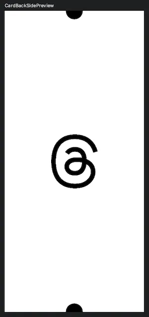
Again, screen seems a little different but we will have a card holder. The card holder will resize it. Hence, we can go to next part which is about Card Holder and Card Turning.
B) Part 1/4 — Card Turning with Dragging
Related commit is here. I would like to divide this topic as two parts. First is card holder. Second is card turning according to dragging value.
1) Card Holder
This compose function is our real card view. Actually, we will turn this card view. Previously, we created design of front and back sides. The logic is that we should put correct card side design according to Axis-Y position. For example, if Axis-Y position of the card is between 0 and 90, it means that card holder should show front side design.
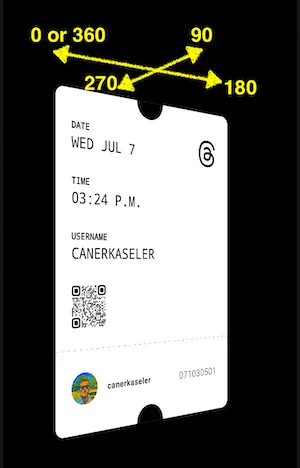
Above example means that we have to consider about Axis-Y position to show correct side design on Card Holder. Let’s see Card Holder compose function:
/**
 * This holder manages logic to show correct side of the card.
 */
@Composable
fun ThreadsInviteCardHolder(
    modifier: Modifier = Modifier,
    positionAxisY: Float,
    frontSide: @Composable () -> Unit = {},
    backSide: @Composable () -> Unit = {},
) {
    Card(
        modifier = modifier
            .graphicsLayer {
                rotationY = positionAxisY // Move card according to value of customY.
                cameraDistance = 14f * density
            },
    ) {

        // Here, logic is about coordinate system such as [0..90], [91..270], [270..360].
        if (abs(positionAxisY.toInt()) % 360 <= 90) {
            Box(
                Modifier.fillMaxSize()
            ) {
                frontSide()
            }
        } else if (abs(positionAxisY.toInt()) % 360 in 91..270) {
            Box(
                Modifier
                    .fillMaxSize()
                    .graphicsLayer {
                        rotationY = 180f // Important to avoid mirror effect.
                    },
            ) {
                backSide()
            }
        } else {
            Box(
                Modifier.fillMaxSize()
            ) {
                frontSide()
            }
        }
    }
}
You can see “Important to avoid mirror effect” comment. Yes, if you do not change rotation-Y (180 degree) for back side, it appears as opposite view.
2) Card Turning with Dragging
ThreadsInviteCard compose function is main function in this project. I call it in MainActivity. In here, of-course we have axisY variable with by delegation and remember keyword. These are helpful to keep our new Axis-Y value in recomposition. However, how can we drag a compose view?
The answer is “.pointerInput” and as you can see we can have all the necessary functions related to dragging.
@Composable
fun ThreadsInviteCard() {

    // This is our custom value of Axis-Y on coordinate system.
    var axisY by remember { mutableStateOf(0f) }

    ThreadsInviteCardHolder (
        frontSide = {
            CardFrontSide(user = User())
        },
        backSide = {
            CardBackSide()
        },
        positionAxisY = axisY,
        modifier = Modifier
            .padding(
                horizontal = 48.dp,
                vertical = 210.dp
            )
            .pointerInput(Unit) {
                detectHorizontalDragGestures(
                    onDragStart = { offset ->

                    },
                    onDragEnd = {

                    },
                    onDragCancel = {

                    },
                    onHorizontalDrag = { change, dragAmount ->

                        // Decide to turn card in which side.
                        axisY = if (dragAmount < 0) {
                            (axisY - abs(dragAmount)) % 360 // Turn left for negative numbers.
                        } else {
                            (axisY + abs(dragAmount)) % 360 // Turn right for positive numbers.
                        }
                    }
                )
            },
    )
}
Let’s see result for this part:
Awesome! Time to add a little animation on it 🚀
B) Part 2/4 — Always Turning Animation & Stop Animation
Related commit is here. Now, we would like to have same behaviour like real Threads Invitation Card. When users open the app, card should start turning by itself automatically. Also, card should stop when user drags it for now.
Firstly, we need to keep status of the animation. Should it run or stop?
// Manage auto-turning animation.
var isAutomaticAnimationActive by remember { mutableStateOf(true) }
In here, I will show only changing parts and idea. axisY value is zero, so auto-animation will start turning right. When users drag the card, animation will stop.
ThreadsInviteCardHolder (

  ...

  positionAxisY = if (isAutomaticAnimationActive) {
      val automaticTurningAnimation = remember { Animatable(axisY) } // Auto-turning animation.

      LaunchedEffect(isAutomaticAnimationActive) {
          if (isAutomaticAnimationActive) {
              automaticTurningAnimation.animateTo(
                  targetValue = if (axisY >= 0) {
                      axisY + 360f // Turn right.
                  } else {
                      - 360f + axisY // Turn left.
                  },
                  animationSpec = infiniteRepeatable(
                      tween(7000, easing = FastOutSlowInEasing)
                  ),
              )
          }
      }
      axisY = automaticTurningAnimation.value // Do not forget to update axis-Y.
      automaticTurningAnimation.value // Finally, return animation value.
  } else {
      axisY
  },

  ...

  onDragStart = { offset ->
      isAutomaticAnimationActive = false // Stop animation.
  },
  onDragEnd = {
      isAutomaticAnimationActive = false // Stop animation.
  },
)
Let’s see result for this part:
Seems good! Having an animation which is rotating card to near Axis-Y after dragging can be perfect. Hmm… Accepted 🤝
B) Part 3/4 — Rotating Card to near Axis-Y Animation after Dragging
Related commit is here. After dragging, card should move to near axis-Y according to position. Also, this animation should run for just one time.
This side is a little about math. If you did not checked B — Part 2/4, please look at the part.
Moreover, you can notice that all logic uses absolute value. The reason is that if we do not user absolute value, dragged position can be “-500” then logic breaks. Hence, according to my experience, I suggest to use absolute value for calculations of the animation logic in this project.
You can see updated parts in below:
var isCompletingAnimationActive by remember { mutableStateOf(false) }


ThreadsInviteCardHolder (

  ...

  positionAxisY = if (isAutomaticAnimationActive) {

    ...
  }
  else if (isCompletingAnimationActive) {
        val completeTurningAnimation = remember { Animatable(axisY) }

        LaunchedEffect(isCompletingAnimationActive) {
            if (isCompletingAnimationActive) {
                completeTurningAnimation.animateTo(
                    targetValue = if(abs(axisY.toInt()) % 360 <= 90) {
                        0f
                    }
                    else if (abs(axisY.toInt()) % 360 in 91..270) {
                        if (abs(axisY.toInt()) % 360 <= 270f) {

                            if (axisY > 0) 180f else -180f
                        }
                        else {
                            if (axisY > 0) 360f else -360f
                        }
                    }
                    else {
                        if (axisY > 0) 360f else -360f
                    },
                    animationSpec = tween(500, easing = FastOutLinearInEasing)
                ).endState
            }
        }
        axisY = completeTurningAnimation.value
        completeTurningAnimation.value
    }
    else {
        axisY
    },

  ...

    detectHorizontalDragGestures(
        onDragStart = { offset ->
            isAutomaticAnimationActive = false // Stop animation.
            isCompletingAnimationActive = false // Stop animation.
        },
        onDragEnd = {
            isAutomaticAnimationActive = false // Stop animation.
            isCompletingAnimationActive = true // Start animation.
        },
    )
)
Let’s see result for this part:
Wow! OK, time to combine all animations, finish this story and math calculations! 👍
B) Part 4/4 — Animation Rotating after Quick Dragging then Infinite Turning Animation
Related commit is here. This is the last part of the animation series. We need to have two things. Firstly, isQuickDragAnimationActive to start or stop animation. Also, we need to know drag amount. If amount of dragging is higher than our limit, app plays rotating animation.
// Follow drag amount to manage QuickDragAnimation.
var animationDragAmount by remember { mutableStateOf(0f) }

ThreadsInviteCardHolder (

  ...

  onHorizontalDrag = { change, dragAmount ->

        // Decide to turn card in which side.
        axisY = if (dragAmount < 0) {
            (axisY - abs(dragAmount)) % 360 // Turn left for negative numbers.
        } else {
            (axisY + abs(dragAmount)) % 360 // Turn right for positive numbers.
        }

        animationDragAmount = dragAmount // Keep updated drag amount.
    }
)
Now, we can decide to target of the animation according to draged amount by user. Moreover, you can notice that we can get endState from “.animateTo().endState”. It helps to understand that is animation running or not. You can see this example in below code:
var isQuickDragAnimationActive by remember { mutableStateOf(false) }


ThreadsInviteCardHolder (
  ...

  positionAxisY = if (isAutomaticAnimationActive) {
    ...
  }
  else if (isCompletingAnimationActive) {
    ....
  }
  else if (isQuickDragAnimationActive) {
        val completeQuickDragAnimation = remember { Animatable(axisY) }

        LaunchedEffect(isQuickDragAnimationActive) {
            if (isQuickDragAnimationActive) {

                val completeTurningAnimationState = completeQuickDragAnimation.animateTo(
                    targetValue = if (animationDragAmount > 0) {
                        360f * 2
                    } else {
                        -360f * 2
                    },
                    animationSpec = tween(1250, easing = LinearEasing)
                ).endState

                if (!completeTurningAnimationState.isRunning) {
                    isQuickDragAnimationActive = false
                    isAutomaticAnimationActive = true
                }
            }
        }
        axisY = completeQuickDragAnimation.value // Update axisY value.
        completeQuickDragAnimation.value // Return needed value.
    }
    else {
        axisY
    },

    ...

    onDragStart = { offset ->
        isAutomaticAnimationActive = false // Stop animation.
        isCompletingAnimationActive = false // Stop animation.
    },
    onDragEnd = {

        // Stop animations.
        isAutomaticAnimationActive = false
        isCompletingAnimationActive = false
        isQuickDragAnimationActive = false

        // If user did not drag enough, just show completing animation.
        if (abs(animationDragAmount) > 12f) {
            isQuickDragAnimationActive = true
        } else {
            isCompletingAnimationActive = true
        }
    },
)
Finally, we have all rotation animations of Threads Invitation Card with all behaviours:
Congratulations! You completed: Threads Invitation Card with Jetpack Compose. 👏

You can reach me on social media and other platforms, stay tuned: https://linktr.ee/canerkaseler 🤝
Thanks! ☕️
This article was previously published on proandroiddev.com


