


In the world of modern Android app development, Jetpack Compose has emerged as a powerful UI toolkit that offers a declarative approach to building native Android apps. With Jetpack Compose, you can create interactive and visually appealing user interfaces using composable functions. In this article, we will explore the CustomSlider composable function, which allows you to build custom sliders with personalized behavior and style in Jetpack Compose.
Introduction to CustomSlider
In this article, we will explore how to create our own implementation of CustomSliderin Jetpack Compose. The CustomSlider allows us to place indicators below the slider and label above the slider thumb. Sliders are widely used in applications to enable users to select values within a specified range. With CustomSlider, we have the flexibility to define the behavior and appearance of a slider by customizing its various parameters.
Let’s take a closer look at the signature of the CustomSlider function and understand its purpose:
@Composable
fun CustomSlider(
    value: Float,
    onValueChange: (Float) -> Unit,
    modifier: Modifier = Modifier,
    valueRange: ClosedFloatingPointRange<Float> = ValueRange,
    gap: Int = Gap,
    showIndicator: Boolean = false,
    showLabel: Boolean = false,
    enabled: Boolean = true,
    thumb: @Composable (thumbValue: Int) -> Unit = {
        CustomSliderDefaults.Thumb(it.toString())
    },
    track: @Composable (sliderPositions: SliderPositions) -> Unit = { sliderPositions ->
        CustomSliderDefaults.Track(sliderPositions = sliderPositions)
    },
    indicator: @Composable (indicatorValue: Int) -> Unit = { indicatorValue ->
        CustomSliderDefaults.Indicator(indicatorValue = indicatorValue.toString())
    },
    label: @Composable (labelValue: Int) -> Unit = { labelValue ->
        CustomSliderDefaults.Label(labelValue = labelValue.toString())
    }
) {
    // Implementation details
}
The CustomSlideraccepts several parameters that allow you to customize the slider’s behavior and appearance according to your requirements. Let’s explore each parameter in more detail:
value: Represents the current value of the slider. It is of typeFloat.onValueChange: A callback function that is invoked whenever the slider’s value changes. It takes aFloatparameter representing the new value selected by the user.modifier: An optionalModifierthat allows you to apply custom modifications to the slider’s visual appearance or behavior.valueRange: Specifies the range of values that the slider can take. It is defined as aClosedFloatingPointRange<Float>.gap: Indicates the gap or spacing between each step on the slider. This parameter determines the granularity of the values that can be selected. By default, the gap is set to 1, meaning there is no gap between steps.showIndicator: A Boolean value that determines whether to display indicators at each step on the slider.showLabel: A Boolean value indicating whether to show labels above the slider thumb.enabled: A Boolean value indicating whether the slider is enabled or disabled.thumb: A composable function that defines the visual representation of the thumb of the slider. It takes the current thumb value as anIntparameter.track: A composable function that defines the visual representation of the slider’s track. It takes aSliderPositionsparameter.indicator: A composable function that defines the visual representation of the indicators displayed at each step on the slider. It takes the indicator value as anIntparameter.label: A composable function that defines the visual representation of the labels displayed above the slider thumb. It takes the label value as anIntparameter.
By leveraging these parameters, you can create highly customizable sliders that align with your app’s design and functionality.
Understanding the Implementation
Now that we have examined the CustomSlider function’s signature and its parameters, let’s dive deeper into its implementation details to understand how it works.
val itemCount = (valueRange.endInclusive - valueRange.start).roundToInt()
val steps = if (gap == 1) 0 else (itemCount / gap - 1)
In this code snippet, we calculate the itemCountvariable by subtracting the start value from the end value of the valueRange.
The steps variable is computed based on the gap value. If the gap is set to 1, indicating no gap between steps, the steps value is set to 0. Otherwise, it is calculated as the number of steps based on the itemCount and gap. The itemCount is divided by the gap and then subtracted by 1. The result is rounded to the nearest integer using the roundToInt() function.
The Slider composable function is responsible for the layout and rendering of the slider components. It utilizes the Layout composable function to position the components correctly. Let’s take a closer look at the code inside the Slider function:
| Box(modifier = modifier) { | |
| Layout( | |
| measurePolicy = customSliderMeasurePolicy( | |
| itemCount = itemCount, | |
| gap = gap, | |
| value = value, | |
| startValue = valueRange.start | |
| ), | |
| content = { | |
| if (showLabel) | |
| Label( | |
| modifier = Modifier.layoutId(CustomSliderComponents.LABEL), | |
| value = value, | |
| label = label | |
| ) | |
| Box(modifier = Modifier.layoutId(CustomSliderComponents.THUMB)) { | |
| thumb(value.roundToInt()) | |
| } | |
| Slider( | |
| modifier = Modifier | |
| .fillMaxWidth() | |
| .layoutId(CustomSliderComponents.SLIDER), | |
| value = value, | |
| valueRange = valueRange, | |
| steps = steps, | |
| onValueChange = { onValueChange(it) }, | |
| thumb = { | |
| thumb(value.roundToInt()) | |
| }, | |
| track = { track(it) }, | |
| enabled = enabled | |
| ) | |
| if (showIndicator) | |
| Indicator( | |
| modifier = Modifier.layoutId(CustomSliderComponents.INDICATOR), | |
| valueRange = valueRange, | |
| gap = gap, | |
| indicator = indicator | |
| ) | |
| } | |
| ) | |
| } |
The Layout composable function is used to define a custom layout for the slider components. In it we have defined our label, indicator & slider components.
The measurePolicy parameter is set to the custommSliderMeasurePolicy function. This function contains the core logic of placing the items of our custom slider. We will explore the custommSliderMeasurePolicy function in more detail shortly.
Understanding the Indicator Function
The Indicator composable function is responsible for rendering the indicators at each step on the slider. It iterates over the range of values defined by valueRange and checks if each value is a multiple of the gap. If it is, an indicator is rendered using the provided indicator composable function. Here’s a snippet of the code inside the Indicator function:
// Iterate over the value range and display indicators at regular intervals.
for (i in valueRange.start.roundToInt()..valueRange.endInclusive.roundToInt() step gap) {
     Box(
         modifier = modifier
     ) {
        indicator(i)
     }
}
The function iterates over the range of values from valueRange.start to valueRange.endInclusive using a for loop with a step equal to gap. For each value, an indicator is rendered by invoking the indicator composable function and passing the value as a parameter.
Understanding the Label Function
The Label composable function is responsible for rendering the label above the thumb of the slider. Here’s a snippet of the code inside the Label function:
Box(
    modifier = modifier,
    contentAlignment = Alignment.Center
) {
    label(value.roundToInt())
}
Understanding the customSliderMeasurePolicy Function
The customSliderMeasurePolicyfunction is responsible for measuring and positioning the components inside the CustomSlider layout. It calculates the width and height of the layout and determines the positions of the label, slider, and indicators. Let’s understand the concept of placing indicators & lables of the custom slider.
Let’s say we have set the gap to 2 and the valueRange is from 0 to 10.
Step 1: Calculate width of each section.
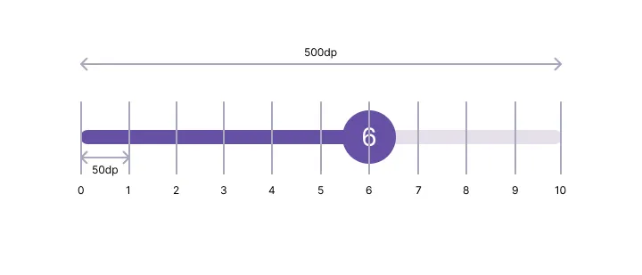
First we will divide the width of the track by the item count as shown in figure above. Let’s say the width of the track is 500dp, and the item count is 10 then the width of each section will be 500/10 = 50dp. So this way we calculated the width of each section.
// Calculate the available width for the track (excluding thumb radius on both sides).
val trackWidth = width - (2 * thumbRadius)
// Calculate the width of each section in the track.
val sectionWidth = trackWidth / itemCount
Step 2: Calculate spacing between indicators.
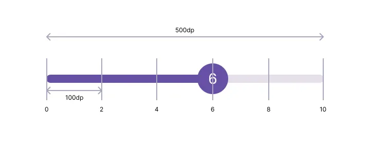
Now we need to calculate spacing between 2 indicators, for this we will multiply the width of each section by the gap i.e. 2, so we will get 50 * 2 = 100dp.
// Calculate the horizontal spacing between indicators.
val indicatorSpacing = sectionWidth * gap
Step 3: Placing the indicators.
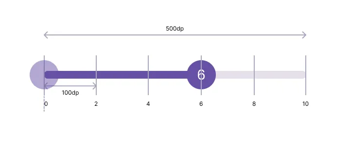
To place the indicators we will manage indicatorOffsetXvariable. Initially we will set indicatorOffsetXvariable tothumbRadiusso that it starts from the track as shown in figure above. And now if we place our indicator at this indicatorOffsetXit will placed a little to the right as show in figure above. To place the indicator exactly in the center, we need to divide the width of the indicator by 2 and then subtract it from the indicatorOffsetX.To place all the indicators we have to loop through all the indicators and add spacing between two indicators i.e. indicatorSpacing intoindicatorOffsetX.This way we can place all our indicators exactly below the slider values.
var indicatorOffsetX = thumbRadius
indicatorPlaceables.forEach { placeable ->
    // We have to subtract the half width of the each indicator from the indicatorOffset,
    // to place our indicators at the center.
    placeable.placeRelative(
        x = (indicatorOffsetX - (placeable.width / 2)).roundToInt(),
        y = labelHeight + sliderHeight
    )
    indicatorOffsetX += indicatorSpacing
}
Step 4: Placing labels above the slider.
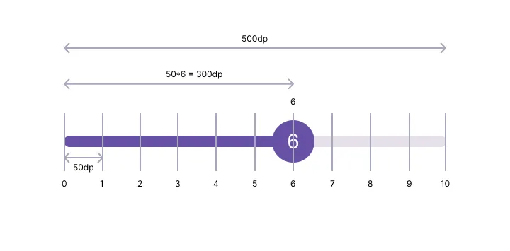
To place the label above the slider thumb, we need to multiply the sectionWidthby current value. To calculate current value we will subtract end value of the slider from the start value i.e. in our case it is (6–0 = 6). We are doing this because it might be possible that the start value of valueRangedoesn’t starts from 0; for example it may be 10f..100f.
// To calculate offset of the label, first we will calculate the progress of the slider
// by subtracting startValue from the current value.
// After that we will multiply this progress by the sectionWidth.
// Add thumb radius to this resulting value.
val labelOffset = (sectionWidth * (value - startValue)) + thumbRadius

// Inside layout composable
layout(width = width, height = height) {
  // We have to subtract the half width of the label from the labelOffset,
  // to place our label at the center.
  labelPlaceable?.placeRelative(
    x = (labelOffset - (labelPlaceable.width / 2)).roundToInt(),
    y = 0
  )
  // Other code
}
Here is the full code of customSliderMeasurePolicy
| private fun customSliderMeasurePolicy( | |
| itemCount: Int, | |
| gap: Int, | |
| value: Float, | |
| startValue: Float | |
| ) = MeasurePolicy { measurables, constraints -> | |
| // Measure the thumb component and calculate its radius. | |
| val thumbPlaceable = measurables.first { | |
| it.layoutId == CustomSliderComponents.THUMB | |
| }.measure(constraints) | |
| val thumbRadius = (thumbPlaceable.width / 2).toFloat() | |
| val indicatorPlaceables = measurables.filter { | |
| it.layoutId == CustomSliderComponents.INDICATOR | |
| }.map { measurable -> | |
| measurable.measure(constraints) | |
| } | |
| val indicatorHeight = indicatorPlaceables.maxByOrNull { it.height }?.height ?: 0 | |
| val sliderPlaceable = measurables.first { | |
| it.layoutId == CustomSliderComponents.SLIDER | |
| }.measure(constraints) | |
| val sliderHeight = sliderPlaceable.height | |
| val labelPlaceable = measurables.find { | |
| it.layoutId == CustomSliderComponents.LABEL | |
| }?.measure(constraints) | |
| val labelHeight = labelPlaceable?.height ?: 0 | |
| // Calculate the total width and height of the custom slider layout | |
| val width = sliderPlaceable.width | |
| val height = labelHeight + sliderHeight + indicatorHeight | |
| // Calculate the available width for the track (excluding thumb radius on both sides). | |
| val trackWidth = width - (2 * thumbRadius) | |
| // Calculate the width of each section in the track. | |
| val sectionWidth = trackWidth / itemCount | |
| // Calculate the horizontal spacing between indicators. | |
| val indicatorSpacing = sectionWidth * gap | |
| // To calculate offset of the label, first we will calculate the progress of the slider | |
| // by subtracting startValue from the current value. | |
| // After that we will multiply this progress by the sectionWidth. | |
| // Add thumb radius to this resulting value. | |
| val labelOffset = (sectionWidth * (value - startValue)) + thumbRadius | |
| layout(width = width, height = height) { | |
| var indicatorOffsetX = thumbRadius | |
| // Place label at top. | |
| // We have to subtract the half width of the label from the labelOffset, | |
| // to place our label at the center. | |
| labelPlaceable?.placeRelative( | |
| x = (labelOffset - (labelPlaceable.width / 2)).roundToInt(), | |
| y = 0 | |
| ) | |
| // Place slider placeable below the label. | |
| sliderPlaceable.placeRelative(x = 0, y = labelHeight) | |
| // Place indicators below the slider. | |
| indicatorPlaceables.forEach { placeable -> | |
| // We have to subtract the half width of the each indicator from the indicatorOffset, | |
| // to place our indicators at the center. | |
| placeable.placeRelative( | |
| x = (indicatorOffsetX - (placeable.width / 2)).roundToInt(), | |
| y = labelHeight + sliderHeight | |
| ) | |
| indicatorOffsetX += indicatorSpacing | |
| } | |
| } | |
| } |
CustomSliderDefaults
CustomSliderDefaults is used to hold defaults which are used by custom slider. It has 4 functions which are thumb, track, indicator and label. The CustomSliderDefaults is easy and does not have any complexity, so I am not going to explain it in this article.
You can find the full code of CustomSlider below:
| /** | |
| * Object to hold defaults used by [CustomSlider] | |
| */ | |
| object CustomSliderDefaults { | |
| /** | |
| * Composable function that represents the thumb of the slider. | |
| * | |
| * @param thumbValue The value to display on the thumb. | |
| * @param modifier The modifier for styling the thumb. | |
| * @param color The color of the thumb. | |
| * @param size The size of the thumb. | |
| * @param shape The shape of the thumb. | |
| */ | |
| @Composable | |
| fun Thumb( | |
| thumbValue: String, | |
| modifier: Modifier = Modifier, | |
| color: Color = PrimaryColor, | |
| size: Dp = ThumbSize, | |
| shape: Shape = CircleShape, | |
| content: @Composable () -> Unit = { | |
| Text( | |
| text = thumbValue, | |
| color = Color.White, | |
| textAlign = TextAlign.Center | |
| ) | |
| } | |
| ) { | |
| Box( | |
| modifier = modifier | |
| .thumb(size = size, shape = shape) | |
| .background(color) | |
| .padding(2.dp), | |
| contentAlignment = Alignment.Center | |
| ) { | |
| content() | |
| } | |
| } | |
| /** | |
| * Composable function that represents the track of the slider. | |
| * | |
| * @param sliderState The state of the slider. | |
| * @param modifier The modifier for styling the track. | |
| * @param trackColor The color of the track. | |
| * @param progressColor The color of the progress. | |
| * @param height The height of the track. | |
| * @param shape The shape of the track. | |
| */ | |
| @OptIn(ExperimentalMaterial3Api::class) | |
| @Composable | |
| fun Track( | |
| sliderState: SliderState, | |
| modifier: Modifier = Modifier, | |
| trackColor: Color = TrackColor, | |
| progressColor: Color = PrimaryColor, | |
| height: Dp = TrackHeight, | |
| shape: Shape = CircleShape | |
| ) { | |
| Box( | |
| modifier = modifier | |
| .track(height = height, shape = shape) | |
| .background(trackColor) | |
| ) { | |
| Box( | |
| modifier = Modifier | |
| .progress( | |
| sliderState = sliderState, | |
| height = height, | |
| shape = shape | |
| ) | |
| .background(progressColor) | |
| ) | |
| } | |
| } | |
| /** | |
| * Composable function that represents the indicator of the slider. | |
| * | |
| * @param indicatorValue The value to display as the indicator. | |
| * @param modifier The modifier for styling the indicator. | |
| * @param style The style of the indicator text. | |
| */ | |
| @Composable | |
| fun Indicator( | |
| indicatorValue: String, | |
| modifier: Modifier = Modifier, | |
| style: TextStyle = TextStyle(fontSize = 10.sp, fontWeight = FontWeight.Normal) | |
| ) { | |
| Box(modifier = modifier) { | |
| Text( | |
| text = indicatorValue, | |
| style = style, | |
| textAlign = TextAlign.Center | |
| ) | |
| } | |
| } | |
| /** | |
| * Composable function that represents the label of the slider. | |
| * | |
| * @param labelValue The value to display as the label. | |
| * @param modifier The modifier for styling the label. | |
| * @param style The style of the label text. | |
| */ | |
| @Composable | |
| fun Label( | |
| labelValue: String, | |
| modifier: Modifier = Modifier, | |
| style: TextStyle = TextStyle(fontSize = 12.sp, fontWeight = FontWeight.Normal) | |
| ) { | |
| Box(modifier = modifier) { | |
| Text( | |
| text = labelValue, | |
| style = style, | |
| textAlign = TextAlign.Center | |
| ) | |
| } | |
| } | |
| } |
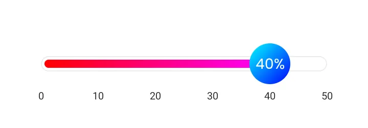
Customizing CustomSlider
Now we have finished creating our custom slider implementation, so let’s see how we can use it in our projects and customize it as per our requirements.
| var sliderValue by remember { mutableFloatStateOf(0f) } | |
| CustomSlider( | |
| modifier = Modifier | |
| .fillMaxWidth() | |
| .padding(horizontal = 20.dp), | |
| value = sliderValue, | |
| onValueChange = { | |
| sliderValue = it | |
| }, | |
| valueRange = 0f..50f, | |
| gap = 10, | |
| showIndicator = true, | |
| thumb = { thumbValue -> | |
| CustomSliderDefaults.Thumb( | |
| thumbValue = "$thumbValue%", | |
| color = Color.Transparent, | |
| size = 40.dp, | |
| modifier = Modifier.background( | |
| brush = Brush.linearGradient(listOf(Color.Cyan, Color.Blue)), | |
| shape = CircleShape | |
| ) | |
| ) | |
| }, | |
| track = { sliderState -> | |
| Box( | |
| modifier = Modifier | |
| .track() | |
| .border( | |
| width = 1.dp, | |
| color = Color.LightGray.copy(alpha = 0.4f), | |
| shape = CircleShape | |
| ) | |
| .background(Color.White) | |
| .padding(3.5.dp), | |
| contentAlignment = Alignment.CenterStart | |
| ) { | |
| Box( | |
| modifier = Modifier | |
| .progress(sliderState = sliderState) | |
| .background( | |
| brush = Brush.linearGradient(listOf(Color.Red, Color.Magenta)) | |
| ) | |
| ) | |
| } | |
| } | |
| ) |
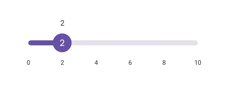
Output
Thanks for reading this article. You can find the full code of creating CustomSlider here.
Conclusion
In this article, we took a deep dive into the CustomSlider composable function in Jetpack Compose. We explored its parameters and learned how to customize the behavior and appearance of sliders in Jetpack Compose. By understanding the implementation of the CustomSlider function, you can create personalized sliders that suit your app’s design and functionality requirements. Jetpack Compose empowers you to build dynamic and interactive user interfaces, and sliders are just one example of the versatile components you can create with it.
This article was previously published on proandroiddev.com


