


Introduction
Animations have the power to make user interfaces feel alive and engaging. In Android, with Jetpack Compose, this power is at your fingertips, offering advanced tools to craft truly dynamic UIs. In this article, we’ll go beyond the basics and explore the deeper aspects of animations within Jetpack Compose.
We’ll cover a range of techniques, from creating fluid, physics-based motions that add a touch of realism, to complex choreographed sequences that bring a narrative quality to your interfaces. Whether you’re fine-tuning your skills or just curious about what’s possible, this journey will provide practical insights into making your apps not only function smoothly but also delight users at every interaction.
Let’s dive in and discover how these animations can transform your approach to UI design, making it more intuitive, responsive, and enjoyable for users.
Section 1 — Custom Animation Handlers in Jetpack Compose
Embracing Dynamic Interactivity with Custom Animations
In this section, we explore the use of advanced custom animation handlers in Jetpack Compose to create dynamic and interactive UI elements. Our focus is on a real-world example that demonstrates how user interaction can influence an animation in a meaningful way.
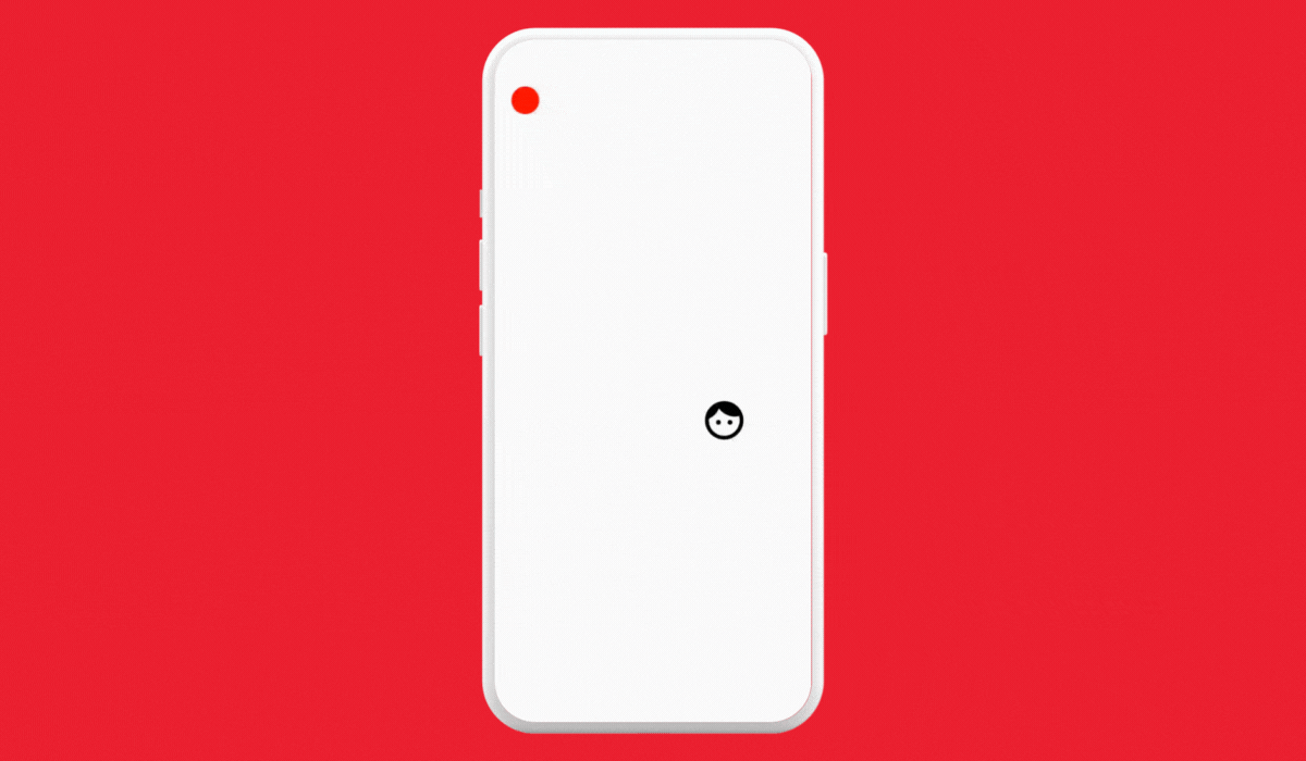
Example — Interactive Game Character Movement
We’ll illustrate this concept with an example where a game character (represented by a face icon) follows a path determined by a user-draggable control point.
@Composable
fun GameCharacterMovement() {
    val startPosition = Offset(100f, 100f)
    val endPosition = Offset(250f, 400f)
    val controlPoint = remember { mutableStateOf(Offset(200f, 300f)) }
    val position = remember { Animatable(startPosition, Offset.VectorConverter) }

    LaunchedEffect(controlPoint.value) {
        position.animateTo(
            targetValue = endPosition,
            animationSpec = keyframes {
                durationMillis = 5000
                controlPoint.value at 2500 // midway point controlled by the draggable control point
            }
        )
    }

    val onControlPointChange: (offset: Offset) -> Unit = {
        controlPoint.value = it
    }

    Box(modifier = Modifier.fillMaxSize()) {

        Icon(
            Icons.Filled.Face, contentDescription = "Localized description", modifier = Modifier
                .size(50.dp)
                .offset(x = position.value.x.dp, y = position.value.y.dp)
        )

        DraggableControlPoint(controlPoint.value, onControlPointChange)
    }
}
Explanation
GameCharacterMovementanimates an icon representing a game character. The animation path is controlled by thecontrolPoint, which is set and updated by user interaction.Animatableis used for smoothly transitioning the icon’s position fromstartPositionto theendPosition.LaunchedEffectlistens for changes in thecontrolPointvalue, re-triggering the animation whenever the control point is moved.- animationSpec— It’s a configuration that defines the duration, delay, and easing of an animation. It determines how the animated values change over time.
- keyframes— This allows you to specify values at specific times during the animation, giving you control over the animation’s intermediate points. It’s particularly useful for creating complex, choreographed animations.
- The
keyframesblock defines the animation as a sequence of keyframes. At 2500 milliseconds (the halfway point), the character reaches the control point, then continues to the end position.
Composable
fun DraggableControlPoint(controlPoint: Offset, onControlPointChange: (Offset) -> Unit) {
    var localPosition by remember { mutableStateOf(controlPoint) }
    Box(
        modifier = Modifier
            .offset {
                IntOffset(
                    x = localPosition.x.roundToInt() - 15,
                    y = localPosition.y.roundToInt() - 15
                )
            }
            .size(30.dp)
            .background(Color.Red, shape = CircleShape)
            .pointerInput(Unit) {
                detectDragGestures(onDragEnd = {
                    onControlPointChange(localPosition)
                }) { _, dragAmount ->
                    // adjust based on screen bounds
                    val newX = (localPosition.x + dragAmount.x).coerceIn(0f, 600f)
                    val newY = (localPosition.y + dragAmount.y).coerceIn(0f, 600f)
                    localPosition = Offset(newX, newY)
                }
            }
    )
}
Explanation
DraggableControlPointis a composable that allows the user to interactively change the position of the control point.- Dragging the control point updates
localPosition, which is then reflected back to theGameCharacterMovementupon the completion of the drag gesture (onDragEnd). This interaction alters the path of the animated icon.
Real-World Use Cases
- Interactive Educational Apps: In an educational app, animations can be used to make learning more engaging. For instance, dragging a planet along its orbit in an astronomy app to see different constellations.
- Interactive Storytelling and Games: In digital storytelling or gaming apps, allowing users to influence the story or game environment through draggable elements can create a more immersive experience.
Section 2 — Choreographing Complex Animations in Jetpack Compose
Synchronizing Multiple Elements for Harmonious Effects
In this section, we delve into the art of choreographing complex animations in Jetpack Compose. We focus on creating synchronized animations where multiple elements interact seamlessly, enhancing the overall user experience.
A) Chain Reaction Animations — The Domino Effect
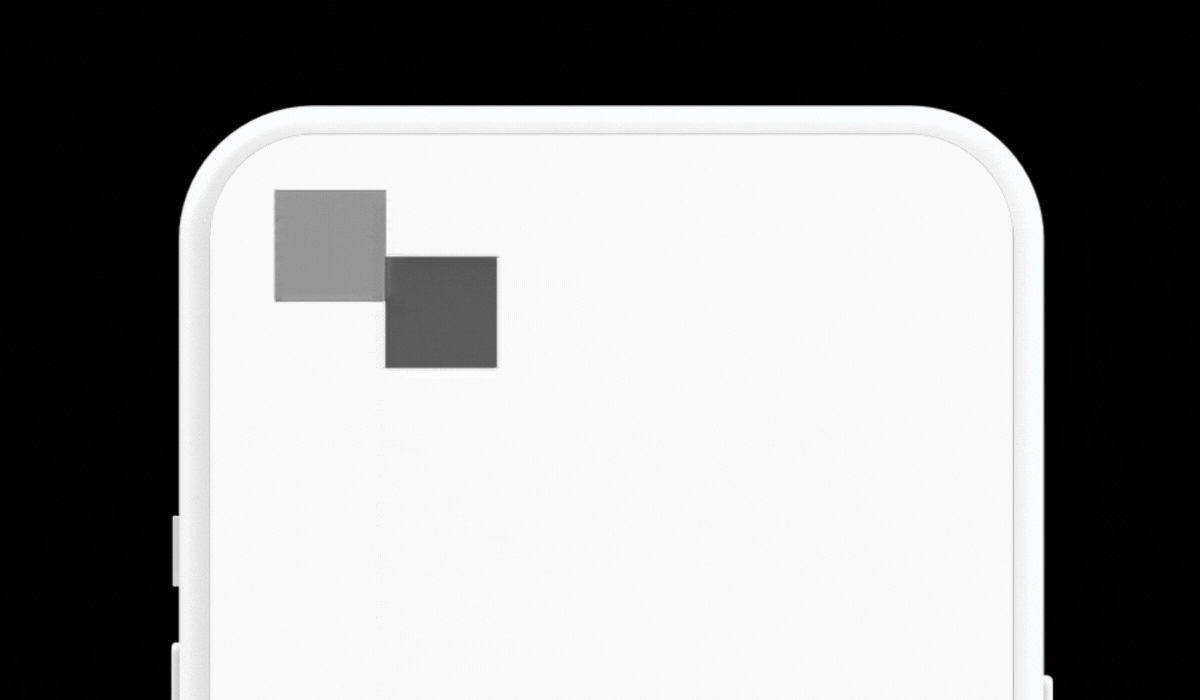
Creating a domino effect in UI can be achieved by setting up a series of animations where the completion of one triggers the start of the next.
@Composable
fun DominoEffect() {
    val animatedValues = List(6) { remember { Animatable(0f) } }

    LaunchedEffect(Unit) {
        animatedValues.forEachIndexed { index, animate ->
            animate.animateTo(
                targetValue = 1f,
                animationSpec = tween(durationMillis = 1000, delayMillis = index * 100)
            )
        }
    }

    Box (modifier = Modifier.fillMaxSize()){
      animatedValues.forEachIndexed { index, value ->
        Box(
            modifier = Modifier
                .size(50.dp)
                .offset(x = ((index+1) * 50).dp, y = ((index+1) * 30).dp)
                .background(getRandomColor(index).copy(alpha = value.value))
        )
      }
    }
}

fun getRandomColor(seed: Int): Color {
    val random = Random(seed = seed).nextInt(256)
    return Color(random, random, random)
}
Explanation
animatedValuesis a list ofAnimatablevalues, each controlling the alpha (opacity) of a box.- The
LaunchedEffecttriggers a sequence of animations for these values, creating a staggered effect where each box fades in after the previous one, akin to dominoes falling. - The
getRandomColorfunction generates a random shade of gray for each box, adding a unique visual element to each component in the sequence. - The boxes are positioned diagonally across the screen, enhancing the domino effect.
B) Interactive Scrollable Timeline
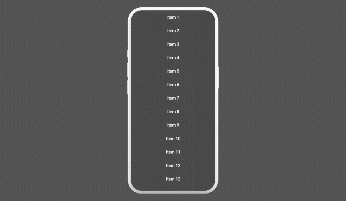
In this timeline, each element will fade in and move into position as the user scrolls through the timeline. We’ll use LazyColumn for the scrollable list and Animatable for the animation.
@Composable
fun InteractiveTimeline(timelineItems: List<String>) {
    val scrollState = rememberLazyListState()

    LazyColumn(state = scrollState) {
        itemsIndexed(timelineItems) { index, item ->
            val animatableAlpha = remember { Animatable(0f) }
            val isVisible = remember {
                derivedStateOf {
                    scrollState.firstVisibleItemIndex <= index
                }
            }

            LaunchedEffect(isVisible.value) {
                if (isVisible.value) {
                    animatableAlpha.animateTo(
                        1f, animationSpec = tween(durationMillis = 1000)
                    )

                }
            }

            TimelineItem(
                text = item,
                alpha = animatableAlpha.value,
            )
        }
    }
}

@Composable
fun TimelineItem(text: String, alpha: Float) {
    Row(
        modifier = Modifier
            .fillMaxWidth()
            .background(Color.DarkGray.copy(alpha = alpha))
            .padding(16.dp),
        verticalAlignment = Alignment.CenterVertically
    ) {
        Text(
            text = text,
            color = Color.White,
            modifier = Modifier.fillMaxWidth(),
            textAlign = TextAlign.Center,
            fontSize = 18.sp,
            fontWeight = FontWeight.SemiBold
        )
    }
}
Explanation
animatableAlphacontrols the alpha (opacity) of each timeline item, initially set to 0 (fully transparent).- The
isVisiblestate is derived from the current scroll position, determining if the item should be visible. - As the user scrolls,
LaunchedEffecttriggers the fade-in animation for items entering the viewport.
Use Case
This interactive timeline is ideal for applications where you want to present a series of events or steps in a visually engaging way. The animation enhances user engagement by drawing attention to the items as they come into view.
Such animations are not only captivating but can also be used to guide user attention through a sequence of events or actions in your app.
Section 3 — Physics-based Animations for Realism in Jetpack Compose

Leveraging Physics to Enhance UI Dynamics
In this section, we explore how to integrate physics principles into animations with Jetpack Compose, adding a layer of realism and interactivity to the UI. We’ll focus on an elastic drag interaction example.
Elastic Effect on Drag
This example illustrates an elastic drag interaction on an icon. When dragged vertically, the icon stretches and bounces back with an elastic effect, simulating the behavior of a spring or rubber band.
Write
1
PAD Editorial
Get unlimited access to the best of Medium for less than $1/week.
Become a member
Animating Inside and Outside the Box with Jetpack Compose
Building Creative Animations with Compose in Android
Nirbhay Pherwani
ProAndroidDev
Nirbhay Pherwani
·
Follow
Published in
ProAndroidDev
·
14 min read
·
5 days ago
414
3
This image was created with the assistance of DALL·E 3
Introduction
Animations have the power to make user interfaces feel alive and engaging. In Android, with Jetpack Compose, this power is at your fingertips, offering advanced tools to craft truly dynamic UIs. In this article, we’ll go beyond the basics and explore the deeper aspects of animations within Jetpack Compose.
We’ll cover a range of techniques, from creating fluid, physics-based motions that add a touch of realism, to complex choreographed sequences that bring a narrative quality to your interfaces. Whether you’re fine-tuning your skills or just curious about what’s possible, this journey will provide practical insights into making your apps not only function smoothly but also delight users at every interaction.
Let’s dive in and discover how these animations can transform your approach to UI design, making it more intuitive, responsive, and enjoyable for users.
Section 1 — Custom Animation Handlers in Jetpack Compose
Game Character Movement
Embracing Dynamic Interactivity with Custom Animations
In this section, we explore the use of advanced custom animation handlers in Jetpack Compose to create dynamic and interactive UI elements. Our focus is on a real-world example that demonstrates how user interaction can influence an animation in a meaningful way.
Example — Interactive Game Character Movement
We’ll illustrate this concept with an example where a game character (represented by a face icon) follows a path determined by a user-draggable control point.
@Composable
fun GameCharacterMovement() {
val startPosition = Offset(100f, 100f)
val endPosition = Offset(250f, 400f)
val controlPoint = remember { mutableStateOf(Offset(200f, 300f)) }
val position = remember { Animatable(startPosition, Offset.VectorConverter) }
LaunchedEffect(controlPoint.value) {
position.animateTo(
targetValue = endPosition,
animationSpec = keyframes {
durationMillis = 5000
controlPoint.value at 2500 // midway point controlled by the draggable control point
}
)
}
val onControlPointChange: (offset: Offset) -> Unit = {
controlPoint.value = it
}
Box(modifier = Modifier.fillMaxSize()) {
Icon(
Icons.Filled.Face, contentDescription = "Localized description", modifier = Modifier
.size(50.dp)
.offset(x = position.value.x.dp, y = position.value.y.dp)
)
DraggableControlPoint(controlPoint.value, onControlPointChange)
}
}
Explanation
GameCharacterMovement animates an icon representing a game character. The animation path is controlled by the controlPoint, which is set and updated by user interaction.
Animatable is used for smoothly transitioning the icon's position from startPosition to the endPosition.
LaunchedEffect listens for changes in the controlPoint value, re-triggering the animation whenever the control point is moved.
animationSpec— It's a configuration that defines the duration, delay, and easing of an animation. It determines how the animated values change over time.
keyframes— This allows you to specify values at specific times during the animation, giving you control over the animation's intermediate points. It's particularly useful for creating complex, choreographed animations.
The keyframes block defines the animation as a sequence of keyframes. At 2500 milliseconds (the halfway point), the character reaches the control point, then continues to the end position.
Composable
fun DraggableControlPoint(controlPoint: Offset, onControlPointChange: (Offset) -> Unit) {
var localPosition by remember { mutableStateOf(controlPoint) }
Box(
modifier = Modifier
.offset {
IntOffset(
x = localPosition.x.roundToInt() - 15,
y = localPosition.y.roundToInt() - 15
)
}
.size(30.dp)
.background(Color.Red, shape = CircleShape)
.pointerInput(Unit) {
detectDragGestures(onDragEnd = {
onControlPointChange(localPosition)
}) { _, dragAmount ->
// adjust based on screen bounds
val newX = (localPosition.x + dragAmount.x).coerceIn(0f, 600f)
val newY = (localPosition.y + dragAmount.y).coerceIn(0f, 600f)
localPosition = Offset(newX, newY)
}
}
)
}
Explanation
DraggableControlPoint is a composable that allows the user to interactively change the position of the control point.
Dragging the control point updates localPosition, which is then reflected back to the GameCharacterMovement upon the completion of the drag gesture (onDragEnd). This interaction alters the path of the animated icon.
Real-World Use Cases
Interactive Educational Apps: In an educational app, animations can be used to make learning more engaging. For instance, dragging a planet along its orbit in an astronomy app to see different constellations.
Interactive Storytelling and Games: In digital storytelling or gaming apps, allowing users to influence the story or game environment through draggable elements can create a more immersive experience.
Section 2 — Choreographing Complex Animations in Jetpack Compose
Synchronizing Multiple Elements for Harmonious Effects
In this section, we delve into the art of choreographing complex animations in Jetpack Compose. We focus on creating synchronized animations where multiple elements interact seamlessly, enhancing the overall user experience.
A) Chain Reaction Animations — The Domino Effect
Domino Effect
Creating a domino effect in UI can be achieved by setting up a series of animations where the completion of one triggers the start of the next.
@Composable
fun DominoEffect() {
val animatedValues = List(6) { remember { Animatable(0f) } }
LaunchedEffect(Unit) {
animatedValues.forEachIndexed { index, animate ->
animate.animateTo(
targetValue = 1f,
animationSpec = tween(durationMillis = 1000, delayMillis = index * 100)
)
}
}
Box (modifier = Modifier.fillMaxSize()){
animatedValues.forEachIndexed { index, value ->
Box(
modifier = Modifier
.size(50.dp)
.offset(x = ((index+1) * 50).dp, y = ((index+1) * 30).dp)
.background(getRandomColor(index).copy(alpha = value.value))
)
}
}
}
fun getRandomColor(seed: Int): Color {
val random = Random(seed = seed).nextInt(256)
return Color(random, random, random)
}
Explanation
animatedValues is a list of Animatable values, each controlling the alpha (opacity) of a box.
The LaunchedEffect triggers a sequence of animations for these values, creating a staggered effect where each box fades in after the previous one, akin to dominoes falling.
The getRandomColor function generates a random shade of gray for each box, adding a unique visual element to each component in the sequence.
The boxes are positioned diagonally across the screen, enhancing the domino effect.
B) Interactive Scrollable Timeline
In this timeline, each element will fade in and move into position as the user scrolls through the timeline. We’ll use LazyColumn for the scrollable list and Animatable for the animation.
@Composable
fun InteractiveTimeline(timelineItems: List<String>) {
val scrollState = rememberLazyListState()
LazyColumn(state = scrollState) {
itemsIndexed(timelineItems) { index, item ->
val animatableAlpha = remember { Animatable(0f) }
val isVisible = remember {
derivedStateOf {
scrollState.firstVisibleItemIndex <= index
}
}
LaunchedEffect(isVisible.value) {
if (isVisible.value) {
animatableAlpha.animateTo(
1f, animationSpec = tween(durationMillis = 1000)
)
}
}
TimelineItem(
text = item,
alpha = animatableAlpha.value,
)
}
}
}
@Composable
fun TimelineItem(text: String, alpha: Float) {
Row(
modifier = Modifier
.fillMaxWidth()
.background(Color.DarkGray.copy(alpha = alpha))
.padding(16.dp),
verticalAlignment = Alignment.CenterVertically
) {
Text(
text = text,
color = Color.White,
modifier = Modifier.fillMaxWidth(),
textAlign = TextAlign.Center,
fontSize = 18.sp,
fontWeight = FontWeight.SemiBold
)
}
}
Explanation
animatableAlpha controls the alpha (opacity) of each timeline item, initially set to 0 (fully transparent).
The isVisible state is derived from the current scroll position, determining if the item should be visible.
As the user scrolls, LaunchedEffect triggers the fade-in animation for items entering the viewport.
Use Case
This interactive timeline is ideal for applications where you want to present a series of events or steps in a visually engaging way. The animation enhances user engagement by drawing attention to the items as they come into view.
Such animations are not only captivating but can also be used to guide user attention through a sequence of events or actions in your app.
Section 3 — Physics-based Animations for Realism in Jetpack Compose
Elastic Drag Animation
Leveraging Physics to Enhance UI Dynamics
In this section, we explore how to integrate physics principles into animations with Jetpack Compose, adding a layer of realism and interactivity to the UI. We’ll focus on an elastic drag interaction example.
Elastic Effect on Drag
This example illustrates an elastic drag interaction on an icon. When dragged vertically, the icon stretches and bounces back with an elastic effect, simulating the behavior of a spring or rubber band.
@Composable
fun ElasticDraggableBox() {
var animatableOffset by remember { mutableStateOf(Animatable(0f)) }
Box(modifier = Modifier.fillMaxSize().background(Color(0xFFFFA732)), contentAlignment = Alignment.Center) {
Box(
modifier = Modifier
.offset(y = animatableOffset.value.dp)
.draggable(
orientation = Orientation.Vertical,
state = rememberDraggableState { delta ->
animatableOffset = Animatable(animatableOffset.value + delta)
},
onDragStopped = {
animatableOffset.animateTo(0f, animationSpec = spring())
}
)
.size(350.dp),
contentAlignment = Alignment.Center
) {
Icon(
Icons.Filled.Favorite,
contentDescription = "heart",
modifier = Modifier.size(animatableOffset.value.dp + 150.dp),
tint = Color.Red
)
}
}
}
Explanation
- A
Boxcomposable, which contains an icon, is made draggable using thedraggablemodifier. animatableOffsettracks the vertical offset of the icon due to dragging.- During the drag, the icon’s size changes based on the drag amount, creating a stretching effect.
- When the drag stops (
onDragStopped),animatableOffsetis animated back to0fusing a spring animation, resulting in the icon snapping back to its original size and position.
Section 4 — Gesture-based Animations in Jetpack Compose
Enhancing User Experience with Responsive Gestures
In this section, we explore how Jetpack Compose can be used to create animations that are controlled by user gestures. We’ll focus on two examples — a multi-touch transformable image and a gesture-controlled audio waveform.
A) Multi-Touch Transformable Image
In this example, we’ll create an image view that users can interact with using multi-touch gestures like pinch, zoom, and rotate.

@Composable
fun TransformableImage(imageId: Int = R.drawable.android) {
var scale by remember { mutableStateOf(1f) }
var rotation by remember { mutableStateOf(0f) }
var offset by remember { mutableStateOf(Offset.Zero) }
Box(modifier = Modifier.fillMaxSize().background(Color.DarkGray), contentAlignment = Alignment.Center) {
Image(
painter = painterResource(id = imageId),
contentDescription = "Transformable image",
contentScale = ContentScale.Crop,
modifier = Modifier
.size(300.dp)
.graphicsLayer(
scaleX = scale,
scaleY = scale,
rotationZ = rotation,
translationX = offset.x,
translationY = offset.y
)
.pointerInput(Unit) {
detectTransformGestures { _, pan, zoom, rotate ->
scale *= zoom
rotation += rotate
offset += pan
}
}
)
}
}
Explanation
- The
Imagecomposable is modified withgraphicsLayerto apply transformations like scale, rotation, and translation. - The
pointerInputwithdetectTransformGesturesis used to handle multi-touch gestures, updating the scale, rotation, and offset accordingly.
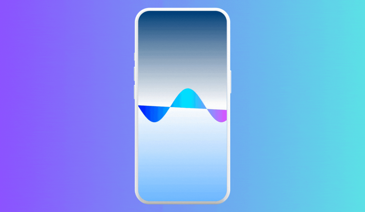
B) Gesture Controlled Waveform
Here’s a waveform visualization that changes its appearance based on user gestures, such as swipes and pinches, to control aspects like amplitude and frequency.
@Composable
fun GestureControlledWaveform() {
var amplitude by remember { mutableStateOf(100f) }
var frequency by remember { mutableStateOf(1f) }
Canvas(modifier = Modifier
.fillMaxSize()
.pointerInput(Unit) {
detectDragGestures { _, dragAmount ->
amplitude += dragAmount.y
frequency += dragAmount.x / 500f
// Adjusting frequency based on drag
}
}
.background(
Brush.verticalGradient(
colors = listOf(Color(0xFF003366), Color.White, Color(0xFF66B2FF))
)
)) {
val width = size.width
val height = size.height
val path = Path()
val halfHeight = height / 2
val waveLength = width / frequency
path.moveTo(0f, halfHeight)
for (x in 0 until width.toInt()) {
val theta = (2.0 * Math.PI * x / waveLength).toFloat()
val y = halfHeight + amplitude * sin(theta.toDouble()).toFloat()
path.lineTo(x.toFloat(), y)
}
val gradient = Brush.horizontalGradient(
colors = listOf(Color.Blue, Color.Cyan, Color.Magenta)
)
drawPath(
path = path,
brush = gradient
)
}
}
Explanation
amplitudeandfrequencyare state variables that control the amplitude and frequency of the waveform, respectively.- The
Canvascomposable is used to draw the waveform. The drawing logic inside theCanvascalculates the Y position for each X position based on the sine function, creating a wave effect. - The
detectDragGesturesmodifier is used to updateamplitudeandfrequencybased on user drag gestures. Horizontal drags adjust the frequency, and vertical drags adjust the amplitude. - As the user drags across the screen, the shape of the waveform changes accordingly, creating an interactive experience.
Note
- This is a basic implementation. For a more realistic audio waveform, you would need to integrate actual audio data.
- The responsiveness of the waveform to gestures can be fine-tuned by adjusting how
amplitudeandfrequencyare modified during the drag.
This example demonstrates how to create a basic interactive waveform in Compose, and it can be extended or modified for more complex use cases or to handle more intricate gestures.
Section 5 — State-driven Animation Patterns in Jetpack Compose
Animating UI Based on Data and State Changes
This section focuses on creating animations that are driven by changes in data or UI state, enhancing the interactivity and responsiveness of the app. We’ll explore two specific examples — animating a data graph and implementing state transitions in a multi-state UI.
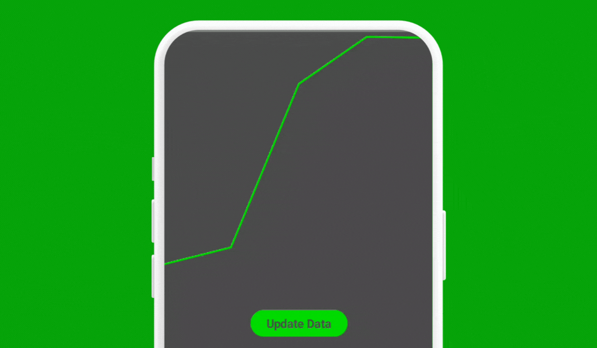
A) Data Driven Graph Animation
This example demonstrates an animated line graph where the path of the graph animates in response to changes in the data set.
@Composable
fun AnimatedGraphExample() {
var dataPoints by remember { mutableStateOf(generateRandomDataPoints(5)) }
Column(
modifier = Modifier
.fillMaxSize()
.background(Color.DarkGray)
) {
AnimatedLineGraph(dataPoints = dataPoints)
Spacer(modifier = Modifier.height(16.dp))
Button(
onClick = {
dataPoints = generateRandomDataPoints(5)
},
modifier = Modifier.align(Alignment.CenterHorizontally),
colors = ButtonDefaults.buttonColors(containerColor = Color.Green)
) {
Text(
"Update Data",
fontWeight = FontWeight.Bold,
color = Color.DarkGray,
fontSize = 18.sp
)
}
}
}
@Composable
fun AnimatedLineGraph(dataPoints: List<Float>) {
val animatableDataPoints = remember { dataPoints.map { Animatable(it) } }
val path = remember { Path() }
LaunchedEffect(dataPoints) {
animatableDataPoints.forEachIndexed { index, animatable ->
animatable.animateTo(dataPoints[index], animationSpec = TweenSpec(durationMillis = 500))
}
}
Canvas(
modifier = Modifier
.fillMaxWidth()
.height(400.dp)
) {
path.reset()
animatableDataPoints.forEachIndexed { index, animatable ->
val x = (size.width / (dataPoints.size - 1)) * index
val y = size.height - (animatable.value * size.height)
if (index == 0) path.moveTo(x, y) else path.lineTo(x, y)
}
drawPath(path, Color.Green, style = Stroke(5f))
}
}
fun generateRandomDataPoints(size: Int): List<Float> {
return List(size) { Random.nextFloat() }
}
Explanation
AnimatedGraphExamplecomposable creates an environment where the line graph’s data points can be updated.- The graph is drawn in a
Canvas, where thedrawPathmethod uses animated values fromanimatableDataPoints. - For each data point in the graph, we need to calculate the corresponding
x(horizontal) andy(vertical) positions on the canvas. x calculation — Thexposition is calculated based on the index of the data point and the total width of the canvas. We evenly distribute the data points along the width of the canvas.
val x = (size.width / (dataPoints.size - 1)) * index
y Calculation — Theyposition is calculated based on the value of the data point (animatable.value) and the height of the canvas.
val y = size.height - (animatable.value * size.height)
- The path starts at the first data point and then
lineTois used to draw a line to each subsequent point, creating the graph line. - The path is drawn based on the animated values of the data points, which creates the animation effect when the data changes.
B) State Transition in a Multi-state UI
Implementing state transitions in a multi-state UI can be done using Animatable to animate between different UI states.
enum class UIState { StateA, StateB, StateC }
@Composable
fun StateTransitionUI() {
var currentState by remember { mutableStateOf(UIState.StateA) }
Box(
modifier = Modifier
.fillMaxSize()
.background(getBackgroundColorForState(currentState)),
contentAlignment = Alignment.Center
) {
AnimatedContent(currentState = currentState)
Button(
onClick = { currentState = getNextState(currentState) },
modifier = Modifier.align(Alignment.BottomCenter)
) {
Text("Next State")
}
}
}
@Composable
fun AnimatedContent(currentState: UIState) {
AnimatedVisibility(
visible = currentState == UIState.StateA,
enter = fadeIn(animationSpec = tween(durationMillis = 2000)) + expandVertically(),
exit = fadeOut(animationSpec = tween(durationMillis = 2000)) + shrinkVertically()
) {
Text("This is ${currentState.name}", fontSize = 32.sp)
}
// Similar blocks for B and C
}
fun getBackgroundColorForState(state: UIState): Color {
return when (state) {
UIState.StateA -> Color.Red
UIState.StateB -> Color.Green
UIState.StateC -> Color.Blue
}
}
fun getNextState(currentState: UIState): UIState {
return when (currentState) {
UIState.StateA -> UIState.StateB
UIState.StateB -> UIState.StateC
UIState.StateC -> UIState.StateA
}
}
Explanation
- In this example,
AnimatedVisibilityis used to animate the appearance and disappearance of content for each state. This adds a smooth transition effect when the state changes. - For each state (
StateA,StateB,StateC), there is anAnimatedVisibilityblock that controls the visibility of its content with fade and expand/shrink animations. - The
enterandexitparameters ofAnimatedVisibilitydefine the animations for when the content becomes visible or hidden, respectively.
Section 6 — Morphing Shapes in Compose
Animating the transformation between shapes involves interpolating the properties of these shapes.
@Composable
fun ShapeMorphingAnimation() {
val animationProgress = remember { Animatable(0f) }
LaunchedEffect(Unit) {
animationProgress.animateTo(
targetValue = 1f,
animationSpec = infiniteRepeatable(
animation = tween(2000, easing = LinearOutSlowInEasing),
repeatMode = RepeatMode.Reverse
)
)
}
Canvas(modifier = Modifier.padding(40.dp).fillMaxSize()) {
val sizeValue = size.width.coerceAtMost(size.height) / 2
val squareRect = Rect(center = center, sizeValue)
val morphedPath = interpolateShapes(progress = animationProgress.value, squareRect = squareRect)
drawPath(morphedPath, color = Color.Blue, style = Fill)
}
}
fun interpolateShapes(progress: Float, squareRect: Rect): Path {
val path = Path()
val cornerRadius = CornerRadius(
x = lerp(start = squareRect.width / 2, stop = 0f, fraction = progress),
y = lerp(start = squareRect.height / 2, stop = 0f, fraction = progress)
)
path.addRoundRect(
roundRect = RoundRect(rect = squareRect, cornerRadius = cornerRadius)
)
return path
}
fun lerp(start: Float, stop: Float, fraction: Float): Float {
return (1 - fraction) * start + fraction * stop
}
Explanation
ShapeMorphingAnimationsets up an infinite animation that toggles theanimationProgressvalue between 0 and 1.- The
Canvascomposable is used to draw the shape. Here, we define the dimensions of a square (squareRect) based on the canvas size. interpolateShapestakes the current animation progress and the square’s rectangle to interpolate between a circle and a square. It useslerp(linear interpolation) to gradually adjust thecornerRadiusof a rounded rectangle, which represents our morphing shape.- When
progressis 0,cornerRadiusis half the size of the rectangle, making the shape a circle. Whenprogressis 1,cornerRadiusis 0, making the shape a square.
Real-World Use Cases
- Loading and Progress Indicators — Morphing shapes can be used to create more engaging loading or progress indicators, providing a visually interesting way to indicate progress or loading states.
- Icon Transitions in UI — Morphing icons can be used to provide visual feedback in response to user actions. For example, a play button morphing into a pause button when clicked, or a hamburger menu icon transforming into a back arrow.
- Data Visualization — In complex data visualizations, morphing can help transition between different views or states of data, making it easier for users to follow and understand changes over time or between categories.
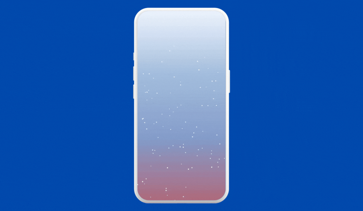
Some Snowfall Anyone?
We’ll demonstrate a simple particle system to create a snowfall effect.
data class Snowflake(
var x: Float,
var y: Float,
var radius: Float,
var speed: Float
)
@Composable
fun SnowfallEffect() {
val snowflakes = remember { List(100) { generateRandomSnowflake() } }
val infiniteTransition = rememberInfiniteTransition(label = "")
val offsetY by infiniteTransition.animateFloat(
initialValue = 0f,
targetValue = 1000f,
animationSpec = infiniteRepeatable(
animation = tween(durationMillis = 5000, easing = LinearEasing),
repeatMode = RepeatMode.Restart
), label = ""
)
Canvas(modifier = Modifier.fillMaxSize().background(Color.Black)) {
snowflakes.forEach { snowflake ->
drawSnowflake(snowflake, offsetY % size.height)
}
}
}
fun generateRandomSnowflake(): Snowflake {
return Snowflake(
x = Random.nextFloat(),
y = Random.nextFloat() * 1000f,
radius = Random.nextFloat() * 2f + 2f, // Snowflake size
speed = Random.nextFloat() * 1.2f + 1f  // Falling speed
)
}
fun DrawScope.drawSnowflake(snowflake: Snowflake, offsetY: Float) {
val newY = (snowflake.y + offsetY * snowflake.speed) % size.height
drawCircle(Color.White, radius = snowflake.radius, center = Offset(snowflake.x * size.width, newY))
}
Explanation
SnowfallEffectsets up a particle system with multiple snowflakes (Snowflakeobjects).- Each
Snowflakehas properties like position (x,y),radius(size), andspeed. rememberInfiniteTransitionandanimateFloatare used to create a continuous vertical movement effect, simulating snowfall.- The
Canvascomposable is used to draw each snowflake. ThedrawSnowflakefunction calculates the new position for each snowflake based on its speed and the animatedoffsetY. - Snowflakes reappear at the top after falling off the bottom, creating a looping snowfall effect.
Conclusion
As we wrap up this exploration of animations in Jetpack Compose, it’s clear that animations are more than just visual embellishments. They are crucial tools for creating engaging, intuitive, and delightful user experiences.
Embracing Interactivity
From the dynamic game character movement to the interactive timeline, we’ve seen how animations can make user interactions more engaging and informative.
Crafting Realistic Experiences
The snowfall effect and the morphing shapes show this toolkit’s ability to bring realism and fluidity into the digital realm. These animations help create immersive experiences that resonate with users.
Simplifying Complexity
Whether it’s choreographing multiple elements or animating state transitions, the simplicity with which it can be done stands out.
Closing Remarks
If you liked what you read, please feel free to leave your valuable feedback or appreciation. I am always looking to learn, collaborate and grow with fellow developers.
If you have any questions feel free to message me!
Follow me on Medium for more articles — Medium Profile
Connect with me on LinkedInand Twitter for collaboration.
Happy Animating!
This article was previously published on proaandroiddev.com


