

Computers have come a long way since their inception. From bulky machines that occupied entire rooms and performed simple calculations, to sleek devices that fit in our pockets and run complex applications, computers have evolved to meet the changing needs and expectations of users.
One of the most important aspects of any computer system is the user interface (UI). The UI is the bridge between the user and the computer, and it determines how easy, efficient, and enjoyable the interaction is. A good UI should be intuitive, responsive, and aesthetically pleasing.
One of the latest trends in UI design is blurring the background content behind the foreground elements. This creates a sense of depth, transparency, and focus, and enhances the visual appeal of the UI. Blurring can also help reduce visual clutter and improve readability of text and icons.
Some examples of popular UI frameworks that use blurring effects are Windows Mica, Acrylic, and Apple’s blurred background. These frameworks apply a dynamic blur effect to the content behind the windows, panels, menus, and other UI components, creating a glass-like appearance that adapts to the context and the user’s preferences.
What is blur and why do we need it?
Blur is a visual effect that reduces the sharpness and clarity of an image or a part of an image. It can be used to create a sense of depth, transparency, and focus, and to enhance the visual appeal of the UI.
There are different kinds of blur that can be created, depending on the desired outcome and the source of the content to be blurred. Some of the common types of blur are:
- Ambient blur: This is a blur effect that applies to the entire background of the UI, creating a uniform and subtle blur that mimics the ambient light and color of the environment.
- Content blur: This is a blur effect that applies to a specific content infornt a UI element, such as an image, a video, or a text. This creates a dynamic and localized blur that highlights the foreground element and reduces the distraction from the background content.
- Background blur: This is a blur effect that applies to the content behind a UI element, but not to the element itself. This creates a transparent and glass-like appearance for the UI element, and allows the background content to be partially visible through the element.
How to create a blur effect with Jetpack Compose?
Jetpack Compose is a modern UI toolkit for Android development that simplifies and accelerates UI creation. Jetpack Compose provides a blur modifier that can be applied to any composable to create a blur effect. However, the blur modifier has some limitations, such as:
- It only works on Android 12 and above, which means it is not compatible with older versions of Android.
- It only blurs the content of the composable, not the background behind it. This means it cannot create a background blur effect, which is one of the most popular and desired blur effects.
To overcome these limitations, I decided to create a custom blur modifier that can work on any version of Android and can blur the background behind the composable. This is how I built the legacyBackgroundBlur modifier.
Why did I create a custom blur modifier and how is it different from other solutions?
There are some third-party libraries that offer blur effects for Jetpack Compose, but they are not consistent and reliable. Some of them require wrapping the entire compose tree in a blur provider, which can affect the performance and the flexibility of the UI. Others require applying a blur modifier in more than one place to create a blur effect, which can be confusing and cumbersome.
I wanted to create a simple and elegant solution that can create a blur effect with just one modifier. I also wanted to make sure that the blur effect is dynamic and adaptive, meaning that it can change according to the background content and the user’s preferences.
That’s why I created the legacyBackgroundBlur Modifier, a custom blur modifier that can blur the background behind any composable in real time. The legacyBackgroundBlur uses a ScriptIntriensicBlur that can work on api 32 below (tested it on api 34; also works flawlessly), and can create a smooth and realistic blur effect.
The legacyBackgroundBlur is a powerful and versatile tool that can help you create stunning glassmorphic designs for your Android apps. In the next section, I will show you how to use the legacyBlurModifier and how to customize it to suit your needs.
What is Toolkit and how to use it?
Toolkit is a collection of libraries that enhance the power and flexibility of Jetpack Compose with features that are not officially supported.
Toolkit is a playground for new Compose APIs, where I can explore new possibilities and solutions with Compose. Toolkit was originally created for personal use, but now it is open to the public so that everyone can contribute and benefit from it.
To use Toolkit, you need to add the dependency to your project. Here are the steps to do that:
Step 1. Add the JitPack repository to your root build.gradle file:
kdependencyResolutionManagement {
    repositoriesMode.set(RepositoriesMode.FAIL_ON_PROJECT_REPOS)
    repositories {
        mavenCentral()
        maven { url 'https://jitpack.io' }
    }
}
Step 2. Add the Toolkit dependency to your app module build.gradle file:
dependencies {
    implementation 'com.github.prime-zs.toolkit:core-ktx:2.0.2-alpha'
}
Currently, only the core-ktx version of Toolkit is public, which contains the blur modifier and other useful extensions for Compose. In the future, more features and modules will be added to Toolkit.
How to use the legacyBackgroundBlur Modifier in your app?
To use the legacyBackgroundBlur, you need to apply it to the composable that you want to blur the background behind. For example, if you want to blur the top bar in Material 3, you can use the following code:
@OptIn(ExperimentalToolkitApi::class, ExperimentalMaterial3Api::class)
@Composable
fun BlurTopBar() {
    TopAppBar(
        title = { Text("Blur Top Bar") },
        modifier = Modifier
            .statusBarsPadding()
            .legacyBackgroundBlur(
                blurRadius = 25f, // the radius of the blur effect, in pixels
                blurAlpha = 0.4f // the alpha value of the blur effect, between 0 and 1
            )
            .background(Color.White.copy(0.7f)) // the background color of the top bar
            .noise(0.05f) // the noise level of the blur effect, between 0 and 1
    )
}
This will create a top bar with a blur effect that adapts to the background content behind it. You can adjust the parameters of the modifier to change the appearance of the blur effect.
You can also use the legacyBackgroundBlur to blur other UI elements, such as dialogs, menus, cards, etc. For example, if you want to blur a dialog that pops up from the bottom bar, you can use the following code:
@OptIn(ExperimentalToolkitApi::class, ExperimentalMaterial3Api::class)
@SuppressLint("UnusedMaterial3ScaffoldPaddingParameter")
@Composable
fun BlurDialog() {
    var show by remember {
        mutableStateOf(false)
    }
    // you can also blur the dialog
    // Make sure the modifier is applied to the top composable in the dialog.
    // If it is applied to a child, the child will get blurred against the dialog.
    Dialog(expanded = show, onDismissRequest = {show = false }) {
        Column(
            horizontalAlignment = Alignment.CenterHorizontally,
            modifier = Modifier
            , ) {

            TopAppBar(title = { Text(text = "Blur Dialog") })

            Column (
                horizontalAlignment = Alignment.CenterHorizontally,
                modifier = Modifier
                    .legacyBackgroundBlur(
                        blurRadius = 25f,
                        blurAlpha = 0.4f
                    )
                    .background(Color.White.copy(0.7f))
                    .noise(0.05f)
                    .fillMaxWidth()
                    .height(400.dp)
            ){
                Spacer(modifier = Modifier.weight(1f))
                Slider(value = 0.5f, onValueChange = {})
                Spacer(modifier = Modifier.weight(1f))
            }
        }
    }
}
This will create a dialog with a blur effect that adapts to the background content behind it. You can also adjust the parameters of the modifier to change the appearance of the blur effect.
The legacyBackgroundBlur is a powerful and versatile tool that can help you create stunning glassmorphic designs for your Android apps. You can use it to blur any content behind your layouts in real time, and achieve a sense of depth, transparency, and focus.
OUR VIDEO RECOMMENDATION


Jobs
How to achieve Windows Mica or Apple blur design with the legacyBackgroundBlur?
Windows Mica and Apple blur are two popular UI design styles that use blur effects to create a glass-like appearance for the UI elements. They differ in the way they apply the blur effect and the color tint to the background content.
To achieve Windows Mica or Apple blur design with the legacyBackgroundBlur, you need to combine the modifier with other modifiers, such as noise & background tint. I built the legacyBackgroundBlur for just blurring as is required by the composition design pattern. I don’t like to build one single combined class, but compose everything with little parts just like in the real world.
I see that you want me to format these notes for your story. Here is a possible draft:
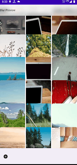
Preview
https://miro.medium.com/v2/resize:fit:540/format:webp/1*z6YWdwkmZupwScrq2cDB6g.gif
Notes
Before you start using the legacyBackgroundBlur in your app, there are some important notes that you should be aware of:
- The modifier does not support preview as it requires the instance of the top most window, which is only available in real device or emulator. In subsequent releases, I will release a way to avoid breaking the preview of Compose by using a fake instance internally.
- The modifier works in up to API 34, but it is recommended to use only up to Android 11 because in Android 12, render effect has been introduced. In subsequent releases, I will build another modifier called backgroundBlur and compatBackgroundBlur to cope with these requirements.
I hope you enjoy using the legacyBackgroundBlur in your app and create stunning glassmorphic designs. If you have any feedback or suggestions, please let me know.
Support
If you like the legacyBackgroundBlur and the Toolkit library, please consider supporting me by:
- Starring the project on GitHub: https://github.com/iZakirSheikh/toolkit/tree/dev
- Checking out my other project, Audiofy: https://github.com/iZakirSheikh/Audiofy
- Downloading Audiofy from Play Store: https://play.google.com/store/apps/details?id=com.prime.player&pli=1
Your support means a lot to me and motivates me to keep creating and improving the Toolkit library.
Happy Coding! 😊
This blog is previously published on proandroiddev.com


