Posted by: Shivam Dhuria
For this tutorial, we will be styling an App with Material Theme.The application basically fetches a list of items from [Imgur Api] and displays it via a Recycler. For this guide however, we will just be working with the design of the App using everything material!
You can find the starting point for this tutorial on GithHub here.

Styles and Themes
There is no way to distinguish between a style and theme except that a theme is applied to a whole application or an activity while style is mostly applied to a View. However a style can be a part of theme.
Make Your Application Material ?
Go to res>values> and create a new file named “themes.xml”.
| <?xml version="1.0" encoding="utf-8"?> | |
| <resources> | |
| //Top Level Theme | |
| <style name="Theme.Zimgur.DayNight" parent="Theme.Zimgur" /> | |
| <style name="Theme.Zimgur" parent="Theme.MaterialComponents.DayNight.NoActionBar" /> | |
| </resources> |
I use Theme.MaterialComponents.DayNight.NoActionBar as I want app to be compatible with DarkMode as well.
Now in AndroidManifest.xml file, set the theme to the application.
<application
 ...
 android:theme="@style/Theme.Zimgur.DayNight" ...>
and remove any other theme from the manifest that might be there for specific activities.
Adding Material Components
Make sure you don’t set any color value to any of the Views such as TextView, ImageView etc as we want to be able to build a dynamic UI whose colors may change depending upon LIGHT or DARK theme.
Material Cards
I’ll wrap the album item_layout in a Material Card, provided by the Material Theme.
I have also added two ImageViews for profile Image and a cover Image.
| <?xml version="1.0" encoding="utf-8"?> | |
| <com.google.android.material.card.MaterialCardView xmlns:android="http://schemas.android.com/apk/res/android" | |
| xmlns:app="http://schemas.android.com/apk/res-auto" | |
| xmlns:tools="http://schemas.android.com/tools" | |
| android:layout_width="match_parent" | |
| android:layout_height="wrap_content" | |
| android:layout_marginBottom="30dp" | |
| android:clickable="true" | |
| android:focusable="true" | |
| android:padding="10dp"> | |
| <androidx.constraintlayout.widget.ConstraintLayout | |
| android:layout_width="match_parent" | |
| android:layout_height="wrap_content" | |
| app:layout_constraintStart_toStartOf="parent" | |
| app:layout_constraintTop_toTopOf="parent"> | |
| <TextView | |
| android:id="@+id/titleTextView" | |
| android:layout_width="0dp" | |
| android:layout_height="wrap_content" | |
| android:textSize="20dp" | |
| android:textStyle="bold" | |
| android:visibility="visible" | |
| app:layout_constraintEnd_toStartOf="@+id/avatarImageView" | |
| app:layout_constraintStart_toStartOf="parent" | |
| app:layout_constraintTop_toTopOf="parent" | |
| tools:text="Heading" /> | |
| <TextView | |
| android:id="@+id/descriptionTextView" | |
| android:layout_width="match_parent" | |
| android:layout_height="wrap_content" | |
| android:visibility="visible" | |
| app:layout_constraintStart_toStartOf="parent" | |
| app:layout_constraintTop_toBottomOf="@id/userName" | |
| tools:text="Description" | |
| tools:visibility="visible" /> | |
| <TextView | |
| android:id="@+id/userName" | |
| android:layout_width="match_parent" | |
| android:layout_height="wrap_content" | |
| app:layout_constraintStart_toStartOf="parent" | |
| app:layout_constraintTop_toBottomOf="@+id/titleTextView" | |
| tools:text="Username" /> | |
| <ImageView | |
| android:id="@+id/avatarImageView" | |
| android:layout_width="40dp" | |
| android:layout_height="40dp" | |
| android:layout_margin="10dp" | |
| app:layout_constraintEnd_toEndOf="parent" | |
| app:layout_constraintTop_toTopOf="@+id/titleTextView" | |
| tools:src="@tools:sample/cities" /> | |
| <ImageView | |
| android:id="@+id/coverImage" | |
| android:layout_width="fill_parent" | |
| android:layout_height="wrap_content" | |
| android:adjustViewBounds="true" | |
| app:layout_constraintStart_toStartOf="parent" | |
| app:layout_constraintTop_toBottomOf="@id/descriptionTextView"/> | |
| </androidx.constraintlayout.widget.ConstraintLayout> | |
| </com.google.android.material.card.MaterialCardView> |
Job Offers
Chips
A Chip represents a complex entity in a small block, such as a contact. It is a rounded button that consists of a label, an optional chip icon, and an optional close icon. A chip can either be clicked or toggled if it is checkable.
I am adding a Chip Group which will be horizontally scrollable to which I’ll dynamically add chips. I’ll use these chips to specify #tags associated with the posts.
<HorizontalScrollView
    android:layout_width="match_parent"
    android:layout_height="wrap_content"
    app:layout_constraintEnd_toEndOf="parent"
    app:layout_constraintStart_toStartOf="parent"
    app:layout_constraintTop_toBottomOf="@+id/coverImage">

    <com.google.android.material.chip.ChipGroup
        android:id="@+id/chipGroup"
        android:layout_width="0dp"
        android:layout_height="wrap_content"
        app:singleLine="true">

    </com.google.android.material.chip.ChipGroup>
</HorizontalScrollView>
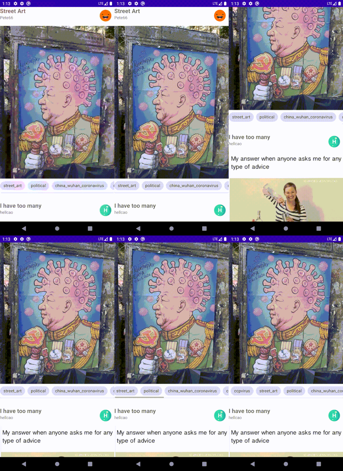
After all this, The UI should look something like this.

Bottom App Bar and FAB
A bottom app bar displays navigation and key actions at the bottom of mobile screens.
| TabLayoutMediator(mTabLayout, mViewPager) { tab, position -> | |
| tab.text = it[position].title | |
| }.attach() |
BottomSheet
Bottom sheets are anchored to the bottom edge of the screen and appear in front of other UI elements. Standard and modal bottom sheets are full-width on mobile can be partially or fully open.I use this to display various tags you browse.
Note: This blog mainly focuses on design, So it will be pretty much non functional.
Check BottomNavDrawerFragment.kt, to see how to configure this.
Dark Mode
Set a click listener to the FAB
setSafeOnClickListener {toggleTheme(isDarkTheme(this@MainActivity))}
Find the current theme
https://gist.github.com/af971c5805441014c33be7be8b9e6c3and toggle the theme and save it in Shared Preferences.
| private fun toggleTheme(isDark: Boolean): Boolean { | |
| val mode = when (isDark) { | |
| true -> LIGHT_MODE | |
| false -> DARK_MODE | |
| } | |
| ThemeManager.applyTheme(mode) | |
| preferenceManager.saveThemePreference(mode) | |
| return true | |
| } |
Create an object Theme Manager that’ll help to apply themes.
| object ThemeManager { | |
| const val LIGHT_MODE = "Light" | |
| const val DARK_MODE = "Dark" | |
| private const val AUTO_BATTERY_MODE = "Auto-battery" | |
| private const val FOLLOW_SYSTEM_MODE = "System" | |
| fun applyTheme(themePreference: String) { | |
| when (themePreference) { | |
| LIGHT_MODE -> setDefaultNightMode(MODE_NIGHT_NO) | |
| DARK_MODE -> setDefaultNightMode(MODE_NIGHT_YES) | |
| AUTO_BATTERY_MODE -> setDefaultNightMode(MODE_NIGHT_AUTO_BATTERY) | |
| FOLLOW_SYSTEM_MODE -> setDefaultNightMode(MODE_NIGHT_FOLLOW_SYSTEM) | |
| } | |
| } | |
| } |
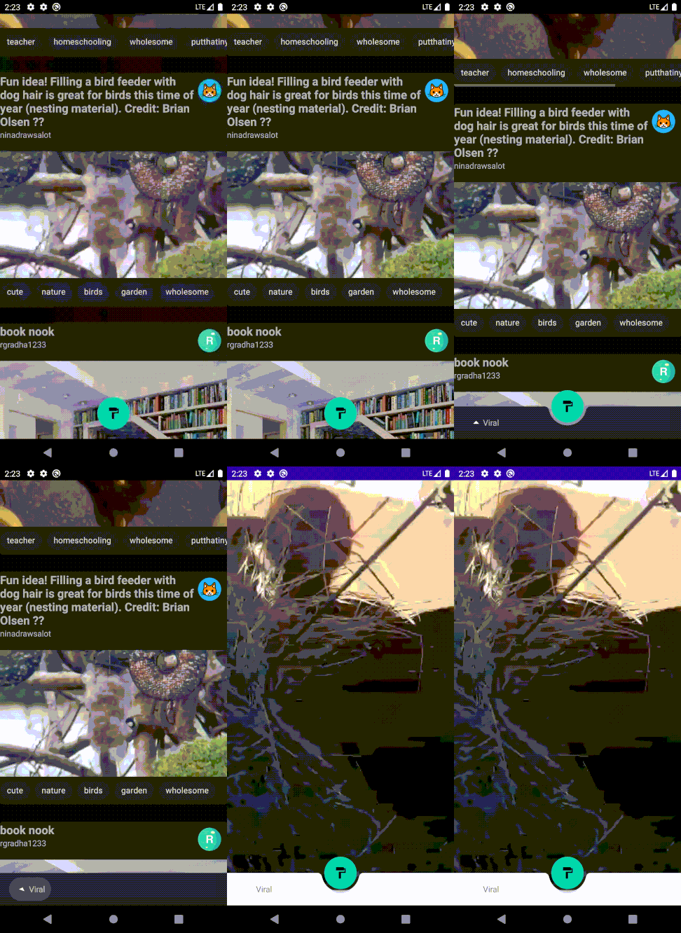
After adding all these Material elements, The end result should looks something like this.

I have added animations to the FAB and a Dialog Fragment which I have included in the code.
https://github.com/Shivamdhuria/zimgur/tree/MaterialTheme
In Part 2, we’ll be customising the theme and styling the app.


