

Blog Infos
Posted by: Nav Singh
In this article, We will learn about NavigationRailView finally which hits the stable channel ? ?
NavigationRailView : It is a side navigation component that displays 3 to 7 app destinations and, optionally, a Floating Action Button.
- Each destination is represented by an icon and a text label.
- The rail can function on its own at larger screen sizes, such as desktop and tablet.
- During the transition between screen sizes and devices, it can also complement other navigation components, such as bottom navigation.
Let’s see it in action ???
- Add dependency to Material Design library in your module’s
build.gradle
implementation("com.google.android.material:material:1.4.0")
I have created the sample project which uses the different layout based on the orientation of the device
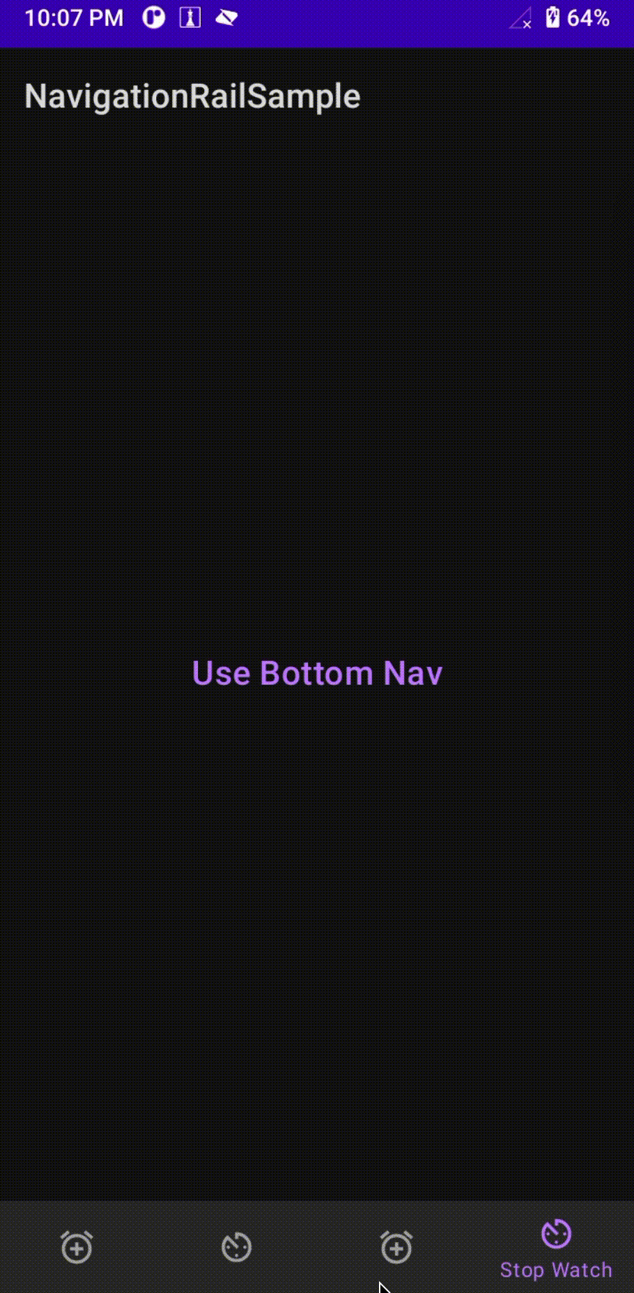
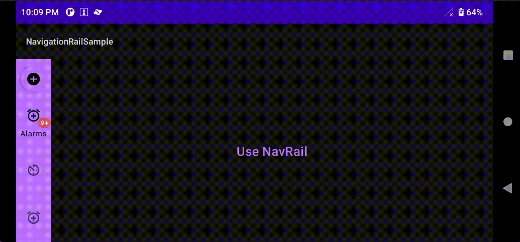
- Portrait mode : Application will use
BottomNavigationView - Landscape mode : Application use the
NavigationRailView
Layout Code for portrait mode :
This file contains bidirectional Unicode text that may be interpreted or compiled differently than what appears below. To review, open the file in an editor that reveals hidden Unicode characters.
Learn more about bidirectional Unicode characters
| <androidx.constraintlayout.widget.ConstraintLayout xmlns:android="http://schemas.android.com/apk/res/android" | |
| xmlns:app="http://schemas.android.com/apk/res-auto" | |
| xmlns:tools="http://schemas.android.com/tools" | |
| android:layout_width="match_parent" | |
| android:layout_height="match_parent" | |
| android:orientation="vertical"> | |
| <TextView | |
| android:id="@+id/textview" | |
| android:layout_width="0dp" | |
| android:layout_height="wrap_content" | |
| android:gravity="center" | |
| android:textAppearance="@style/TextAppearance.MaterialComponents.Headline6" | |
| android:textColor="?colorPrimary" | |
| app:layout_constraintBottom_toTopOf="@id/bottom_bar" | |
| app:layout_constraintEnd_toEndOf="parent" | |
| app:layout_constraintStart_toStartOf="parent" | |
| app:layout_constraintTop_toTopOf="parent" | |
| tools:text="@string/bottom_nav_label" /> | |
| <com.google.android.material.bottomnavigation.BottomNavigationView | |
| android:id="@+id/bottom_bar" | |
| style="@style/Widget.MaterialComponents.BottomNavigationView.PrimarySurface" | |
| android:layout_width="match_parent" | |
| android:layout_height="wrap_content" | |
| app:layout_constraintBottom_toBottomOf="parent" | |
| app:layout_constraintEnd_toEndOf="parent" | |
| app:layout_constraintStart_toStartOf="parent" | |
| app:menu="@menu/nav_menu" /> | |
| </androidx.constraintlayout.widget.ConstraintLayout> |
Layout Code for landscape mode:
This file contains bidirectional Unicode text that may be interpreted or compiled differently than what appears below. To review, open the file in an editor that reveals hidden Unicode characters.
Learn more about bidirectional Unicode characters
| <androidx.constraintlayout.widget.ConstraintLayout xmlns:android="http://schemas.android.com/apk/res/android" | |
| xmlns:app="http://schemas.android.com/apk/res-auto" | |
| xmlns:tools="http://schemas.android.com/tools" | |
| android:layout_width="match_parent" | |
| android:layout_height="match_parent" | |
| > | |
| <TextView | |
| android:id="@+id/textview" | |
| android:layout_width="0dp" | |
| android:layout_height="wrap_content" | |
| android:gravity="center" | |
| android:textAppearance="@style/TextAppearance.MaterialComponents.Headline6" | |
| android:textColor="?colorPrimary" | |
| app:layout_constraintBottom_toBottomOf="parent" | |
| app:layout_constraintEnd_toEndOf="parent" | |
| app:layout_constraintStart_toEndOf="@id/navigation_rail" | |
| app:layout_constraintTop_toTopOf="parent" | |
| tools:text="@string/nav_rail_label" /> | |
| <com.google.android.material.navigationrail.NavigationRailView | |
| android:id="@+id/navigation_rail" | |
| style="@style/Widget.MaterialComponents.NavigationRailView.Colored.Compact" | |
| android:layout_width="wrap_content" | |
| android:layout_height="match_parent" | |
| app:headerLayout="@layout/nav_header" | |
| app:labelVisibilityMode="selected" | |
| app:layout_constraintStart_toStartOf="parent" | |
| app:layout_constraintTop_toTopOf="parent" | |
| app:menu="@menu/nav_menu" | |
| app:menuGravity="bottom" /> | |
| </androidx.constraintlayout.widget.ConstraintLayout> |
MainActivity code:
This file contains bidirectional Unicode text that may be interpreted or compiled differently than what appears below. To review, open the file in an editor that reveals hidden Unicode characters.
Learn more about bidirectional Unicode characters
| package com.example.navigationrailsample | |
| import android.content.res.Configuration | |
| import android.os.Bundle | |
| import android.widget.Toast | |
| import androidx.appcompat.app.AppCompatActivity | |
| import androidx.core.content.ContextCompat | |
| import com.example.navigationrailsample.databinding.ActivityMainBinding | |
| import com.google.android.material.badge.BadgeDrawable | |
| import com.google.android.material.floatingactionbutton.FloatingActionButton | |
| /** | |
| * @author Nav Singh | |
| * @see [com.google.android.material.bottomnavigation.BottomNavigationView] | |
| * @see [com.google.android.material.navigationrail.NavigationRailView] | |
| */ | |
| class MainActivity : AppCompatActivity() { | |
| override fun onCreate(savedInstanceState: Bundle?) { | |
| super.onCreate(savedInstanceState) | |
| val activityMainBinding = ActivityMainBinding.inflate(layoutInflater) | |
| setContentView(activityMainBinding.root) | |
| // update the text based on the orientation | |
| activityMainBinding.textview.text = when (resources.configuration.orientation) { | |
| Configuration.ORIENTATION_PORTRAIT -> { | |
| getString(R.string.bottom_nav_label) | |
| } | |
| else -> { | |
| getString(R.string.nav_rail_label) | |
| } | |
| } | |
| // add badge to alarm | |
| val badgeDrawable = activityMainBinding.navigationRail?.getOrCreateBadge(R.id.alarms) | |
| badgeDrawable?.run { | |
| Toast.makeText(applicationContext, "Create badge", Toast.LENGTH_SHORT).show() | |
| number = 999 | |
| badgeTextColor = | |
| ContextCompat.getColor(applicationContext, android.R.color.holo_red_light) | |
| maxCharacterCount = 2 | |
| badgeGravity = BadgeDrawable.TOP_START | |
| isVisible = true | |
| } | |
| // remove badge | |
| // activityMainBinding.navigationRail?.removeBadge(R.id.alarms) | |
| activityMainBinding.bottomBar?.setOnItemSelectedListener { item -> | |
| when (item.itemId) { | |
| R.id.alarms -> { | |
| Toast.makeText(this, "Alarms Clicked", Toast.LENGTH_SHORT).show() | |
| true | |
| } | |
| else -> { | |
| Toast.makeText(this, "Other item clicked", Toast.LENGTH_SHORT).show() | |
| true | |
| } | |
| } | |
| } | |
| activityMainBinding.navigationRail?.headerView?.findViewById<FloatingActionButton>(R.id.fab_add) | |
| ?.setOnClickListener { | |
| Toast.makeText(this, "Fab Clicked", Toast.LENGTH_SHORT).show() | |
| } | |
| activityMainBinding.navigationRail?.setOnItemSelectedListener { item -> | |
| when (item.itemId) { | |
| R.id.alarms -> { | |
| Toast.makeText(this, "Alarms Clicked", Toast.LENGTH_SHORT).show() | |
| true | |
| } | |
| else -> { | |
| Toast.makeText(this, "Other item clicked", Toast.LENGTH_SHORT).show() | |
| true | |
| } | |
| } | |
| } | |
| } | |
| } |
NavigationRailView properties deep dive:
- Set the menu :
nav_manurefer to the menu layout file which is used to inflate the items inNavigationRailView
app:menu="@menu/nav_menu"
- Set the menu gravity :
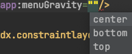
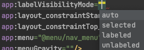
- Set the label visibility mode for menu item’s title :
- Set the header : It sets the header in
NavigationRailView
app:headerLayout="@layout/nav_header"
- Add/Remove Badge to item : Each item in
NavigationRailViewcan have badge associates to it. You can add/remove badge to any item :
// it will create a new badge if there is no badge exist for provided menu itemgetOrCreateBadge(int menuItemId)
This file contains bidirectional Unicode text that may be interpreted or compiled differently than what appears below. To review, open the file in an editor that reveals hidden Unicode characters.
Learn more about bidirectional Unicode characters
| // add badge to alarm | |
| val badgeDrawable = activityMainBinding.navigationRail?.getOrCreateBadge(R.id.alarms) | |
| badgeDrawable?.run { | |
| Toast.makeText(applicationContext, "Create badge", Toast.LENGTH_SHORT).show() | |
| number = 999 | |
| badgeTextColor = | |
| ContextCompat.getColor(applicationContext, android.R.color.holo_red_light) | |
| maxCharacterCount = 2 | |
| badgeGravity = BadgeDrawable.TOP_START | |
| isVisible = true | |
| } | |
| // remove badge | |
| // activityMainBinding.navigationRail?.removeBadge(R.id.alarms) |
You can modify the various properties of badge :
- number
- badgeTextColor,
- maxCharacterCount,
- badgeGravity: (BadgeDrawable.TOP_START, BadgeDrawable.BOTTOM_END, etc.)
- setOnItemSelectedListener on
NavigationRailView:
This file contains bidirectional Unicode text that may be interpreted or compiled differently than what appears below. To review, open the file in an editor that reveals hidden Unicode characters.
Learn more about bidirectional Unicode characters
| activityMainBinding.navigationRail?.setOnItemSelectedListener { item -> | |
| when (item.itemId) { | |
| R.id.alarms -> { | |
| Toast.makeText(this, "Alarms Clicked", Toast.LENGTH_SHORT).show() | |
| true | |
| } | |
| else -> { | |
| Toast.makeText(this, "Other item clicked", Toast.LENGTH_SHORT).show() | |
| true | |
| } | |
| } | |
| } |
- setOnItemReselectedListener on
NavigationRailView:
This file contains bidirectional Unicode text that may be interpreted or compiled differently than what appears below. To review, open the file in an editor that reveals hidden Unicode characters.
Learn more about bidirectional Unicode characters
| activityMainBinding.navigationRail?.setOnItemReselectedListener { item -> | |
| when (item.itemId) { | |
| R.id.alarms -> { | |
| Toast.makeText(this, "Alarms Clicked", Toast.LENGTH_SHORT).show() | |
| true | |
| } | |
| else -> { | |
| Toast.makeText(this, "Other item clicked", Toast.LENGTH_SHORT).show() | |
| true | |
| } | |
| } | |
| } |
OUR VIDEO RECOMMENDATION
In the implementation of Jetpack compose at our organization, one of the issues that popped up was how to implement a Design system that is not adapted from material design but true to what our…
Watch Video


Jobs
Demo
- Portrait mode:
- Landscape mode :
I have used ViewBinding for layout inflation, Check here to learn more about ViewBinding.
Check full sample code :
navczydev/NavigationRailSample


