

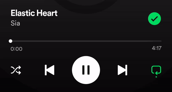
Recently, while using Spotify on my Pixel during a slow mobile connection, I came across an interesting and rarely seen animation: a slider ripple effect animation. Let’s dive into the implementation!
At first, creating the slider buffering animation seemed straightforward, however I wondered if it was possible to make this kind of animation without implementing a whole slider from zero?
Thankfully, Material 3 allows us to do just that.
Implementation
We’ll use the Slider composable function, which lets us customize the track. The most elegant way to add custom effects on a component in Compose is with a Modifier.
var sliderValue by remember { mutableFloatStateOf(0.3f) }

Slider(
    value = sliderValue,
    onValueChange = { sliderValue = it },
    track = { sliderPositions ->
        SliderDefaults.Track(
            sliderPositions = sliderPositions,
            // modifier = Modifier.pulsatingEffect(...)
        )
    }
)
To create the pulsatingEffect modifier, we’ll need:
- Current Slider Value (To determine the thumb’s position on the track, allowing the effect to start from the correct location)
- Effect Visibility Flag (A boolean to control whether the animation should be displayed or not)
Optional: Color (Custom color of the animated line)
Let’s start by measuring the component’s width when it’s placed on the screen using onGloballyPositioned. We’ll also figure out where the thumb is by taking the total width of the track and multiplying it by the current slider value, which ranges from 0f to 1f.
Next, we’ll set up drawWithContent to create the ripple effect right on top of the slider track:
@Composable
fun Modifier.pulsatingEffect(
    currentValue: Float,
    isVisible: Boolean,
    color: Color = Color.Black,
): Modifier {
    val trackWidth = remember { mutableFloatStateOf(0f) }
    var thumbX by remember { mutableFloatStateOf(0f) }

    return this then Modifier
        .onGloballyPositioned { coordinates ->
            trackWidth = coordinates.size.width.toFloat()
            thumbX = trackWidth * currentValue
        }
        .drawWithContent {
            drawContent()
            // The animation implementation will be here
        }
}
At first glance, using InfiniteTransition for our animation seems perfect since it allows us to adjust both the width and color smoothly.
Setting up the animation
First, we’ll set up an animation for the line’s width and color. The line will start at the thumb and stretch to the track’s end, fading to transparent along the way. The animation specs should be set the same as we want both animations run together smoothly.
    val transition = rememberInfiniteTransition(label = "trackAnimation")

    val animationWidth by transition.animateFloat(
        initialValue = 0f,
        targetValue = trackWidth - thumbX,
        animationSpec = infiniteRepeatable(
            animation = tween(
                durationMillis = 800,
                delayMillis = 200,
            )
        ), label = "width"
    )

    val animationColor by transition.animateColor(
        initialValue = color,
        targetValue = color.copy(alpha = 0f),
        animationSpec = infiniteRepeatable(
            animation = tween(
                durationMillis = 800,
                delayMillis = 200,
            ),
        ), label = "color"
    )
Drawing the actual animated line
We’ll set its height to match the track’s height and specify the offsets where it starts and ends:
Modifier.drawWithContent {
    drawContent()

    val strokeWidth = size.height
    val y = size.height / 2f
    val startOffset = thumbX
    val endOffset = thumbX + animationWidth

    if (isVisible) {
        drawLine(
            color = animationColor,
            start = Offset(startOffset, y),
            end = Offset(endOffset, y),
            cap = StrokeCap.Round,
            strokeWidth = strokeWidth
        )
    }
}
Right away, a couple of issues pop up.
Firstly, the color fades out a bit too quickly, leading to a flickering effect when the line should be fully transparent at full width. Additionally, the animations aren’t perfectly in sync.
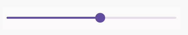
When moving the thumb, which updates the slider’s currentValue and consequently the thumbX position, the animations don’t adjust together as expected:
Solving the Sync
Let’s link the color’s transparency directly to how far the width animation has progressed. This is calculated by the ratio of the current animation width to its maximum potential width.
val currentProgress = animationWidth / (maxWidth - thumbX)
val dynamicAlpha = (1f - currentProgress).coerceIn(0f, 1f)
This method creates a smooth fade without needing a separate setting for color. The coerceIn is used to keep the transparency within bounds, especially as the thumb moves.
Our effect is similar to what’s seen in the Spotify app, but there are some noticeable glitches when the thumb moves, causing the animation to reset each time.
Refining Animation
To ensure the animation adapts to any changes in the available slider’s width, we’ll animate the progress of the width instead of the width value itself. This way, the animation remains consistent, regardless of the actual track width. Plus, calculating the color’s alpha becomes a lot simpler.
Here is the full Modifier.pulsatingEffect() implementation:
OUR VIDEO RECOMMENDATION


Jobs
| fun Modifier.pulsatingEffect( | |
| currentValue: Float, | |
| isVisible: Boolean, | |
| color: Color = Color.Gray, | |
| ): Modifier = composed { | |
| var trackWidth by remember { mutableFloatStateOf(0f) } | |
| val thumbX by remember(currentValue) { | |
| mutableFloatStateOf(trackWidth * currentValue) | |
| } | |
| val transition = rememberInfiniteTransition(label = "trackAnimation") | |
| val animationProgress by transition.animateFloat( | |
| initialValue = 0f, | |
| targetValue = 1f, | |
| animationSpec = infiniteRepeatable( | |
| animation = tween( | |
| durationMillis = 800, | |
| delayMillis = 200, | |
| ) | |
| ), label = "width" | |
| ) | |
| this then Modifier | |
| .onGloballyPositioned { coordinates -> | |
| trackWidth = coordinates.size.width.toFloat() | |
| } | |
| .drawWithContent { | |
| drawContent() | |
| val strokeWidth = size.height | |
| val y = size.height / 2f | |
| val startOffset = thumbX | |
| val endOffset = thumbX + animationProgress * (trackWidth - thumbX) | |
| val dynamicAlpha = (1f - animationProgress).coerceIn(0f, 1f) | |
| if (isVisible) { | |
| drawLine( | |
| color = color.copy(alpha = dynamicAlpha), | |
| start = Offset(startOffset, y), | |
| end = Offset(endOffset, y), | |
| cap = StrokeCap.Round, | |
| strokeWidth = strokeWidth | |
| ) | |
| } | |
| } | |
| } |
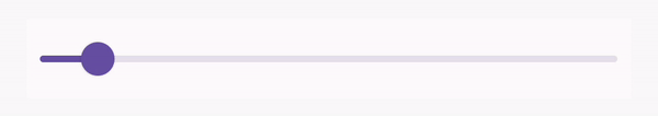
Let’s check the results!


That wraps up our animation guide! Thanks for reading.
See you next time!
https://developer.android.com/jetpack/compose/animation?source=post_page—–debd19cacd32——————————–
This article is previously published on proandroiddev.com


