During I/O 2021, Google announced the latest stage for Material Design, Material You (or M3). This new design coming first to Android 12 is focused on customization, responsiveness and accessibility, making devices feel even more personal.
Since the initial announcement, Google released more and more content, tutorials and libraries to help the developers embrace Material You and create beautiful and expressive apps. In this article, we will take a look at some key concepts and how to learn more about this new design.
Dynamic Color
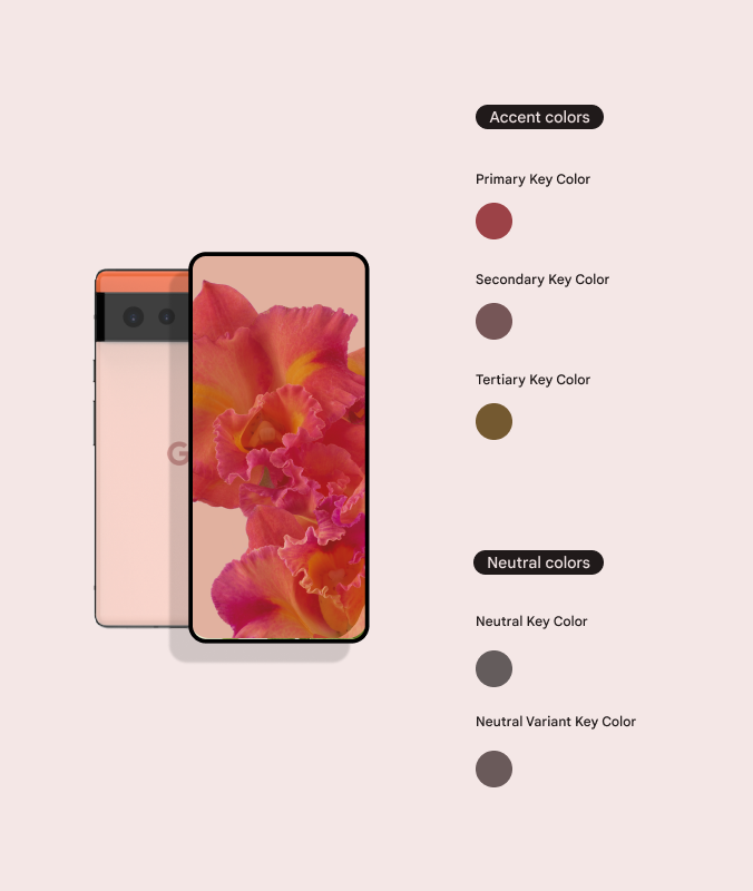
The dynamic color is a user-generated color scheme which integrates with Android system and apps implementing the Material You color system. This color is generated from the user wallpaper, creating a beautiful and unique color palette.
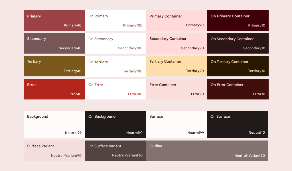
Here is an example of a color palette generates by a red floral wallpaper. The scheme also generates the colors for both light and dark themes.
And now you can make your own application use this user-generated color palette! With the addition of the new dynamicLightColorScheme and dynamicDarkColorScheme APIs, adding the support in your app is as easy as adding few lines of code.
| val dynamicColor = isDynamicColor && Build.VERSION.SDK_INT >= Build.VERSION_CODES.S | |
| val colorScheme = when { | |
| dynamicColor && isDarkTheme -> dynamicDarkColorScheme(LocalContext.current) | |
| dynamicColor && !isDarkTheme -> dynamicLightColorScheme(LocalContext.current) | |
| isDarkTheme -> MyAppDarkColorScheme | |
| else -> MyAppLightColorScheme | |
| } |
At the moment, the dynamic color support is available starting in Android 12 and in some selected devices.
Material Theme Builder
The Material Theme Builder is a tool designed to help us visualize and create custom themes following Material You’s guidelines. It is possible to generate themes both from a wallpaper and from accent or brand colors.
This tools is available as a Figma Plugin and on the Web. In addition to providing a better visualization, the Material Theme Builder allow us to export the theming code to multiple formats: Android Views (XML), Jetpack Compose (Kotlin) and Design System Package (DSP).

Material Theme Builder by Google
Naming updates
When migrating from Material Design 2 to M3, you will notice that some color and typography naming were updated. The new naming has a stronger focus on creating a adaptive type scale, express style and communicate meaning. So type scales like “H1”, “Body1” comes out and “Headline Large”, “Body Medium” comes in.
The color names also underwent an update and have been given more meaningful names, facilitating the usage and hand-off between developers and designers. And thanks to the Material 3 Design Kit and the Material Theme Builder it is easy to preview and understand the changes.
Job Offers
MDC-Android and Compose-Material3
Google also updated the Material Components for Android library in order to reflect the changes on Material You. The current version supporting M3 is not stable yet (minimum 1.5.0-alpha or later) but the library already supports the key components, themes, layouts and more. To make our life easier, they even released a migration guide to make the transition smoother.
And if you think that Material You is available for Jetpack Compose, you’re right. A brand new Compose Material 3 library was also released to give the refreshed look and feel in our Compose apps. The library is currently in alpha, but a lot is going on to bring all the components to M3.
Design to Code
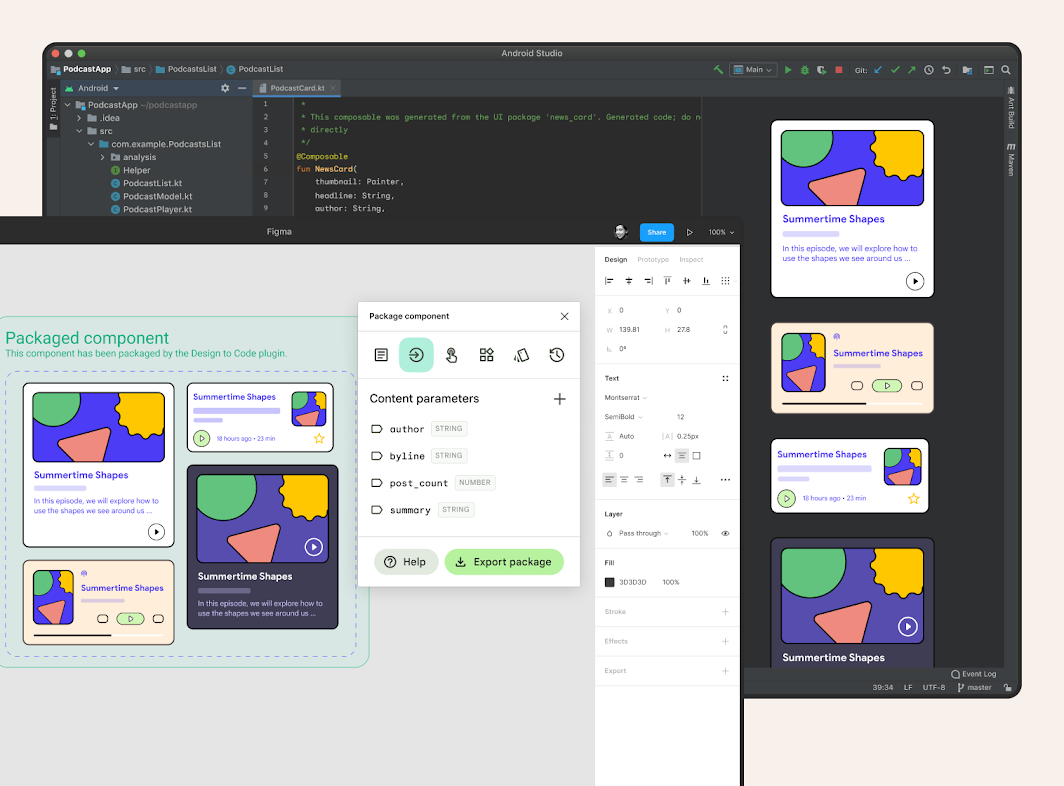
One of the pleasant surprises from Android Dev Summit 2021 is the Material Design to Code. The idea is that the designer creates the UI components in Figma and provides a shareable link for the developers. This link can be imported on Android Studio and the design is automatically created in Jetpack Compose code! 🤯
The UI components can also be updated from Figma side and reflect in Android Studio with a click of a button, integrating with the version control system. No more headaches and misunderstanding between designers and developers!
This feature is currently in Preview and if you are interested to join the early access program you need to sign up using this form.

What’s next?
It’s a exciting moment for Material Design and what we can achieve to create personal and beautiful applications. Material You, the new libraries and tools are refreshing and Google is providing support and listening to the community, which makes me feel that we are building a great thing together.
I started to update my open-source project from Material Design 2 to Material You. This is currently a on-going pull request once some of the components that I use are not yet ported to M3. If you want to see how simple is to use dynamic color, update the existing components and integrate the theme created in Material Theme Builder, this PR is a good start. 😊
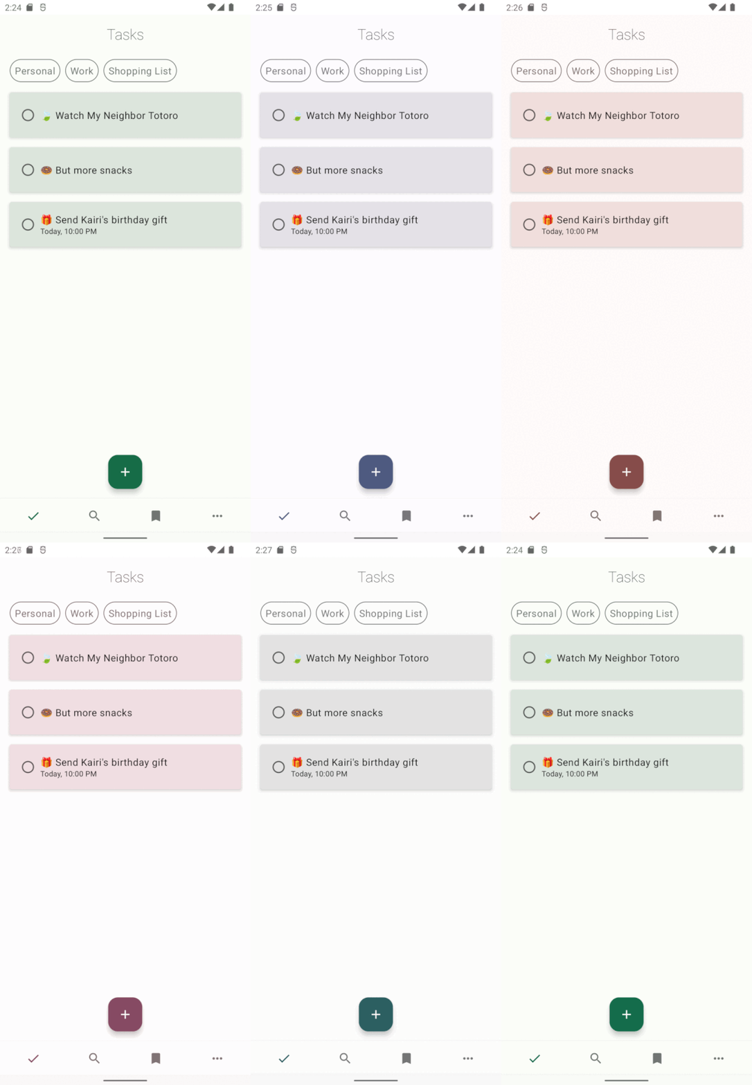
Here is the currently implementation of the pull request above with Material You components and dynamic color:

Alkaa with dynamic color
External resources
I also would love to share some external resources to help you understand even better the new libraries, tools and concepts of Material You.
- Material Design 3 Homepage
- Material A-Z
- Unveiling Material You
- Jetpack Compose, now with Material You — ADS 2021 Video Playlist
- Design to Code: Turning Handoffs Into High-fives
Thanks a lot for reading my article! ❤️
Thanks to Bruno Kenji Tiba.


