

Learn to create lists and handle pagination in Jetpack Compose
This is part of a multi-part series about learning to use Jetpack Compose through code. This part of the series will be focusing on building the game listing screen and also covering the test cases for this screen.
Other articles in this series:
Introduction
If you are hearing about jetpack compose for the first time then Google describes it as:
Jetpack Compose is Android’s modern toolkit for building native UI. It simplifies and accelerates UI development on Android bringing your apps to life with less code, powerful tools, and intuitive Kotlin APIs. It makes building Android UI faster and easier.
There are a lot of keywords in the above paragraph like less code, intuitive, faster and easier. One of the main things that is missing is the ease of testing your compose UI. Compose makes it much easier to test each of your individual UI components separately.
I hear what you are saying — enough about compose already!
What is the app which we will be building?

Yes! We will be building a video games discovery app! You can scroll through an infinite list of games, click on the interested game to see all the details and if any videos are available, you will be able to watch them all! We will be using the awesome RAWG API for our games data.
Dissecting the home screen
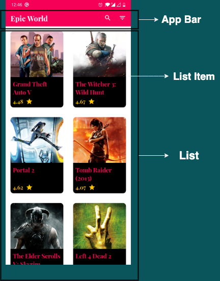
As you can see, there are 2 main components in this screen. First one is your app bar which has a title and also has search and filter options. The other one is your list which is responsible to show all the games and also to handle pagination. Let’s code!
App bar
We can design our app bar using TopAppBar.
The top app bar displays information and actions relating to the current screen.
Let’s go ahead and create a simple composable which takes a title and 2 functions for our search and filter clicks as input parameters.
| @Composable | |
| fun HomeAppBar(title: String, openSearch: () -> Unit, openFilters: () -> Unit) { | |
| TopAppBar( | |
| title = { Text(text = title) }, | |
| actions = { | |
| IconButton(onClick = openSearch) { | |
| Icon(imageVector = Icons.Filled.Search, contentDescription = "Search") | |
| } | |
| IconButton(onClick = openFilters) { | |
| Icon(imageVector = Icons.Filled.FilterList, contentDescription = "Filter") | |
| } | |
| } | |
| ) | |
| } |
Let’s preview our HomeAppBar and see what we got so far.
| @Preview(showBackground = true) | |
| @Composable | |
| fun HomeAppBarPreview() { | |
| HomeAppBar( | |
| title = "EpicWorld", | |
| openSearch = {}, | |
| openFilters = {} | |
| ) | |
| } |

Looks pretty good but it is missing some styling. Let’s go ahead and give a background colour for the app bar and also change the colour of our icons.
| @Composable | |
| fun HomeAppBar(title: String, openSearch: () -> Unit, openFilters: () -> Unit) { | |
| TopAppBar( | |
| title = { Text(text = title, color = Color.White) }, | |
| backgroundColor = Color(0xFFF50057), | |
| actions = { | |
| IconButton(onClick = openSearch) { | |
| Icon( | |
| imageVector = Icons.Filled.Search, | |
| contentDescription = "Search", | |
| tint = Color.White | |
| ) | |
| } | |
| IconButton(onClick = openFilters) { | |
| Icon( | |
| imageVector = Icons.Filled.FilterList, | |
| contentDescription = "Filter", | |
| tint = Color.White | |
| ) | |
| } | |
| } | |
| ) | |
| } |
Designing an app bar has never been easier! Our final HomeAppBar will look as follows:

Games List
Our games list is a grid having 2 items in each row. When we think about lists the first thing that comes to mind is the RecyclerView widget. In compose, we have lazy composables. As you would have guessed, we have LazyColumn to display a vertical list and LazyRow to display a horizontal list. But for our particular use case we have another component called LazyVerticalGrid which helps in displaying items in a grid.
For pagination we can make use of the Paging 3 library which provides compose support.
Lazy components follow the same set of principles as RecyclerView widget.
The Paging Library makes it easier for you to load data gradually and gracefully.
Note: At the time of writing, lazyVerticalGrid is experimental and paging-compose is still in alpha. Both of these apis may change in the future and be different as described in this article.
Let’s first setup our paging library and then start consuming the data in our composable.
Define a data source
PagingSource is the primary component of our paging 3 library. It is responsible for all our data.
| class GamesSource( | |
| private val gamesRepository: GamesRepository | |
| ) : PagingSource<Int, GameResultsEntity>() { | |
| override suspend fun load( | |
| params: LoadParams<Int> | |
| ): LoadResult<Int, GameResultsEntity> { | |
| val nextPage = params.key ?: 1 | |
| val gamesResponse = | |
| gamesRepository.getAllGames(nextPage) | |
| return if (gamesResponse.data == null) { | |
| LoadResult.Error( | |
| Exception(gamesResponse.error.toString()) | |
| ) | |
| } else { | |
| LoadResult.Page( | |
| data = gamesResponse.data.gameEntities, | |
| prevKey = | |
| if (nextPage == 1) null | |
| else nextPage - 1, | |
| nextKey = nextPage.plus(1) | |
| ) | |
| } | |
| } | |
| } |
Setup a steam of PagingData
Now that we have our paging source ready, let’s setup the data stream in our ViewModel. Pager class helps to expose a stream of paging data as Flow<PagingData<GameResultsEntity>> from GamesSource. This flow is emitted every time Pager fetches new data from our GamesSource.
| class HomeViewModel(private val gamesSource: GamesSource) : | |
| ViewModel() { | |
| fun getAllGames(): Flow<PagingData<GameResultsEntity>> { | |
| return Pager(PagingConfig(50)) { gamesSource }.flow | |
| } | |
| } |
Here, the PagingConfig takes pageSize as an input parameter which defines the number of items loaded at once from the PagingSource.
Displaying the data
Now that we have setup a data stream in our ViewModel, all that is left is to collect this stream and display it in our LazyVerticalGrid. For this, we can use the collectAsLazyPagingItems() extension function which collects our stream and converts it into LazyPagingItems.
| @Composable | |
| fun GameListing( | |
| games: Flow<PagingData<GameResultsEntity>> | |
| ) { | |
| val lazyGameItems = games.collectAsLazyPagingItems() | |
| LazyVerticalGrid( | |
| cells = GridCells.Fixed(2), | |
| content = { | |
| items(lazyGameItems.itemCount) { index -> | |
| lazyGameItems[index]?.let { | |
| Text( | |
| modifier = Modifier.fillMaxWidth(), | |
| text = it.name, | |
| color = Color.Black | |
| ) | |
| } | |
| } | |
| } | |
| ) | |
| } |
LazyVerticalGrid also needs to know the cell information. In our case, since we want 2 fixed columns, we can provide it through the instance of GrideCells.Fixed.
Let’s combine our app bar and games list and see what we get so far!
| @Composable | |
| fun HomeScreen( | |
| openSearch: () -> Unit, | |
| openFilters: () -> Unit, | |
| homeViewModel: HomeViewModel = viewModel(), | |
| ) { | |
| Scaffold(topBar = { | |
| HomeAppBar( | |
| title = "Epic World", | |
| openSearch = openSearch, | |
| openFilters = openFilters | |
| ) | |
| }, | |
| content = { GameListing(homeViewModel.getAllGames()) } | |
| ) | |
| } |

We have our list and we have also achieved pagination! All with very few lines of code!
Designing the game item
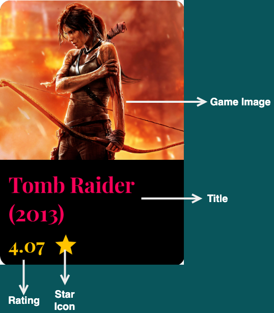
On top we have our game image, below that we have our game title, and then below that we have our rating. First layout that would come to mind is a Column but I wanted to showcase the use of ConstraintLayout in compose so let’s design it using a ConstraintLayout.
Also, we will be using Coil library for displaying images.
| @Composable | |
| fun GameItem(game: GameResultsEntity) { | |
| Card( | |
| elevation = 20.dp, | |
| backgroundColor = Color.Black, | |
| modifier = | |
| Modifier.padding(16.dp) | |
| .clip(RoundedCornerShape(10.dp)) | |
| .height(250.dp) | |
| .fillMaxWidth() | |
| ) { | |
| ConstraintLayout { | |
| val (image, title, rating) = createRefs() | |
| Image( | |
| contentScale = ContentScale.Crop, | |
| painter = | |
| rememberImagePainter( | |
| data = game.backgroundImage, | |
| builder = { | |
| placeholder( | |
| R.drawable | |
| .ic_esports_placeholder | |
| ) | |
| crossfade(true) | |
| } | |
| ), | |
| contentDescription = "Image", | |
| modifier = | |
| Modifier.constrainAs(image) { | |
| top.linkTo(parent.top) | |
| start.linkTo(parent.start) | |
| end.linkTo(parent.end) | |
| } | |
| .height(150.dp) | |
| .fillMaxWidth() | |
| ) | |
| Text( | |
| text = game.name, | |
| color = Color(0xFFF50057), | |
| maxLines = 2, | |
| fontSize = 20.sp, | |
| fontWeight = FontWeight.Bold, | |
| modifier = | |
| Modifier.constrainAs(title) { | |
| top.linkTo(image.bottom) | |
| start.linkTo(parent.start) | |
| end.linkTo(parent.end) | |
| } | |
| .fillMaxWidth() | |
| .padding(8.dp) | |
| ) | |
| Row( | |
| modifier = | |
| Modifier.fillMaxWidth().constrainAs( | |
| rating | |
| ) { | |
| bottom.linkTo(parent.bottom) | |
| start.linkTo(parent.start) | |
| end.linkTo(parent.end) | |
| } | |
| ) { | |
| Text( | |
| text = game.rating.toString(), | |
| color = Color(0xFFFFC400), | |
| modifier = Modifier.padding(8.dp), | |
| fontSize = 18.sp | |
| ) | |
| Image( | |
| contentScale = ContentScale.Crop, | |
| painter = | |
| painterResource( | |
| id = R.drawable.ic_star | |
| ), | |
| contentDescription = "Star", | |
| modifier = Modifier.padding(top = 10.dp) | |
| ) | |
| } | |
| } | |
| } | |
| } |
Running it now we get the following:

We have almost reached our end state. Let’s fine tune our screen a little more.
OUR VIDEO RECOMMENDATION


Jobs
Displaying loading state and error state
Paging library has built in support to display loading state and error state. We can get the loading state from LoadState object which can be obtained from LazyPagingItems.
| @Composable | |
| fun GameListing( | |
| games: Flow<PagingData<GameResultsEntity>> | |
| ) { | |
| val lazyGameItems = games.collectAsLazyPagingItems() | |
| LazyVerticalGrid( | |
| cells = GridCells.Fixed(2), | |
| content = { | |
| items(lazyGameItems.itemCount) { index -> | |
| lazyGameItems[index]?.let { GameItem(it) } | |
| } | |
| lazyGameItems.apply { | |
| when { | |
| loadState.refresh is | |
| LoadState.Loading -> { | |
| item { LoadingItem() } | |
| item { LoadingItem() } | |
| } | |
| loadState.append is | |
| LoadState.Loading -> { | |
| item { LoadingItem() } | |
| item { LoadingItem() } | |
| } | |
| loadState.refresh is | |
| LoadState.Error -> {} | |
| loadState.append is | |
| LoadState.Error -> {} | |
| } | |
| } | |
| } | |
| ) | |
| } | |
| @Composable | |
| fun LoadingItem() { | |
| CircularProgressIndicator( | |
| modifier = | |
| Modifier.testTag("ProgressBarItem") | |
| .fillMaxWidth() | |
| .padding(16.dp) | |
| .wrapContentWidth( | |
| Alignment.CenterHorizontally | |
| ) | |
| ) | |
| } | |
loadState.refresh is for when the data is loading for the first time and loadState.append is for every fetch after the first time. Running it now will get us the following:

I will leave the error state to you. Let me know about your design in the comments!
Testing the composables
Now that we have designed our home screen, let’s see how it can be tested.
Testing UIs or screens is used to verify the correct behaviour of your Compose code, improving the quality of your app by catching errors early in the development process.
For all of our tests we will be using ComposeTestRule — A TestRule that allows you to test and control composables and applications using Compose.
When you are testing your UI, the 3 important APIs to consider are:
- Finders: Let you select one or more elements
- Assertions: Let you verify if element is displayed or have certain attributes
- Actions: Let you perform certain view actions like click or scroll
Since we designed our app bar first, let’s try and write a test for it.
| class AppBarTest { | |
| @get:Rule val composeTestRule = createComposeRule() | |
| @Test | |
| fun given_title_should_be_displayed_in_home_app_bar() { | |
| // Load our composable | |
| composeTestRule.setContent { | |
| EpicWorldTheme { | |
| HomeAppBar( | |
| title = "Title", | |
| searchClick = {}, | |
| filterClick = {} | |
| ) | |
| } | |
| } | |
| // onNode - Finder | |
| // assertIsDisplayed - Assertion | |
| composeTestRule | |
| .onNodeWithText("Title") | |
| .assertIsDisplayed() | |
| } | |
| } |
The test is pretty self-explanatory. We are loading our home app bar and passing “Title” as our title and then asserting that a view with text “Title” is displayed.
I will leave the rest of the tests for the app bar to you. One example for a test case could be to test whether our search and filter icons are displayed in the app bar. Do get creative and try to cover as many tests as possible!
Let’s try and write a test for game list.
| class HomeScreenTest { | |
| @get:Rule val composeTestRule = createComposeRule() | |
| //Mock the viewmodel | |
| private val homeViewModel = mockk<HomeViewModel>() | |
| @Before | |
| fun init() { | |
| MockKAnnotations.init(this, true) | |
| //provide mock data | |
| every { homeViewModel.getAllGames() } answers | |
| { | |
| FakeGamesData.getFakePagingData() | |
| } | |
| } | |
| @Test | |
| fun games_should_be_displayed_in_home_screen() { | |
| //load our composable | |
| composeTestRule.setContent { | |
| EpicWorldTheme { | |
| HomeScreen( | |
| openSearch = {}, | |
| openFilters = {}, | |
| openGameDetails = {}, | |
| homeViewModel = homeViewModel | |
| ) | |
| } | |
| } | |
| //assert that a view with text "Max Payne" is displayed | |
| composeTestRule | |
| .onNodeWithText("Max Payne") | |
| .assertIsDisplayed() | |
| //assert that a view with text "4.5" is displayed | |
| composeTestRule | |
| .onNodeWithText("4.5") | |
| .assertIsDisplayed() | |
| //assert that 2 views with content description "Image" are displayed | |
| composeTestRule | |
| .onAllNodesWithContentDescription("Image") | |
| .assertCountEquals(2) | |
| //assert that 2 views with content description "Star" are displayed | |
| composeTestRule | |
| .onAllNodesWithContentDescription("Star") | |
| .assertCountEquals(2) | |
| //assert that a view with text "GTA V" is displayed | |
| composeTestRule | |
| .onNodeWithText("GTA V") | |
| .assertIsDisplayed() | |
| //assert that a view with text "4.8" is displayed | |
| composeTestRule | |
| .onNodeWithText("4.8") | |
| .assertIsDisplayed() | |
| } | |
| } | |
| //Provide mock data | |
| object FakeGamesData { | |
| fun getFakePagingData(): | |
| Flow<PagingData<GameResultsEntity>> { | |
| return flow { | |
| emit(PagingData.from(getGamesEntity())) | |
| } | |
| } | |
| private fun getGamesEntity(): List<GameResultsEntity> { | |
| val gameResults: ArrayList<GameResultsEntity> = | |
| ArrayList() | |
| gameResults.add( | |
| GameResultsEntity(1, "Max Payne", "", 4.5) | |
| ) | |
| gameResults.add( | |
| GameResultsEntity(2, "GTA V", "", 4.8) | |
| ) | |
| return gameResults | |
| } | |
| } |
There are a few things happening in the test. Firstly, we have mocked our ViewModel and provided a mocked response for getting the data. Then, we are loading our home screen and asserting that the games are displayed in our list.
Again, I will leave the rest of the tests to you. Use all your creativity and cover as many tests as possible for the screen!
You can find the complete source code with all the tests for the home screen in this repository.
What’s next?
In this post we have designed our game listing screen and also tested the same. In the next post, let’s explore and build the game details screen and also the different UI tests for this screen. See you there:
Thanks for reading! If you liked the article please do leave a clap 👏 and don’t forget to subscribe and follow to get regular updates! 🙂 You can also connect with me on LinkedIn. I would love to see your designs and tests!
Additional Resources
- RAWG website to checkout their cool video games API and get your key
- Android Developers website to learn more about Jetpack Compose
- Material Icons to checkout all available icons which can be used in your application
- Coil library for displaying images in jetpack compose
- Android Developers website to dive deeper into lists in jetpack compose
- Android Developers website to understand Paging 3 library better
- Android Developers website to dive deeper into testing in jetpack compose


