

Recently new codelab was launched for Android which covers the accessibility in Jetpack Compose.
In this article, we will learn how to implement accessibility in Jetpack Compose.
Major properties that help to improve the app’s accessibility
- Touch target size
- Click labels
- Custom actions
- Content description or Visual element descriptions
- Headings
- Custom merging
- State descriptions
- Custom navigation
Touch target size
- You should make sure that any on-screen element that the user can click, touch, or interact with have a width and height of at least
48dp. - If these controls are sized dynamically, or resize based on the size of their content, consider using the
sizeInmodifier to set a lower bound on their dimensions.
Text(
    text = "SizeIn sample",
    modifier = Modifier.sizeIn(
        minWidth = 48.dp,
        minHeight = 48.dp
    )
)
- Some Material components set these sizes for you 🎉
Rather than doing it by ourselves, we can use IconButton composable that has a minimum touch target size of 48 x 48dp to meet the accessibility guidelines.
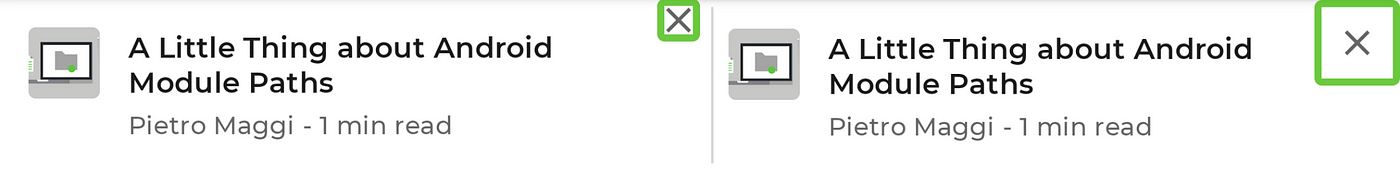
https://developer.android.com/codelabs/jetpack-compose-accessibility/img/6dbe0b3c0ee055e0.png?authuser=4
- As you can see on the left
close button’s size was 24 dp, and after fix it is48 dpwhich is required.
| Icon( | |
| imageVector = Icons.Default.Close, | |
| contentDescription = stringResource(R.string.cd_show_fewer), | |
| modifier = Modifier | |
| .clickable { openDialog = true } | |
| .padding(12.dp) // adding 12 dp padding helps us to meet the requirements of 48dp touch target size | |
| .size(24.dp) | |
| ) |
Click labels
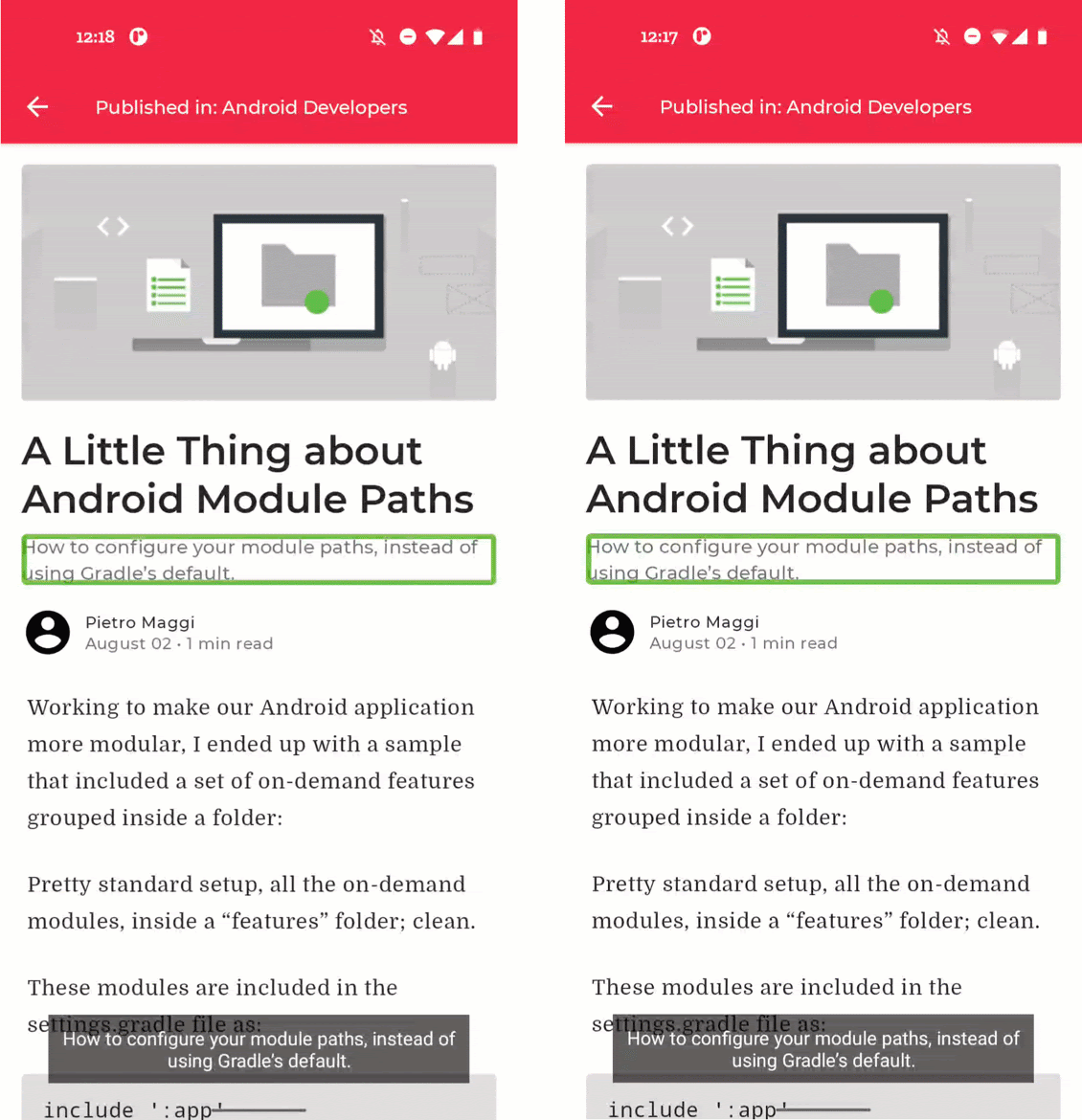
- Clickable elements by default don’t provide any information on what clicking that element will do. Therefore, accessibility services like TalkBack will use a very generic default description.
- We can provide a specific description that explains what will happen when the user clicks this element which helps to provide the best experience for users with accessibility needs.
- As you can see that on the left side talkback just says
Double-tap to activate, after improvement on the right side, it saysDouble-tap to read article.
You just need to provide the label do not add
Double-tap toto your label, talkback will handle it for you based on the event (click, longClick)
| Row( | |
| Modifier.clickable( | |
| onClickLabel = stringResource(R.string.post_card_hostiry_click_label) // read article | |
| ) { navigateToArticle(post.id) } | |
| ) { | |
| // content | |
| } |
Custom actions
- With the help of the custom accessibility actions, we can group together actions that relate to the same list item.
- We can pass the list of CustomAccessibilityAction’s to
customActions semantic property
| Row( | |
| Modifier | |
| .clickable( | |
| onClickLabel = stringResource(R.string.post_card_history_click_label) | |
| ) { | |
| navigateToArticle(post.id) | |
| } | |
| .semantics { | |
| customActions = listOf( | |
| CustomAccessibilityAction( | |
| label = "Show fewer like this" | |
| // action returns boolean to indicate success | |
| action = { openDialog = true; true } | |
| ) | |
| ) | |
| } | |
| ) { | |
| // ... | |
| CompositionLocalProvider(LocalContentAlpha provides ContentAlpha.medium) { | |
| IconButton( | |
| // it makes sure that Talkback will not interact with this item | |
| modifier = Modifier.clearAndSetSemantics { }, | |
| onClick = { openDialog = true } | |
| ) { | |
| Icon( | |
| imageVector = Icons.Default.Close, | |
| contentDescription = stringResource(R.string.cd_show_fewer) | |
| ) | |
| } | |
| } | |
| } | |
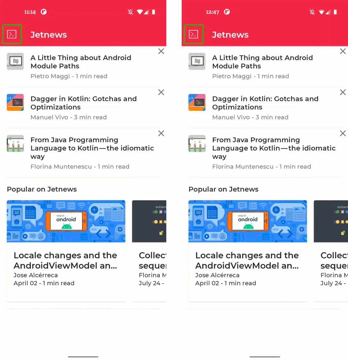
On the left, you can see the default situation, where each cross icon is focusable. On the right, you can see the solution, where the action is included in the custom actions in TalkBack:

Content description or Visual element descriptions
- Accessibility services have no way to make sense of visual elements based on their pixels alone.
- Visual
composableslikeImageandIconinclude a parametercontentDescriptionwhere we can pass alocalized descriptionof that visual element, ornullif the element is purely decorative.
| Image( | |
| painter = painterResource(R.drawable.post_1), | |
| contentDescription = null, // decorative | |
| contentScale = ContentScale.Crop, | |
| modifier = Modifier | |
| .height(100.dp) | |
| .fillMaxWidth() | |
| ) | |
| Image( | |
| painter = painterResource(R.drawable.post_1), | |
| contentDescription = stringResource(R.string.content_desc_post_header) | |
| contentScale = ContentScale.Crop, | |
| modifier = Modifier | |
| .height(100.dp) | |
| .fillMaxWidth() | |
| ) |
Headings
- We can indicate which parts of the text are
headingswhich helps users to navigate quickly through different headings by swiping up or down ⬆️ ⬇️. - We can set the
heading semantics propertyto indicate that this composable is a heading.
| Text( | |
| text = post.title, | |
| style = MaterialTheme.typography.h6, | |
| modifier = Modifier.semantics { | |
| heading() | |
| } | |
| ) |

Custom merging
- Accessibility services like TalkBack navigate a screen element by element.
- By default, each low-level composable in Jetpack Compose that sets at least one semantics property receives focus.
For example, a Text composable set the text semantics property and thus receives focus.
Composablescan be merged together using the semantics modifier with itsmergeDescendantsproperty.
The metadata of the article is currently read aloud as several separate items. It can be improved by merging that into one focusable entity:
| Row(modifier = Modifier.semantics(mergeDescendants = true) {}) { | |
| Image( | |
| ) | |
| Spacer(Modifier.width(8.dp)) | |
| Column { | |
| // content | |
| } | |
| } |
State descriptions
- By adding a custom description for the state of the composable we can improve the accessibility of composable components.
- For example, Checkbox status is read as either “Ticked” or “Not ticked”. We can replace this description with a custom description by using the
stateDescriptionproperty inside thesemanticsmodifier:
https://developer.android.com/codelabs/jetpack-compose-accessibility/img/695e7fc091c77611.gif?authuser=4
| private fun TopicItem(itemTitle: String, selected: Boolean, onToggle: () -> Unit) { | |
| // ... | |
| val stateNotSubscribed = stringResource(R.string.state_not_subscribed) | |
| val stateSubscribed = stringResource(R.string.state_subscribed) | |
| Row( | |
| modifier = Modifier | |
| .semantics { | |
| // custom description based on the state | |
| stateDescription = if (selected) { | |
| stateSubscribed | |
| } else { | |
| stateNotSubscribed | |
| } | |
| } | |
| .toggleable( | |
| value = selected, | |
| onValueChange = { _ -> onToggle() }, | |
| role = Role.Checkbox | |
| ) | |
| .padding(horizontal = 16.dp, vertical = 8.dp) | |
| ) { | |
| // ... | |
| Checkbox( | |
| checked = selected, | |
| onCheckedChange = null, | |
| modifier = Modifier.align(Alignment.CenterVertically) | |
| ) | |
| } | |
| } |
OUR VIDEO RECOMMENDATION


Jobs
Custom Navigation
Focus Modifiershelps us to customize the navigation between different composables
We can interact with the focus mechanisms in Compose with the help of the following modifiers.
Modifier.focusTarget(): Allows making the component focusable
Text(
    text = "Hello World",
    modifier = Modifier.focusTarget()
)
Modifier.focusOrder(): In combination withFocusRequesters, this allows us to change the focus order
val (first, second) = FocusRequester.createRefs()
You can also pass lambda to customize the focus events behaviour
Text(
    text = "Hello World",
    modifier = Modifier
        .focusOrder(first) {
            this.down = second
        // down, left, right, up, previous, next, start, end
        }
)
Modifier.focusRequester(): By adding a customFocusRequesterit allows us to request focus for individual components
val (first, second) = FocusRequester.createRefs()
Text(
    text = "FocusRequester",
    modifier = Modifier
        .focusRequester(second)
)
// requestFocus
second.requestFocus()
Modifier.onFocusEvent(),Modifier.onFocusChanged():Allows us to observe the changes to focus state
Modifier.onFocusChanged { focusState ->
    with(focusState) {
        when {
            hasFocus -> {
                Log.d("A child of mine has focus!")
            }
            isFocused -> {
                Log.d("I'm focused!")
            }
        }
    }
}
Check full sample code
😊😊 👏👏👏👏 HAPPY CODING 👏👏👏👏 😊😊


