

Google recently announced that Compose for Wear OS is in Developer Preview. In this blog post, you will understand how to use Scaffold in Wear OS to build apps using different Material Design components.
If you have built Android apps in Jetpack Compose, I have good news, all components in Compose will continue to work as expected in Wear OS, it’s just that we have some additional components that have been built taking the Wear OS platform into consideration.
If you are interested in exploring other components in Compose for Wear OS you can check out other blogs that I have written.
Series pitstops
- Compose for Wear OS: Scaffold (You’re here)
- Compose for Wear OS: ScalingLazyColumn
- Compose for Wear OS: Navigation
Let’s get started!
Adding the Wear OS dependencies
| def wearVersion = "1.0.0-alpha08" | |
| implementation "androidx.wear.compose:compose-material:$wearVersion" |
Just like while making an Android app we can use a Scaffold to add common UI elements like top app bar, bottom app bar etc, we can use the Scaffold from the androidx.wear.compose.material package to add the common Material Design components in a Wear OS app.
Let’s have a look at the method signature of Scaffold
| @Composable | |
| public fun Scaffold( | |
| modifier: Modifier = Modifier, | |
| vignette: @Composable (() -> Unit)? = null, | |
| positionIndicator: @Composable (() -> Unit)? = null, | |
| timeText: @Composable (() -> Unit)? = null, | |
| content: @Composable () -> Unit | |
| ) |
Let me give a brief overview of all these parameters and later in the blog, we will understand each of these components in detail.
vignetteis the blur that you can see on the top and bottom edges of a scrollable containerpositionIndicatoris the scrollbar that appears on the side of your scrollable containertimeTextis the time that you see at the top of your screen
The following code snippet shows how we can use the Scaffold component
| Scaffold( | |
| timeText = { | |
| TimeText() | |
| }, | |
| vignette = { | |
| Vignette(vignettePosition = VignettePosition.TopAndBottom) | |
| }, | |
| positionIndicator = { | |
| PositionIndicator( | |
| scalingLazyListState = scalingLazyListState | |
| ) | |
| } | |
| ) { | |
| // omitted for brevity | |
| .. | |
| .. | |
| } |
This is how the Scaffold would look like:
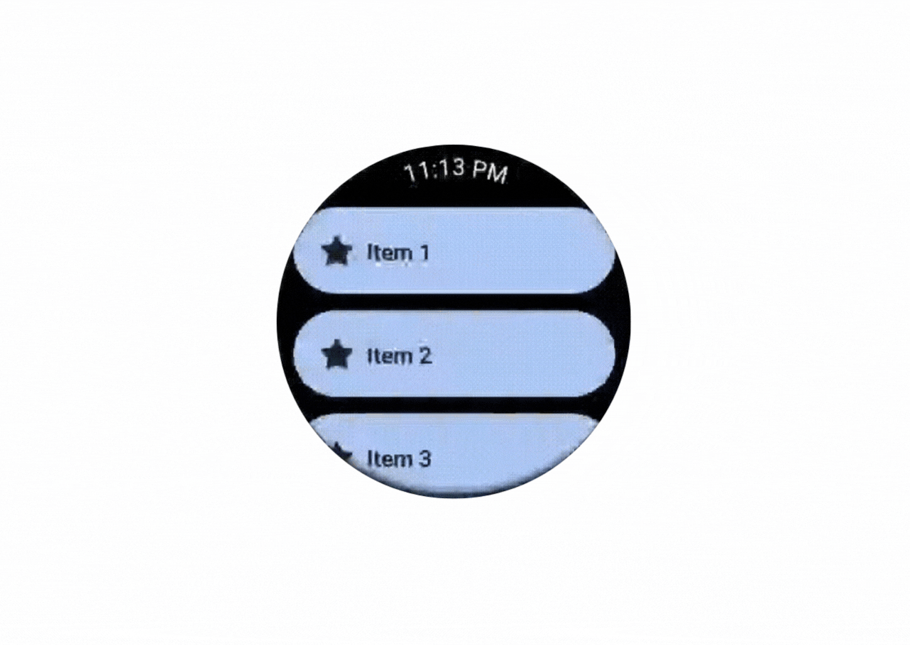
Note: The list implementation has been skipped on purpose to keep things simple. Let’s focus on Scaffold in this blog.
All the components used inside Scaffold are from the Compose for Wear OS library. Let’s understand how they work
TimeText
This component will add the time text at the top of your screen. Let’s look at its method signature
| @Composable | |
| fun TimeText( | |
| modifier: Modifier = Modifier, | |
| timeSource: TimeSource = TimeTextDefaults.timeSource(timeFormat()), | |
| timeTextStyle: TextStyle = TimeTextDefaults.timeTextStyle(), | |
| contentPadding: PaddingValues = TimeTextDefaults.ContentPadding, | |
| leadingLinearContent: (@Composable () -> Unit)? = null, | |
| leadingCurvedContent: (@Composable CurvedRowScope.() -> Unit)? = null, | |
| trailingLinearContent: (@Composable () -> Unit)? = null, | |
| trailingCurvedContent: (@Composable CurvedRowScope.() -> Unit)? = null, | |
| textLinearSeparator: @Composable () -> Unit = { TextSeparator(textStyle = timeTextStyle) }, | |
| textCurvedSeparator: @Composable CurvedRowScope.() -> Unit = { | |
| CurvedTextSeparator(curvedTextStyle = CurvedTextStyle(timeTextStyle)) | |
| }, | |
| ) |
This might look too much but it is really simple, the screenshot below might help you to understand it better. The timeSource parameter will retrieve the current time of the watch. The timeFormat() would be the format that the user has chosen for their watch whether it is in 24 hour or 12 hour format.
In Wear OS, the screen can be circular or square shaped, to make it easy to handle these scenarios we have these linear and curved parameters, the linear parameters will only be applied to square watches and the curved parameters will be applied to the circular watches. So if you want to show some text before the time text you can use leadingLinearContent or leadingCurvedContent. Similarly to show text after the time text, you can use trailingLinearContent or trailingCurvedContent.
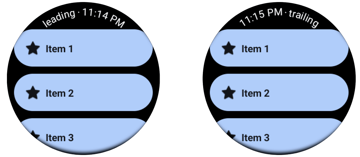
The last parametertextLinearSeparator or textCurvedSeparator by default will add a “.” before or after the time text to separate it from the leading and trailing content (check it out in the screenshot above). You can customise it to add anything you want. This text separator will only be added if you use any of the above leading/trailing texts.
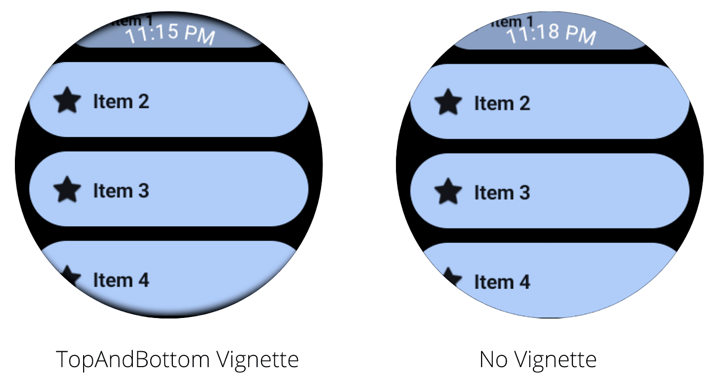
Vignette
This composable will blur the top or bottom edge of the screen slightly. Let’s have a look at the method signature
| @Composable | |
| public fun Vignette( | |
| vignettePosition: VignettePosition, | |
| modifier: Modifier = Modifier, | |
| ) |
OUR VIDEO RECOMMENDATION


Jobs
Here we just have to provide where all we want to blur the screen. The values that we can provide to vignettePosition are Top, Bottom and TopAndBottom.
You can check the screenshot below to see how Vignette looks.
PositionIndicator
This component will add a scrollbar to the scrollable composable. This component has multiple method signatures as it supports multiple scrollable components, let’s have a look at one of these method signatures
| @Composable | |
| public fun PositionIndicator( | |
| scalingLazyListState: ScalingLazyListState, | |
| modifier: Modifier = Modifier, | |
| reverseDirection: Boolean = false | |
| ) |
The parameter scalingLazyListState is the scrolling state used to implement the PositionIndicator. The reverseDirection if given the true value will make the scrollbar move in the opposite direction of the scroll so if the user is scrolling down, the scroll bar will move up. The following video may make it easier to understand the difference.

It’s an exciting time to be an Android developer, Jetpack Compose makes UI development enjoyable. I had fun making Wear OS apps in Jetpack Compose, I hope you enjoyed the blog post.
The GitHub repository of this sample app has been linked below
If you have feedback, feel free to tweet/message me on Twitter.


