

Designing your first composable.
- Part 1 — Integrating a new tool in a production product.
- Part 2 — Designing your first composable.
- Part 3 — Creating a custom button with Jetpack Compose.
In this part of the series, we will plan our first screen in Jetpack Compose, and learn how we can think differently when building UI with compose
In the last part of the series, we chose a candidate to be the first screen written with Jetpack compose to be introduced into the
app and be used in production by millions of users.
We configured our Gradle and Kotlin versions, and now we are ready to start planning how we should build the following screen:
Jetpack Compose vs XML
As we all remember when working on a new complete screen in the old view system we would start by writing up an XML file that would describe a static state of the screen, it would have a Toolbar, then a recycler view, which we later need to write view holders for, that would be some more XML, then a Button and another Button, and we can use a linear layout or constraint layout.
But when writing UI’s with Jetpack compose, we work in a different approach, as
demonstrates in his amazing video, Thinking in compose, we start from the smaller pieces of UI and combine them to eventually form the screen we want.
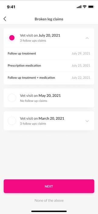
Start small
So let’s see what our screen contains:
- Top Bar with a title and a button.
- Expandible items with texts, an icon, and a Radio button.
- A
NEXTbutton. - A
SKIPbutton.
We will start with the simplest view on our screen, the clickable skip button.
But before we start we need to answer a question we haven’t answered yet.
What is a Composable?
The clickable text is described in this function:
@Composable
private fun ClickableTextButton(
    text: String,
    onClick: () -> Unit
)
The @Composable annotation is where the magic happens, a lot is going on under the hood but the best way to think about it is as if this was a modifier, the same as suspend.
When we call a suspend function in Kotlin we can only call it from another suspend function, or more accurately, from a coroutine context.
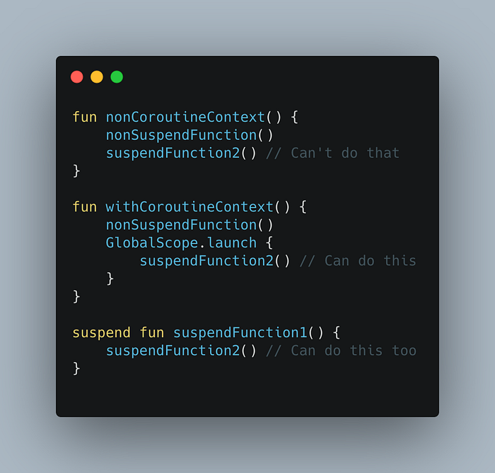
Compose is similar in this way.
So if we want a function that describes UI declaratively, we would call it from a setContent lambda of an Activity or Fragment, or we can call it from another function annotated with @Composable .
First Piece of the puzzle
The clickable text from the bottom of our screen is described in the following function:
OUR VIDEO RECOMMENDATION


Jobs
Let’s break that down:
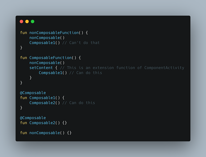
Inside our ClickableTextButtonfunction we call another function, this is the Box function, it is another composable function (a function annotated with @Composable ), what you see is this:
@Composable
fun ClickableTextButton(...) {
    Box(...) {
        TextButton(...) {
           Text(...)
        }
    }
}
Notice how every composable take a function as a parameter, it is a composable function and its signature looks like this:
@Composable
fun MyComposable(content: @Composable () -> Unit)
And we leverage the kotlin trailing lambda feature to write composables as nested functions like in the code above.
The code above is comprised of 3 pieces.
The Box
TheBox takes a modifier , an Alignment parameter and a trailing lambda, where you set more composable functions, which will be placed in the Box .
A Box is a bit similar to a FrameLayout of the old view system, it allows you to place UI components inside it, and align them, there are also the Rowand Columncomposbles which are similar to linear layouts vertical and horizontal, these three are the main building blocks of compose layouts.
 From the google developers website
The Text Button
The TextButton is our clickable text and it also is a Composable, and it takes a lambda of onClick() to set the click action as well as a string to set as the text of the button.
TextButton(
   onClick = onClick,
   modifier = Modifier
            .padding(start = 15.dp, end = 15.dp, bottom = 20.dp)
            .fillMaxWidth()
)
The Text
The Text will be nested in the TextButton which does not contain its own text implementation, and will set properties like fonts, weights colors, etc’.
Text(
    text = text,
    fontFamily = latoFamily,
    fontWeight = FontWeight.Normal,
    fontSize = 14.sp,
    color = colorResource(id = R.color.my_color)
)
Fonts
Text also takes a fontFamily, fontWeight and fontSizeparameters, in our example we give it latoFamiliy which we created:
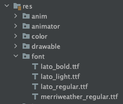
val latoFamily = FontFamily(
   Font(R.font.lato_bold, FontWeight.Bold),
   Font(R.font.lato_light, FontWeight.Light),
   Font(R.font.lato_regular, FontWeight.Normal),
)
The font assets should go under res/fonts like this:
Now our screen looks like this
That’s it for now!
And now we have our first composable element! you can call ClickableTextButton where ever you want in your codebase, being a function means it is not bound to a class context and is easily reusable.
Hope you like this article, please follow and clap, but only if you think I deserve it!.


