

In my opinion, working with theming and designs isn’t that easy. It would be if every app was designed 100% based on Material Design and Android in mind. Keep dreaming 😉
The purpose of this article is to share my experience with designs and implementation in the View System and how it worked out for me in Jetpack Compose lately.
Understand Material Design
Google has a dedicated site for Material where you will find tons of information explaining in great detail what material is, from what elements it’s built, and how you can implement individual UI components. However, it’s extremely overwhelming if you are not a design veteran. So, I will try to break it down for you as an Android developer to another Android developer in my own words and I will limit that knowledge to what is really needed.
Let’s Go!
Material Design is a ready-to-use design system built for different platforms including Android. What “system” means is simply a set of sub-systems that we put together to control how our app feels and looks.
There are 3 main sub-systems that you should learn about:
- Typography — define set of text styles
- Colors — define set of colors mixed with opacity, ripple effects, text selections
- Shapes — define set of 3 shape groups: small, medium large
A very good place to look at in documentation is Jetpack Compose Anatomy of a theme but I will try to explain how I wrap that around my head.
Each of those sub-systems we divide into schema and values. I will picture this for you with the following diagram:

I have skipped some parts of the schema in colors and typography to keep it simple.
Let’s take a look at Color Schema. It contains colors like Primary or Background. It doesn’t say blue or red because we want those colors to have some meaning and it means where those colors suppose to be used. However, we also don’t want them to be very specific like SendEmailButton or anything that leads to specific functionality in the app. Those colors should be reusable and group together similar UI components.
Another reason why we don’t use specific colors blue or red, that I mentioned above, is because depending on the configuration we might actually get a different value. For example, Primary in light mode can be blue and gray in dark mode.
Material Design Components
It’s important to know that the UI components from the Material library refer to schema properties specified in Material Design. That is why different components look good out of the box. It is also worth knowing which schema properties are used where. As an example, below you can see how Material Design distributes most components into 3 shape sizes.
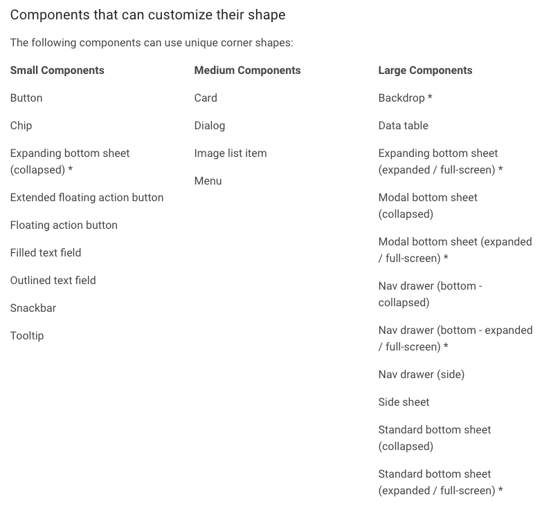
https://material.io/design/shape/applying-shape-to-ui.html#shape-scheme
With Jetpack Compose, I highly recommend browsing the implementation to see what Material uses as default. Here is a Card as an example:
@Composable
fun Card(
    modifier: Modifier = Modifier,
    shape: Shape = MaterialTheme.shapes.medium,
    backgroundColor: Color = MaterialTheme.colors.surface,
    contentColor: Color = contentColorFor(backgroundColor),
    border: BorderStroke? = null,
    elevation: Dp = 1.dp,
    content: @Composable () -> Unit
) {
    Surface(
        modifier = modifier,
        shape = shape,
        color = backgroundColor,
        contentColor = contentColor,
        elevation = elevation,
        border = border,
        content = content
    )
}
Card use MaterialTheme.shapes.medium as shape and MaterialTheme.colors.surface as background color.
You might also sometimes hear about the style guide. I am not an expert on this but according to my understanding that is basically a plain set of fonts, colors, dimensions etc. If you would go back to my diagram above that would be just the left boxes: Color Palette, Fonts, Shapes, and nothing else.
Real-life
I could move on straight to tell you how to build your own system on top of Material but I need to address one issue first.
There are cases when it gets complicated to work with a design system:
- design is created with raw values, style guide might be provided but that basically means there is no design system
- the design was derived from web design which is common and enforce moving away from built-in Material
- the design uses a high level of customization for most UI components and all namings look nothing like Material
As long as we have a design system in place that separates the scheme from values we are saved. The level of customization just extends the time needed to code it but that is what we get paid for 🙂
The problem is with the lack of a design system. Especially, if the app you build suppose to last a long time and be actively maintained over time. Because that is when the design system truly shines when more feature is built or branding evolve. Without it, making changes simply hurts like hell. So, what to do in that case?
Strive to build a design system together with your team and stick to it. Even if it’s not perfect with clever names, it’s still better than nothing. A design system can also evolve as long as you have one and you do it gradually.
What a Design System is for me?
For me, the design system represents branding I am going to apply to the app. Apart from used fonts, colors, or shapes it also:
- tell me what level of theme customization my app needs
- is a contract between developers and designers
- is a kind of communication platform regarding design issues
- allow easy design modifications in the future
Tooling
There is no design system without tools. I believe that currently, Figma is a very popular one, or at least the one I have seen in use. It’s a tool where designers create beautiful designs and developers read to apply them in the code. It provides layouts for specific screens in the app and style guides with a design system describing the branding. It can also contain common UI components that designers use across different screens. It is also a good practice to follow that approach in the code building for example custom button.
There are 3 important things in such a tool:
- it translates designs into platform (Web, iOS, Android) specific properties that we should use, e.g. how much DP should be set between the edge of the screen and elements on the screen; you wouldn’t like to measure pixels from the design provided as PNG and then translate as DP yourself 🙂
- specific screen designs refer to design system, so when you click in Figma on a Button you will see that it uses a color from Color system scheme like primary
- enable communication between designers and devs by adding comments – its a really good way to resolve issues or misunderstanding
In the past, I was also using Zeplin that developers used and it was integrated with Sketch that designers were using. Can’t really tell which solution is better. In the end, both solutions depend on how much experience designers have with those tools and how much they are willing to cooperate with developers and vice versa.
Custom design system
That is the last part of the article. Custom design system. There are multiple ways to approach it with Jetpack Compose theming. In fact, Google did a really good job describing that in their docs. This is where I have learned what can be done and I highly recommend that you do the same.
I don’t want to copy what they already explained. If you are reading this you probably searched for some guides and didn’t know it’s already in official docs, or you looked for something that gives you a better overview on possible options, and what are the prerequisites to apply one of them. That is exactly where I want to step in.
LocalComposition
Before you jump into theming customization you HAVE TO understand LocalComposition and how that mechanism works. So put away the theme on the side and dive into that first.
CompositionLocal is a tool for passing data down through the Composition implicitly
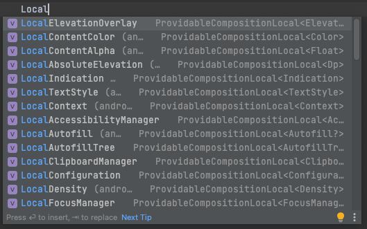
👆 That is exactly what it is according to the docs. That is how you can for example get Android Context by simply calling LocalContext.current wherever in @Composable That’s why it is implicit, no need to pass it as a composable parameter. There are many existing local compositions like the one I mentioned. Go to the IDE in any @Composable and start typing Local
Q: What do you need LocalComposition for in theming?
A: It’s used to pass down theme sub-systems for your disposal. That is how MaterialTheme does it and that is how you will do it.
LocalComposition doc is not short but If I would have to highlight what is the most important to know it would be the difference between compositionLocalOfand staticCompositionLocalOf described as follow:
There are two APIs to create a CompositionLocal:
compositionLocalOf: Changing the value provided during recomposition invalidates only the content that reads itscurrent value.staticCompositionLocalOf: UnlikecompositionLocalOf, reads of astaticCompositionLocalOf are not tracked by Compose. Changing the value causes the entirety of thecontent lambda where theCompositionLocal is provided to be recomposed, instead of just the places where thecurrent value is read in the Composition.
If you have Flutter experience, this mechanism is basically the same what
InheritedWidgetis for widgets in Flutter.
Referencing MaterialTheme
It is worth noting how we reference MaterialTheme in the code. Whenever you start typing MaterialTheme in the code, two things popup.
First, it’s @Composable MaterialTheme that you will use somewhere at the top of your hierarchy directly or wrapping in your own @Composable Later one is how Android Studio creates the Jetpack Compose project from the wizard.
Second, it’s Object MaterialTheme that is a class that you will be using across your UI code applying fonts, color, or other sub-systems.
In the next section, I will showcase possible options and want to make it clear that whenever there is an option without Custom Theme it means there is noObject CustomTheme but having just@Composable CustomTheme that only setup Material is always a good option. Hope that is clear 😅
Custom design options

Option ordered with the simplest being first
OUR VIDEO RECOMMENDATION


Jobs
Option 1 — Extensions
This is the simplest approach. It’s the only one when you don’t actually need LocalComposition.
| // somewhere in your theming code | |
| val Colors.mySpecialColor: Color | |
| get() = if (isLight) Color.Black else Color.White | |
| // somewhere in the layouts | |
| Surface(color = MaterialTheme.colors.mySpecialColor) { | |
| } |
Option 1 with a simple extension
That is a good option when you rely almost completely on Material Design and you have just a few extra properties to add.
Option 2 — Additional sub-system as Material extension
This one also relies on extensions but unlike option 1 we will be extending the entire theme with a completely new LocalComposition.
| // somewhere in the theming code | |
| data class Dimensions( | |
| val tiny: Dp = 4.dp, | |
| val mediocre: Dp = 16.dp, | |
| val craaaazy: Dp = 100.dp | |
| ) | |
| val LocalDimensions = staticCompositionLocalOf { Dimensions() } | |
| val MaterialTheme.dimensions | |
| @Composable | |
| @ReadOnlyComposable | |
| get() = LocalDimensions.current | |
| // somewhere at top level of your UI hierarchy | |
| CompositionLocalProvider(LocalDimensions provides Dimensions()) { | |
| MaterialTheme( | |
| colors = colors, | |
| typography = Typography, | |
| shapes = Shapes, | |
| content = content | |
| ) | |
| } | |
| // somewhere in the layouts | |
| Surface(modifier = Modifier.padding(MaterialTheme.dimensions.craaaazy)) { | |
| } |
Option 2 with sub-system as an extension
- Create
data classrepresenting the sub-system you want to expose and properties it has - Create
LocalDimensionsas static composition, as a body of composition creates an instance of the sub-system. - Expose
LocalDimensions.currentas an extension ofMaterialThemeThat way it will look like yet another Material Design sub-system - Wrap
MaterialThemewithCompositionLocalProviderthat again createsDimensionsinstance and provide down the hierarchy. You can provide different instances depending on your configuration.
According to Google’s documentation, we should separate the default creation of LocalComposition with some unspecified/dummy value like Dp.Unspecifiedfrom the real instance created when building the theme but it’s up to you.
Philipp Lackner released a nice video about this option👇 I like his content so hopefully he will get a few more subscribers thanks to this article 🥂
Option 3 — Custom theme on top of Material
We are getting deeper into the rabbit hole. This time, apart from the new sub-system from option 3, we will add Object CustomTheme that we can use it along with Object MaterialTheme within the layouts. Also, I will add a completely new sub-system for font styles.
| // somwhere in the theming code | |
| data class MyTypography( | |
| val bigText: TextStyle = TextStyle( | |
| fontFamily = FontFamily.Monospace, | |
| fontSize = 16.sp, | |
| fontWeight = FontWeight.Bold | |
| ), | |
| val smallText: TextStyle = TextStyle( | |
| fontFamily = FontFamily.Monospace, | |
| fontSize = 16.sp, | |
| fontWeight = FontWeight.Bold | |
| ) | |
| ) | |
| val LocalSimpleTypography = staticCompositionLocalOf { MyTypography() } | |
| object CustomTheme { | |
| val dimensions | |
| @Composable | |
| @ReadOnlyComposable | |
| get() = LocalDimensions.current | |
| val typography | |
| @Composable | |
| @ReadOnlyComposable | |
| get() = LocalSimpleTypography.current | |
| } | |
| // somewhere at the top level of your UI hierarchy | |
| CompositionLocalProvider( | |
| LocalDimensions provides Dimensions(), | |
| LocalSimpleTypography provides MyTypography() | |
| ) { | |
| MaterialTheme( | |
| colors = colors, | |
| shapes = Shapes, | |
| content = content | |
| ) | |
| } | |
| // somewhere in the layouts | |
| Text( | |
| text = "Hello", | |
| style = CustomTheme.typography.bigText | |
| ) |
- MyTypography created similar to Dimensions from option 3
- On purpose skipped setting up Material’s typography
- Added
CustomThemeobject and used it onTextcomponent
It can be a bit weird at first why would we need separate theme object but you might want to have a more clear separation from MaterialTheme the more customization you make. As you can see, I have skipped Material’s typography because of that new typography being introduced with bigText and smallTextproperties.
Of course, nothing stops you from making new typography as an extension. It is really up to you how you draw the line between Material and custom sub-systems.
Option 4 — Custom theme without Material
This one is the complete custom theme solution. If you understand previous options and how to build LocalComposition and custom theme object then it’s actually simple. Just remove completely use of @Composable MaterialTheme in your code:
| CompositionLocalProvider( | |
| LocalDimensions provides Dimensions(), | |
| LocalSimpleTypography provides MyTypography(), | |
| LocalMyColors provides MyColors() | |
| ) { | |
| // MaterialTheme( | |
| // colors = colors, | |
| // shapes = Shapes, | |
| // content = content | |
| // ) | |
| content() | |
| } |
MaterialThemeremoved, I just kept it in sample commented be clear from where it’s removed
This is the approach if your design system is completely different from Material and there is basically nothing to re-use from there.
Custom UI components
Google in their docs also mentions reusing material components and that is important. Even though we might not be using the Material theme we might still use UI components from the Material library. As mentioned earlier, those components will still try to use sub-systems from MaterialTheme object. Therefore, instead of calling CustomTheme.typography.bigText everywhere you might also create custom @Composable which uses it:
| @Composable | |
| fun BigText(text: String, modifier: Modifier = Modifier) { | |
| Text( | |
| text = text, | |
| modifier = modifier, | |
| style = CustomTheme.typography.bigText | |
| ) | |
| } |
Troubleshooting
I will extend this section if I encounter more interesting issues to share or if someone ask interesting question in the comments.
Q: What if my design uses something like Material but there are some properties used on a design that doesn’t match any sub-system and I am not able to group them.
A: I suggest creating an extension for every case and making it very specific. Let’s say you have a color that shows up on many different text components that are not related. Make an extension for each case and put it somewhere in the theme package.
| val SuspiciousColor = Color(0xFF0F0F0F) | |
| val Colors.specialCardTitle: Color | |
| get() = SuspiciousColor | |
| val Colors.profileTitle: Color | |
| get() = SuspiciousColor | |
| val Colors.settingFooter: Color | |
| get() = SuspiciousColor |
That way you won’t expose SuspiciouseColor but a list of specific properties and in the future, once your app gets far with development and it hopefully gets some reasoning behind that color, you will be able to easily identify where it’s used by looking at this single file and then refactor it.
Summary
That is all folks. I have tried my best to explain what is Material Design, design system and how one can be extended or build in Jetpack Compose. It got a bit longer than I anticipated but if you like it leave a 👏 or few. I hope you also liked my drawings, it was a challenge on its own 😅
Credits for reviewing goes to Piotr Rutka
Thank you for reading and have a happy coding.


