

Glance is a recent addition to the suite of Jetpack libraries. It was introduced to make it faster and easier to build app widgets for surfaces such as the home screen.
Glance is built on top of the Jetpack Compose runtime and requires Compose to be enabled in order to be used. It offers a declarative API, and provides a set of composables to simplify app widget UI development.
This post goes over the basics of building an app widget with Glance. It then explores key features Glance offers, from handling user interactions and errors, managing state, composing the UI, handling resizing and responsiveness to interoperability with RemoteViews. All code snippets in this post are available in this repo.
Writing Your First App Widget
Building a basic Glance app widget involves 4 steps:
1. Creating the app widget
A Glance app widget is a class that extends GlanceAppWidget, and must provide -at minimum- the widget’s UI by overriding its Content() composable function. Glance takes care of calling it whenever it’s necessary.
| class HelloWorldWidget : GlanceAppWidget() { | |
| @Composable | |
| override fun Content() { | |
| Text(text = "Hello world!") | |
| } | |
| } |
2. Providing the app widget
AppWidgetProvider is a convenience class that extends BroadcastReceiver, it intercepts, parses and correctly dispatches app widget specific broadcast events.
GlanceAppWidgetReceiver extends AppWidgetProvider, and provides the extra functionality of generating RemoteViews from the widget’s composable Content() function, which is why a GlanceAppWidget must be attached to a GlanceAppWidgetReceiver.
| class HelloWorldWidgetReceiver : GlanceAppWidgetReceiver() { | |
| override val glanceAppWidget: GlanceAppWidget = HelloWorldWidget() | |
| } |
3. Registering the widget receiver
The GlanceAppWidgetReceiver is a BroadcastReceiver, thus like any other Android component, it must be registered in the app’s manifest.
| <?xml version="1.0" encoding="utf-8"?> | |
| <manifest...> | |
| <application...> | |
| <receiver | |
| android:name=".HelloWorldWidgetReceiver"> | |
| <intent-filter> | |
| <action android:name="android.appwidget.action.APPWIDGET_UPDATE" /> | |
| </intent-filter> | |
| <meta-data | |
| android:name="android.appwidget.provider" | |
| android:resource="@xml/widget_hello_world_info" /> | |
| </receiver> | |
| </application> | |
| </manifest> |
4. Defining the widget’s metadata
A widget’s metadata defines essential qualities about the widget, such as its initial layout, preview, description, minimum size and resize mode. It’s defined in res/xml. You can read more about it here.
The above steps result in the following app widget.
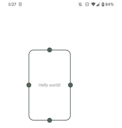
A “Hello world” Glance app widget
Handling user interactions
Glance provides a more intuitive API to handle user interactions, and abstracts away the complexities you’d encounter while using RemoteViews and PendingIntent. It provides the following predefined actions:
actionRunCallback: An action that accepts typed key-value pairs as parameters and executes a callback. The callback extendsActionCallbackand must have a public zero argument constructor, as it’s instantiated at runtime. To pass parameters to an action, define anActionParameters.Key, specify the type of value it expects, then pass it along with its value toactionParametersOf().
| class ActionWidget : GlanceAppWidget() { | |
| @Composable | |
| override fun Content() { | |
| Button( | |
| text = "Log on a click event", | |
| onClick = actionRunCallback<LogActionCallback>( | |
| parameters = actionParametersOf( | |
| actionWidgetKey to "log event" | |
| ) | |
| ) | |
| ) | |
| } | |
| } | |
| class LogActionCallback : ActionCallback { | |
| override suspend fun onRun( | |
| context: Context, | |
| glanceId: GlanceId, | |
| parameters: ActionParameters | |
| ) { | |
| log("Item with id $glanceId and params $parameters clicked.") | |
| } | |
| } | |
| val actionWidgetKey = ActionParameters.Key<String>("action-widget-key") |
Example of actionRunCallback that logs when it’s triggered
actionStartActivity: An action that launches anActivity. It accepts typed key-value pairs as parameters which can later be retrieved from the launchedActivity. The action expects theComponentName,Classor type of theActivityto launch.actionStartService: An action that launches aService. You can optionally specify whether the service should be launched as a foreground service. The action expects theComponentName,Classor type of theServiceto launch.actionStartBroadcastReceiver: An action that launches aBroadcastReceiver. It expects theComponentName,Classor type of theBroadcastReceiverto launch.
Handling errors
When a GlanceAppWidget encounters an error, such as when rendering its UI, it displays an error UI. By default, it displays the layout glance_error_layout when an error occurs. To use a custom error UI, pass in its layout id when extending GlanceAppWidget.
| class ErrorUIWidget : GlanceAppWidget(errorUiLayout = R.layout.layout_widget_custom_error) { | |
| // Normal widget implementation | |
| } |
Defining a custom error UI
Composing the UI
Glance provides several composables out of the box that are similar to the ones offered by androidx.compose.ui, including Box, Row, Column, Text, Button, LazyColumn, Image and Spacer. Make sure to use the composables from the package androidx.glance.appwidget when composing the widget’s UI, otherwise it won’t compile.
Similar to compose’s Modifier, Glance provides GlanceModifier which you can use to decorate and/or add behavior to your widget’s composables.
| class ListWidget : GlanceAppWidget() { | |
| private val items = listOf("an item", "another item", /* more items */) | |
| @Composable | |
| override fun Content() { | |
| LazyColumn( | |
| modifier = GlanceModifier.padding(8.dp) | |
| ) { | |
| items(items) { item -> | |
| Text( | |
| text = item, | |
| modifier = GlanceModifier | |
| .padding(vertical = 8.dp) | |
| .clickable( | |
| onClick = // some action | |
| ) | |
| ) | |
| } | |
| } | |
| } | |
| } |
OUR VIDEO RECOMMENDATION


Jobs
Managing state
A GlanceAppWidget can store data specific to its UI. To make a widget stateful, provide a GlanceStateDefinition, which defines how the widget’s underlying data store is created and where the data is stored. Glance provides PreferencesGlanceStateDefinition, a state definition that stores a widget’s state using DataStore’s Preferences.
To get the widget’s current state when rendering its UI, use the local composition currentState, it returns a Preferences instance when you use a PreferencesGlanceStateDefinition.You can then use its APIs to query the widget’s state.
To update the widget’s state, use updateAppWidgetState(), then call GlanceAppWidget.update() to refresh the widget’s UI.
The gif below shows a counter Glance app widget whose state is composed of a single Int, the count. When clicked, each of the buttons updates the widget’s state, i.e the count’s value, by calling updateAppWidgetState(), then also triggers an update to the widget’s UI using GlanceAppWidget.update(). Check out how this example was implemented here.

A counter Glance app widget that manages state
Handling responsiveness
Glance makes it easier to handle resizing the app widget by introducing SizeMode. It provides 3 options that define how a GlanceAppWidget reacts to being resized.
Single: The defaultSizeMode, it results in the widget’sContent()function being called only once when the widget is initially selected from the widgets selector. It uses the minimum supported size defined as part of the widget’s metadata (inres/xml). If the available space for the widget changes, i.e the user resizes the widget, the widget’s UI is not refreshed.Exact: Causes the widget’s UI to be refreshed every time its size changes, i.e every time the user resizes it. This may result in stuttering transitions between sizes if the UI changes, as well as poor performance.Responsive: Provides a way to define a set of sizes the widget supports. When the widget is selected from the widgets selector, Glance calls itsContent()function with each of the provided sizes, then stores the corresponding UI in memory. When the widget is rendered for the first time or after being resized, the system selects the right UI to display depending on the widget’s available space. It reuses the UI it had previously stored in memory. This may result in smoother transitions and better performance.
| class SizeSingleWidget : GlanceAppWidget() { | |
| override val sizeMode: SizeMode = SizeMode.Single | |
| // Remainder of the widget's implementation | |
| } |
Example of a Glance widget with the SizeMode Single
The gif below shows the impact of the SizeMode on the actual size of a Glance app widget while it’s being resized. Notice how the size remains the same with Single, how it constantly changes with Exact, and how it changes at certain breakpoints (100×100, 250×100, 250×250) with Responsive. Check out how these widgets were implemented here.
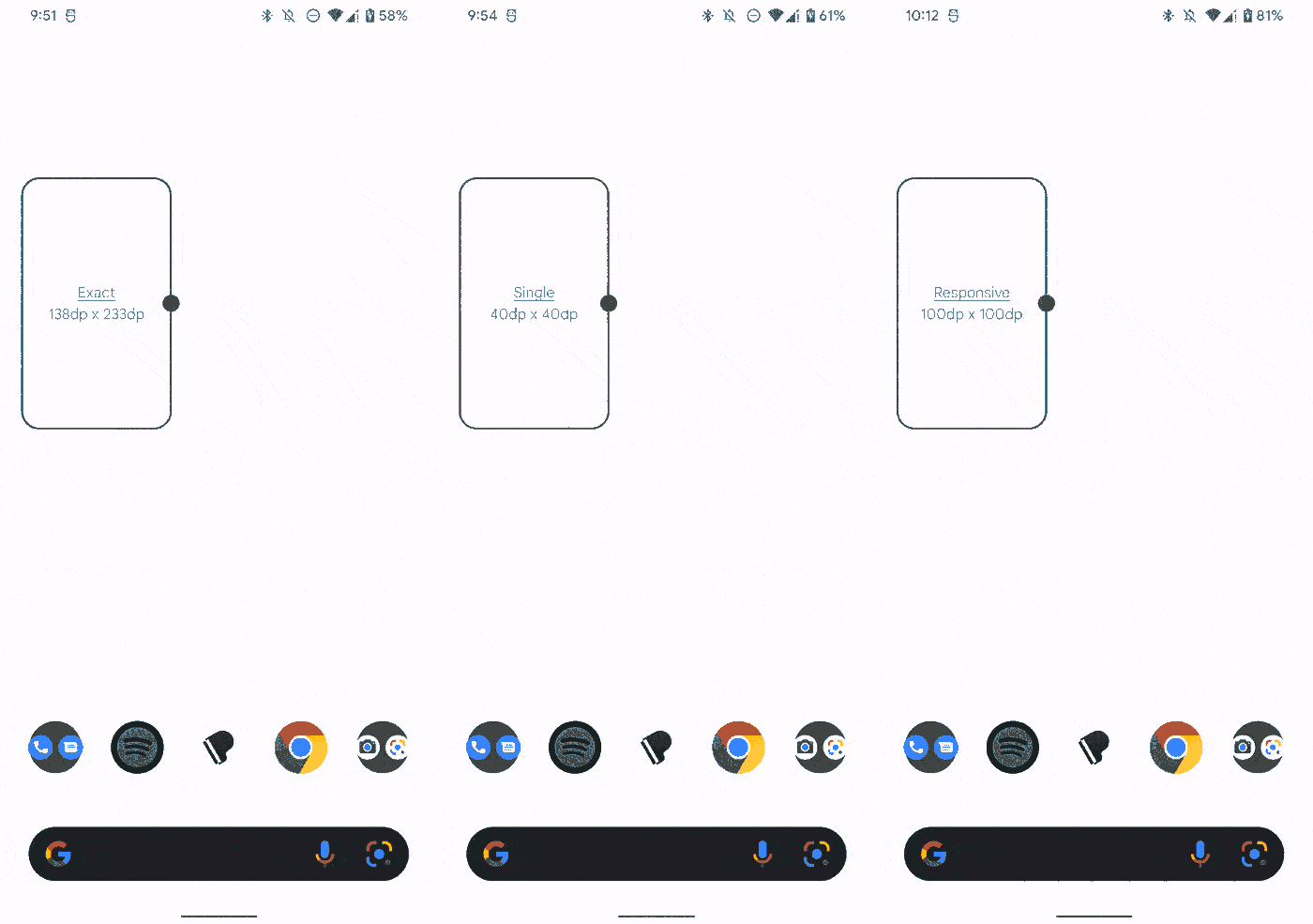
Resizing an app widget with different size modes
Interop with RemoteViews
Similar to how Jetpack Compose supports interoperability with Android Views, Glance provides a way to add RemoteViews to a Glance composition. Simply wrap them in AndroidRemoteViews. This allows (re)using existing RemoteViews inside Glance app widgets as you start adopting Glance in your app.
| class RemoteViewInteropWidget : GlanceAppWidget() { | |
| @Composable | |
| override fun Content() { | |
| Column { | |
| Text(text = "Above remote views") | |
| val context = LocalContext.current | |
| AndroidRemoteViews(remoteViews = RemoteViewWidget(context)) | |
| Text(text = "Below remote views") | |
| } | |
| } | |
| } | |
| class RemoteViewWidget(context: Context) : | |
| RemoteViews(context.packageName, R.layout.widget_remote_view) { /* ... */ } |
Code sample
This repo contains the code snippets included in this post, as well as other examples of Glance app widgets.
Conclusion
In summary:
- Build an app widget with Glance by defining its UI inside a
GlanceAppWidget, then make it available through aGlanceAppWidgetReceiver. - Handle user interactions in your Glance app widget using one of the predefined action handlers
actionRunCallback,actionStartActivity,actionStartServiceandactionStartBroadcastReceiver. - Provide a custom error UI for you app widget by passing its layout id when extending
GlanceAppWidget. - Make use of the composables Glance provides to build your app widget’s UI.
- Make your app widget stateful by providing a
GlanceStateDefinition. Make use of the predefinedPreferencesGlanceStateDefinitionGlance offers. - Choose how your app widget should handle being resized by setting its
SizeModetoSingle,ExactorResponsive. - Glance provides interop with
RemoteViews, so make use of existingRemoveViewsin your Glance app widget.
Want to learn more about Glance and app widgets on Android? Check out:
For more on Android, follow me to get notified when I write new posts, or let’s connect on Github and Twitter!


