

Jetpack Compose is Android’s modern toolkit for building native UI. It simplifies and accelerates UI development on Android. Quickly bring your app to life with less code, powerful tools, and intuitive Kotlin APIs.
I recently learnt Jetpack Compose and almost instantly understood the craze behind it. Compose allows you to do more with less code, compared to using the Android View system: Buttons, lists or animation — whatever you need to build, now there’s less code to write.
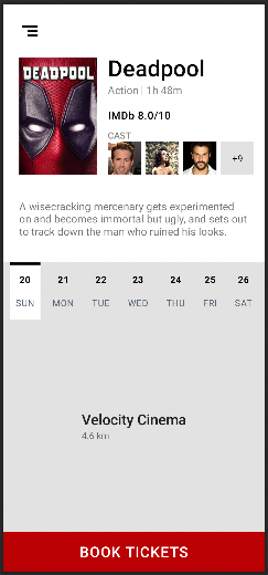
I had been using ConstraintLayout extensively in my projects. So naturally, when I moved on to Compose, I felt the need to explore it here as well. So, here’s the design we will aim to implement:
Inspiration: https://proandroiddev.com/designing-complex-ui-using-android-constraintlayout-cb0606823da0
We’ll be covering the following about ConstraintLayout in this tutorial:
- Basics
- Guidelines
- Barriers
- Chains
So, let’s begin…
- Open Android Studio and click on New Project.
- Select Empty Compose Activity. Click on Next.

3. Give a suitable name to your project and click on Finish.
4. Once the project is completely loaded, go to app-level Gradle file and under dependencies, add:
implementation "androidx.constraintlayout:constraintlayout-compose:1.0.0"
5. Sync the project Gradle files.
Get. Set. CODE!!
Go to MainActivity.kt and replace the code with:
| class MainActivity : ComponentActivity() { | |
| override fun onCreate(savedInstanceState: Bundle?) { | |
| super.onCreate(savedInstanceState) | |
| setContent { | |
| MovieBookingScreen() | |
| } | |
| } | |
| } | |
| @Preview(showBackground = true) | |
| @Composable | |
| fun DefaultPreview() { | |
| MovieBookingScreen() | |
| } |
Create a new class: MovieBookingScreen.kt. And add the following code:
| @Composable | |
| fun MovieBookingScreen() { | |
| Surface(color = Color.White) { | |
| ConstraintLayout( | |
| modifier = Modifier.fillMaxSize(), | |
| ) { | |
| } | |
| } | |
| } |
Here, we first create a base composable function with nothing but a Surface and a ConstraintLayout which covers the entire height and width.
To compare with the traditional XML based ConstraintLayout, we assign IDs to our views and then use those IDs to constrain other views accordingly. Here too, we first create all these references using the createRefs()function and then assign them to our composables.
| val ( | |
| menuButton, coverImage, titleText, genreText, ratingText, | |
| castText, castContainer, castImage1, castImage2, castImage3, castImage4, | |
| descText, bottomSurface, bookButton, cinemaNameContainer, | |
| ) = createRefs() |
First, let’s take up the menu icon at the top-left. We use the constrainAs(reference) to assign the reference to a composable. And then in the constrainBlock, we write all the constraints. In the below example, we assign the menuButton reference to the Icon composable and then in the constrainBlock, we define its constraints:
start and top should be linked to the parent’s start and top respectively, with 16 dps of margin
Instead of the parent, we can also refer to other composable’s references.
| Icon( | |
| painter = painterResource(id = R.drawable.ic_menu), | |
| contentDescription = null, | |
| modifier = Modifier | |
| .size(48.dp) | |
| .padding(8.dp) | |
| .constrainAs(menuButton) { | |
| start.linkTo(parent.start, 16.dp) | |
| top.linkTo(parent.top, 16.dp) | |
| } | |
| ) |
OUR VIDEO RECOMMENDATION


Jobs
Guideline
Guidelines in ConstraintLayout are invisible lines that are not visible to users but help developers to design the layout easily and constrain views to these guidelines, so that design can be more clear and interactive.
Next, let’s say we want to create a guideline at 40% and constrain the cover image of the movie between the parent and the guideline. Also, we want to make sure that the image’s width and height are in the ratio of 2:3.
| val rightGuideline = createGuidelineFromStart(0.4f) | |
| Image( | |
| painter = painterResource(id = R.drawable.cover_image), contentDescription = null, | |
| contentScale = ContentScale.Crop, | |
| alignment = Alignment.Center, | |
| modifier = Modifier | |
| .constrainAs(coverImage) { | |
| start.linkTo(parent.start, 24.dp) | |
| top.linkTo(menuButton.bottom, 16.dp) | |
| end.linkTo(rightGuideline, 16.dp) | |
| width = Dimension.fillToConstraints | |
| } | |
| .aspectRatio(2f / 3f), | |
| ) |
We can do the following by first creating a guideline. (40% is passed as 0.4f). We can also pass an absolute value in dp. Next, we define the width as Dimension.fillToConstraints which is analogous to setting android:layout_width=”0dp” . To set the ratio, we use the aspectRatiomodifier where we pass the ratio. This is again analogous to app:layout_constraintDimensionRatio=”2:3" .
Similarly, we can create other text composables and constrain them.
| Text( | |
| text = "Deadpool", | |
| style = MaterialTheme.typography.h4, | |
| fontWeight = FontWeight.SemiBold, | |
| modifier = Modifier.constrainAs(titleText) { | |
| top.linkTo(menuButton.bottom, 8.dp) | |
| start.linkTo(coverImage.end, 16.dp) | |
| } | |
| ) | |
| Text( | |
| text = "Action | 1h 48m", | |
| fontSize = 16.sp, | |
| color = Color.Gray, | |
| modifier = Modifier.constrainAs(genreText) { | |
| top.linkTo(titleText.bottom) | |
| start.linkTo(coverImage.end, 16.dp) | |
| } | |
| ) | |
| Text( | |
| text = "IMDb 8.0/10", | |
| fontWeight = FontWeight.Medium, | |
| style = MaterialTheme.typography.body1, | |
| modifier = Modifier.constrainAs(ratingText) { | |
| top.linkTo(genreText.bottom, 16.dp) | |
| start.linkTo(coverImage.end, 16.dp) | |
| } | |
| ) | |
| Text( | |
| text = "CAST", | |
| fontSize = 14.sp, | |
| color = Color.Gray, | |
| fontWeight = FontWeight.SemiBold, | |
| modifier = Modifier.constrainAs(castText) { | |
| bottom.linkTo(castContainer.top) | |
| start.linkTo(coverImage.end, 16.dp) | |
| } | |
| ) |
Horizontal Chaining
A chain is a group of views that are linked to each other with bi-directional position constraints
The chain can be of 3 types:
Spread: A chain style that evenly distributes the contained layouts.SpreadInside: A chain style where the first and last layouts are affixed to the constraints on each end of the chain and the rest are evenly distributed.Packed: A chain style where the contained layouts are packed together and placed to the centre of the available space.

Casts section of our layout
Next, for the casts row, we will first create a ConstraintLayout, add our composables in it, and then chain them together using the createHorizontalChain(). Also, each Image composable is constrained by giving an aspect ratio of 1:1 to maintain the square shape.
| ConstraintLayout(modifier = Modifier.constrainAs(castContainer) { | |
| bottom.linkTo(coverImage.bottom) | |
| start.linkTo(coverImage.end, 16.dp) | |
| end.linkTo(parent.end, 16.dp) | |
| width = Dimension.fillToConstraints | |
| }) { | |
| Image( | |
| painter = painterResource(id = R.drawable.cast1), | |
| contentDescription = null, | |
| contentScale = ContentScale.Crop, | |
| modifier = Modifier | |
| .height(50.dp) | |
| .constrainAs(castImage1) { | |
| top.linkTo(parent.top) | |
| bottom.linkTo(parent.bottom) | |
| start.linkTo(coverImage.end, 16.dp) | |
| } | |
| .aspectRatio(1f) | |
| ) | |
| Image( | |
| painter = painterResource(id = R.drawable.cast2), | |
| contentDescription = null, | |
| contentScale = ContentScale.Crop, | |
| modifier = Modifier | |
| .height(50.dp) | |
| .constrainAs(castImage2) { | |
| top.linkTo(castImage1.top) | |
| bottom.linkTo(castImage1.bottom) | |
| start.linkTo(castImage1.end) | |
| } | |
| .aspectRatio(1f) | |
| ) | |
| Image( | |
| painter = painterResource(id = R.drawable.cast3), | |
| contentDescription = null, | |
| contentScale = ContentScale.Crop, | |
| modifier = Modifier | |
| .height(50.dp) | |
| .constrainAs(castImage3) { | |
| top.linkTo(castImage1.top) | |
| bottom.linkTo(castImage1.bottom) | |
| start.linkTo(castImage2.end) | |
| } | |
| .aspectRatio(1f) | |
| ) | |
| Box(modifier = Modifier | |
| .height(50.dp) | |
| .background(color = colorResource(id = R.color.gray)) | |
| .constrainAs(castImage4) { | |
| top.linkTo(castImage1.top) | |
| bottom.linkTo(castImage1.bottom) | |
| start.linkTo(castImage3.end) | |
| end.linkTo(parent.end, 16.dp) | |
| } | |
| .aspectRatio(1f)) | |
| { | |
| Text( | |
| text = "+9", | |
| textAlign = TextAlign.Center, | |
| fontSize = 14.sp, | |
| modifier = Modifier | |
| .padding(horizontal = 4.dp) | |
| .align(Alignment.Center), | |
| color = Color.Black | |
| ) | |
| } | |
| createHorizontalChain( | |
| castImage1, castImage2, castImage3, castImage4, | |
| chainStyle = ChainStyle.SpreadInside | |
| ) | |
| } |
Barrier
A Barrier references multiple widgets as input, and creates a virtual guideline based on the most extreme widget on the specified side. For example, a left barrier will align to the left of all the referenced views.
A barrier can be easily created as shown below by passing in the views. Here we create a bottom barrier to get a guideline below the cover image and our cast container. Similarly, we can create top, bottom, start and end barriers.
val barrier = createBottomBarrier(coverImage, castContainer)
Next, we constrain the description text under the barrier. With this, we are done with the top half of our layout 🎉. Now we are left with the bottom half of the screen.
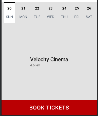
Let’s divide the bottom half of the screen into 3 parts:
- Calendar strip
- Cinema details
- The “Book Tickets” button
Firstly, the grey background can be implemented by adding a simple Surface composable and giving it a grey colour.
| Surface(color = colorResource(id = R.color.gray), | |
| modifier = Modifier.constrainAs(bottomSurface) { | |
| top.linkTo(descText.bottom, 36.dp) | |
| bottom.linkTo(parent.bottom) | |
| start.linkTo(parent.start) | |
| end.linkTo(parent.end) | |
| width = Dimension.fillToConstraints | |
| height = Dimension.fillToConstraints | |
| } | |
| ) {} |
1. Calendar Strip
The calendar strip can again be split into three parts: Selector, dates row and days row.
First, we create the Text Composables for the days row and constrain them using a horizontal chain to evenly distribute them throughout the width of the screen. Then, we create the Text Compoasables for the dates row and constrain each date with its corresponding day (for start and end) and the previous date (for top and bottom), something like this:
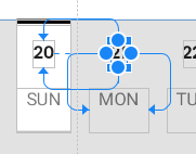
Now comes the interesting part. For the date selector, we create two Surface composables. One white, which is the main background, and the other a black strip, which is constrained to the white surface. Now, since we want the date selector to be dynamic and move over to the selected date, instead of hardcoding the constraints to the first day’s start and end, we store it in a state. So, whenever we change the value of the state, a recomposition will be triggered, and our date selector will change its constraints accordingly.
| val selectedDateStartState = remember { mutableStateOf(day1.start) } | |
| val selectedDateEndState = remember { mutableStateOf(day1.end) } | |
| Surface( | |
| color = Color.White, | |
| modifier = Modifier | |
| .constrainAs(dateSelector) { | |
| top.linkTo(descText.bottom, 36.dp) | |
| start.linkTo(selectedDateStartState.value) | |
| end.linkTo(selectedDateEndState.value) | |
| bottom.linkTo(day1.bottom) | |
| width = Dimension.fillToConstraints | |
| height = Dimension.fillToConstraints | |
| } | |
| ) {} | |
| Surface( | |
| color = Color.Black, | |
| modifier = Modifier | |
| .height(4.dp) | |
| .constrainAs(dateMarker) { | |
| top.linkTo(dateSelector.top) | |
| start.linkTo(dateSelector.start) | |
| end.linkTo(dateSelector.end) | |
| width = Dimension.fillToConstraints | |
| } | |
| ) {} |
As an example, refer to the below snippet for the Composable of “Monday” Text. In the clickable block, we change the value of the constraints of the date selector surface.
| Text( | |
| text = "MON", | |
| style = MaterialTheme.typography.body1, | |
| color = colorResource(id = R.color.dark_grey), | |
| fontSize = 14.sp, | |
| modifier = Modifier | |
| .padding(start = 8.dp, end = 8.dp, bottom = 16.dp) | |
| .constrainAs(day2) { | |
| top.linkTo(day1.top) | |
| bottom.linkTo(day1.bottom) | |
| } | |
| .clickable { | |
| selectedDateStartState.value = day2.start | |
| selectedDateEndState.value = day2.end | |
| } | |
| ) |
2. Cinema Details
We can consider the cinema name and distance as two Text composables that are chained in the centre of the available space between the calendar strip and the button. So, we again create a ConstraintLayout composable that occupies all the available space, and chain both the Text composables using a VerticalChain, keeping the chain style as Packed.
| ConstraintLayout(modifier = Modifier.constrainAs(cinemaNameContainer) { | |
| start.linkTo(parent.start) | |
| end.linkTo(parent.end) | |
| top.linkTo(dateSelector.bottom, 16.dp) | |
| bottom.linkTo(bookButton.top, 16.dp) | |
| width = Dimension.fillToConstraints | |
| height = Dimension.fillToConstraints | |
| }) | |
| { | |
| val (cinemaNameText, cinemaDistText) = createRefs() | |
| Text( | |
| text = "Velocity Cinema", | |
| fontSize = 22.sp, | |
| color = Color(0xDD000000), | |
| fontWeight = FontWeight.Medium, | |
| modifier = Modifier.constrainAs(cinemaNameText) { | |
| start.linkTo(parent.start) | |
| end.linkTo(parent.end) | |
| } | |
| ) | |
| Text( | |
| text = "4.6 km", | |
| fontSize = 14.sp, | |
| color = Color(0x8A000000), | |
| modifier = Modifier.constrainAs(cinemaDistText) { | |
| start.linkTo(cinemaNameText.start) | |
| end.linkTo(cinemaNameText.end) | |
| width = Dimension.fillToConstraints | |
| } | |
| ) | |
| createVerticalChain(cinemaNameText, cinemaDistText, chainStyle = ChainStyle.Packed) | |
| } |
3. The “Book Tickets” button
This is just a simple Button composable with a Text composable inside it. It is constrained at the bottom of the parent and made to occupy the complete width.
| Button( | |
| onClick = {}, | |
| colors = ButtonDefaults.buttonColors(backgroundColor = colorResource(id = R.color.brick_red)), | |
| modifier = Modifier | |
| .height(60.dp) | |
| .background(color = colorResource(id = R.color.brick_red)) | |
| .constrainAs(bookButton) { | |
| bottom.linkTo(parent.bottom) | |
| start.linkTo(parent.start) | |
| end.linkTo(parent.end) | |
| width = Dimension.fillToConstraints | |
| } | |
| ) { | |
| Text( | |
| text = "BOOK TICKETS", | |
| color = Color.White, | |
| fontSize = 22.sp, | |
| fontWeight = FontWeight.Medium | |
| ) | |
| } |
And that’s it 😎
We have achieved the following:

Here’s the complete code of MovieBookingScreen.kt for your reference:
| import androidx.compose.foundation.Image | |
| import androidx.compose.foundation.background | |
| import androidx.compose.foundation.clickable | |
| import androidx.compose.foundation.layout.* | |
| import androidx.compose.material.* | |
| import androidx.compose.runtime.Composable | |
| import androidx.compose.runtime.mutableStateOf | |
| import androidx.compose.runtime.remember | |
| import androidx.compose.ui.Alignment | |
| import androidx.compose.ui.Modifier | |
| import androidx.compose.ui.graphics.Color | |
| import androidx.compose.ui.layout.ContentScale | |
| import androidx.compose.ui.res.colorResource | |
| import androidx.compose.ui.res.painterResource | |
| import androidx.compose.ui.res.stringResource | |
| import androidx.compose.ui.text.font.FontWeight | |
| import androidx.compose.ui.text.style.TextAlign | |
| import androidx.compose.ui.tooling.preview.Preview | |
| import androidx.compose.ui.unit.dp | |
| import androidx.compose.ui.unit.sp | |
| import androidx.constraintlayout.compose.ChainStyle | |
| import androidx.constraintlayout.compose.ConstraintLayout | |
| import androidx.constraintlayout.compose.Dimension | |
| import com.ssindher.composecarousel.R | |
| @Composable | |
| fun MovieBookingScreen() { | |
| Surface(color = Color.White) { | |
| ConstraintLayout( | |
| modifier = Modifier.fillMaxSize(), | |
| ) { | |
| val ( | |
| menuButton, coverImage, titleText, genreText, ratingText, | |
| castText, castContainer, castImage1, castImage2, castImage3, castImage4, | |
| descText, bottomSurface, bookButton, cinemaNameContainer, | |
| ) = createRefs() | |
| Icon( | |
| painter = painterResource(id = R.drawable.ic_menu), | |
| contentDescription = null, | |
| modifier = Modifier | |
| .size(48.dp) | |
| .padding(8.dp) | |
| .constrainAs(menuButton) { | |
| start.linkTo(parent.start, 16.dp) | |
| top.linkTo(parent.top, 16.dp) | |
| } | |
| ) | |
| val rightGuideline = createGuidelineFromStart(0.4f) | |
| Image( | |
| painter = painterResource(id = R.drawable.cover_image), contentDescription = null, | |
| contentScale = ContentScale.Crop, | |
| alignment = Alignment.Center, | |
| modifier = Modifier | |
| .constrainAs(coverImage) { | |
| start.linkTo(parent.start, 24.dp) | |
| top.linkTo(menuButton.bottom, 16.dp) | |
| end.linkTo(rightGuideline, 16.dp) | |
| width = Dimension.fillToConstraints | |
| } | |
| .aspectRatio(2f / 3f), | |
| ) | |
| Text( | |
| text = "Deadpool", | |
| style = MaterialTheme.typography.h4, | |
| fontWeight = FontWeight.SemiBold, | |
| modifier = Modifier.constrainAs(titleText) { | |
| top.linkTo(menuButton.bottom, 8.dp) | |
| start.linkTo(coverImage.end, 16.dp) | |
| } | |
| ) | |
| Text( | |
| text = "Action | 1h 48m", | |
| fontSize = 16.sp, | |
| color = Color.Gray, | |
| modifier = Modifier.constrainAs(genreText) { | |
| top.linkTo(titleText.bottom) | |
| start.linkTo(coverImage.end, 16.dp) | |
| } | |
| ) | |
| Text( | |
| text = "IMDb 8.0/10", | |
| fontWeight = FontWeight.Medium, | |
| style = MaterialTheme.typography.body1, | |
| modifier = Modifier.constrainAs(ratingText) { | |
| top.linkTo(genreText.bottom, 16.dp) | |
| start.linkTo(coverImage.end, 16.dp) | |
| } | |
| ) | |
| Text( | |
| text = "CAST", | |
| fontSize = 14.sp, | |
| color = Color.Gray, | |
| fontWeight = FontWeight.SemiBold, | |
| modifier = Modifier.constrainAs(castText) { | |
| bottom.linkTo(castContainer.top) | |
| start.linkTo(coverImage.end, 16.dp) | |
| } | |
| ) | |
| ConstraintLayout(modifier = Modifier.constrainAs(castContainer) { | |
| bottom.linkTo(coverImage.bottom) | |
| start.linkTo(coverImage.end, 16.dp) | |
| end.linkTo(parent.end, 16.dp) | |
| width = Dimension.fillToConstraints | |
| }) | |
| { | |
| Image( | |
| painter = painterResource(id = R.drawable.cast1), | |
| contentDescription = null, | |
| contentScale = ContentScale.Crop, | |
| modifier = Modifier | |
| .height(50.dp) | |
| .constrainAs(castImage1) { | |
| bottom.linkTo(coverImage.bottom) | |
| start.linkTo(coverImage.end, 16.dp) | |
| } | |
| .aspectRatio(1f) | |
| ) | |
| Image( | |
| painter = painterResource(id = R.drawable.cast2), | |
| contentDescription = null, | |
| contentScale = ContentScale.Crop, | |
| modifier = Modifier | |
| .height(50.dp) | |
| .constrainAs(castImage2) { | |
| top.linkTo(castImage1.top) | |
| bottom.linkTo(castImage1.bottom) | |
| start.linkTo(castImage1.end) | |
| } | |
| .aspectRatio(1f) | |
| ) | |
| Image( | |
| painter = painterResource(id = R.drawable.cast3), | |
| contentDescription = null, | |
| contentScale = ContentScale.Crop, | |
| modifier = Modifier | |
| .height(50.dp) | |
| .constrainAs(castImage3) { | |
| top.linkTo(castImage1.top) | |
| bottom.linkTo(castImage1.bottom) | |
| start.linkTo(castImage2.end) | |
| } | |
| .aspectRatio(1f) | |
| ) | |
| Box(modifier = Modifier | |
| .height(50.dp) | |
| .background(color = colorResource(id = R.color.gray)) | |
| .constrainAs(castImage4) { | |
| top.linkTo(castImage1.top) | |
| bottom.linkTo(castImage1.bottom) | |
| start.linkTo(castImage3.end) | |
| end.linkTo(parent.end, 16.dp) | |
| } | |
| .aspectRatio(1f)) { | |
| Text( | |
| text = "+9", | |
| textAlign = TextAlign.Center, | |
| fontSize = 14.sp, | |
| modifier = Modifier | |
| .padding(horizontal = 4.dp) | |
| .align(Alignment.Center), | |
| color = Color.Black | |
| ) | |
| } | |
| createHorizontalChain( | |
| castImage1, castImage2, castImage3, castImage4, | |
| chainStyle = ChainStyle.SpreadInside | |
| ) | |
| } | |
| val barrier = createBottomBarrier(coverImage, castContainer) | |
| Text( | |
| text = stringResource(id = R.string.movie_info), | |
| color = Color(0x8A000000), | |
| fontSize = 16.sp, | |
| modifier = Modifier.constrainAs(descText) { | |
| top.linkTo(barrier, 36.dp) | |
| start.linkTo(parent.start, 24.dp) | |
| end.linkTo(parent.end, 24.dp) | |
| width = Dimension.preferredWrapContent | |
| } | |
| ) | |
| Surface(color = colorResource(id = R.color.gray), | |
| modifier = Modifier.constrainAs(bottomSurface) { | |
| top.linkTo(descText.bottom, 36.dp) | |
| bottom.linkTo(parent.bottom) | |
| start.linkTo(parent.start) | |
| end.linkTo(parent.end) | |
| width = Dimension.fillToConstraints | |
| height = Dimension.fillToConstraints | |
| } | |
| ) {} | |
| val (date1, date2, date3, date4, date5, date6, date7, | |
| day1, day2, day3, day4, day5, day6, day7, dateSelector, dateMarker) = createRefs() | |
| val selectedDateStartState = remember { mutableStateOf(day1.start) } | |
| val selectedDateEndState = remember { mutableStateOf(day1.end) } | |
| Surface( | |
| color = Color.White, | |
| modifier = Modifier | |
| .constrainAs(dateSelector) { | |
| top.linkTo(descText.bottom, 36.dp) | |
| start.linkTo(selectedDateStartState.value) | |
| end.linkTo(selectedDateEndState.value) | |
| bottom.linkTo(day1.bottom) | |
| width = Dimension.fillToConstraints | |
| height = Dimension.fillToConstraints | |
| } | |
| ) {} | |
| Surface( | |
| color = Color.Black, | |
| modifier = Modifier | |
| .height(4.dp) | |
| .constrainAs(dateMarker) { | |
| top.linkTo(dateSelector.top) | |
| start.linkTo(dateSelector.start) | |
| end.linkTo(dateSelector.end) | |
| width = Dimension.fillToConstraints | |
| } | |
| ) {} | |
| Text( | |
| text = "20", | |
| fontWeight = FontWeight.Bold, | |
| style = MaterialTheme.typography.body1, | |
| fontSize = 14.sp, | |
| modifier = Modifier | |
| .constrainAs(date1) { | |
| top.linkTo(descText.bottom, 52.dp) | |
| start.linkTo(day1.start) | |
| end.linkTo(day1.end) | |
| } | |
| .clickable { | |
| selectedDateStartState.value = day1.start | |
| selectedDateEndState.value = day1.end | |
| } | |
| ) | |
| Text( | |
| text = "21", | |
| fontWeight = FontWeight.Bold, | |
| style = MaterialTheme.typography.body1, | |
| fontSize = 14.sp, | |
| modifier = Modifier | |
| .constrainAs(date2) { | |
| top.linkTo(date1.top) | |
| bottom.linkTo(date1.bottom) | |
| start.linkTo(day2.start) | |
| end.linkTo(day2.end) | |
| } | |
| .clickable { | |
| selectedDateStartState.value = day2.start | |
| selectedDateEndState.value = day2.end | |
| } | |
| ) | |
| Text( | |
| text = "22", | |
| fontWeight = FontWeight.Bold, | |
| style = MaterialTheme.typography.body1, | |
| fontSize = 14.sp, | |
| modifier = Modifier | |
| .constrainAs(date3) { | |
| top.linkTo(date1.top) | |
| bottom.linkTo(date1.bottom) | |
| start.linkTo(day3.start) | |
| end.linkTo(day3.end) | |
| } | |
| .clickable { | |
| selectedDateStartState.value = day3.start | |
| selectedDateEndState.value = day3.end | |
| } | |
| ) | |
| Text( | |
| text = "23", | |
| fontWeight = FontWeight.Bold, | |
| style = MaterialTheme.typography.body1, | |
| fontSize = 14.sp, | |
| modifier = Modifier | |
| .constrainAs(date4) { | |
| top.linkTo(date1.top) | |
| bottom.linkTo(date1.bottom) | |
| start.linkTo(day4.start) | |
| end.linkTo(day4.end) | |
| } | |
| .clickable { | |
| selectedDateStartState.value = day4.start | |
| selectedDateEndState.value = day4.end | |
| } | |
| ) | |
| Text( | |
| text = "24", | |
| fontWeight = FontWeight.Bold, | |
| style = MaterialTheme.typography.body1, | |
| fontSize = 14.sp, | |
| modifier = Modifier | |
| .constrainAs(date5) { | |
| top.linkTo(date1.top) | |
| bottom.linkTo(date1.bottom) | |
| start.linkTo(day5.start) | |
| end.linkTo(day5.end) | |
| } | |
| .clickable { | |
| selectedDateStartState.value = day5.start | |
| selectedDateEndState.value = day5.end | |
| } | |
| ) | |
| Text( | |
| text = "25", | |
| fontWeight = FontWeight.Bold, | |
| style = MaterialTheme.typography.body1, | |
| fontSize = 14.sp, | |
| modifier = Modifier | |
| .constrainAs(date6) { | |
| top.linkTo(date1.top) | |
| bottom.linkTo(date1.bottom) | |
| start.linkTo(day6.start) | |
| end.linkTo(day6.end) | |
| } | |
| .clickable { | |
| selectedDateStartState.value = day6.start | |
| selectedDateEndState.value = day6.end | |
| } | |
| ) | |
| Text( | |
| text = "26", | |
| fontWeight = FontWeight.Bold, | |
| style = MaterialTheme.typography.body1, | |
| fontSize = 14.sp, | |
| modifier = Modifier | |
| .constrainAs(date7) { | |
| top.linkTo(date1.top) | |
| bottom.linkTo(date1.bottom) | |
| start.linkTo(day7.start) | |
| end.linkTo(day7.end) | |
| } | |
| .clickable { | |
| selectedDateStartState.value = day7.start | |
| selectedDateEndState.value = day7.end | |
| } | |
| ) | |
| Text( | |
| text = "SUN", | |
| style = MaterialTheme.typography.body1, | |
| color = colorResource(id = R.color.dark_grey), | |
| fontSize = 14.sp, | |
| modifier = Modifier | |
| .padding(start = 8.dp, end = 8.dp, bottom = 16.dp) | |
| .constrainAs(day1) { | |
| top.linkTo(date1.bottom, 16.dp) | |
| } | |
| .clickable { | |
| selectedDateStartState.value = day1.start | |
| selectedDateEndState.value = day1.end | |
| } | |
| ) | |
| Text( | |
| text = "MON", | |
| style = MaterialTheme.typography.body1, | |
| color = colorResource(id = R.color.dark_grey), | |
| fontSize = 14.sp, | |
| modifier = Modifier | |
| .padding(start = 8.dp, end = 8.dp, bottom = 16.dp) | |
| .constrainAs(day2) { | |
| top.linkTo(day1.top) | |
| bottom.linkTo(day1.bottom) | |
| } | |
| .clickable { | |
| selectedDateStartState.value = day2.start | |
| selectedDateEndState.value = day2.end | |
| } | |
| ) | |
| Text( | |
| text = "TUE", | |
| style = MaterialTheme.typography.body1, | |
| color = colorResource(id = R.color.dark_grey), | |
| fontSize = 14.sp, | |
| modifier = Modifier | |
| .padding(start = 8.dp, end = 8.dp, bottom = 16.dp) | |
| .constrainAs(day3) { | |
| top.linkTo(day1.top) | |
| bottom.linkTo(day1.bottom) | |
| } | |
| .clickable { | |
| selectedDateStartState.value = day3.start | |
| selectedDateEndState.value = day3.end | |
| } | |
| ) | |
| Text( | |
| text = "WED", | |
| style = MaterialTheme.typography.body1, | |
| color = colorResource(id = R.color.dark_grey), | |
| fontSize = 14.sp, | |
| modifier = Modifier | |
| .padding(start = 8.dp, end = 8.dp, bottom = 16.dp) | |
| .constrainAs(day4) { | |
| top.linkTo(day1.top) | |
| bottom.linkTo(day1.bottom) | |
| } | |
| .clickable { | |
| selectedDateStartState.value = day4.start | |
| selectedDateEndState.value = day4.end | |
| } | |
| ) | |
| Text( | |
| text = "THU", | |
| style = MaterialTheme.typography.body1, | |
| color = colorResource(id = R.color.dark_grey), | |
| fontSize = 14.sp, | |
| modifier = Modifier | |
| .padding(start = 8.dp, end = 8.dp, bottom = 16.dp) | |
| .constrainAs(day5) { | |
| top.linkTo(day1.top) | |
| bottom.linkTo(day1.bottom) | |
| } | |
| .clickable { | |
| selectedDateStartState.value = day5.start | |
| selectedDateEndState.value = day5.end | |
| } | |
| ) | |
| Text( | |
| text = "FRI", | |
| style = MaterialTheme.typography.body1, | |
| color = colorResource(id = R.color.dark_grey), | |
| fontSize = 14.sp, | |
| modifier = Modifier | |
| .padding(start = 8.dp, end = 8.dp, bottom = 16.dp) | |
| .constrainAs(day6) { | |
| top.linkTo(day1.top) | |
| bottom.linkTo(day1.bottom) | |
| } | |
| .clickable { | |
| selectedDateStartState.value = day6.start | |
| selectedDateEndState.value = day6.end | |
| } | |
| ) | |
| Text( | |
| text = "SAT", | |
| style = MaterialTheme.typography.body1, | |
| color = colorResource(id = R.color.dark_grey), | |
| fontSize = 14.sp, | |
| modifier = Modifier | |
| .padding(start = 8.dp, end = 8.dp, bottom = 16.dp) | |
| .constrainAs(day7) { | |
| top.linkTo(day1.top) | |
| bottom.linkTo(day1.bottom) | |
| } | |
| .clickable { | |
| selectedDateStartState.value = day7.start | |
| selectedDateEndState.value = day7.end | |
| } | |
| ) | |
| createHorizontalChain(day1, day2, day3, day4, day5, day6, day7) | |
| ConstraintLayout(modifier = Modifier.constrainAs(cinemaNameContainer) { | |
| start.linkTo(parent.start) | |
| end.linkTo(parent.end) | |
| top.linkTo(dateSelector.bottom, 16.dp) | |
| bottom.linkTo(bookButton.top, 16.dp) | |
| width = Dimension.fillToConstraints | |
| height = Dimension.fillToConstraints | |
| }) | |
| { | |
| val (cinemaNameText, cinemaDistText) = createRefs() | |
| Text( | |
| text = "Velocity Cinema", | |
| fontSize = 22.sp, | |
| color = Color(0xDD000000), | |
| fontWeight = FontWeight.Medium, | |
| modifier = Modifier.constrainAs(cinemaNameText) { | |
| start.linkTo(parent.start) | |
| end.linkTo(parent.end) | |
| } | |
| ) | |
| Text( | |
| text = "4.6 km", | |
| fontSize = 14.sp, | |
| color = Color(0x8A000000), | |
| modifier = Modifier.constrainAs(cinemaDistText) { | |
| start.linkTo(cinemaNameText.start) | |
| end.linkTo(cinemaNameText.end) | |
| width = Dimension.fillToConstraints | |
| } | |
| ) | |
| createVerticalChain(cinemaNameText, cinemaDistText, chainStyle = ChainStyle.Packed) | |
| } | |
| Button( | |
| onClick = {}, | |
| colors = ButtonDefaults.buttonColors(backgroundColor = colorResource(id = R.color.brick_red)), | |
| modifier = Modifier | |
| .height(60.dp) | |
| .background(color = colorResource(id = R.color.brick_red)) | |
| .constrainAs(bookButton) { | |
| bottom.linkTo(parent.bottom) | |
| start.linkTo(parent.start) | |
| end.linkTo(parent.end) | |
| width = Dimension.fillToConstraints | |
| } | |
| ) { | |
| Text( | |
| text = "BOOK TICKETS", | |
| color = Color.White, | |
| fontSize = 22.sp, | |
| fontWeight = FontWeight.Medium | |
| ) | |
| } | |
| } | |
| } | |
| } |
Thank You for reading. I would love to discuss and solve any of your queries. If you liked the article, please give some claps and share it 🙃


