

Compose is great when you inherit all of the MaterialTheme components. It is also great when you don’t inherit any of the MaterialTheme components. It just requires a bit more extra work.
At Hole19 we decided that we want to have our theme, which is similar but not quite the same as what Material and MaterialTheme from Compose provides. Google provided us with a good guide to achieve this but I found myself in a bit of a pickle when it came to the implementation.
For full code visit: ComposeTheming
Create your theme
In order to create our theme, we need to define a different set of attributes and their properties. These attributes will help us later when we define the rest of our components and allow to create multiple themes (e.g. Dark and Light), in a similar way to what MaterialTheme provides us by default.
You can find a detailed explanation of the initial theming setup at How to create a truly material theme in Jetpack Compose, which was my starting guide, therefore I will not go into much detail on how to create the Theme, Colors, and Typography but rather I will be focusing more on component replacement and how to achieve the same color and typography behavior that we have on Jetpack Compose MaterialTheme.
One thing to note here is that we are defining the TextStyle for the App with ProvideTextStyle as well as providing, via Composition, our colors, shapes, typography, and ripple. If you want to learn more about composition, read this really good article by Elye.
In our theme, we define 3 elements: Typography, Shapes, and Colors.
| object H19Theme { | |
| val colors: H19Colors | |
| @Composable | |
| @ReadOnlyComposable | |
| get() = LocalColors.current | |
| val typography: H19Typography | |
| @Composable | |
| @ReadOnlyComposable | |
| get() = LocalTypography.current | |
| // We use the default material shapes | |
| val shapes: Shapes | |
| @ReadOnlyComposable | |
| @Composable | |
| get() = LocalShapes.current | |
| } |
Add your colors
Note that you can name these colors as anything you want. If you want a Banana color simply replace, let’s say primary, with Banana. We will later associate this color with the components that you want to inherit.
| val LightColors = H19Colors( | |
| primary = Blue, | |
| background = Color.White, | |
| textPrimary = Color.White, | |
| onPrimary = Color.White, | |
| onBackground = DarkGrey, | |
| isLight = true | |
| ) | |
| class H19Colors( | |
| primary: Color, | |
| background: Color, | |
| textPrimary: Color, | |
| onPrimary: Color, | |
| onBackground: Color, | |
| isLight: Boolean | |
| ) { | |
| var primary by mutableStateOf(primary) | |
| private set | |
| var background by mutableStateOf(background) | |
| private set | |
| var textPrimary by mutableStateOf(textPrimary) | |
| private set | |
| var onPrimary by mutableStateOf(onPrimary) | |
| private set | |
| var onBackground by mutableStateOf(onBackground) | |
| private set | |
| var isLight by mutableStateOf(isLight) | |
| private set | |
| fun copy( | |
| primary: Color = this.primary, | |
| background: Color = this.background, | |
| textPrimary: Color = this.textPrimary, | |
| onPrimary: Color = this.onPrimary, | |
| onBackground: Color = this.onBackground, | |
| isLight: Boolean = this.isLight | |
| ): H19Colors = H19Colors( | |
| primary, | |
| background, | |
| textPrimary, | |
| onPrimary, | |
| onBackground, | |
| isLight | |
| ) | |
| fun updateColorsFrom(other: H19Colors) { | |
| primary = other.primary | |
| background = other.background | |
| textPrimary = other.textPrimary | |
| onPrimary = other.onPrimary | |
| onBackground = other.onBackground | |
| isLight = other.isLight | |
| } | |
| } | |
| internal val LocalColors = staticCompositionLocalOf { LightColors } |
Add your Typography
Although Material Theme provides us with a very good amount of defined typography, that we can extend if we want, at Hole19 we wanted to add new typography, and for that reason, we created our typography as well.
| @Immutable | |
| data class H19Typography( | |
| val title1: TextStyle = TextStyle( | |
| fontWeight = FontWeight.Medium, | |
| fontSize = 24.sp, | |
| letterSpacing = 0.sp, | |
| lineHeight = 20.sp | |
| ), | |
| val title2: TextStyle = TextStyle( | |
| fontWeight = FontWeight.Medium, | |
| fontSize = 22.sp, | |
| letterSpacing = 0.sp, | |
| lineHeight = 20.sp | |
| ), | |
| val body1: TextStyle = TextStyle( | |
| fontWeight = FontWeight.Medium, | |
| fontSize = 16.sp, | |
| letterSpacing = 0.sp, | |
| lineHeight = 20.sp | |
| ), | |
| val body1Bold: TextStyle = TextStyle( | |
| fontWeight = FontWeight.Bold, | |
| fontSize = 16.sp, | |
| letterSpacing = 0.sp, | |
| lineHeight = 20.sp | |
| ), | |
| val body2: TextStyle = TextStyle( | |
| fontWeight = FontWeight.Medium, | |
| fontSize = 14.sp, | |
| letterSpacing = 0.sp, | |
| lineHeight = 18.sp | |
| ), | |
| val body2Bold: TextStyle = TextStyle( | |
| fontWeight = FontWeight.Bold, | |
| fontSize = 14.sp, | |
| letterSpacing = 0.sp, | |
| lineHeight = 18.sp | |
| ), | |
| val caption: TextStyle = TextStyle( | |
| fontWeight = FontWeight.Medium, | |
| fontSize = 12.sp, | |
| letterSpacing = 0.sp, | |
| lineHeight = 16.sp | |
| ), | |
| val captionBold: TextStyle = TextStyle( | |
| fontWeight = FontWeight.Bold, | |
| fontSize = 12.sp, | |
| letterSpacing = 0.sp, | |
| lineHeight = 16.sp | |
| ), | |
| ) | |
| internal val LocalTypography = staticCompositionLocalOf { H19Typography() } |
OUR VIDEO RECOMMENDATION


Jobs
Add your Shapes
Here you can see that we are using Material Shapes rather than defining our own. We only change the values of the shapes that we use
| internal val LocalShapes = staticCompositionLocalOf { | |
| Shapes( | |
| small = RoundedCornerShape(size = 15.dp), | |
| medium = RoundedCornerShape(size = 20.dp), | |
| large = RoundedCornerShape(size = 20.dp) | |
| ) | |
| } |
Theming a Button
So, we’ve defined our theme, now how can we add this new theme to the compose elements, such as a button? My first time trying this I did the following:
And the result was:

Well, this doesn’t seem what we have defined in our theme at all. Right? So I took a look at how the button is defined in MaterialTheme
As I quickly found out (which in all honesty was perfectly expected, I wasn’t just understanding, at first, the implications of creating our own theme) the Button is using MaterialTheme attributes, which we haven’t defined. This then means that we need to completely replace the Button attributes with our own. And so we did.
Which in turn creates this button
Ok looks better, but the typography looks weird, doesn’t it? So I looked back at the Material Button code and we can see the following:
Well, it seems that it is overriding our TextStyle with the MaterialTheme typography. Ok, we can fix that by adding our own TextStyle. So we replace our Text with the below code which will yield the final result

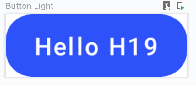
Ok! Now that looks like one of our buttons!
Dark and Light
As we’ve learned before, we will need to wrap the Material Theme composables into our own composables with our theme attributes. Let’s try to create a surface that matches dark and light themes. At first glance we could simply use the Surface that is provided. But now we already expect things not to work as we want to, right?
| @Composable | |
| fun H19Surface( | |
| modifier: Modifier = Modifier, | |
| shape: Shape = RectangleShape, | |
| content: @Composable () -> Unit | |
| ) { | |
| Surface( | |
| modifier = modifier, | |
| shape = shape, | |
| content = content | |
| ) | |
| } |

The Light Theme looks ok (But is it really?) but the dark is nothing compared to what we expected. It doesn’t seem dark at all! But now we know what the problem is. By looking again at the Compose Surface definition, we see the following:
| fun Surface( | |
| modifier: Modifier = Modifier, | |
| shape: Shape = RectangleShape, | |
| color: Color = MaterialTheme.colors.surface, <- Note this line right here | |
| contentColor: Color = contentColorFor(color), | |
| ... | |
| ) |
Yep. It’s using MaterialTheme colors. So let’s wrap it around our own surface
| @Composable | |
| fun H19Surface( | |
| modifier: Modifier = Modifier, | |
| shape: Shape = RectangleShape, | |
| color: Color = H19Theme.colors.background, | |
| contentColor: Color = defaultContentColorFor(color), | |
| content: @Composable () -> Unit | |
| ) { | |
| Surface( | |
| modifier = modifier, | |
| color = color, | |
| contentColor = contentColor, | |
| shape = shape, | |
| content = content | |
| ) | |
| } |

Yep! This is what we want. Now a couple of things to note here.
- We defined background color as the color for the surface. But here is where things get interesting. Since you are defining your own theme you are free to decide what is the color you want for your surfaces, you can use any color attribute you have defined in your theme: primary, secondary, background, surface or even Banana.
- More avid readers may have noticed we are defining our contentColor as defaultContentColorFor(color) What is this?
MaterialTheme provides us with a method that is contentColorFor(color) but we cannot use it because it uses the MaterialTheme specification, which falls back to MaterialTheme coloring. Therefore we use our method to fetch our theme colors
| @Composable | |
| @ReadOnlyComposable | |
| fun defaultContentColorFor(backgroundColor: Color): Color = | |
| H19Theme.colors.contentColorFor(backgroundColor).takeOrElse { LocalContentColor.current } | |
| private fun H19Colors.contentColorFor(backgroundColor: Color): Color { | |
| return when (backgroundColor) { | |
| primary -> onPrimary | |
| background -> onBackground | |
| else -> Color.Unspecified | |
| } | |
| } |
Conclusion
By using our component elements, which wrap around the predefined components, and changing some attributes, like color, we are able to fully customize our theme and allow the properties of Dark and Light to apply correctly.
I hope that with this knowledge, you will be able to apply this logic to any component you want and create your completely new custom Theme.


