

Profile images are an essential part of any modern-day app. Stream recently announced the open-source AvatarView for Android library so you can easily create and customize your own stylish profile images.
Introducing the AvatarView Library
AvatarView supports loading profile images with fractional style, borders, indicators, and initials for Android. It also provides internal image loaders to load profile images with your loading strategies.
To show you how useful the API is, this post will show you how to use AvatarView so that you can implement your own stylish profile images in your next Android project.
Gradle Setup
Before getting started, import the AvatarView into your project. Add the dependency below to your app level build.gradle file:
| dependencies { | |
| implementation "io.getstream:avatarview-coil:1.0.4" | |
| } |
Note: To see the latest version of the SDK, check out the GitHub releasespage.
AvatarView uses Coil to load images internally, so please make sure your project uses the same Coil version. If your project uses Glide to load images, check out AvatarView-Glide.
AvatarView in XML Layout
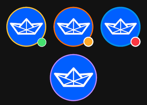
You can implement your own stylish profile images by adding io.getstream.avatarview.AvatarView in your XML layout file as shown in the following example:
| <io.getstream.avatarview.AvatarView | |
| android:layout_width="110dp" | |
| android:layout_height="110dp" | |
| app:avatarViewBorderColor="@color/yellow" | |
| app:avatarViewBorderWidth="3dp" | |
| app:avatarViewIndicatorBorderColor="@color/white" | |
| app:avatarViewIndicatorBorderSizeCriteria="10" | |
| app:avatarViewIndicatorColor="@color/md_green_100" | |
| app:avatarViewIndicatorEnabled="true" | |
| app:avatarViewIndicatorPosition="bottomRight" | |
| app:avatarViewIndicatorSizeCriteria="9" | |
| app:avatarViewInitialsTextStyle="bold" | |
| app:avatarViewShape="circle" /> |
You can also customize the AvatarView by setting custom attributes in your XML file. AvatarView allows you to customize the border, initials, shape, indicator, and RTL support with the custom attributes.
To learn more about attributes, you can check out the AvatarView Attributes documentation.
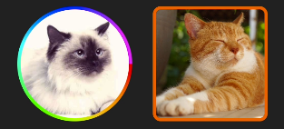
Loading Single Style Images
You can easily load a profile image to your AvatarView with the loadImage(data) function:
| avatarView.loadImage(data) |
You can pass the following parameters to load an image:
- String
- URI
- HttpUrl
- File
- DrawableRes
- Drawable
- Bitmap
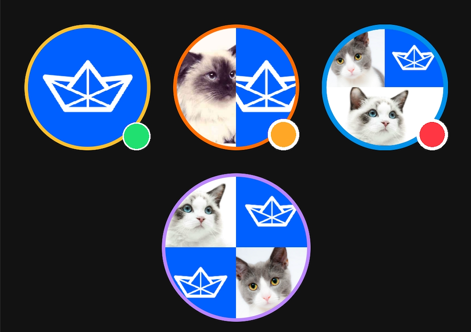
Loading Fractional Style Images
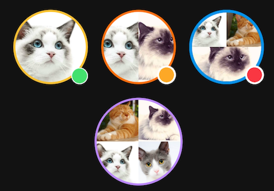
A fractional style profile image combines multiple profile images into one cohesive image, and is one of the most widely-used styles to represent group and channel profiles. AvatarView supports loading fractional style profile images using multiple URLs as seen in the example below:
| avatarView.loadImage( | |
| data = listof(url1, url2, url3, url4) | |
| ) |
You can load up to four images by default. But, if you would like to limit the number of sections regardless of the parameters, you can control it with the avatarViewMaxSectionSize attribute in your XML layout:
| app:avatarViewMaxSectionSize="4" |
Customizing AvatarView
AvatarView supports fully customizable attributes for the border, shape, indicator, and initials, so you have complete control over the look and feel of our profile images. Let’s see how to customize the components of AvatarView.
Border
You can customize the color and thickness of the border with the attributes below:
- avatarViewBorderColor: determines the color of the border
- avatarViewBorderWidth: determines the thickness of the border
You can use the attributes above in your XML layout as in the following example:
| <io.getstream.avatarview.AvatarView | |
| android:id="@+id/avatarView2" | |
| android:layout_width="110dp" | |
| android:layout_height="110dp" | |
| app:avatarViewBorderColor="@color/md_orange_200" | |
| app:avatarViewBorderWidth="4dp" /> |
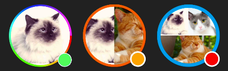
Color Array for Borders
If you want to make your profile image more colorful, you can do so with the avatarViewIndicatorBorderColorArray attribute, which applies a color array to your border.
First, declare your color array in your colors.xml file:
| <array name="rainbow"> | |
| <item>@color/red</item> | |
| <item>@color/orange</item> | |
| <item>@color/yellow</item> | |
| <item>@color/chartreuse</item> | |
| <item>@color/green</item> | |
| </array> |
Next, set the color array on your AvatarView:
| <io.getstream.avatarview.AvatarView | |
| android:layout_width="110dp" | |
| android:layout_height="110dp" | |
| app:avatarViewBorderColorArray="@color/white" | |
| app:avatarViewBorderWidth="3dp" /> |
Shape
By default, AvatarView supports circle and rectangle shapes to customize your profile images.
Circle
You can set the shape to a circle by setting the avatarViewShape attribute to circle as seen in the code below:
| <io.getstream.avatarview.AvatarView | |
| android:layout_width="110dp" | |
| android:layout_height="110dp" | |
| app:avatarViewShape="circle" /> |
Jobs
Note: The default setting of the avatarViewShape is already circle, so you don’t need to set it explicitly if you want to make it into a circular shape.
Rectangle
You can set the shape to a rectangle by setting the avatarViewShape attribute to round_rect. Also, you can change the radius of the border with the avatarViewBorderRadius attribute:
| <io.getstream.avatarview.AvatarView | |
| android:layout_width="110dp" | |
| android:layout_height="110dp" | |
| app:avatarViewShape="rounded_rect" | |
| app:avatarViewBorderRadius="21dp" /> |
Indicator
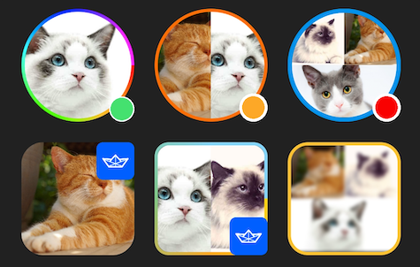
AvatarView supports indicators, which are used to indicate a user’s online status in messaging applications or to add custom badges. You can enable indicators by passing true to the avatarViewIndicatorEnabled attribute:
| <io.getstream.avatarview.AvatarView | |
| android:layout_width="110dp" | |
| android:layout_height="110dp" | |
| app:avatarViewIndicatorEnabled="true" | |
| app:avatarViewIndicatorColor="@color/green" | |
| app:avatarViewIndicatorBorderColor="@color/white" | |
| app:avatarViewIndicatorSizeCriteria="9" | |
| app:avatarViewIndicatorBorderSizeCriteria="10" | |
| app:avatarViewIndicatorPosition="bottomRight" /> |
You can also customize the indicator with your own drawable resources:
| <io.getstream.avatarview.AvatarView | |
| android:layout_width="110dp" | |
| android:layout_height="110dp" | |
| app:avatarViewIndicatorDrawable="@drawable/stream" /> |
Displaying a Placeholder
Placeholders are an important feature in UX. AvatarView supports the following types of placeholders: loading and error.
Loading Placeholder
You can display a placeholder with your drawable resource while your image is loading like in the following example:
| app:avatarViewPlaceholder="@drawable/stream" |
Error Placeholder
You can also display a placeholder with your drawable resource when the image request fails as seen in the following example:
| app:avatarViewErrorPlaceholder="@drawable/stream" |
Drawing Initials
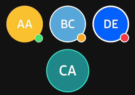
Initials are another popular way to represent a user’s information. AvatarView supports the initials style and you can fully customize every attribute:
| <io.getstream.avatarview.AvatarView | |
| android:layout_width="110dp" | |
| android:layout_height="110dp" | |
| app:avatarViewInitials="AB" | |
| app:avatarViewInitialsBackgroundColor="@color/skyBlue" | |
| app:avatarViewInitialsTextColor="@color/white" | |
| app:avatarViewInitialsTextSize="21sp" | |
| app:avatarViewInitialsTextSizeRatio="0.33" | |
| app:avatarViewInitialsTextStyle="bold" /> |
If you want to load the initials when your image request fails, you can do so with custom listeners and the avatarInitials property as seen in the following example:
| avatarView.loadImage( | |
| data = url, | |
| onError = { _, _ -> | |
| avatarView.avatarInitials = "AA" | |
| } | |
| ) |
Customizing Image Loaders With AvatarCoil
AvatarView’s AvatarCoil supports customization of internal Coil image loaders. By customizing the AvatarCoil, you can generalize all AvatarView image loading requests.
Custom ImageLoader
You can set an ImageLoader to generalize loading requests with the AvatarCoil as in the following example:
| AvatarCoil.setImageLoader( | |
| AvatarImageLoaderFactory(context) { | |
| crossfade(true) | |
| crossfade(400) | |
| okHttpClient { | |
| OkHttpClient.Builder() | |
| .cache(CoilUtils.createDefaultCache(context)) | |
| .build() | |
| } | |
| } | |
| ) |
AvatarView provides a default factory — called AvatarImageLoaderFactory – to load images with your own ImageLoader.
You can also customize bitmap factories to operate image bitmaps before loading on AvatarView. For more information, check out the Custom AvatarBitmapFactory.
Stream Integration
AvatarView supports an integrating solution with Stream Chat SDK for Android.
To get started, first add the dependency below:
| dependencies { | |
| implementation "io.getstream:avatarview-stream-integration:$avatarview_version" | |
| } |
Note: You can check out the most recent version on GitHub.
Next, you should set the StreamAvatarBitmapFactory on the AvatarCoil with the following:
| AvatarCoil.setAvatarBitmapFactory(StreamAvatarBitmapFactory(context)) |
We recommend placing the code above your Application class to initialize it at once.
Finally, set your User or Channel models to your AvatarView like in the following example:
| val currentUser = ChatClient.instance().getCurrentUser() | |
| avatarView.setUserData(currentUser) | |
| // or set a channel | |
| avatarView.setChannel(channel) |
Note: The channel image will be loaded first. However, if the channel image does not exist, the fractional style of the members will be loaded.
Wrapping Up
In this article, you saw how to implement stylish profile images with AvatarViewthat stand out and match your app’s look and feel.
Remember: AvatarView is an open-source repository, so anyone can contribute to improving the code, documentation, or submit feature requests.
You can find the author of AvatarView on GitHub at github/skydoves with any questions or feedback. You can also follow us on Twitter @getstream_io for upcoming technical content.
As always, happy coding!
— Jaewoong
Originally published at https://getstream.io.


