

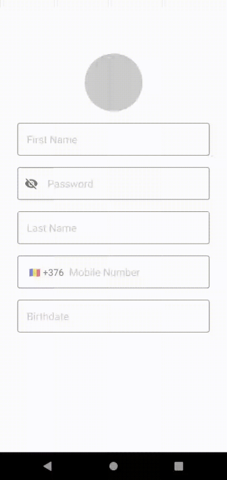
As always any app will always need a form screen like login, signup, edit profile, request form and many more …
This article aim to be a simple reference for the common form fields components
Let’s see how to make a form with Jetpack Compose 🚀
We’ll cover all of the following points :
- IME Action
- Password with Visibility Toggle
- Mobile number with Country Code Picker
- Date picker
- Image Picker from Gallery or from Camera
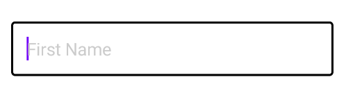
Styling Text Field
Before starting you need to have a composable view of the text field component according to your app design, it can be something like this :
fun AppTextField(
    modifier: Modifier = Modifier,
    text: String,
    placeholder: String,
    leadingIcon: @Composable (() -> Unit)? = null,
    onChange: (String) -> Unit = {},
    imeAction: ImeAction = ImeAction.Next,
    keyboardType: KeyboardType = KeyboardType.Text,
    keyBoardActions: KeyboardActions = KeyboardActions(),
    isEnabled: Boolean = true
) {
    OutlinedTextField(
        modifier = modifier.fillMaxWidth(),
        value = text,
        onValueChange = onChange,
        leadingIcon = leadingIcon,
        textStyle = TextStyle(fontSize = 18.sp),
        keyboardOptions = KeyboardOptions(imeAction = imeAction, keyboardType = keyboardType),
        keyboardActions = keyBoardActions,
        enabled = isEnabled,
        colors = TextFieldDefaults.outlinedTextFieldColors(
            focusedBorderColor = Color.Black,
            unfocusedBorderColor = Color.Gray,
            disabledBorderColor = Color.Gray,
            disabledTextColor = Color.Black
        ),
        placeholder = {
            Text(text = placeholder, style = TextStyle(fontSize = 18.sp, color = Color.LightGray))
        }
    )
}
Also this example follow MVVM so the view model will hold all states, all can be empty or prefilled with previous value (like edit screen case)
class FormViewModel : ViewModel() {
var firstName by mutableStateOf("")
    var lastName by mutableStateOf("")
    var password by mutableStateOf("")
    var mobileNumber by mutableStateOf("")
    var mobileCountryCode by mutableStateOf("")
    var dateOfBirth by mutableStateOf("")
    ...
}
Add IME Actions
In the parent composable form view, we can add multiple textfield components, all attached with keyboard IME actions
//User name text field
Column{
    val focusManager = LocalFocusManager.current

    AppTextField(
        text = viewModel.firstName,
        placeholder = "First Name",
        onChange = {
            viewModel.firstName = it
        },
        imeAction = ImeAction.Next,//Show next as IME button
        keyboardType = KeyboardType.Text, //Plain text keyboard
        keyBoardActions = KeyboardActions(
            onNext = {
                focusManager.moveFocus(FocusDirection.Down)
            }
        )
    )
    ...
}
Also if the design have two text field views in a horizontal row, we can use FocusDirection.Left or FocusDirection.Right
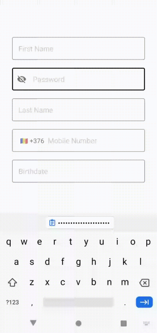
Password Field
Simple like plain text field but with PasswordVisualTransformation
AppTextField(
    text = viewModel.password,
    placeholder = "Password",
    onChange = {
        viewModel.password = it
    },
    imeAction = ...
    visualTransformation = PasswordVisualTransformation(),
    keyboardType = KeyboardType.Password,
    keyBoardActions = ...
)
Let’s also add the Visibility Toggle icon button to show/hide password like this
var isPasswordVisible by remember { mutableStateOf(false) }
AppTextField(
    ....,
    leadingIcon = {
        IconButton(onClick = {
            isPasswordVisible = !isPasswordVisible
        }) {
            Icon(
             imageVector = if (isPasswordVisible)
               Icons.Filled.Visibility
             else
               Icons.Filled.VisibilityOff,
            contentDescription = "Password Visibility"
            )
        }
    },
   visualTransformation = if (isPasswordVisible)
                            VisualTransformation.None
                         else
                            PasswordVisualTransformation(),
    ...
)
Please note that in order to use these icons you will need the following dependency
implementation "androidx.compose.material:material-icons-extended:$compose_version"
Mobile Number Field
Same like plain text field but with phone keyboard type
keyboardType = KeyboardType.Phone,
Let’s add the Country Code Picker to the text field as following
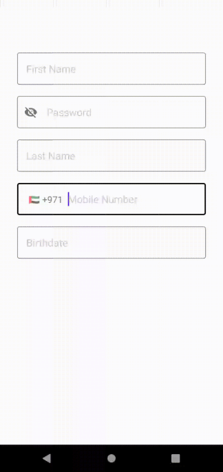
And let’s add the selected country code label to the text field as a leading label
leadingIcon = {
    viewModel.mobileCountry?.let {
        CountryPickerView(
            countries = viewModel.countriesList
            selectedCountry = it,
            onSelection = { selectedCountry ->
                viewModel.mobileCountry = selectedCountry
            },
        )
    }
},
OUR VIDEO RECOMMENDATION


Jobs
Using CountryPickerUtils.kt , the viewmodel will hold the needed states as usual
val countriesList = getCountriesList()
var mobileCountry by mutableStateOf<Country?>(null)
And the CountryPickerView composable can be like this
@Composable
fun CountryPickerView(
    selectedCountry: Country,
    onSelection: (Country) -> Unit,
    countries: List<Country>
) {
    var showDialog by remember { mutableStateOf(false) }
    Text(
        modifier = Modifier
            .clickable {
                showDialog = true
            }
            .padding(start = 20.dp, end = 5.dp),
        text = "${getFlagEmojiFor(selectedCountry.nameCode)} +${selectedCountry.code}"
    )

    if (showDialog)
        CountryCodePickerDialog(countries, onSelection) {
            showDialog = false
        }
}
And this is a very simple implementation of CountryCodePickerDialog, absolutely enhance the design as needed according to your app design
@Composable
fun CountryCodePickerDialog(
    countries: List<Country>,
    onSelection: (Country) -> Unit,
    dismiss: () -> Unit,
) {
    Dialog(onDismissRequest = dismiss) {
        Box {
            LazyColumn(
                Modifier
                    .fillMaxWidth()
                    .padding(horizontal = 30.dp, vertical = 40.dp)
                    .background(shape = RoundedCornerShape(20.dp), color = Color.White)
            ) {
                for (country in countries) {
                    item {
                        Text(
                            modifier = Modifier
                                .clickable {
                                    onSelection(country)
                                    dismiss()
                                }
                                .fillMaxWidth()
                                .padding(10.dp),
                            text = "${getFlagEmojiFor(country.nameCode)} ${country.fullName}"
                        )
                    }
                }
            }
        }
    }
}
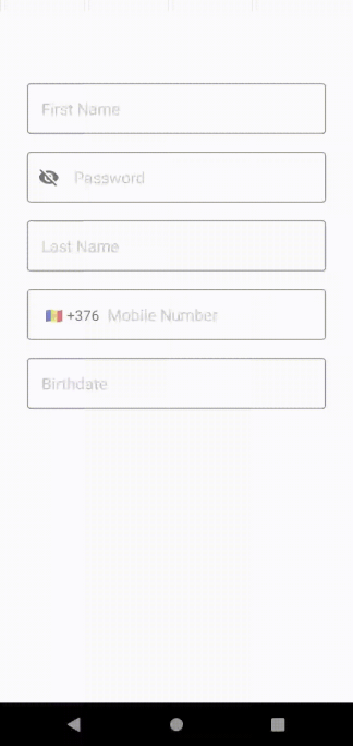
Date Picker Field
It will show a date picker dialog like this
val context = LocalContext.current
AppTextField(
    modifier = Modifier.clickable {
        viewModel.showDatePickerDialog(context)
    },
    text = viewModel.dateOfBirth,
    placeholder = "Birthdate",
    onChange = {
        viewModel.dateOfBirth = it
    },
    isEnabled = false
)
The date dialog will either show today’s date or the last selected date in the dateOfBirth state variable
private var dateFormat = "yyyy-MM-dd"
fun showDatePickerDialog(context: Context) {
    val calendar = getCalendar()
    DatePickerDialog(
        context, { _, year, month, day ->
            dateOfBirth = getPickedDateAsString(year, month, day)
        },
        calendar.get(Calendar.YEAR),
        calendar.get(Calendar.MONTH),
        calendar.get(Calendar.DAY_OF_MONTH)
    )
        .show()
}
private fun getCalendar(): Calendar {
    return if (dateOfBirth.isEmpty())
        Calendar.getInstance()
    else
        getLastPickedDateCalendar()
}


private fun getLastPickedDateCalendar(): Calendar {
    val dateFormat = SimpleDateFormat(dateFormat)
    val calendar = Calendar.getInstance()
    calendar.time = dateFormat.parse(dateOfBirth)
    return calendar
}

private fun getPickedDateAsString(year: Int, month: Int, day: Int): String {
    val calendar = Calendar.getInstance()
    calendar.set(year, month, day)
    val dateFormat = SimpleDateFormat(dateFormat)
    return dateFormat.format(calendar.time)
}
Image Picker
- Pick Image From Gallery
- Capture Image From Camera
First we will enable user to pick image from gallery as following

First import coil compose library
implementation "io.coil-kt:coil-compose:1.4.0"
and keep the picked image uri in the view model
val pickedImage = mutableStateOf<Uri?>(null)
Add the image picker view to the form view
ImagePickerView(
    modifier = Modifier.align(Alignment.CenterHorizontally),
    lastSelectedImage = viewModel.pickedImage.value,
    onSelection = {
        viewModel.pickedImage.value = it
    }
)
To pick image from gallery the ImagePickerView composable will use the gallery launcher like this
@Composable
fun ImagePickerView(
    modifier: Modifier = Modifier,
    lastSelectedImage: Uri?,
    onSelection: (Uri?) -> Unit
) {
    val galleryLauncher = rememberLauncherForActivityResult(
       ActivityResultContracts.GetContent()) {
           onSelection(it)
    }
    Image(
        modifier = modifier
            .size(100.dp)
            .clip(CircleShape)
            .background(Color.LightGray)
            .clickable {
                galleryLauncher.launch("image/*")
            },
        painter = rememberImagePainter(lastSelectedImage),
        contentDescription = "Profile Picture",
        contentScale = ContentScale.Crop
    )
}
Now to capture image from camera as following
First let’s handle camera permission using Accompanist library and import it
implementation "com.google.accompanist:accompanist-permissions:0.24.1-alpha"
And add the camera permission to the app manifest file
<uses-permission android:name="android.permission.CAMERA" />
Now let’s update the ImagePickerView composable to
- Request permission
- Open camera launcher ( If permission is just granted or on click)
@OptIn(ExperimentalPermissionsApi::class)
@Composable
fun ImagePickerView(
    modifier: Modifier = Modifier,
    lastSelectedImage: Uri?,
    onSelection: (Uri?) -> Unit
) {
    val context = LocalContext.current
    val cameraPermission = rememberPermissionState(Manifest.permission.CAMERA)
    var isPermissionRequested by rememberSaveable { mutableStateOf(false) }

    val cameraLauncher: ManagedActivityResultLauncher<Void?, Bitmap?> =
rememberLauncherForActivityResult(ActivityResultContracts.TakePicturePreview()) {
            onSelection(it?.toUri(context))
        }

    if (isPermissionRequested && cameraPermission.hasPermission) {
        cameraLauncher.launch()
        isPermissionRequested = false
    }

    Image(
        modifier = modifier
            .size(100.dp)
            .clip(CircleShape)
            .background(Color.LightGray)
            .clickable {
                if (!cameraPermission.hasPermission) {
                    cameraPermission.launchPermissionRequest()
                    isPermissionRequested = true
                } else
                    cameraLauncher.launch()
            },
        painter = rememberImagePainter(lastSelectedImage),
        contentDescription = "Profile Picture",
        contentScale = ContentScale.Crop
    )
}
Also please note that the accompanist permission state have shouldShowRationale which you can use to inform user why you need this permission before requesting it, Find more about this here
That’s it! You made it! 💪
Do you see anything missing? please comment!
Thanks for reading, see you in the next article 😊
This article was originally published on proandroiddev.com on February 26, 2022


