At the beginning of this year, I embarked on a journey of migrating my large Android app to Jetpack Compose. My approach has been gradual, tackling one screen at a time until the entire app is fully migrated to Jetpack Compose. This article will be part of a series of articles focused on my experience with the migration to Jetpack Compose. One of my screens made use of the BottomSheetDialogFragment and this too needed to be converted to Jetpack Compose. I will outline how I achieved that.
About the app
The app is called Upnext: TV Series Manager, an open-source Android app that is also officially part of the Google Developers Dev Library. It is a TV series app with various screens ranging from show schedules, popular shows to favorite shows.
 Upnext: TV Series Manager
One of my screens, the show detail screen contains a list of cast members for the show, and clicking on a cast member triggers a BottomSheetDialogFragment to be opened.
I have already migrated all the main screens to Jetpack Compose composables as part of my migration journey, with certain view elements like the Appbar or BottomNavigation still requiring that I migrate them to their Jetpack Compose versions. The BottomSheetDialogFragment is one such element that needed to be converted for the show detail screen.
Interoperability
Jetpack Compose has made it possible for XML-based code to co-exist with Compose code through interoperability. During my journey, in preparation for replacing the traditional Appbar and BottomNavigation with the Jetpack Compose versions, I used ComposeView inside my fragment XML files like this:
| <layout xmlns:android="http://schemas.android.com/apk/res/android" | |
| xmlns:app="http://schemas.android.com/apk/res-auto"> | |
| <androidx.compose.ui.platform.ComposeView | |
| android:id="@+id/compose_container" | |
| android:layout_width="match_parent" | |
| android:layout_height="match_parent" | |
| android:transitionGroup="true" | |
| app:layout_constraintEnd_toEndOf="parent" | |
| app:layout_constraintStart_toStartOf="parent" | |
| app:layout_constraintTop_toTopOf="parent" /> | |
| </layout> |
and displayed the Compose UI content through the fragment like this:
| override fun onCreateView(...): View { | |
| ... | |
| binding.composeContainer.apply { | |
| // Dispose of the Composition when the view's | |
| // LifecycleOwner is destroyed | |
| // https://developer.android.com/jetpack/compose/interop/interop-apis | |
| setViewCompositionStrategy(ViewCompositionStrategy.DisposeOnViewTreeLifecycleDestroyed) | |
| setContent { | |
| MdcTheme { | |
| ShowDetailScreen( | |
| onSeasonsClick = { | |
| viewModel.onSeasonsClick() | |
| } | |
| ) | |
| } | |
| } | |
| } |
It is from this same fragment, where the BottomSheetDialogFragment is called:
class ShowDetailFragment : BaseFragment() {
...
   activity?.supportFragmentManager?.let { fragmentManager ->
       showCastBottomSheet.show(
           fragmentManager,
           ShowCastBottomSheetFragment.TAG
       )
   }
Replacing the traditional Appbar and BottomNavigation meant a complete move away from ComposeView as using Jetpack Compose Navigation will enable me to navigate between Composables and away from fragment navigation.
The Show Detail Screen
I created a composable called ShowDetailScreen to represent the entire show detail screen. I then created several smaller composables representing portions of the screen, for example, the backdrop image, the poster, episode information, cast information, and so on. The ShowDetailArea composable becomes the parent composable where the state from the ViewModel is observed from and passed down to the child composables, its direct child being a composable I created called DetailArea:
| @Composable | |
| fun ShowDetailScreen( | |
| viewModel: ShowDetailViewModel = hiltViewModel(), | |
| ... | |
| ) { | |
| ... | |
| val showCast = viewModel.showCast.observeAsState() | |
| Surface( | |
| modifier = Modifier | |
| .fillMaxSize() | |
| ) { | |
| Column { | |
| Box(modifier = Modifier.fillMaxSize()) { | |
| DetailArea( | |
| ... | |
| showCast = showCast.value, | |
| onCastItemClick = { onCastItemClick(it) }, | |
| ... | |
| ) | |
| if (isLoading.value == true) { | |
| LinearProgressIndicator( | |
| modifier = Modifier | |
| .padding(8.dp) | |
| .fillMaxWidth() | |
| ) | |
| } | |
| } | |
| } | |
| } | |
| } |
In the DetailArea composable that’s where I have a composable for the cast information — ShowCastList — that displays the cast information using the LazyRow composable:
| @Composable | |
| fun DetailArea( | |
| ... | |
| showCast: List<ShowCast>?, | |
| onCastItemClick: (item: ShowCast) -> Unit | |
| ) { | |
| val scrollState = rememberScrollState() | |
| Column( | |
| modifier = Modifier | |
| .fillMaxWidth() | |
| .verticalScroll(scrollState) | |
| ) { | |
| ... | |
| showCast?.let { | |
| if (it.isNotEmpty()) { | |
| ShowCastList(it) { showCastItem -> | |
| onCastItemClick(showCastItem) | |
| } | |
| } | |
| } |
When a cast item is clicked, that onClick event — onCastItemClick() — is passed up through state-hoisting all the way to the main parent — ShowDetailScreencomposable. It is here where the bottom sheet should be triggered.
Setting up the ModalBottomSheetLayout
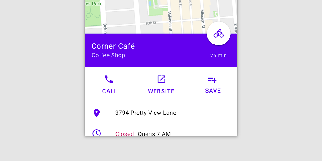
There is BottomSheetScaffold and ModalBottomSheetLayout. The former presents a bottom sheet where the interaction behind it is not blocked (similar to the bottom sheet presented in Google Maps:
 Source: Android Developers website
whereas the latter — ModalBottomSheetLayout — blocks any interaction with what’s behind it and can be dismissed by clicking outside it. For my purpose, ModalBottomSheetLayout is exactly what I needed for my use case and a direct replacement for BottomSheetDialogFragment.
To set it up, I needed to do the following:
- Replace my Surface composable in ShowDetailScreen with ModalBottomSheetLayout (see line 9 below) this way the ModalBottomSheetLayout acts as a container similar to Surface.
| @ExperimentalMaterialApi | |
| @Composable | |
| fun ShowDetailScreen( | |
| viewModel: ShowDetailViewModel = hiltViewModel(), | |
| ... | |
| ) { | |
| ... | |
| ModalBottomSheetLayout( // <---- This was Surface | |
| sheetState = modalBottomSheetState, | |
| sheetContent = { | |
| Surface( | |
| Modifier | |
| .fillMaxWidth() | |
| ) { | |
| ShowCastBottomSheetItem(showCast = selectedCastMemberState.value) | |
| } | |
| }, | |
| scrimColor = Color.Black.copy(alpha = 0.32f) | |
| ) { |
Job Offers
- ModalBottomSheetLayout requires a ModalBottomSheetState to be defined. With this state variable, its show() method can be used to display the bottom sheet content. The rememberModalBottomSheetState allows you to do this and the default I have defined is Hidden:
val modalBottomSheetState = rememberModalBottomSheetState(ModalBottomSheetValue.Hidden)
| @ExperimentalMaterialApi | |
| @Composable | |
| fun ShowDetailScreen(...) { | |
| ... | |
| val modalBottomSheetState = rememberModalBottomSheetState(ModalBottomSheetValue.Hidden) | |
| ... | |
| ModalBottomSheetLayout( | |
| sheetState = modalBottomSheetState, | |
| sheetContent = { | |
| Surface( | |
| Modifier | |
| .fillMaxWidth() | |
| ) { | |
| ShowCastBottomSheetItem(showCast = selectedCastMemberState.value) | |
| } | |
| }, | |
| scrimColor = Color.Black.copy(alpha = 0.32f) | |
| ) { |
I then pass this state variable to the sheetState parameter of ModalBottomSheetLayout (see line 11 above).
sheetState = modalBottomSheetState
- Another parameter to define is the sheet’s content. In this case, I created a new composable representing the bottom sheet content called ShowCastBottomSheetItem which will be the individual cast member’s information. I then wrapped this composable in a Surface composable and using the ModalBottomSheetLayout’s sheetContent parameter, I passed this to it:
sheetContent = {
    Surface(
        Modifier
            .fillMaxWidth()
    ) {
        ShowCastBottomSheetItem(showCast = selectedCastMemberState.value)
    }
},
| @ExperimentalMaterialApi | |
| @Composable | |
| fun ShowDetailScreen(...) { | |
| ... | |
| ModalBottomSheetLayout( | |
| ... | |
| sheetContent = { | |
| Surface( | |
| Modifier | |
| .fillMaxWidth() | |
| ) { | |
| ShowCastBottomSheetItem(showCast = selectedCastMemberState.value) | |
| } | |
| }, | |
| scrimColor = Color.Black.copy(alpha = 0.32f) | |
| ) { | |
| Column { | |
| Box(modifier = Modifier.fillMaxSize()) { | |
| DetailArea( |
- I passed a value for the scrimColor parameter as the current default scrimColor for the ModalBottomSheetLayout is incorrect. The scrim color is the color applied to the rest of the screen when the bottom sheet is visible. Here I defined it to be black with an alpha of 0.32f (see line 17 above).
- Then finally, I passed the modalBottomSheetState variable down through the DetailArea composable
ModalBottomSheetLayout(...) {

    Column {
        Box(modifier = Modifier.fillMaxSize()) {
            DetailArea(
                ...
                modalBottomSheetState = modalBottomSheetState
            )
to where the ShowCastList composable is called. This way, when the show cast member item is clicked, the suspend function show() is called. A note that the coroutineScope is required to be able to invoke the show() method (see line 17 below):
| @ExperimentalMaterialApi | |
| @Composable | |
| fun DetailArea( | |
| ... | |
| modalBottomSheetState: ModalBottomSheetState | |
| ) { | |
| ... | |
| val coroutineScope = rememberCoroutineScope() | |
| Column(...) { | |
| ... | |
| showCast?.let { | |
| if (it.isNotEmpty()) { | |
| ShowCastList(it) { showCastItem -> | |
| coroutineScope.launch { | |
| modalBottomSheetState.show() | |
| } | |
| onCastItemClick(showCastItem) | |
| } | |
| } | |
| } |
And that’s it! That is all I needed to do in order to set up the Jetpack Compose ModalBottomSheetLayout. And this is how it looks:

You can find the above code changes in the 35-implement-compose-navigationbranch where they will all be merged into the main branch soon. Happy Composing!
This article was originally published on proandroiddev.com on March 17, 2022


