With Jetpack Compose’s first birthday just passing, many Android developer are probably thinking not if but when and how should I move to Jetpack Compose. The same thought had been playing on my mind and in November of last year I decided to come up with a strategy to move our team in that direction in a risk free manner. I had learnt that a few local companies in Australia were using Compose so that gave me the confidence that it was ready and stable.
Risk Assessment & Strategy
As much as I want this article to be about Compose I also want it cover the risks associated with adopting new technologies. Whether you work in a small or large team conducting your due diligence is an important step in avoiding issues down the road. A risk is simply the possibility (likelihood) of something bad happening (severity)

Although we might not be using a matrix like this every-time we do a software upgrade such as adding a new library or framework, most good engineers evaluate the risk and formulate a strategy to ensure the upgrade or adoption is successful so they don’t affect the productivity of the wider team or even worse impact their business. Let’s apply this matrix to a real live example on our app.
Scenario 1.
A few years ago we wanted to adopt an image loading library, our app can be considered more of a utility and is not content rich so we don’t really have a lot of images to display.
Likelhood of problem/s=Unlikely, as the plan was to use Picasso a mature library that was well supported and on top of that another team in our company was already using it without issues.
Severity of problem/s= Minor as we only planned on using this library in a few places and if an image didn’t load it wouldn’t stop the user from using that particular feature. Also since the code footprint would be quite small, if needed we could easily replace the library with an alternative if something went wrong.
Overall Assessment = Low Risk
Interestingly, after implementing Picasso we did get experience a small number of crashes due to the library not handling the lifecycle properly, since we couldn’t fix the issue we decided to replace the library entirely. It only took us a couple of days to replace Picasso with another library called Coil so the impact and severity was limited.
Scenario 2.
Adopting Compose in our team (which is what this article is about!)
Likelyhood of problem/s= Possible, as Compose is relatively new framework and is not widely adopted in the Android community. It could be buggy and not have all the features required to replace the old view system or even worse it could crash in production. Also productivity could be impacted if the tooling support is inadequate.
Severity of problem/s= Minor, as we only planned on using it on one new screen which wasn’t high traffic. If we did experience issues we could easily revert the code. On the productivity side if it did impact the build or development productivity the plan was also to remove it since it was not widely used throughout the code. We did have some concerns over dependencies since Compose is still under active development and a-lot of the newer features are only available in the alphas and betas.
Overall Assessment = Medium
We knew that adopting Compose wasn’t trivial and that it did pose a reasonable risk to our team, so thats why we knew that we had to come up with a clear strategy to minimize risks when getting it into production. Our next step was to research and learn about Compose, I had practically ignored it for the last 3 years until it was stable so I was starting from scratch. After completing many of the Compose codelabs we were confident that we had enough knowledge to start. We were surprised to find the Wear Compose libraries so we decided change our strategy and come up with the following 3 steps;
1. Rewrite the screens in our Android Wear App in Compose
2. Rewrite the screens in our Debug App
3. Replace an existing screen in our Mobile (Phone) App with Compose
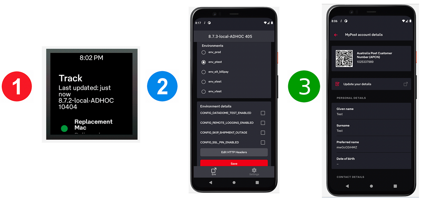
The idea behind these 3 steps was to start with something simple and low risk, and then slowly increase the complexity with each step. We decided to start with our Android Wear app as it has a much smaller user base than our phone app (< 0.000001%) and if things did go wrong it would be limited to those small number of users. Also since our Wear app only has 6 screens in total and it’s a fairly simple app, we thought it would be quite easy to replace them all. Next, we wanted to try Compose on our internal Debug app since its screens are closer to the main app and a-lot more complex than our minimalist Wear screens. Again if it didn’t work out then it would only affect the Android development team and we would only have ourselves to blame. The last step was to try it on an existing screen on our phone App, the reason we decided this over a brand new screen is that we wanted to ensure the same Compose screen was pixel perfect and that you couldn’t tell the difference between the old screen and the new screen. During this work we also wanted to establish some goals and create the following;
- a reusable UI widget library
- a reusable UI styles guide
- a set of design patterns
- a knowledge repository about Compose.
Just like building a house we wanted to ensure that our foundation was strong and that once all these things were in place developers could start building more of the house in Compose without worrying that the house would fall down.
Step 1 — Wear App
As they say your first steps are always the hardest. We knew early on that architecture in our wear app had to modernised to work with Compose. This meant the introduction of ViewModels into the Wear App which didn’t exist when it was originally written. The ViewModels would hold our state and the Composables would react to changes in the state. We wanted to redo each screen one by one and to help facilitate that we put in a skeleton navigation to blank screens which we would fill in later. Since our styles weren’t defined until after all our screens where developed, styling was left to the end.
Developing a Wear Compose screen involved
- Defining the route
- Getting the
ViewModelfrom the factory - Triggering the API call using
LauchedEffect - Observing the state of the
LiveData - Calling the Screen Composable
(we pretty much followed this template for all our Wear screens)
| composable( | |
| // Route information | |
| route = WearScreen.DETAILS.name + "/{trackNumber}", | |
| arguments = listOf(navArgument("trackNumber") { type = NavType.StringType }) | |
| ) { backStackEntry -> | |
| val trackNumber = backStackEntry.arguments?.getString("trackNumber") ?: "" | |
| // Retrieve View model | |
| val trackDetailsViewModel = viewModel<TrackDetailsViewModel>() | |
| // Call API to retrieve data | |
| LaunchedEffect( | |
| key1 = true, | |
| block = { | |
| trackDetailsViewModel.initialise(trackNumber) | |
| trackDetailsViewModel.getTrackDetails() | |
| trackDetailsViewModel.sendAnalytics() | |
| baseViewModel.refreshLoginStatus() | |
| } | |
| ) | |
| // State of LiveData | |
| val trackDetailsState = trackDetailsViewModel.trackWearItem.observeAsState() | |
| val dataState = trackDetailsViewModel.trackWearItem.state.observeAsState() | |
| val authenticatedState = baseViewModel.loggedInStatus.observeAsState() | |
| val trackOnPhoneOpenedState = trackDetailsViewModel.openPhoneRequest.observeAsState() | |
| val authenticated = authenticatedState.value?.getContentIfNotHandled() ?: true | |
| val trackOnPhoneOpened = trackOnPhoneOpenedState.value?.getContentIfNotHandled() ?: false | |
| // Render screen | |
| trackDetailsState.value?.let { | |
| DetailsScreen( | |
| trackDetails = it, | |
| dataState = dataState.value, | |
| authenticated = authenticated, | |
| trackOnPhoneOpened = trackOnPhoneOpened, | |
| onQrCodeClick = { qrCodes -> | |
| navController.navigate(WearScreen.QRCODE.name + "/${trackDetailsViewModel.getSafeEncodedQrCodeNavParam(qrCodes)}") | |
| }, | |
| updateAlias = { alias -> | |
| trackDetailsViewModel.updateAlias(alias) | |
| }, | |
| requestTrackOnPhone = { | |
| trackDetailsViewModel.requestTrackOnPhone() | |
| }, | |
| onError = { error: Throwable, retry: Boolean -> | |
| val errorType = WearErrorType.from(error) | |
| navController.navigate(WearScreen.ERROR.name + "?error=$errorType&retry=$retry") | |
| }, | |
| onUnAuthenticated = { | |
| navController.navigate(WearScreen.LOGIN.name) | |
| } | |
| ) | |
| } | |
| } |
We decided to use LiveData over Kotlin Flows and MutableState not because it was easier or better but because we wanted to limit the amount of new things we had to learn at the same time. We couldn’t use Hilt to inject the ViewModel since we were using another DI framework however it was pretty easy just to get it from the ViewModelFactory.
Dependency Injection
Since all composable are functions and you can’t perform dependency injection on a function, you basically have 2 options to access injected dependencies on your ViewModel.
- Call method on
viewModel.doSomething()which in turn calls the injected object - Reference
viewModel.dependencyObjectdirectly which means the injected object must be made public
Best Practices
From the code you can see that we followed some of the best practices set out by Google which include;
- Not passing
ViewModelsto Screens as it makes them difficult to test - Not passing
Navcontrollerto Screens as it also makes it difficult to test - Passing IDs to screens following REST patterns when using Compose Navigation (controversial but it’s easier to follow it than fight it)
- Using a
Scaffoldto provide the basic layout for all screen - Establishing a code formatting style to improve Compose code readability
When using the Wear Scaffold we did find that when scrolling while the time is displayed, the content clashes.
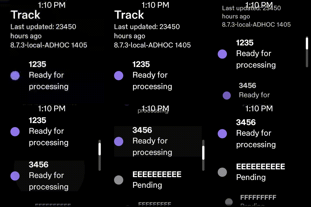
To improve this we hoisted the ScalingLazyListState and hide the time when the list was scrolling
| WearAppTheme { | |
| Scaffold( | |
| timeText = { | |
| if (displayTime(currentScreen, scalingLazyListState)) { | |
| TimeText() | |
| } | |
| }, | |
| vignette = { | |
| Vignette(vignettePosition = VignettePosition.TopAndBottom) | |
| }, | |
| positionIndicator = { | |
| if (scalingLazyListState.isScrollInProgress) { | |
| PositionIndicator(scalingLazyListState = scalingLazyListState) | |
| } | |
| } | |
| ) { | |
| WearNavHost(navController = navController, scalingLazyListState) | |
| } | |
| } | |
| private fun displayTime(currentScreen: WearScreen, scalingLazyListState: ScalingLazyListState): Boolean { | |
| return when (currentScreen) { | |
| WearScreen.LIST -> { | |
| return !scalingLazyListState.isScrollInProgress && | |
| scalingLazyListState.layoutInfo.visibleItemsInfo.firstOrNull()?.index == 0 | |
| } | |
| else -> true | |
| } | |
| } |

A bit on Wear styling
Something to watch out for is that Wear Compose pretty much has it own optimised versions of everything so make sure you are using the right classes.
import androidx.wear.compose.material.Icon
import androidx.compose.material.Icon
If you are using non wear material components such as the CircularProgressIndicator you need to ensure that you apply the theme from the androidx.compose.material package otherwise the component won’t be styled.
androidx.compose.material.MaterialTheme(colors = APLightColors) {
    CircularProgressIndicator(modifier = modifier)
}
Also since Compose is new we opted against using any non Google compose libraries for now just because we didn’t want to be the situation where we had to replace or delete these libraries due to deprecations down the track or because Google now provide the same functionality. This was just another risk reduction strategy.
Step 2 — Debug App
After successfully deploying the Wear App to production we set our sights on rewriting the UI on the Debug App. The Debug app posed new challenges such as how to add the app bar and the bottom nav which are non-existent on a Wear app due the limited screen realestate. We now also add to deal with input fields since our Wear app didn’t have any of these.
When we started to investigate how to replace the UI components on the Debug app with Compose, it become quite evident that where we used to rely the the material design component library for things like EditText, in Compose we would have to roll our own. Once again we started by putting in a skeleton navigation to blank screens for the Debug app using Compose Navigation. We noticed that no back arrow was shown with Compose where as in the old view system the framework would provide it.
To implement the back arrow we defined a screen with a boolean indicating whether it was a top level destination or not. When the screen wasn’t a top level destination the back arrow was displayed otherwise it wasn’t drawn.
| sealed class DebugScreen(val route: String, val title: Int, val topLevelDestination: Boolean = false) { | |
| object Environment : DebugScreen(DebugNavigationItem.Environment.route, R.string.environment_screen_title, true) | |
| } | |
| Scaffold( | |
| scaffoldState = scaffoldState, | |
| topBar = { DebugTopBar(navController, version) }, | |
| bottomBar = { DebugBottomNavigationBar(navController) } | |
| ) { paddingValues -> | |
| DebugNavHost(navController = navController, paddingValues, showSnackBar) | |
| } | |
| @Composable | |
| fun DebugTopBar(navController: NavController, version: String) { | |
| val currentScreen = getCurrentScreen(navController) | |
| TopAppBar( | |
| title = { | |
| val topBarTitle = stringResource(id = currentScreen.title) | |
| APText(apStyle = APTextStyle.Title, text = topBarTitle, textColor = AP_White) | |
| }, | |
| navigationIcon = { | |
| if (!currentScreen.topLevelDestination) { | |
| IconButton(onClick = { navController.navigateUp() }) { | |
| Icon( | |
| imageVector = Icons.Filled.ArrowBack, | |
| contentDescription = "Back" | |
| ) | |
| } | |
| } | |
| } | |
| ) | |
| } |
Job Offers
Since our Debug App had 3 times the number of screens compared to our Wear App to avoid having all our navigation routes in one large method we used an extension method on the NavGraphBuilder to split up the code.
After putting in all that plumbing and with the navigation working we started work on creating the many UI widgets/components that we needed. We settled on a simple module structure, one module containing compose styles and another module for all our custom UI widget/components. We were inspired by Google’s flat package structure so we put all our custom UI widget/components in one directory.
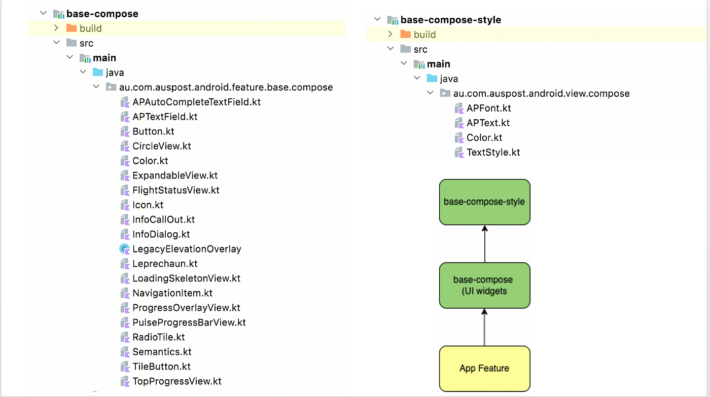
We had quite an extensive number of custom widgets to rewrite in Compose but early on we decided that we wanted to make the transition to Compose as easy as possible on everyone so wanted to provide everything that developers had in the old view system. Surprisingly it took less than 3 weeks to develop the bulk of our custom UI components, one such UI component was the APTextField which provided the same look and feel as the EditText in the old view system.

We did find getting the same look and feel as EditText a bit challenging especially in displaying the cross icon. To avoid importing another library of images and increasing the size of the app we decided to use the PaintResource to reference an existing image from the old view system.
| @OptIn(ExperimentalAnimationGraphicsApi::class) | |
| @Composable | |
| fun APTextField( | |
| modifier: Modifier = Modifier, | |
| value: String? = null, | |
| onValueChange: (String) -> Unit, | |
| onEndIconClicked: () -> Unit = { }, | |
| label: String? = null, | |
| mode: APTextFieldType = APTextFieldType.Normal | |
| ) { | |
| val text = remember(key1 = value) { mutableStateOf(value) } | |
| var visualTransformation = VisualTransformation.None | |
| var trailingIcon: @Composable () -> Unit = { } | |
| when (mode) { | |
| APTextFieldType.ClearText -> { | |
| trailingIcon = { | |
| if (text.value?.isNotEmpty() == true) { | |
| IconButton(onClick = { | |
| text.value = "" | |
| onValueChange("") | |
| onEndIconClicked() | |
| }) { | |
| Icon( | |
| painter = painterResource(id = com.google.android.material.R.drawable.mtrl_ic_cancel), | |
| contentDescription = stringResource(id = R.string.textfield_clear_text_accessibility) | |
| ) | |
| } | |
| } | |
| } | |
| } |
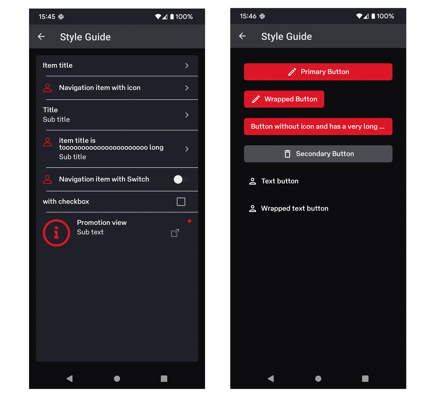
Below is a sample of the components and typography that we developed.

Since our app already supported light/dark themes it was a must to set this up in Compose. It was easy as defining 2 sets of colours (lightColors & darkColors) and providing an isSystemInDarkTheme() check where needed.
| val defaultTextColor: Color | |
| @Composable | |
| @ReadOnlyComposable | |
| get() = if (isSystemInDarkTheme()) AP_White else AP_Ink | |
| val defaultSecondaryTextColor: Color | |
| @Composable | |
| @ReadOnlyComposable | |
| get() = if (isSystemInDarkTheme()) AP_Smoke else AP_Iron | |
| val defaultTertiaryTextColor: Color | |
| @Composable | |
| @ReadOnlyComposable | |
| get() = if (isSystemInDarkTheme()) AP_Ash else AP_Dim |
Overall, it was a bit of work to get our Debug App rewritten in Compose but we knew that everything that we had done so far would make the next step just that little bit easier. I also forgot to mention that we transitioned from using Livedata toMutableState in our ViewModels, there isn’t much to add because it was pretty straight forward. This is one example of how we started out with a narrow focus and scope to reduce risk and as we become more comfortable we widen it.
Step 3 — App
For the final step we decided to rewrite an existing screen that hadn’t been uplifted to our newer architecture with Compose. Since our main app is still activity based (no single activity for navigation) this threw up new challenges and issues since it wasn’t practical to rewrite the entire navigation like we did on our Wear and Debug app.
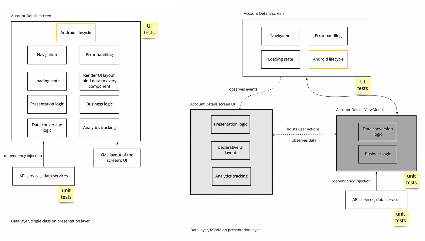
Just like our Wear app we had to modernize the architecture for this screen and introduce a ViewModel. Just a note we had switched to ViewModels many years ago but not all our code was migrated over, it was only applied to new features. What we finally landed on was a hybrid approach, the activity would still be responsible for things such as navigation, analytics logging, error handling, loading state and anything to do the with the Android life cycle. While the Composable’s would be responsible for presentation logic, layouts and analytics tracking generation. Essentially the Activity would observe events from the ViewModelthat were send via the Composables.
This solution and approach is unique to our app’s architecture and limitations, however I would expect other apps to take a different approach based on their own app’s architecture. For instance our progress overlays and page loading indicators are already available on our base activities via base layouts so it just made sense to reuse them rather than replicate them. Over time as we refactor and refine our design patterns the goal is to slowly remove these responsibilities away from the Activity. Below on the left is our original architecture and responsibilities and on the right is what we settled on.
Spot the difference
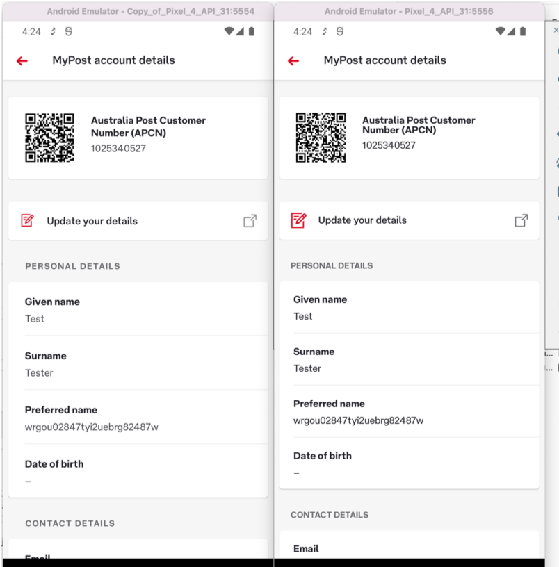
As mentioned before we decided to rewrite an existing screen mainly to ensure that the new Composable UI components were as close as possible to the old view components. A user of our app shouldn’t be able to distinguish between the two. We did have some problems making the screen identical since some Compose components have a default padding that can’t be removed. To help us get the screen as pixel perfect as possible we also enlisted the help of our UI/UX designer to go over our new Composable screen. As always we wanted to keep the screen accessible and we found that the Compose’s accessibility API was much cleaner than the old View system, however we did notice a few minor bugs like the snackbar being announced twice.
Testing
I know that this is sometimes the last things on developers minds and funny enough the last topic in this article but we wanted to make sure that we could easily test our new Composable screens. Since we were already using Robolectric for all our UI tests and it was working well, we wanted to continue down this path and didn’t explore all the testing options out there. We were glad to learn that Robolectric supported Compose however it required the tests to be written in a very different way. Compose has a semantics tree which contains all the semantic meaning of your Composables but not how they are drawn. This semantic tree is then used to access the information about the UI components using a tag that you need to manually add to your Composables. Below is an example test for our new Composable screen using the ComposeContentTestRule.
| @Config(application = PostApp::class, instrumentedPackages = ["androidx.loader.content"]) | |
| class AccountDetailsActivityTest : | |
| RobolectricTestBase<AccountDetailsActivity>(AccountDetailsActivity::class) { | |
| @get:Rule | |
| val composeTestRule = createComposeRule() | |
| private lateinit var page: AccountDetailsPage | |
| @Before | |
| @Throws(Exception::class) | |
| fun setUp() { | |
| page = AccountDetailsPage(composeTestRule) | |
| } | |
| @Test | |
| fun testRequestNonEmptyCSSOProfile() { | |
| with(page) { | |
| apcn.assertText(stringRes(R.string.glam_customer_number), "C0000APMOB23") | |
| with(personalDetails) { | |
| preferredName.assertText(stringRes(R.string.glam_preferred_name), "Bob") | |
| lastName.assertText(stringRes(R.string.glam_surname), "Smith") | |
| givenName.assertText(stringRes(R.string.glam_given_name), "BobLegal") | |
| dateOfBirth.assertText(stringRes(R.string.glam_date_of_birth), "08/06/1976") | |
| } | |
| } |
Using the Page Object Model to locate the different elements on the page via the ComposeTestRule.
| class AccountDetailsPage constructor(private val composeTestRule: ComposeContentTestRule) { | |
| val personalDetails: PersonalDetails | |
| get() = | |
| with(composeTestRule) { | |
| PersonalDetails( | |
| preferredName = TitleValue( | |
| title = onNestedChild(UiAssert.stringRes(R.string.glam_preferred_name), "txt_title"), | |
| value = onNestedChild(UiAssert.stringRes(R.string.glam_preferred_name), "txt_subtitle") | |
| ), | |
| lastName = TitleValue( | |
| title = onNestedChild(UiAssert.stringRes(R.string.glam_surname), "txt_title"), | |
| value = onNestedChild(UiAssert.stringRes(R.string.glam_surname), "txt_subtitle") | |
| ), | |
| givenName = TitleValue( | |
| title = onNestedChild(UiAssert.stringRes(R.string.glam_given_name), "txt_title"), | |
| value = onNestedChild(UiAssert.stringRes(R.string.glam_given_name), "txt_subtitle") | |
| ), | |
| dateOfBirth = TitleValue( | |
| title = onNestedChild(UiAssert.stringRes(R.string.glam_date_of_birth), "txt_title"), | |
| value = onNestedChild(UiAssert.stringRes(R.string.glam_date_of_birth), "txt_subtitle") | |
| ), | |
| ) | |
| } | |
| data class PersonalDetails( | |
| val preferredName: TitleValue, | |
| val lastName: TitleValue, | |
| val givenName: TitleValue, | |
| val dateOfBirth: TitleValue, | |
| ) | |
| data class TitleValue( | |
| val title: SemanticsNodeInteraction, | |
| val value: SemanticsNodeInteraction | |
| ) { | |
| fun assertText(titleText: String, valueText: String) { | |
| title.assert(hasText(titleText)) | |
| value.assert(hasText(valueText)) | |
| } | |
| } | |
| } |
Adding the test tag on our Composables so they can be accessed via the semantic tree.
| APText( | |
| modifier = Modifier | |
| .testTag("txt_title") | |
| .padding(top = 6.dp, bottom = 4.dp), | |
| apStyle = textStyle, text = text, textColor = textColor | |
| ) |
Summary
Just as this is a pretty long article, it was a pretty long journey to get there in the end. We started with Compose 1.0 (now Compose 1.2) and we haven’t had any significant issues that we couldn’t deal with, yes there are less examples, blogs and information out there but most things can be solved by spending that little bit extra time playing around with the APIs ,digging into the source code, checking the Google issue tracker (your issue might be fixed in the next release or someone might have a work around)or writing your own component.
We did take a pretty risk adverse strategy but that allowed us to buy more time and use the more stable versions on the most important part of the code the main app (step 3) when they were available. At the moment our plan is to only use Compose on new screens as we want to avoid running into any compatibility issues when mixing Views and Composables. This may change in the future but it’s just our strategy of reducing risk.
As more and more companies (e.g. Twitter, Airbnb, Block and Tinder) are sharing their stories about how they successfully moved to Compose, the risks of something going wrong when adopting Compose are now dropping with each new release. My personal advice is that I reckon Compose is ready for prime time, you just need to have a plan.
I would like to acknowledge Natalia & Wenchao for editing and actually helping implement what was mentioned in this article.
This article was originally published on proandroiddev.com on August 29, 2022


