

Why Adaptive UI
Android has been powering a wide variety of devices with all types of screen sizes. Starting from compact 4 inch displays all the way upto tablets with 12+ inches displays, and now, we have foldables and full blown desktops capable of running android apps.
This makes it more important than ever before for apps to feel at home and look beautiful on all these different screen sizes. It is equally important to make good use of extra screen real-estate when available so that the users can do and see more where it makes sense.
Fortunately, Jetpack Compose comes with a bunch of tools to make it easier for developers to build these beautiful, responsive UIs that adapt onto any screen size. In this blog post, we will look at the most important and commonly used tools.
How to create an adaptive UI
Screen Level Changes
In this section, we will look at how to adapt our screen’s UI to different form factors. Screen level or root level composables are components that occupy the entire screen and are made up of multiple smaller components.
For example, on a smaller device, we would like to show just the list of items and only show the detail screen when user selects an item (Compact UI). On the other hand, on a large screen device, we could show them both side by side (Expanded UI).
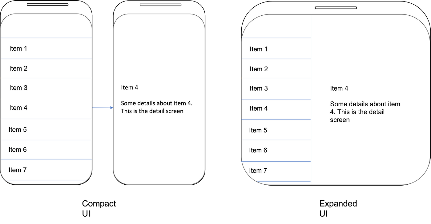
Hence, based on the device or screen size, we have decided to show or hide certain UI components. This forms the first stepping stone for our responsive UI application.
To achieve this, there are multiple ways. We could query for the device width and height and then do some calculations. For example, if the width goes beyond 600px, we would opt for ExpandedUI and for everything below 600px, we stick to CompactUI.
While the above mentioned method is totally possible, it leaves some important aspect for the developers to take care of. For example, the magic number of 600 — one could argue why 600 and not 500 or 700px as the breakpoint. Other major problems with that method is a device could have multiple screens (foldables) or your app is not occupying the entire screen (multi-window) in which case you should only consider the space allocated to your app.
To solve for all of these issues and to simplify the decision making, Android introduced Window Size Classes. These are pre-defined breakpoints which take into account the orientation and screen space available to your app based on which you can draw different UI. It categorises the display area into
- Compact
- Medium
- Expanded
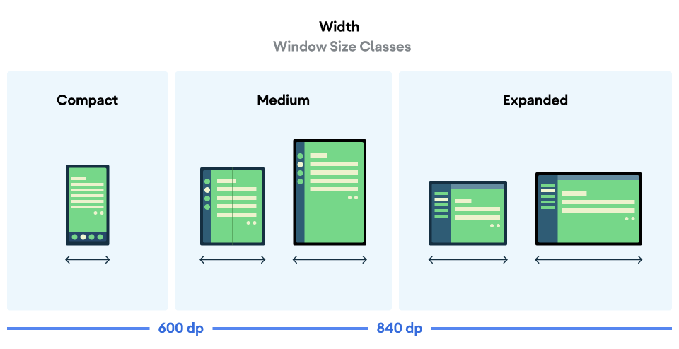
A category is assigned to both, height and width of the device which can be used to render the most suitable UI. Coming back to our example, we could decide to render the CompactUI on Compact width devices while ExpandedUI would make more sense for Medium and Expanded
| // gradle dependecies (app.gradle) | |
| dependencies { | |
| implementation "androidx.compose.material3:material3:<latest_version>" | |
| implementation "androidx.compose.material3:material3-window-size-class:<latest_version>" | |
| } | |
| // Activity | |
| class MainActivity : ComponentActivity() { | |
| @OptIn(ExperimentalMaterial3WindowSizeClassApi::class) | |
| override fun onCreate(savedInstanceState: Bundle?) { | |
| super.onCreate(savedInstanceState) | |
| setContent { | |
| val windowSizeClass = calculateWindowSizeClass(this) | |
| MyApp(windowSizeClass = windowSizeClass) | |
| } | |
| } | |
| } | |
| @Composable | |
| fun MyApp(windowSizeClass: WindowSizeClass) { | |
| when (windowSizeClass.widthSizeClass) { | |
| WindowWidthSizeClass.Compact -> { | |
| CompactUI() | |
| } | |
| else -> { | |
| ExpandedUI() | |
| } | |
| } | |
| } |
Component Level Changes
Now that screen level decisions are made, we can drill down into non-root composables and see how to make them adapt to different screen sizes.
For a truly adaptive UI, every composable should be smart enough to render itself properly on any given display area. Based on the available space, it should be able to make a decision on
- What data to show
- How to structure that data
If we can take care of the above two questions, we can make sure that our composable can be placed anywhere on the screen and it will adapt to render in the most meaningful way. Baking adaptability into individual composables also ensures that when these are used to build complex UI structures, every component can take care of itself to build the most meaningful and adaptive UI as a whole, always!
Let’s look at what tools can we use to answer the two questions mentioned above
What data to show
Based on the available space, it might make sense to hide or show some fields. For example, showing profile picture only if we have enough space, else just showing the username.

For such cases, we can use BoxWithConstraints composable. As the name suggests, it is similar to a Box composable, but provides the available dimensions in its scope. It will give you the available min and max height and width based on which you can take decisions to show or hide certain components.
| fun Profile(user: User) { | |
| BoxWithConstraints(modifier = Modifier.padding(16.dp)) { | |
| when (this.maxWidth) { | |
| in (0.dp..600.dp) -> { | |
| CompactProfile(user) | |
| } | |
| in (601.dp..900.dp) -> { | |
| ExpandedProfile(user) | |
| } | |
| } | |
| } | |
| } |
OUR VIDEO RECOMMENDATION


Jobs
This is a powerful tool which comes in handy to make decisions based on available space but should be used with some care. BoxWithConstraints defers the composition until the layout phase because it needs to know its dimensions before it can start composing. This basically means more work in the layout phase. If you are interested in reading more about the different phases of a composable, you can refer to this.
How to structure the data
Now that we have figured out what data to show given an area, the next thing we need to figure out is how to structure or layout the data to make the most of the available space.
For example, based on the available width, we can decide how many children to place in a given row before moving on to the next row.
Laying out children composable is the task of a Layout Composable. Row and Column are the two most commonly used Layouts which lay down their children in horizontally or vertically respectively. Let’s take a look at some of the other Layouts which are more adaptive in nature.
BoxWithConstraints:
We can use BoxWithConstraints to not only show or hide components but to also decide how to show them given a set of constraints. For example, if the available width is limited, we can render items in a column else we can use a Row to render them side by side.

| @Composable | |
| fun Profile(user: User) { | |
| BoxWithConstraints(modifier = Modifier.padding(16.dp)) { | |
| when (this.maxWidth) { | |
| in (0.dp..400.dp) -> { | |
| VerticalProfile(user) | |
| } | |
| in (401.dp..900.dp) -> { | |
| HorizontalProfile(user) | |
| } | |
| } | |
| } | |
| } |
FlowRow and FlowColumn:
To make the most of available space, two layouts which can prove to be handy are FlowRow and FlowColumn. FlowRow, for example, lays down its children in a row till the time there is space available. Once all the horizontal space is occupied, it moves the next child to a new row. So, on a large screen device, there may be 4 items in a row whereas on a small device there could be only 2 items in a row with the rest of the UI flowing to a next line. FlowColumn works on a similar basis, laying its children vertically until there is space available, and then moves onto a new column.
These free-flowing layouts help keep your UI adaptive to any given space without the developer having to worry about the nitty-gritty.
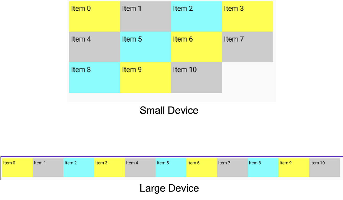 4 items fit on a small device, whereas 11 can fit on large
| @Composable | |
| fun FlowRowSample() { | |
| val colors = remember { | |
| listOf(Color.Yellow, Color.LightGray, Color.Cyan) | |
| } | |
| Box(modifier = Modifier.padding(4.dp)) { | |
| FlowRow { | |
| for (i in 0..10) { | |
| Box( | |
| modifier = Modifier | |
| .width(100.dp) | |
| .height(60.dp) | |
| .background(colors[i % 3]) | |
| ) { | |
| Text("Item $i", modifier = Modifier.padding(4.dp)) | |
| } | |
| } | |
| } | |
| } | |
| } |
LazyGrid:
LazyGrid is another out-of-the-box Layout which can adapt to any given area. As the name suggests, it lays down its children in a Grid vertically (LazyVerticalGrid) or horizontally (LazyHorizontalGrid). For the purpose of this example, we will focus on LazyVerticalGrid but LazyHorizontalGrid works in a similar fashion.
LazyVerticalGrid gets its adaptive nature from the column param, which accepts parameter of type GridCells<link to documentation>. GridCells can be basically of two types:
- Fixed — This fixes the number of columns to a given number. The available horizontal space is then divided into these many columns. So if the available width is say 100dp, and we have number of columns as 4, each column will be 25dp. If the available width had been 200dp, we will have each column spanning 50dp.
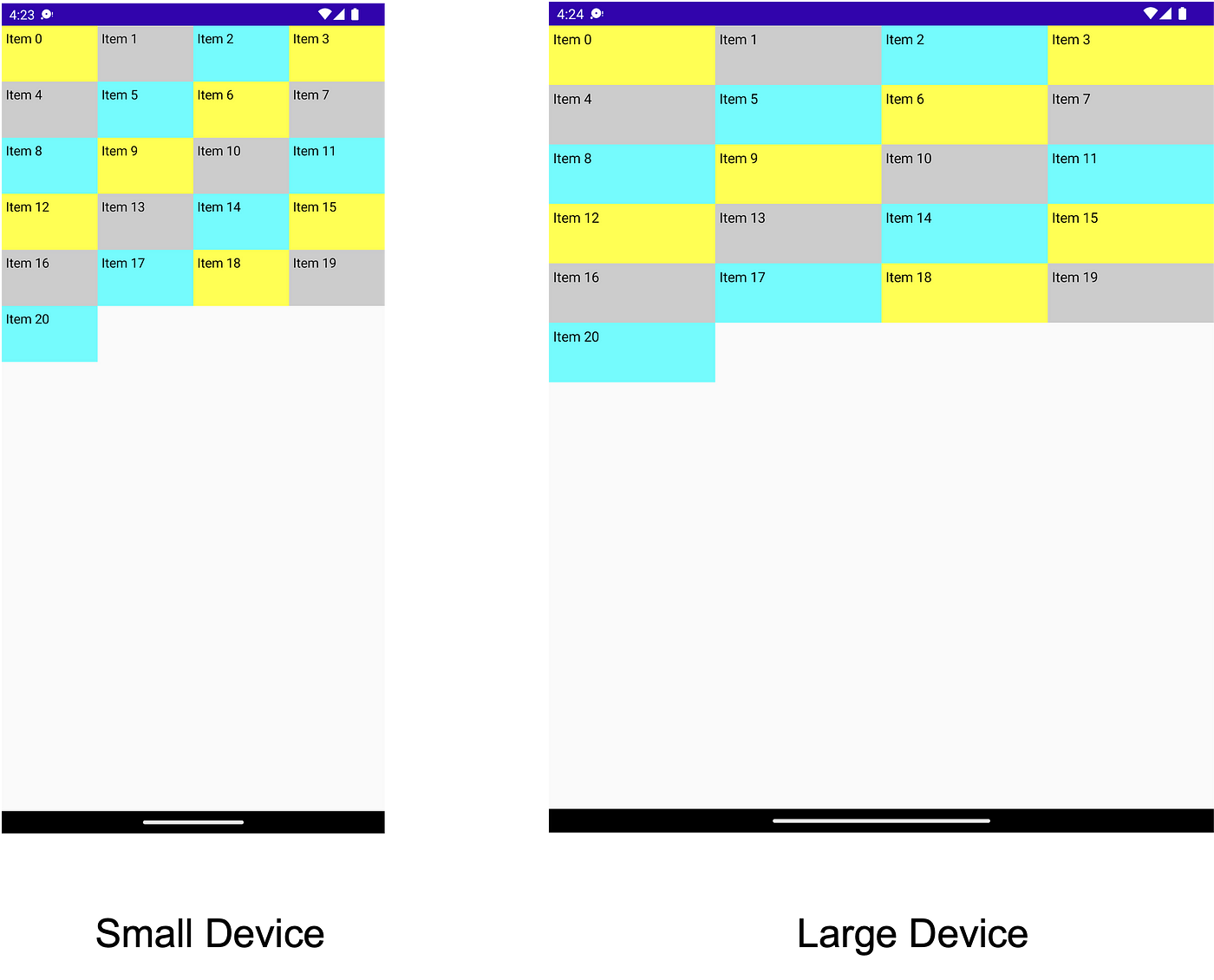 Each row has 4 (fixed) items — different width
| @Composable | |
| fun FixedLazyGrid() { | |
| val colors = remember { | |
| listOf(Color.Yellow, Color.LightGray, Color.Cyan) | |
| } | |
| LazyVerticalGrid( | |
| columns = GridCells.Fixed(5), | |
| content = { | |
| for (i in 0..20) { | |
| item { | |
| Box( | |
| modifier = Modifier | |
| .width(100.dp) | |
| .height(60.dp) | |
| .background(colors[i % 3]) | |
| ) { | |
| Text("Item $i", modifier = Modifier.padding(4.dp)) | |
| } | |
| } | |
| } | |
| }) | |
| } |
- Adaptive — This fixes the minWidth for a column. Using this type of GridCells, we can ensure the minimum width each column gets and then the number of columns are decided based on how many such columns can we fit. For example, if each column is required to be 120dp and available width is 400dp, we would have 3 columns whereas on a device with 700dp available space, we would have 5 columns. The remaining space is then divided equally amongst all the columns.
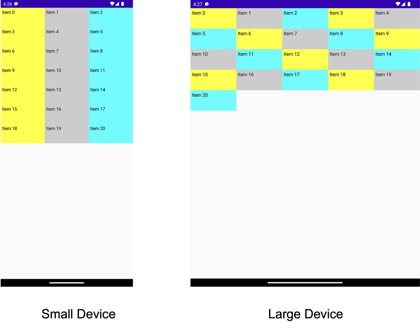
Small device has 3 items, large has 5 items per row
| @Composable | |
| fun AdaptiveLazyGrid() { | |
| val colors = remember { | |
| listOf(Color.Yellow, Color.LightGray, Color.Cyan) | |
| } | |
| LazyVerticalGrid( | |
| columns = GridCells.Adaptive(120.dp), | |
| content = { | |
| for (i in 0..20) { | |
| item { | |
| Box( | |
| modifier = Modifier | |
| .width(100.dp) | |
| .height(60.dp) | |
| .background(colors[i % 3]) | |
| ) { | |
| Text("Item $i", modifier = Modifier.padding(4.dp)) | |
| } | |
| } | |
| } | |
| }) | |
| } |
Custom Layouts:
If these out-of-the-box available layouts do not solve your purpose, we can always create a new layout using the Layout Composable. By creating a new layout composable, we can decide how to place the children in the best possible fashion, making the most of the available space.
How to create a custom layout is something which requires a blog post of its own, but this documentation is a good starting point.
With that, we have covered some of the most common ways to start creating adaptive and response UIs which are designed to look good on all form factors. Do leave a clap before you get back to composing beautiful Android apps 🙂
This article was originally published on proandroiddev.com on September 30, 2022


