

Jetpack Compose is a modern UI toolkit that is designed to simplify UI development in Android.
This is the second part of the 2 part series on Jetpack Compose Basics.
- Jetpack Compose Basics — Part 1
- Jetpack Compose Basics — Part 2 (Design Code Samples)
In the first part, we tried to address some questions that come up with Compose. We understood what are the basic functions in Compose and the rules and annotations used for them. In this blog, we will try to use them and design some simple UI using Jetpack Compose.
Let’s refer to the designs used in the Google Developer’s Course on Compose Unit 1 — Pathway 3 and try to compose them.
Design 1: Birthday Greeting Card
In the first design, we will draw a birthday greeting card like the above. For the “message” and “from” strings, we will use Text Composable. Let’s make a Composable function BirthdayGreetingWithText() and pass two parameters, one for the “message” and one for the “from” text. To align it in a vertical arrangement, we use the Column function.
| @Composable | |
| fun BirthdayGreetingWithText(message: String, from: String) { | |
| Column { | |
| Text(text = message) | |
| Text(text = from) | |
| } | |
| } |
To specify the text size of the text, Text Composable takes a parameter — fontSize. We can specify the text size with sp extension available in TextUnit Class. We can also set the text color by specifying it in the color param in Text Composable. There is a modifier param as well which allows us to specify the alignment, padding, width, height, etc.
| @Composable | |
| fun BirthdayGreetingWithText(message: String, from: String) { | |
| Column { | |
| Text( | |
| text = message, | |
| fontSize = 24.sp, | |
| color = Color.White, | |
| modifier = Modifier | |
| .fillMaxWidth() | |
| .wrapContentWidth(Alignment.CenterHorizontally) | |
| .padding(10.dp) | |
| ) | |
| Text( | |
| text = from, | |
| fontSize = 20.sp, | |
| color = Color.White, | |
| modifier = Modifier | |
| .fillMaxWidth() | |
| .wrapContentWidth(Alignment.CenterHorizontally) | |
| .padding(10.dp) | |
| ) | |
| } | |
| } |
To add background color, we can add this column inside a Surface and give color to that, let’s try that.
| @Composable | |
| fun BirthdayGreetingWithText(message: String, from: String) { | |
| Surface(color = Color.Magenta) { | |
| Column { | |
| Text( | |
| text = message, | |
| fontSize = 24.sp, | |
| color = Color.White, | |
| modifier = Modifier | |
| .fillMaxWidth() | |
| .wrapContentWidth(Alignment.CenterHorizontally) | |
| .padding(10.dp) | |
| ) | |
| Text( | |
| text = from, | |
| fontSize = 20.sp, | |
| color = Color.White, | |
| modifier = Modifier | |
| .fillMaxWidth() | |
| .wrapContentWidth(Alignment.CenterHorizontally) | |
| .padding(10.dp) | |
| ) | |
| } | |
| } | |
| } |
How do we preview this?
To preview this, we have to create a composable function with @Preview annotation to be able to see the UI in the Design tab.
| @Preview(showBackground = true) | |
| @Composable | |
| fun BirthdayGreetingWithTextPreview() { | |
| ComposeExampleTheme { | |
| BirthdayGreetingWithText("Happy Birthday Alankrita!", "From, Alankrita") | |
| } | |
| } |
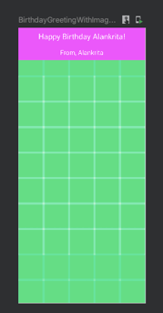
Build and refresh and you will get to see something like this in the Design preview. It is a surface with a Magenta color with two Text Composable in vertical arrangement aligned in the center horizontal in white color and some padding with some fontSize.

To add an image to the greeting card, let’s use Image Composable. painterResource Composable uses the parameter id of the drawable and returns painter which can be used in Image Composable. Feel free to choose any drawable image that feels attractive in your greeting card.
Let’s make another Composable function BirthdayGreetingWithImage() with 3 params — message, from, and image. Let’s use a Box layout for this. The box layout is used to stack elements on top of one another. Box layout also lets you configure the specific alignment of the elements that it contains.
| @Composable | |
| fun BirthdayGreetingWithImage(message: String, from: String, image: Int) { | |
| val image = painterResource(id = image) | |
| Box { | |
| Image( | |
| painter = image, | |
| contentDescription = null, | |
| modifier = Modifier | |
| .fillMaxWidth() | |
| .fillMaxHeight(), | |
| contentScale = ContentScale.Crop | |
| ) | |
| BirthdayGreetingWithText(message, from) | |
| } | |
| } |
Let’s preview the greeting card with image and text.
| @Preview(showBackground = true) | |
| @Composable | |
| fun BirthdayGreetingWithImagePreview() { | |
| ComposeExampleTheme { | |
| BirthdayGreetingWithImage("Happy Birthday Alankrita!", "From, Alankrita", R.drawable.ic_launcher_background) | |
| } | |
| } |
Yay! The birthday greeting card is ready. Let’s check out another design example.
Design 2: Compose Article
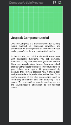
In this design, let’s create a Compose article UI. This contains an image with full-screen width. It has 3 text elements with some font size and padding. The second and third text elements are in Justify text alignment. Note that all the elements are placed in vertical order. So, we can use Column Composable to arrange the elements. Let’s write a Composable function — ComposeArticle() that accepts one image and 3 text values.
| @Composable | |
| fun ComposeArticle(head: String, body1: String, body2: String, image: Int) { | |
| val image = painterResource(id = image) | |
| Column(modifier = Modifier.fillMaxSize()) { | |
| Image( | |
| painter = image, | |
| contentDescription = "Jetpack Compose Article", | |
| modifier = Modifier | |
| .fillMaxWidth() | |
| .height(200.dp), | |
| contentScale = ContentScale.Crop | |
| ) | |
| Text( | |
| text = head, | |
| fontSize = 24.sp, | |
| fontWeight = FontWeight.Bold, | |
| modifier = Modifier.padding(16.dp, 16.dp, 16.dp, 8.dp) | |
| ) | |
| Text( | |
| text = body1, | |
| textAlign = TextAlign.Justify, | |
| modifier = Modifier.padding(16.dp, 8.dp, 16.dp, 8.dp) | |
| ) | |
| Text( | |
| text = body2, | |
| textAlign = TextAlign.Justify, | |
| modifier = Modifier.padding(16.dp, 8.dp, 16.dp, 16.dp) | |
| ) | |
| } | |
| } |
OUR VIDEO RECOMMENDATION


Jobs
To align text in Justify, we can set the textAlign param in Text Composable as TextAlign.Justify. To preview this, let’s add another function — ComposeArticlePreview()
| @Preview(showBackground = true) | |
| @Composable | |
| fun ComposeArticlePreview() { | |
| ComposeExampleTheme { | |
| ComposeArticle( | |
| "Jetpack Compose tutorial", | |
| "Jetpack Compose is a modern toolkit for building native Android UI. Compose simplifies and accelerates UI development on Android with less code, powerful tools, and intuitive Kotlin APIs.", | |
| "In this tutorial, you build a simple UI component with declarative functions. You call Compose functions to say what elements you want and the Compose compiler does the rest. Compose is built around Composable functions. These functions let you define your app\\'s UI programmatically because they let you describe how it should look and provide data dependencies, rather than focus on the process of the UI\\'s construction, such as initializing an element and then attaching it to a parent. To create a Composable function, you add the @Composable annotation to the function name.", | |
| R.drawable.ic_launcher_background) | |
| } | |
| } |
Build and refresh to see the changes. The Compose Article design is ready.
Design 3: Task Manager
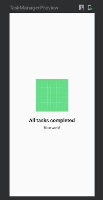
In this design, we will create a design that looks like a task manager, which shows the UI like above when all your tasks are done. It has an image and 2 text elements. All the items are center-aligned horizontally and vertically. Let’s write a Composable function — TaskManager() for this.
| @Composable | |
| fun TaskManager(head: String, body: String) { | |
| val image = painterResource(id = R.drawable.ic_launcher_background) | |
| Column( | |
| modifier = Modifier.fillMaxSize(), | |
| verticalArrangement = Arrangement.Center, | |
| horizontalAlignment = Alignment.CenterHorizontally | |
| ) { | |
| Image( | |
| painter = image, | |
| contentDescription = "All tasks done", | |
| modifier = Modifier | |
| .width(150.dp) | |
| .height(150.dp) | |
| ) | |
| Text( | |
| text = head, | |
| fontSize = 24.sp, | |
| fontWeight = FontWeight.Bold, | |
| modifier = Modifier | |
| .padding(0.dp, 24.dp, 0.dp, 8.dp) | |
| ) | |
| Text( | |
| text = body, | |
| fontSize = 16.sp | |
| ) | |
| } | |
| } |
To set the elements in the vertical center, we have assigned the value Arrangement.Center to verticalArrangement param in Column Composable. And to set elements in the horizontal center, we have used Alignment.CenterHorizontally in horizontalAlignment param in Column Composable. Let’s preview this by writing another Preview Composable function — TaskManagerPreview()
| @Preview(showBackground = true) | |
| @Composable | |
| fun TaskManagerPreview() { | |
| ComposeExampleTheme { | |
| TaskManager( | |
| "All tasks completed", | |
| "Nice work!" | |
| ) | |
| } | |
| } |
The task manager design is ready.
Design 4: Compose Quadrant
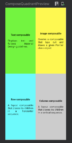
In this design, the screen is divided into 4 quadrants. Each Quadrant has 2 text elements in the center of that quadrant. All quadrants have different colors.
Let’s first draw what one card (quadrant) looks like. Each card has 2 text elements. The second text uses Justify as text alignment. The first one is bold. And both text combined is placed in the center horizontally and vertically.
| @Composable | |
| fun ComposeQuadrant(color: Color, head: String, body: String, modifier: Modifier = Modifier) { | |
| Column( | |
| modifier = modifier | |
| .background(color) | |
| .padding(16.dp) | |
| .fillMaxHeight(), | |
| verticalArrangement = Arrangement.Center, | |
| horizontalAlignment = Alignment.CenterHorizontally | |
| ) { | |
| Text( | |
| text = head, | |
| fontWeight = FontWeight.Bold, | |
| modifier = Modifier.padding(0.dp, 0.dp, 0.dp, 16.dp) | |
| ) | |
| Text( | |
| text = body, | |
| textAlign = TextAlign.Justify, | |
| ) | |
| } | |
| } |
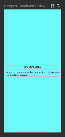
If we preview this, this will show one quadrant preview.
| @Preview(showBackground = true) | |
| @Composable | |
| fun ComposeQuadrantPreview() { | |
| ComposeExampleTheme { | |
| ComposeQuadrant( | |
| color = Color.Cyan, | |
| head = "Row composable", | |
| body = "A layout composable that places its children in a horizontal sequence.", | |
| ) | |
| } | |
| } |
Now, we have to show 4 quadrants. For this, we can use 2 rows in a column. To assign each composable quadrant equal width, set the modifier weight as 1f in each card composable. And to set each quadrant of equal height, set modifier weight as 1f in each row in the column. Let’s look into the code.
| @Composable | |
| fun ComposeQuadrants() { | |
| Column(modifier = Modifier.fillMaxSize()) { | |
| Row(Modifier.weight(1F)) { | |
| ComposeQuadrant( | |
| color = Color.Green, | |
| head = "Text composable", | |
| body = "Displays text and follows Material Design guidelines.", | |
| modifier = Modifier.weight(1f) | |
| ) | |
| ComposeQuadrant( | |
| color = Color.Yellow, | |
| head = "Image composable", | |
| body = "Creates a composable that lays out and draws a given Painter class object.", | |
| modifier = Modifier.weight(1f) | |
| ) | |
| } | |
| Row(Modifier.weight(1F)) { | |
| ComposeQuadrant( | |
| color = Color.Cyan, | |
| head = "Row composable", | |
| body = "A layout composable that places its children in a horizontal sequence.", | |
| modifier = Modifier.weight(1f) | |
| ) | |
| ComposeQuadrant( | |
| color = Color.LightGray, | |
| head = "Column composable", | |
| body = "A layout composable that places its children in a vertical sequence.", | |
| modifier = Modifier.weight(1f) | |
| ) | |
| } | |
| } | |
| } |
Let’s preview this.
| @Preview(showBackground = true) | |
| @Composable | |
| fun ComposeQuadrantPreview() { | |
| ComposeExampleTheme { | |
| ComposeQuadrants() | |
| } | |
| } |
Yay! The ComposeQuadrants Composable is ready.
Design 5: Business Card
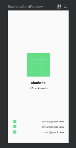
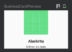
In this design, we will create a business card Composable. There are two sections in it. One is the top layer in which we have an image and two text elements. It is placed in the center horizontally. Let’s create a Composable for the top portion — BusinessCardTop()
| @Composable | |
| fun BusinessCardTop() { | |
| val image = painterResource(id = R.drawable.ic_launcher_background) | |
| Column( | |
| modifier = Modifier.fillMaxWidth(), | |
| horizontalAlignment = Alignment.CenterHorizontally, | |
| verticalArrangement = Arrangement.Bottom | |
| ) { | |
| Image( | |
| painter = image, | |
| contentDescription = "All tasks done", | |
| modifier = Modifier | |
| .width(150.dp) | |
| .height(150.dp) | |
| ) | |
| Text( | |
| text = "Alankrita", | |
| fontSize = 24.sp, | |
| fontWeight = FontWeight.Bold, | |
| modifier = Modifier | |
| .padding(0.dp, 24.dp, 0.dp, 8.dp) | |
| ) | |
| Text( | |
| text = "Hi From Alankrita", | |
| fontSize = 16.sp | |
| ) | |
| } | |
| } |
Let’s preview this and see how does it look like,
| @Preview(showBackground = true) | |
| @Composable | |
| fun BusinessCardPreview() { | |
| ComposeExampleTheme { | |
| BusinessCardTop() | |
| } | |
| } | |
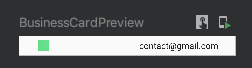
Great! Now, let’s look at the bottom section. The bottom section has 3 rows arranged in a column. Each row has an image and a text. Let’s also add some padding to them to make them look nice.
| @Composable | |
| fun BusinessCardBottomRow(contact: String) { | |
| val image = painterResource(id = R.drawable.ic_launcher_background) | |
| Row( | |
| modifier = Modifier | |
| .fillMaxWidth() | |
| .padding(30.dp, 2.dp, 20.dp, 2.dp) | |
| ) { | |
| Image( | |
| painter = image, | |
| contentDescription = contact, | |
| modifier = Modifier | |
| .width(30.dp) | |
| .height(30.dp) | |
| .padding(5.dp) | |
| .wrapContentWidth(Alignment.Start) | |
| ) | |
| Text( | |
| contact, | |
| modifier = Modifier | |
| .padding(10.dp, 0.dp, 10.dp, 0.dp) | |
| .align(Alignment.CenterVertically) | |
| .fillMaxWidth() | |
| .wrapContentWidth(Alignment.End) | |
| ) | |
| } | |
| } |
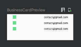
Let’s preview this and see how does it look like.
| @Preview(showBackground = true) | |
| @Composable | |
| fun BusinessCardPreview() { | |
| ComposeExampleTheme { | |
| BusinessCardBottomRow() | |
| } | |
| } |
Awesome! The row item is ready. Let’s add 3 rows in a column. Add your different contact details here.
| @Composable | |
| fun BusinessCardBottom() { | |
| Column( | |
| modifier = Modifier | |
| .fillMaxWidth() | |
| .padding(0.dp, 0.dp, 0.dp, 50.dp), | |
| horizontalAlignment = Alignment.CenterHorizontally, | |
| verticalArrangement = Arrangement.Bottom | |
| ) { | |
| BusinessCardBottomRow("contact@gmail.com") | |
| BusinessCardBottomRow("contact@gmail.com") | |
| BusinessCardBottomRow("contact@gmail.com") | |
| } | |
| } |
Let’s preview this.
| @Preview(showBackground = true) | |
| @Composable | |
| fun BusinessCardPreview() { | |
| ComposeExampleTheme { | |
| BusinessCardBottom() | |
| } | |
| } |
Going well so far. We have the top section ready and we have the bottom section ready. Now, let’s make some changes and add some weight to the UI.
| //Business Card | |
| @Composable | |
| fun BusinessCard() { | |
| Column(modifier = Modifier.fillMaxSize()) { | |
| BusinessCardTop(modifier = Modifier.weight(3F)) | |
| BusinessCardBottom(modifier = Modifier.weight(2F)) | |
| } | |
| } | |
| @Composable | |
| fun BusinessCardTop(modifier: Modifier) { | |
| val image = painterResource(id = R.drawable.ic_launcher_background) | |
| Column( | |
| modifier = modifier.fillMaxWidth(), | |
| horizontalAlignment = Alignment.CenterHorizontally, | |
| verticalArrangement = Arrangement.Bottom | |
| ) { | |
| Image( | |
| painter = image, | |
| contentDescription = "All tasks done", | |
| modifier = Modifier | |
| .width(150.dp) | |
| .height(150.dp) | |
| ) | |
| Text( | |
| text = "Alankrita", | |
| fontSize = 24.sp, | |
| fontWeight = FontWeight.Bold, | |
| modifier = Modifier | |
| .padding(0.dp, 24.dp, 0.dp, 8.dp) | |
| ) | |
| Text( | |
| text = "Hi From Alankrita", | |
| fontSize = 16.sp | |
| ) | |
| } | |
| } | |
| @Composable | |
| fun BusinessCardBottom(modifier: Modifier) { | |
| Column( | |
| modifier = modifier | |
| .fillMaxWidth() | |
| .padding(0.dp, 0.dp, 0.dp, 50.dp), | |
| horizontalAlignment = Alignment.CenterHorizontally, | |
| verticalArrangement = Arrangement.Bottom | |
| ) { | |
| BusinessCardBottomRow("contact@gmail.com") | |
| BusinessCardBottomRow("contact@gmail.com") | |
| BusinessCardBottomRow("contact@gmail.com") | |
| } | |
| } | |
| @Composable | |
| fun BusinessCardBottomRow(contact: String) { | |
| val image = painterResource(id = R.drawable.ic_launcher_background) | |
| Row( | |
| modifier = Modifier | |
| .fillMaxWidth() | |
| .padding(30.dp, 2.dp, 20.dp, 2.dp) | |
| ) { | |
| Image( | |
| painter = image, | |
| contentDescription = contact, | |
| modifier = Modifier | |
| .width(30.dp) | |
| .height(30.dp) | |
| .padding(5.dp) | |
| .wrapContentWidth(Alignment.Start) | |
| ) | |
| Text( | |
| contact, | |
| modifier = Modifier | |
| .padding(10.dp, 0.dp, 10.dp, 0.dp) | |
| .align(Alignment.CenterVertically) | |
| .fillMaxWidth() | |
| .wrapContentWidth(Alignment.End) | |
| ) | |
| } | |
| } | |
| @Preview(showBackground = true) | |
| @Composable | |
| fun BusinessCardPreview() { | |
| ComposeExampleTheme { | |
| BusinessCard() | |
| } | |
| } |
The business card is ready. Congratulations!
With the 5 designs we created in this blog, we have learned about three layouts — Row, Column, and Box. We have also learned about Modifier.weight. We also came across the functionality of verticalArrangement and horizontalAlignment. We learned to add an Image and Text Composable with fontWeight, fontSize, textAlign, and modifier. Here is the Github link with all the designs code that we have implemented in this blog. Feel free to refer to it.
References
- https://developer.android.com/jetpack/compose/tutorial
- https://developer.android.com/courses/android-basics-compose/unit-1
Hope you find this blog helpful in getting started with the Jetpack Compose. If you like this, don’t forget to hit the 👏 .
This article was originally published on proandroiddev.com on October 27, 2022


