

Restricting the content of the composable lambda using layoutId modifier.
Jetpack Compose introduced us to a new concept — Slot API. It empowers developers to create flexible yet easy-to-use reusable UI components. However, sometimes there is too much flexibility — we need a way to allow only a certain number of UI components to be placed into a slot.
But how to do it? Today we will find out. Strap in!
The Problem
Imagine we are designing our own TopAppBar:
@Composable
fun TopAppBar(
    title: String,
    icon: @Composable () -> Unit,
)
And we already have a custom Icon:
@Composable
fun Icon(painter: Painter, tint: Color = DefaultTintColor)
But we want users of TopAppBar to be able to place one and only one Icon composable into an icon slot.
Solution One
The easiest way is to just do this:
@Composable
fun TopAppBar(
    title: String,
    iconPainter: Painter,
    iconTint: Color = DefaultTintColor,
) {
    // ...
    Icon(iconPainter, iconTint)
    // ...
}
However, if an Icon component has many parameters (5–9 or even more), and/or TopAppBar has many icons, this solution becomes impractical.
Solution Two
We can create a TopAppBarIcon data class specifically for TopAppBar:
data class TopAppBarIcon(
    val painter: Painter,
    val tint: Color = DefaultTintColor,
)

@Composable
fun TopAppBar(
    title: String,
    icon: TopAppBarIcon,
) {
    // ...
    Icon(icon.painter, icon.tint)
    // ...
}
However, this solution has many disadvantages:
- Code duplication. A list of
Icon‘s parameters and their default values are duplicated inTopAppBarIcon, which will be a headache to maintain. - Combinatorial explosion. If an icon will be used in a lot of other components, there will be a lot of wrapper classes for the same
Iconcomponent. - Not idiomatic. Jetpack Compose heavily uses Slot APIs, and developers are used to it. This approach strays away from the conventions and confuses devs.
- Recomposition scope. If
icon.tintchanges, it will trigger a recomposition of the wholeTopAppBar, which is not very efficient, especially when using animations (animating tint, for example).
Solution Three
Compose Layout subsystem has a thing called layoutId — a parameter that every LayoutNode can have (implemented using ParentDataModifier).
First, it is set using a Modifier.layoutId, then — read in a layout (measuring) phase.
Applying this knowledge to our problem, firstly we use Modifier.layoutId inside an Icon like this:
@Composable
fun Icon(painter: Painter, tint: Color = DefaultTintColor) {
    Box(Modifier.layoutId(IconLayoutId)) {
        Icon(
            painter = painter,
            tint = tint,
            contentDescription = null
        )
    }
}

private object IconLayoutId
OUR VIDEO RECOMMENDATION


Jobs
Then create a composable function RequireLayoutId:
@Composable
fun RequireLayoutId(
    layoutId: Any?,
    errorMessage: String = "Failed requirement.",
    content: @Composable () -> Unit,
) = Layout(content) { measurables, constraints ->
    val child = measurables.singleOrNull()
        ?: error("Only a single child is allowed, was: ${measurables.size}")

    // read layoutId of a single child
    require(child.layoutId == layoutId) { errorMessage }

    // do not actually measure or layout a child
    layout(0, 0) {}
}
This function is a custom layout that doesn’t actually measure or layout any children, it’s just checking if a single allowed child has a required layoutId.
Finally, we use the function like this:
@Composable
fun TopAppBar(
    title: String,
    icon: @Composable () -> Unit,
) {
    RequireLayoutId(
        layoutId = IconLayoutId,
        errorMessage = "Only Icon is allowed",
        content = icon
    )

    // later in code
    icon()
}
Here are some test cases:
@Preview
@Composable
fun TestCases() = Column {
    // ✅
    TopAppBar(title = "Lorem") {
        Icon(painter = rememberVectorPainter(Icons.Default.Add))
    }

    // ❌
    TopAppBar(title = "Lorem") {
        Button(onClick = {})
    }

    // ❌
    TopAppBar(title = "Lorem") {

    }

    // ❌
    TopAppBar(title = "Lorem") {
        Box {
            Icon(painter = rememberVectorPainter(Icons.Default.Add))
        }
    }

    @Composable
    fun IconWrapper() {
        // you can use any composable functions that do not emit UI
        remember { "Something" }
        LaunchedEffect(Unit) { delay(200) }
        Icon(painter = rememberVectorPainter(Icons.Default.Add))
    }

    // ✅
    TopAppBar(title = "Lorem") {
        IconWrapper()
    }
}
Even more!
If you want even more granular control over what Icons can be passed to TopAppBar, you can create a composable wrapper that will only allow a certain subset of all possible Icon configurations:
interface TopAppBarScope {
    @Composable
    fun TopAppBarIcon(painter: Painter) {
        Box(Modifier.layoutId(TopAppBarIconLayoutId)) {
            Icon(painter = painter, tint = TopAppBarTint)
        }
    }

    companion object {
        private val instance = object : TopAppBarScope {}
        internal operator fun invoke() = instance
    }
}

private object TopAppBarIconLayoutId

@Composable
fun TopAppBar(
    title: String,
    icon: @Composable TopAppBarScope.() -> Unit,
) {
    // ...
    RequireLayoutId(
        layoutId = TopAppBarIconLayoutId,
        errorMessage = "Only TopAppBarIcon is allowed",
    ) {
        TopAppBarScope().icon()
    }
    TopAppBarScope().icon()
    // ...
}
Usage:
@Preview
@Composable
fun TestCases() = Column {
    // ✅
    TopAppBar(title = "Lorem") {
        TopAppBarIcon(painter = rememberVectorPainter(Icons.Default.Add))
    }
}
Because of TopAppBarScope we even get a nice autocompletion:
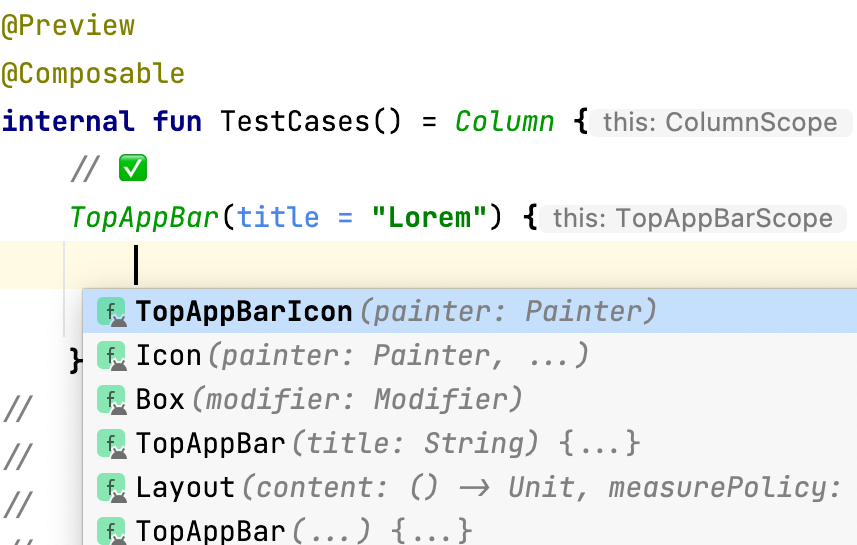
Autocompletion dropdown in TopAppBarScope
Of course, this approach can easily be extended to accept a defined number of different UI components.
That’s all for today, I hope it helps! Feel free to leave a comment if something is not clear or if you have questions. Thank you for reading!
This article was originally published on proandroiddev.com on December 03, 2022


