

How to use the out of the box features to get a great result.
I was recently building an app in Jetpack Compose and when laying out my main scaffold I wanted a collapsible top app bar, similar to CoordinatorLayout from the view based UI system. I found that when looking online on how to do this, most of the example implementations in other Medium posts were very custom, and not using LargeTopAppBar at all. The official documentation was rather scant on the subject so I thought my investigations may be of use to others!
Collapsing TopAppBar Basics
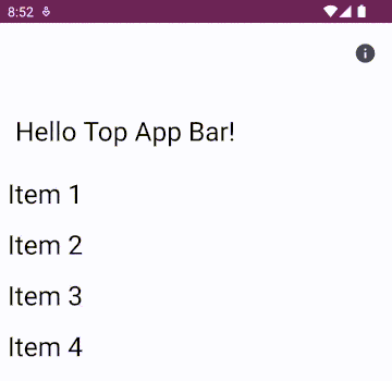
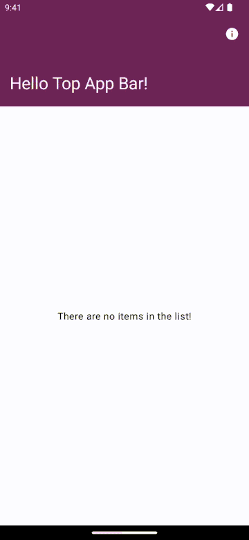
LargeTopAppBar, no collapsing at all
First, we need to start off with a standard LargeTopAppBar in a Scaffold with a list of content:
| val viewModel: MainViewModel = hiltViewModel() | |
| val items: List<Int> by viewModel.items.collectAsState(initial = emptyList()) | |
| Scaffold( | |
| topBar = { | |
| LargeTopAppBar( | |
| title = { Text(text = stringResource(id = R.string.title)) }, | |
| navigationIcon = { NavigationIcon(navController = navController)}, | |
| actions = { AboutActionIcon(navController) } | |
| ) | |
| } | |
| ) { innerPadding -> | |
| LazyColumn(modifier = Modifier | |
| .fillMaxSize() | |
| .padding(innerPadding)) { | |
| items(items) { item -> | |
| Text( | |
| text = stringResource(id = R.string.item_text, item), | |
| style = MaterialTheme.typography.headlineMedium, | |
| modifier = Modifier.padding(Dimen.spacing) | |
| ) | |
| } | |
| } | |
| } |
Now, to make it collapse we need to add a scroll behaviour and connect this behaviour to our list so that when the list scrolls, the top app bar knows to collapse. This scroll behaviour is created using TopAppBarScrollBehaviour. There are several default defined types you can use, I will demonstrate these below, but for the moment I will use TopAppBarDefaults.exitUntilCollapsedScrollBehavior(). This is created and added to the LargeTopAppBar definition and also as a modifier on the Scaffold to the scrollable content (the LazyColumn):
| ... | |
| val scrollBehavior = TopAppBarDefaults.exitUntilCollapsedScrollBehavior(rememberTopAppBarState()) | |
| Scaffold( | |
| topBar = { | |
| LargeTopAppBar( | |
| title = { Text(text = stringResource(id = R.string.title)) }, | |
| navigationIcon = { NavigationIcon(navController = navController)}, | |
| actions = { AboutActionIcon(navController) }, | |
| scrollBehavior = scrollBehavior | |
| ) | |
| }, | |
| modifier = modifier.nestedScroll(scrollBehavior.nestedScrollConnection) | |
| ) { innerPadding -> | |
| LazyColumn(...)) { | |
| ... | |
| } | |
| } |
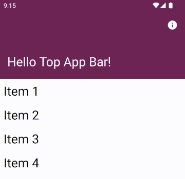
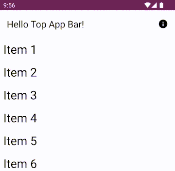
And the result, as the content is scrolled, the top app bar is collapsed to a standard TopAppBar!
Collapsing LargeTopAppBar
Pretty straightforward right? Well, we can add a bit more style and customisation…
If you are using Material theming, then the top app bar title styling will update along with the collapse behaviour. But if you are using custom styling in your app the style will remain static throughout the scroll. For example:
| ... | |
| val topAppBarTextSize = 28.sp | |
| val topAppBarElementColor = MaterialTheme.colorScheme.onPrimary | |
| Scaffold( | |
| topBar = { | |
| LargeTopAppBar( | |
| title = { Text(text = stringResource(id = R.string.title), fontSize = topAppBarTextSize) }, | |
| navigationIcon = { NavigationIcon(navController = navController)}, | |
| actions = { AboutActionIcon(navController) }, | |
| colors = TopAppBarDefaults.largeTopAppBarColors( | |
| containerColor = MaterialTheme.colorScheme.primary, | |
| scrolledContainerColor = MaterialTheme.colorScheme.surface, | |
| navigationIconContentColor = topAppBarElementColor, | |
| titleContentColor = topAppBarElementColor, | |
| actionIconContentColor= topAppBarElementColor, | |
| ), | |
| scrollBehavior = scrollBehavior | |
| ) | |
| }, | |
| modifier = modifier.nestedScroll(scrollBehavior.nestedScrollConnection) | |
| ) { innerPadding -> | |
| ... | |
| } |
So in the above, we have a font size set and colours for the TopAppBar container (containerColor), the title (titleContentColor) and the icons (navigationIconContentColor and actionIconContentColor). We can also set the collapsed background colour with scrolledContainerColor. When this is run, we get the collapsing top app bar, but the colour and title text does not change (in my example case, rendering them invisible). Unfortunately there is no scrolled version of the title or icon content colours.

Custom styling, but when collapsed the title and icons are invisible!
To fix this we can tap into the TopAppBarState collapsedFraction value to determine the transition point:
| ... | |
| val scrollBehavior = TopAppBarDefaults.enterAlwaysScrollBehavior(rememberTopAppBarState()) | |
| val topAppBarElementColor = if (scrollBehavior.state.collapsedFraction > 0.5) { | |
| MaterialTheme.colorScheme.onSurface | |
| } else { | |
| MaterialTheme.colorScheme.onPrimary | |
| } | |
| ... |
OUR VIDEO RECOMMENDATION


Jobs
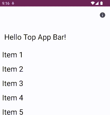
As soon as the collapsed fraction passes the halfway point (0.5) we change the colour:
Colour change, but font size staying the same
We can make this better for performance by replacing our collapsedFraction check by using derivedStateOf to minimise the recompositions required (although, for this simple example there will not be much difference if you don’t use it).
| ... | |
| val scrollBehavior = TopAppBarDefaults.enterAlwaysScrollBehavior(rememberTopAppBarState()) | |
| val isCollapsed = remember { derivedStateOf { scrollBehavior.state.collapsedFraction > 0.5 } } | |
| val topAppBarElementColor = if (isCollapsed) { | |
| MaterialTheme.colorScheme.onSurface | |
| } else { | |
| MaterialTheme.colorScheme.onPrimary | |
| } | |
| ... |
For more details on when to use derivedStateOf check out this blog post.
Now what about the text size? Again, we can make use of the collapsedFraction and transition between the two font sizes:
| ... | |
| val scrollBehavior = TopAppBarDefaults.enterAlwaysScrollBehavior(rememberTopAppBarState()) | |
| val collapsed = 22 | |
| val expanded = 28 | |
| val topAppBarTextSize = (collapsed + (expanded - collapsed)*(1-scrollBehavior.state.collapsedFraction)).sp | |
| ... |
Because we want the exact collapsed fraction value, the derivedStateOf won’t help here.
Giving a final result:
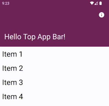
Font and colours transitioning nicely!
You can get even more custom here if your styling transitions are more elaborate by checking the collapedFraction against other values (e.g. not just halfway) or some of the other offsets included in the TopAppBarState object.
Comparison of Jetpack Compose Top App Bar Scroll Behaviours
As mentioned above, there are several scroll behaviours available to be used for collapsing top app bars. These are analogous to the scrollFlags from the view system (examples illustrated well in this blog post). We have the following available to us in Jetpack Compose:
pinnedScrollBehaviorenterAlwaysScrollBehaviorexitUntilCollapsedScrollBehavior
pinnedScrollBehavior
As you can guess from the name, pinnedScrollBehavior does not scroll or collapse the TopAppBar at all, it keeps it at the top (indeed, as if there was no scroll behaviour set at all). The scrolledContainerColor value will be ignored and as the content scrolls the background colour will not change. You cannot use the collapsedFraction either as this will remain static.
The other two have slightly different behaviours (from the documentation):
enterAlwaysScrollBehavior
…will immediately collapse when the content is pulled up, and will immediately appear when the content is pulled down.
exitUntilCollapsedScrollBehavior
…will immediately collapse when the nested content is pulled up, and will expand back the collapsed area when the content is pulled all the way down.
This is easier to see side by side:

Scroll behaviours side by side
Ad you can see, enterAlwaysScrollBehavior will immediately snap appear on scroll up or down while the exitUntilCollapsedScrollBehavior will expand gradually on scroll. Which one you use depends on your usecase.
Both enterAlwaysScrollBehavior and exitUntilCollapsedScrollBehavior allow you to also specify snap and fling animation specifications to further customise the collapse animations.
What if the content is not scrollable by default?
What happens when our content is not a standard list, instead perhaps another large composable? But the collapsable toolbar effect is still wanted?
Here, we can add a verticalScroll modifier to the single component with a remembered scroll state that will allow the nestedScrollConnection to pick up the scrolling action.
| ... | |
| Scaffold( | |
| topBar = {...}, | |
| modifier = modifier.nestedScroll(scrollBehavior.nestedScrollConnection) | |
| ) { innerPadding -> | |
| Box(contentAlignment = Alignment.Center, | |
| modifier = Modifier.fillMaxSize().padding(innerPadding)) { | |
| Column(modifier = Modifier.verticalScroll(rememberScrollState())) { | |
| Text(stringResource(id = R.string.empty_list_text)) | |
| } | |
| } | |
| } |
Just a single item can still trigger the scroll. Although, in a real example you would only need this if your content was large and needed to be able to use the extra space given by a collapsed toolbar.
Bonus: Colour changing fixed TopAppBar
A final case to consider is if you want your TopAppBar to change colour even when it is not a collapsing one (for example, when the pinned scroll behaviour or no scroll behaviour is defined). Here, attempting to use scrolledContainerColor as we used above will have no effect. Instead, we can use a derived value (to reduce the number of recompositions, see above) to decide when a scroll has occurred.
For a pinnedScrollBehavior you can use the contentOffset . Technically you can just check that it does not equal zero, but in my experience this flickers a bit too quickly if the user only scrolls a tiny amount so using a small buffer works better:
| ... | |
| val scrollBehavior = TopAppBarDefaults.pinnedScrollBehavior(rememberTopAppBarState()) | |
| val isScrolled = remember { derivedStateOf { scrollBehavior.state.contentOffset < -100f } } | |
| val topAppBarElementColor = if (isScrolled.value) { | |
| MaterialTheme.colorScheme.onSurface | |
| } else { | |
| MaterialTheme.colorScheme.onPrimary | |
| } | |
| ... |
If there is no scroll behaviour defined then you can use the LazyListState to detect a scroll:
| ... | |
| val listState = rememberLazyListState() | |
| val isScrolled = remember { derivedStateOf { listState.firstVisibleItemIndex > 0 } } | |
| val topAppBarContainerColor = if (isScrolled.value) { | |
| MaterialTheme.colorScheme.surfaceVariant | |
| } else { | |
| MaterialTheme.colorScheme.surface | |
| } | |
| Scaffold( | |
| topBar = { | |
| TopAppBar( | |
| title = { Text(text = stringResource(id = R.string.title)) }, | |
| navigationIcon = { NavigationIcon(navController = navController)}, | |
| actions = { AboutActionIcon(navController) }, | |
| colors = TopAppBarDefaults.smallTopAppBarColors( | |
| containerColor = topAppBarContainerColor, | |
| navigationIconContentColor = MaterialTheme.colorScheme.onSurface, | |
| actionIconContentColor = MaterialTheme.colorScheme.onSurface, | |
| titleContentColor = MaterialTheme.colorScheme.onSurface | |
| ) | |
| ) | |
| }, | |
| modifier = modifier | |
| ) { innerPadding -> | |
| LazyColumn( | |
| state = listState, | |
| modifier = Modifier.fillMaxSize().padding(innerPadding)) { | |
| items(items) { item -> | |
| ... | |
| } | |
| } | |
| } |
Once we scroll past the first item, the colour changes.
This same approach could be applied to more styling options and also used with the scrollState used in the single item verticalScroll modifier, in that case:
| ... | |
| val scrollState = rememberScrollState() | |
| val isScrolled = remember { derivedStateOf { scrollState.value > 0 } } | |
| ... |
Conclusion
So there you have it, it is pretty easy to create a collapsing top app bar with consistent, fluid transitions without resorting to super custom code.
To see some examples of the code above, check out my Github Experiments repository here:
This article was originally published on proandroiddev.com on December 13, 2022


