

One-time password (OTP), also called dynamic password, one-time PIN, and one-time authorization code (OTAC), is password that is only valid for one login session. Most commonly, it is received in a format of 4 or 6 digit code, through SMS, and it used for implementation of two-factor authentication.
Implementing OTP support inside our mobile apps requires us to build a custom UI input field, which should be strictly customized for handling the received OTP code.
Motivation
Since Jetpack Compose is a new UI toolkit for Android development, I wanted to write an article regarding how we can make our own custom OTP input field using BasicTextField.

Custom OTP input
Creating input fields with Compose UI is quite simple. There is already an existing Material component called TextField, that we can use. It has a lot of built-in functionalities because it follows Material design principles. That also comes with some drawbacks, for example, if we wanted to customize our input field, we would have struggled to do so with TextField, because it isn’t as flexible.
That’s why we need another component that is a bit lower-level compared to TextField, but it enables us to customize it the way that suits us the best. I’m talking about BasicTextField.
Implementation
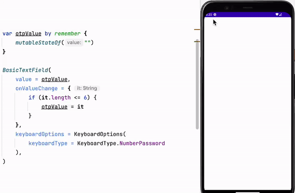
Firstly, lets implement a simple BasicTextField that enables it to open a keyboard with only numbers. We can do that by setting up the keybaordOptions parameter with keyboardType set to NumberPassword. If you’ve wondered why we use NumberPassword and not just Number, it is because the keyboard that is opened for the Number keyboard type contains dot, comma and dash characters, and we don’t need anything other than digits inside our OTP input field.

Next step we need to do is to implement more restrictions inside our input field. In case we know that our OTP must be a 6 digit code, our input field should be able to receive max 6 digits, and not allow user to input more than that.
To accomplish max characters restriction, we need to update our onValueChage behaviour with the additional check regarding the length of our new string. In case the new string contains more than 6 characters, we don’t want to update our otpValue. By doing that, we are going to ignore any user input for a 7th character.
OUR VIDEO RECOMMENDATION


Jobs
Functionality-wise this seems like a decent OTP input field. But we really need to do something regarding its style.
Since OTP is an important step for user authorization, and sometimes the user is not familiar with this concept, it is quite necessary to design our input field in a way that it is clear what is expected from the user. In our case, we require our user to input a 6-digit code; this can be represented as six small blocks of input fields that the user needs to fill in.
The first thing that came up in my mind when thinking about how I could create this, was to implement six small TextFields and make them interact with each other. It is safe to say that is not a clean solution; it really looks like overkill, and it can get quite complex making the cursor transition between six TextFields.
That’s why I started to research the possibilities for styling our BasicTextField. It turns out, there is a parameter called decorationBox, that helps us to add decorations like images, hint, placeholder, background color, etc. It is a composable lambda, that contains access to innerTextField, that basically represents our original BasicTextField. Inside our decorationBox function, we can decorate our innerTextField, and change the way our BasicTextField looks. So, we end up rendering the composable inside our decorationBox on the screen instead of the regular BasicTextField.
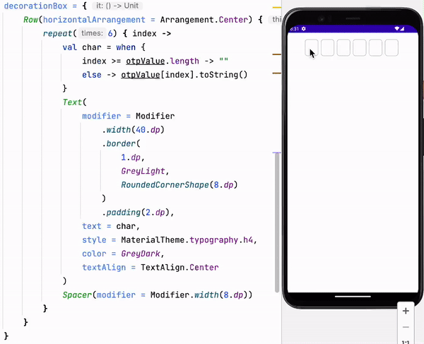
OTP decorationBox
The idea here, is to utilize decorationBox by constructing the look of our OTP input the way we want it. In my example I’m going to make six Text composables with rounded borders, and they will display corresponding characters of the user’s OTP input value.
This can be done with Row composable that will use repeat six times, in order to make six Text components with Spacer between them (because our example covers the OTP code of six digits).
There is one more thing that we need to accomplish when building our custom Row with six Texts, we need to pass the right digits from our OTP input value to the corresponding Texts. Because we have index information in our repeat function, we are going to use it in order to get the corresponding character from the input string. The one thing we need to check here, is that the length of our input string can be shorter than six; in those cases, we need to pass empty string to Texts that are not filled at that moment.
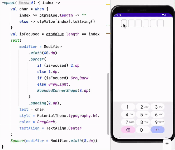
The current solution looks quite nice, in my opinion, there is only one more improvement that would be nice to have and that is some indicator to show the currently focused field where we should place our next character that user inputs.
In order to get the currently focused place, we can just access the length of the current OTP input value, and that is the index of our currently focused field. Because we want to highlight it, we can make the color of its border a bit darker and we can increase the borders width.
Voila!
Final thoughts
I tried to show and explain to you how I made my own OTP input field. Hopefully you’ve learned a thing or two, and you are going to be able to use this knowledge to customize your own OTP input fields.
If you would like to access the source code, here is the Github repo of this example with a little bit cleaner code.
I want to thank you for your time! If you found this article helpful, please follow for more similar content, and if you prefer a bite-sized content about Android, you can consider following me on Twitter. In case you want to connect on a more professional level, here is my LinkedIn.
This article was originally published on proandroiddev.com on December 19, 2022


