The @Preview annotation has several capabilities to help manage previewing composable functions. This article, going deep dive and covering the power of @Preview! 🔥

Theme preview
For previewing a composable function, simply define another composable function with @Preview:
@Preview
@Composable
fun MyButtonPreview() {
    MyAppTheme {
        MyButton()
    }
}
This function generate the preview:

@Preview
@Preview(uiMode = Configuration.UI_MODE_NIGHT_YES)
@Composable
fun MyButtonPreview() {
    ComposeNewsTheme {
        MyButton()
    }
}
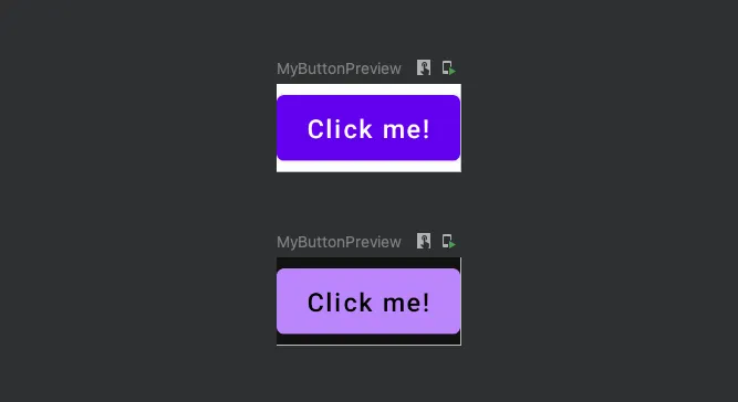
Here we got:

But, for every composable function, do we have to add two @Preview annotations? Of course not. There is a way to define your own annotation:
@Preview(name = "Light")
@Preview(
    name = "Dark",
    uiMode = Configuration.UI_MODE_NIGHT_YES,
)
annotation class ThemePreviews
Now, It can be used like this:
@ThemePreviews
@Composable
fun MyButtonPreview() {
    MyAppTheme {
        MyButton()
    }
}
You can put these annotation class definitions into the design system module.
Font scale preview
Like the previous section, for previewing a widget in different font scales, you can define an annotation class for it:
@Preview(fontScale = 1.0f, name = "Default (100%)")
@Preview(fontScale = 0.85f, name = "Small (85%) ")
@Preview(fontScale = 1.15f, name = "Large (115%)")
@Preview(fontScale = 1.3f, name = "Largest (130%) ")
annotation class FontScalePreview
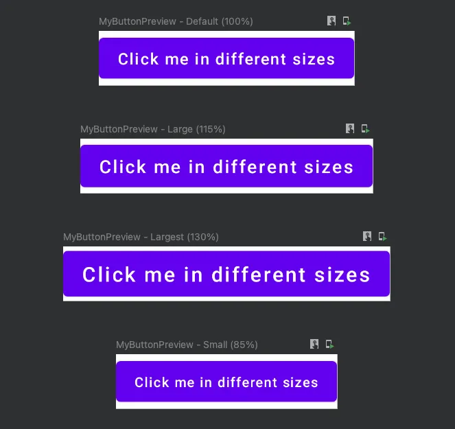
And the result:

Multi-Language preview
If your app supports multiple languages and gets text strings from string resources, this annotation helps you to preview your composable functions in different locales:
@Preview(locale = "en", name = "English")
@Preview(locale = "fr", name = "French")
@Preview(locale = "ar", name = "Arabic")
@Preview(locale = "ja", name = "Japanese")
annotation class MultiLanguagePreview
Screen sizes preview
It’s handy to preview a Screen composable in different screen sizes, such as phone, foldable, tablet and even desktop (specifically for ChromeOS). For this purpose, we can use the device attribute of @Preview.

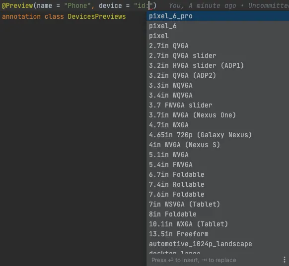
As the auto-completion of Android studio suggests, there are predefined specifications for different dimensions. This is how we can use them:
@Preview(name = "Phone", device = "spec:width=411dp,height=891dp")
@Preview(name = "Foldable", device = "spec:width=673.5dp,height=841dp,dpi=480")
@Preview(name = "Tablet", device = "spec:width=1280dp,height=800dp,dpi=480")
@Preview(name = "Desktop", device = "spec:width=1920dp,height=1080dp,dpi=480")
annotation class DevicesPreviews
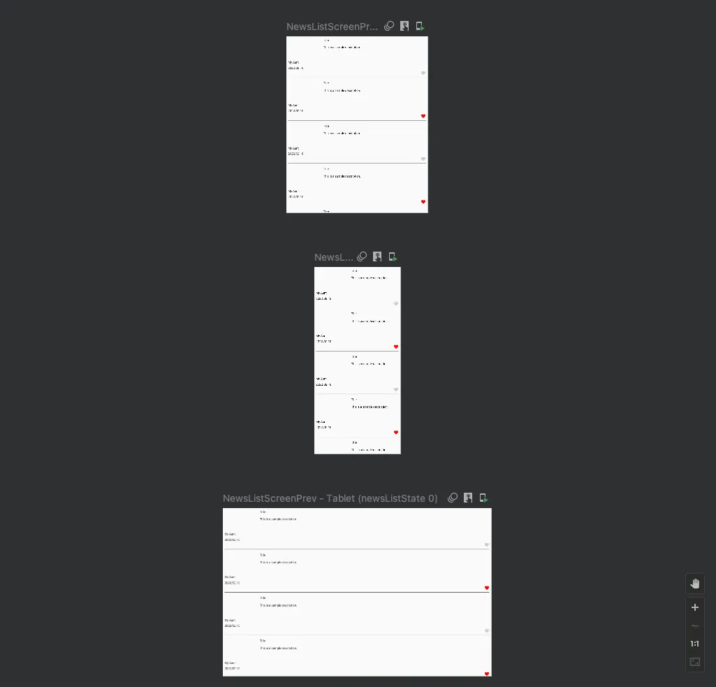
Here the result:

The device attribute also have some predefined phones specifications for testing more easily:

Preview a Screen
It’s common that a Screen Composable needs viewModel as the state holder. One basic approach is passing viewModel as parameter:
@Composable
fun NewsListScreen(
    viewModel: NewsListViewModel,
    onNavigateToDetailScreen: (news: News) -> Unit,
) {

    ...

}
For seeing the preview of this composable, you must provide a viewModel instance that makes previewing difficult. For handling this scenario, you can define a composable wrapper:
@Composable
fun NewsListRoute(
    viewModel: NewsListViewModel,
    onNavigateToDetailScreen: (news: News) -> Unit,
) {

    ...

    NewsListScreen(...)

}
Then change the Screen composable to a stateless version:
@Composable
private fun NewsListScreen(
    newsListState: NewsListState,
    onNavigateToDetailScreen: (news: News) -> Unit,
    onFavoriteClick: (news: News) -> Unit,
    onRefresh: () -> Unit,
) {

    ...

}
In the NewsListRoute, you call the NewsListScreen and pass every parameter it want. Now, you can more easily get the preview of NewsListScreen and test all possible of its parameters.
Provide parameter for previewing
The last tip for previewing is the situation that your composable function depends on some arguments like data classes.
@Composable
fun NewsItem(
    news: News,
    onFavoriteClick: (news: News) -> Unit,
) {

    ...

}
To prevent hard coding default values for previewing above composable, there is an annotation called @PreviewParameter.
@Preview
@Composable
private fun NewsItemPreview(
    @PreviewParameter(NewsProvider::class)
    news: News,
) {
    NewsItem(news = news, onFavoriteClick = {})
}
This is how the NewsProvider class define:
class NewsProvider: PreviewParameterProvider<News> {
    override val values = sequenceOf(
        News(
            author = "Kaaveh Mohamedi",
            description = "This is a sample description.",
            publishedAt = "2022/02.10",
            ...
        ),
        News(...),
        ...
    )
}
The PreviewParameterProvider is a good solution to reuse default parameters for previewing.
I hope you enjoyed after reading this article 🤓. If you like to see above tips in a code-base, checkout this Github repo:


