

Photo by Iñaki del Olmo on Unsplash
There are many ways to build collapsible top bars in traditional RecyclerViews. In this article, I’ll explore three different approaches to achieve the same effect in a Jetpack Compose LazyColumn.
I use the terms “toolbar” and “top bar” interchangeably day-to-day, but I went with “top bar” for this article since that’s the term Material Design uses.
The sample code lives in this repository if you want to check it out.
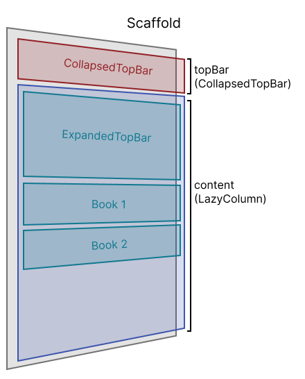
Using Scaffold
The animation will look like this:

Before we jump into the top bar part, here’s the simple BookModel I use throughout this article to display the list of books:
data class BookModel(val title: String, val author: String, val pageCount: Int)
val DEFAULT_BOOKS = listOf(
  BookModel(
    title = "Tomorrow and Tomorrow and Tomorrow",
    author = "Gabrielle Zevin",
    pageCount = 416
  ),
  BookModel(title = "Babel", author = "R.F. Kuang", pageCount = 545),
  …
)
And the Book Composable:
@Composable
fun Book(modifier: Modifier = Modifier, model: BookModel) =
  Card(modifier = modifier.fillMaxWidth()) {
    Column(
      modifier = Modifier.padding(16.dp)
    ) {
      Text(model.title)
      Text(model.author)
      Text("${model.pageCount} pages")
     }
  }
In all examples, I use these height constants:
val COLLAPSED_TOP_BAR_HEIGHT = 56.dp
val EXPANDED_TOP_BAR_HEIGHT = 200.dp
In Compose, a Scaffold is a layout that implements a basic Material Design layout structure. It supports adding a Top Bar, Bottom Bar, Floating Action Button, or Drawer. It follows the Slot design pattern, making it easy to slot in any Composable you want as the top bar.
Here’s the code for showing the list of BookModel without any top bar logic:
@Composable
fun ScaffoldLibrary(books: List<BookModel> = DEFAULT_BOOKS) {
  val listState = rememberLazyListState()
  Scaffold(
    topBar = {/** TODO **/ }
  ) { padding ->
    LazyColumn(
      modifier = Modifier.padding(padding),
      state = listState
    ) {
      items(items = libraryState) { book ->
        Book(model = book)
        Spacer(modifier = Modifier.height(24.dp))
      }
    }
  }
}
Now onto the top bar. First, I created an ExpandedTopBar Composable:
@Composable
private fun ExpandedTopBar() {
  Box(
    modifier = Modifier
      .background(MaterialTheme.colors.primaryVariant)
      .fillMaxWidth()
      .height(EXPANDED_TOP_BAR_HEIGHT - COLLAPSED_TOP_BAR_HEIGHT),
    contentAlignment = Alignment.BottomStart
  ) {
    Text(
      modifier = Modifier.padding(16.dp),
      text = "Library",
      color = MaterialTheme.colors.onPrimary,
      style = MaterialTheme.typography.h3,
    )
  }
}
 ExpandedTopBar preview
I put the ExpandedTopBar as the first item in the LazyColumn, so that it scrolls up with the regular items:
@Composable
fun ScaffoldLibrary(books: List<BookModel> = DEFAULT_BOOKS) {
  ...
  Scaffold(
    ...
    ) {
      item { ExpandedTopBar() }
      items(items = libraryState) { book ->
        Book(model = book)
        Spacer(modifier = Modifier.height(24.dp))
      }
    }
  }
}
For the topBar slot, I created a CollapsedTopBar Composable that shows the “Library” top bar text against the background/white background color when the top bar is collapsed and the primaryVariant/purple top bar color when the top bar is expanded. That way, when ExpandedTopBar is still partially visible, CollapsedTopBar’s color matches it, making it visually hidden.
I used animateColorAsState() and AnimatedVisibility() to achieve smooth transitions between expanded and collapsed states.
@OptIn(ExperimentalFoundationApi::class)
@Composable
private fun CollapsedTopBar(
  modifier: Modifier = Modifier,
  isCollapsed: Boolean
) {
  val color: Color by animateColorAsState(
    if (isCollapsed) {
      MaterialTheme.colors.background
     } else {
      MaterialTheme.colors.primaryVariant
    }
  )
  Box(
    modifier = modifier
      .background(color)
      .fillMaxWidth()
      .height(COLLAPSED_TOP_BAR_HEIGHT)
      .padding(16.dp),
      contentAlignment = Alignment.BottomStart
  ) {
    AnimatedVisibility(visible = isCollapsed) {
      Text(text = "Library", style = MaterialTheme.typography.h6)
    }
  }
}
 CollapsedTopBar(isCollapsed = true) preview
 CollapsedTopBar(isCollapsed = false) preview
Here’s how CollapsedTopBar is used in the Scaffold. I added a LocalOverscrollConfiguration provides null — this removes the overscroll animation, which shows an unwanted white gap between the toolbar and LazyColumn. It’s experimental in the Compose foundation API.
@OptIn(ExperimentalFoundationApi::class)
@Composable
fun ScaffoldLibrary(books: List<BookModel> = DEFAULT_BOOKS) {
  ...
  Scaffold(
    topBar = {
      CollapsedTopBar(isCollapsed = isCollapsed)
    }
  ) { padding ->
      CompositionLocalProvider(LocalOverscrollConfiguration provides null) {
      LazyColumn(
        modifier = Modifier.padding(padding),
        state = listState
      ) {
        ...
      }
    }
  }
}
The final piece is calculating isCollapsed. Compose’s LazyListState makes this trivial. It contains information about item visibility that’s hard to calculate with RecyclerViews. Here, we’ll use firstVisibleItemIndex. Since the first item in the list is ExpandedTopBar, once firstVisibleItemIndex is larger than 0, we know we’ve scrolled past it and we should show the CollapsedTopBar.
@Composable
fun ScaffoldLibrary(books: List<BookModel> = DEFAULT_BOOKS) {
  val listState = rememberLazyListState()
  val isCollapsed: Boolean by remember {
    derivedStateOf { listState.firstVisibleItemIndex > 0 }
  }
  Scaffold(
    topBar = {
    CollapsedTopBar(isCollapsed = isCollapsed)
  }
  ){
    ...
  }
}
The check needs to be wrapped in a remember { } because firstVisibleItemIndex is an observable property, and would cause recompositions on every change if used like a normal Int, leading topotential performance issues.
The Scaffold approach’s main limitation is it looks fine with solid-colored top bars or even vector illustrations, but not with a full bleed image top bar, since the image gets cut off abruptly by the top bar slot. There are probably ways around this using Scaffold, but I find it more straightforward to simply use a Box.
Using Box
The animation will look like this:

We’ll take an approach similar to using Scaffold, but instead of the CollapsedTopBar appearing above the LazyColumn along the y-axis, the CollapsedTopBar is overlayed on the LazyColumn along the z-axis.
@Composable
fun BoxLibrary(books: List<BookModel> = DEFAULT_BOOKS) {
  val listState = rememberLazyListState()
  val isCollapsed: Boolean by remember {
    /** TODO **/
  }
  Box {
    CollapsedTopBar(modifier = Modifier.zIndex(2f), isCollapsed = isCollapsed)
    LazyColumn(state = listState) {
      item { ExpandedTopBar() }
      items(items = libraryState) { book ->
        Book(model = book)
        Spacer(modifier = Modifier.height(24.dp))
      }
    }
  }
}
OUR VIDEO RECOMMENDATION


Jobs
I added modifier = Modifier.zIndex(2f) so that CollapsedTopBar is drawn over the LazyColumn. We could avoid this modifier by putting CollapsedTopBar() below LazyColumn() in the Box content code, but I find the code easier to reason about like this.
I’m using a version of ExpandedTopBar with an Image background to better show the animation:
@Composable
private fun ExpandedTopBar() {
  Box(
    modifier = Modifier
      .background(MaterialTheme.colors.primaryVariant)
      .fillMaxWidth()
      .height(EXPANDED_TOP_BAR_HEIGHT),
    contentAlignment = Alignment.BottomStart
  ) {
    Image(
      modifier = Modifier.fillMaxSize(),
      painter = painterResource(R.drawable.library),
      contentDescription = null,
      contentScale = ContentScale.Crop,
    )
    Text(
      modifier = Modifier.padding(16.dp),
      text = "Library",
      color = MaterialTheme.colors.onPrimary,
      style = MaterialTheme.typography.h3,
    )
  }
}
 ExpandedTopBar preview
The CollapsedTopBar is almost identical to the one from above, except its background color is Transparent instead of primaryVariant when the top bar is expanded. That way, when ExpandedTopBar is still on-screen, the CollapsedTopBar allows the top bar image to be fully visible below it.
@Composable
private fun CollapsedTopBar(
  modifier: Modifier = Modifier,
  isCollapsed: Boolean
) {
  val color: Color by animateColorAsState(
    if (isCollapsed) MaterialTheme.colors.background else Color.Transparent
  )
  Box(
    modifier = modifier
      .background(color)
      .fillMaxWidth()
      .height(COLLAPSED_TOP_BAR_HEIGHT)
      .padding(16.dp),
    contentAlignment = Alignment.BottomStart
  ) {
    AnimatedVisibility(visible = isCollapsed) {
    Text(text = "Library", style = MaterialTheme.typography.h6)
  }
}
The isCollapsed calculation is more complicated, since we still want the animation to occur once the ExpandedTopBar is fully covered by the CollapsedTopBar, but the firstVisibleItemIndex doesn’t update until ExpandedTopBar scrolls past the top of the screen.
We can use LazyListState.firstVisibleItemScrollOffset to calculate when CollapsedTopBar completely overlaps ExpandedTopBar. firstVisibleItemScrollOffset changes whenever the firstVisibleItemIndex changes — ie. when we scroll to the second item, firstVisibleItemScrollOffset resets to 0 to reflect the offset of the second item — so we still need a firstVisibleItemIndex > 0 check.
@Composable
fun BoxLibrary(books: List<BookModel> = DEFAULT_BOOKS) {
  val listState = rememberLazyListState()

  val overlapHeightPx = with(LocalDensity.current) {
    EXPANDED_TOP_BAR_HEIGHT.toPx() - COLLAPSED_TOP_BAR_HEIGHT.toPx()
  }
  val isCollapsed: Boolean by remember {
    derivedStateOf {
      val isFirstItemHidden =
        listState.firstVisibleItemScrollOffset > overlapHeightPx
      isFirstItemHidden || listState.firstVisibleItemIndex > 0
    }
  }
  Box {
    CollapsedTopBar(modifier = Modifier.zIndex(2f), isCollapsed = isCollapsed)
    ...
  }
}
Using Scaffold with LargeTopAppBar
Material 3 had its first stable release recently, and it includes an experimental LargeTopAppBar that handles scrolling out of the box. I decided to try it out in a Scaffold.
The animation will look like this:

Here’s my LibraryTopBar Composable:
@OptIn(ExperimentalMaterial3Api::class)
@Composable
private fun LibraryTopBar(
  scrollBehavior: TopAppBarScrollBehavior,
  isCollapsed: Boolean
) = LargeTopAppBar(
  title = { Text(text = "Library") },
  colors = TopAppBarDefaults.mediumTopAppBarColors(
    containerColor = MaterialTheme.colorScheme.primary,
    scrolledContainerColor = MaterialTheme.colorScheme.background,
    titleContentColor = if (isCollapsed) {
      MaterialTheme.colorScheme.onBackground
    } else {
      MaterialTheme.colorScheme.onPrimary
    },
  ),
  scrollBehavior = scrollBehavior,
)
Since LargeTopAppBar handles the collapsing animation, we only need a single Composable instead of a collapsed and expanded one — all we have to do is pass in a TopAppBarScrollBehavior.
TopAppBarScrollBehavior defines how an app bar should behave when the content under it is scrolled. I went with enterAlwaysScrollBehavior provided in TopAppBarDefaults.
In order to have the behavior work correctly, we need its parent — in this case, the Scaffold — to include a Modifier.nestedScroll.
@OptIn(ExperimentalMaterial3Api::class)
@Composable
fun Material3ScaffoldLibrary(books: List<BookModel> = DEFAULT_BOOKS) {
  val listState = rememberLazyListState()
  val scrollBehavior =
    TopAppBarDefaults.enterAlwaysScrollBehavior(rememberTopAppBarState())
  Scaffold(
    modifier = Modifier.nestedScroll(scrollBehavior.nestedScrollConnection),
    topBar = { LibraryTopBar(scrollBehavior, isCollapsed) }
  ) { padding ->
    LazyColumn(
      modifier = Modifier.padding(padding),
      state = listState
    ) {
      items(items = libraryState) { book ->
        Book(model = book)
        Spacer(modifier = Modifier.height(24.dp))
      }
    }
  }
}
Finally, we can use the collapsedFraction in TopAppBarScrollBehavior’s TopAppBarState to calculate whether the toolbar is collapsed.
@OptIn(ExperimentalMaterial3Api::class)
@Composable
fun MaterialScaffoldLibrary(books: List<BookModel> = DEFAULT_BOOKS) {
  ...
  val isCollapsed: Boolean by remember {
    derivedStateOf {
      scrollBehavior.state.collapsedFraction == 1f
    }
  }
  Scaffold(
    modifier = Modifier.nestedScroll(scrollBehavior.nestedScrollConnection),
    topBar = { TopBar(scrollBehavior, isCollapsed) }
  ) { padding ->
    ...
  }
}
There are a few caveats with using LargeTopAppBar.
The most obvious one is that it’s an experimental API, so there may be breaking changes in later versions. Or it may disappear completely. 🤷
I noticed that TwoRowsTopAppBar, which it calls under the hood, recomposes with every scroll, even when the top bar doesn’t visually change. The Scaffold and Box implementations only recompose when animating between collapsed and expanded states.
LargeTopAppBar is also disappointingly limited in terms of customization. It only supports solid color top bars and can’t display images. Since it’s experimental, I’m hoping more powerful customization will be added later.
Most apps probably haven’t fully migrated to Material 3 yet, but LargeTopAppBar doesn’t interop well with the older Material API. My first attempt included imports from both material and material3, and there were some weird visual bugs. For example, the “Library” top bar text appeared twice when I was using material.Text, and switching the import to material3.Text fixed it.
I wouldn’t recommend using LargeTopAppBar in a production app until the API is stable, but it seems promising!
Not pictured: stickyHeader
I also played around with the experimental LazyListScope.stickyHeader API. It “adds a sticky header item, which will remain pinned even when scrolling after it. The header will remain pinned until the next header will take its place.”
I found that it didn’t work well for this use case. The main issue was it required manually updating the header height based on the scroll, which was tricky to calculate even with the LazyListState API. I managed to get it working using a NestedScrollConnection, but it was quite verbose and recomposed constantly as it recalculated the header height.
That said, stickyHeader should be useful for other cases. It’s probably the simplest solution for handling top bars where the displayed content changes depending on which item of the LazyColumn we’re scrolled to, but the height remains constant. For example, a LazyColumn of contacts where the top bar displays different letters of the alphabet depending on the contacts’ names.
Takeaways
- Having easy access to items’ visibility info through
LazyListStatesimplifies a lot of effects that are difficult to implement inRecyclerView. However, many of the state’s properties are observable and would cause performance issues if accessed directly. We generally want to wrap them inside aremember {derivedStateOf(…)}. It’s worth checking the Recomposition Counts in the Layout Inspector to make sure there aren’t unexpected recompositions. - Compose animation APIs are much more intuitive and expressive than the traditional APIs! I highly recommend exploring them.
- There are multiple solutions for similar animations — my three examples of creating a collapsible top bar are nowhere near exhaustive – and we can use more complex solutions as the animation complexity increases. For example, here’s a collapsing toolbar tutorial I consulted that includes a parallax effect as well.
Here’s the repository with the sample code again:
GitHub – frostyshadows/CollapsingTopBarLibrary
As always, thanks for reading 🖤
This article was previously published on proandroiddev.com


