

This story will show how to create ViewPager (HorizontalPager /VerticalPager ) in Jetpack Compose.
Photo by Amélie Mourichon on Unsplash
I have written another story about Tabs Layout in Jetpack Compose using Official API. You can read it there.
ViewPager is a common design layout used in android apps. In the story we will see how to create a ViewPager using Jetpack Compose. In Jetpack compose they are called HorizontalPager and VerticalPager .
Content
High level overview of the page content
- Dependency
- Horizontal Pager (Simple Example)
- Horizontal Pager with Next and Prev Button (Manual Scrolling)
- Horizontal Pager with Images and Dot Indicators
- Vertical Pager with Images
- Github Project
Dependency
HorizontalPager and VerticalPager API were initially part of accompanist But from Compose 1.4.0+ it’s part of official API, But still they are in Experimental phase. You need to add Compose Foundation dependency inside the project. You can see the latest version here
implementation 'androidx.compose.foundation:foundation:1.4.1'
Your project might give errors because you might still be on an older version of Compose Compiler. You need to upgrade your Compose Compiler version to at least 1.4.0 and for that you might also need to update your Kotlin version. You can see Kotlin version to Compose Compiler version mapping here. I am using Kotlin version Compiler version 1.8.10 and Compose Compiler version 1.4.4
You should update Compose Compiler version in gradle files as below
composeOptions {
        kotlinCompilerExtensionVersion '1.4.4'
    }
Horizontal Pager Composable
Lets look at HorizontalPager composable and parameters required by the composable
| fun HorizontalPager( | |
| pageCount: Int, | |
| modifier: Modifier = Modifier, | |
| state: PagerState = rememberPagerState(), | |
| contentPadding: PaddingValues = PaddingValues(0.dp), | |
| pageSize: PageSize = PageSize.Fill, | |
| beyondBoundsPageCount: Int = 0, | |
| pageSpacing: Dp = 0.dp, | |
| verticalAlignment: Alignment.Vertical = Alignment.CenterVertically, | |
| flingBehavior: SnapFlingBehavior = PagerDefaults.flingBehavior(state = state), | |
| userScrollEnabled: Boolean = true, | |
| reverseLayout: Boolean = false, | |
| key: ((index: Int) -> Any)? = null, | |
| pageNestedScrollConnection: NestedScrollConnection = PagerDefaults.pageNestedScrollConnection( | |
| Orientation.Horizontal | |
| ), | |
| pageContent: @Composable (page: Int) -> Unit | |
| ) |
Explaining parameters which we will use in our examples below.
pageCount— thats number of pages we want to showpageSize— it represents size of the pager itself (not the content size), default value isPagerSize.Fillthat means forHorizontalPagerit will take complete width of the screen and forVerticalPagerit will take complete height of the screen as default size of the pager.pageSpacing— it represents the distance between two pagers ofHorizontalPagerorVerticalPagerstate— it keeps the pager state i.e which page user is currently visible and provides the scrolling functionalitypageContent—it provides composable lambda which will represent actual content of the pager. lambda provides the page index of the page which is currently being displayed on screen which will be used to disable the custom page insideHorizontalPagermodifier— that’s genericmodifierparameter as every composable function has.
Horizontal Pager (Simple Example)
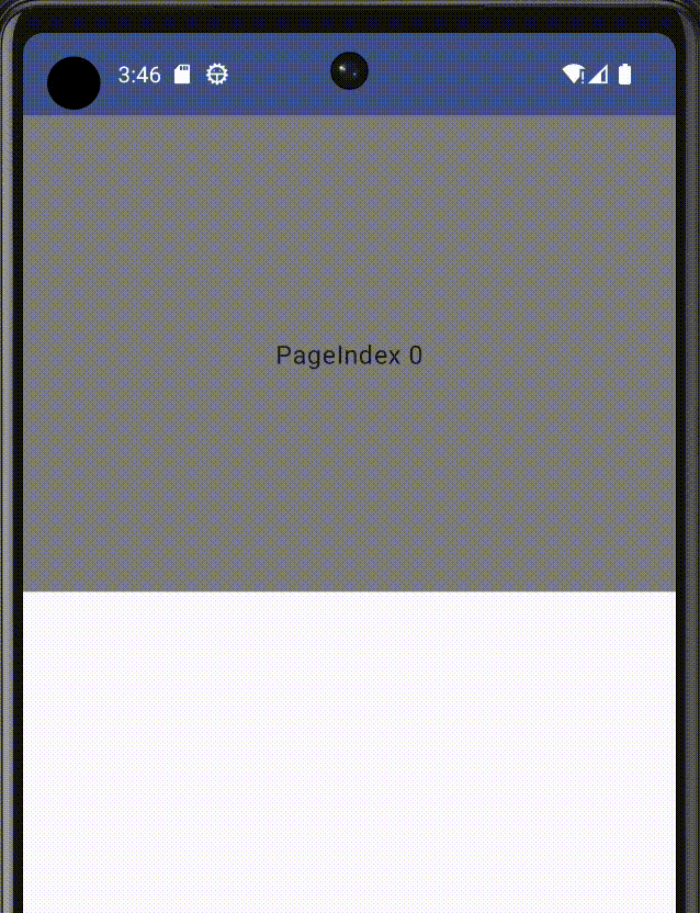
Lets see basic example of HorizontalPager . In example below we are creating pager state using rememberPagerState() and passing into HorizontalPager along with number of pages we want to show which is 5. pagerState manages scrolling state of the HorizontalPager , keept track of current page the pager is at and it can be used to scroll to a specific page manually, we will see its usage later in next example.
| @OptIn(ExperimentalFoundationApi::class) | |
| @Composable | |
| fun HorizontalPagerSimpleExample() { | |
| val pagerState = rememberPagerState() | |
| HorizontalPager(pageCount = 5, state = pagerState) { | |
| Box(modifier = Modifier | |
| .fillMaxWidth() | |
| .height(300.dp) | |
| .background(Color.Gray), | |
| contentAlignment = Alignment.Center | |
| ) { | |
| Text(text = "Page Index : $it") | |
| } | |
| } | |
| } |
OUR VIDEO RECOMMENDATION


Jobs
Output:
Horizontal Pager with Next and Prev Button (Manual Scrolling)
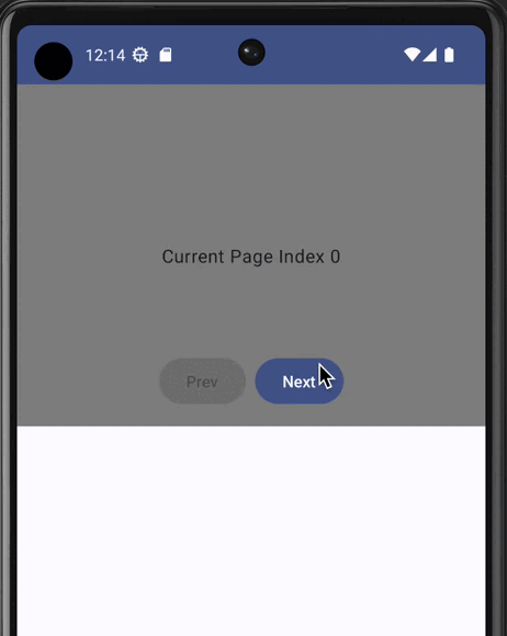
In the next example we are adding Next and Prev Buttons on the pager to show usage of rememberPagerState , which you can use to manually scroll to a specific page as shown in example below
| @OptIn(ExperimentalFoundationApi::class) | |
| @Composable | |
| fun HorizontalPagerWithNextPrevButtonExample() { | |
| val pagerState = rememberPagerState() | |
| val coroutineScope = rememberCoroutineScope() | |
| Box ( | |
| modifier = Modifier | |
| .fillMaxWidth() | |
| .height(300.dp) | |
| ) { | |
| HorizontalPager(pageCount = 5, state = pagerState) { pageIndex -> | |
| Box( | |
| modifier = Modifier | |
| .fillMaxSize() | |
| .background(Color.Gray), | |
| contentAlignment = Alignment.Center | |
| ) { | |
| Text(text = "Current Page Index $pageIndex") | |
| } | |
| } | |
| Row(modifier = Modifier | |
| .align(Alignment.BottomCenter) | |
| .padding(bottom = 16.dp), | |
| horizontalArrangement = Arrangement.spacedBy(8.dp) | |
| ) { | |
| val prevButtonVisible = remember { | |
| derivedStateOf { | |
| pagerState.currentPage > 0 | |
| } | |
| } | |
| val nextButtonVisible = remember { | |
| derivedStateOf { | |
| pagerState.currentPage < 4 // total pages are 5 | |
| } | |
| } | |
| Button( | |
| enabled = prevButtonVisible.value, | |
| onClick = { | |
| val prevPageIndex = pagerState.currentPage - 1 | |
| coroutineScope.launch { pagerState.animateScrollToPage(prevPageIndex) } | |
| }, | |
| ) { | |
| Text(text = "Prev") | |
| } | |
| Button( | |
| enabled = nextButtonVisible.value , | |
| onClick = { | |
| val nextPageIndex = pagerState.currentPage + 1 | |
| coroutineScope.launch { pagerState.animateScrollToPage(nextPageIndex) } | |
| }, | |
| ) { | |
| Text(text = "Next") | |
| } | |
| } | |
| } | |
| } |
We are using Box to lay Next and Prev buttons on top of HorizontalPager
derivedStateOf Api is used to determine when to enable Next and Prev Buttons. derivedStateOf is an ideal choice here because we don’t want to recompose buttons every time page index changes in order to avoid unnecessary recompositions. see below code for prevButtonVisible
val prevButtonVisible = remember {
    derivedStateOf {
        pagerState.currentPage > 0
    }
}
Prev Button will be visible when pagerState.currentPage index is greater than 0, but we don’t want to recompose Prev Button when pagerState.currentPag is 2,3 or 4 so, derivedStateOf will handle it automatically i.e it enables Prev Button when current page index is 1 and it will not recompose Prev button if pagerState.currentPage index is 2,3 and 4 to avoid unnecessary recompositions.
pagerState provides property pagerState.currentPage which tells current visible page index, and a method animateScrollToPage which scrolls the pager to provided pageIndex.
scrollToPage is also another method provided on pagerState which can be used if we don’t need animation during scroll.
animateScrollToPage is also a suspend function, so calling a suspend outside of composable we need coroutineScope to launch animateScrollToPage , that’s why we created coroutine scope using api rememberCoroutineScope
rememberCoroutineScope is a composable which is called to get a coroutine scope. It’s tied to the composable function from where it’s called and gets canceled when that composable does not exist. i.e you can launch coroutines using this scope without worrying about lifecycle of coroutines.
Output:
Horizontal Pager with Images and Dot Indicators
In the next example we want to show images inside HorizontalPager with the dot indicators at the bottom. For the dot indicators we will use HorizontalPagerIndicator Api from accompanist . HorizontalPagerIndicator Api is still not moved to official compose dependencies that’s why we have to use from accompanist and it’s compatible with HorizontalPager from Jetpack compose foundation dependency.
Add the following dependency for HorizontalPagerIndicator , see the compatible version in the Readme section of the github repo of accompanist.
implementation "com.google.accompanist:accompanist-pager-indicators:0.30.1"
Lets look at the final code below
| @Composable | |
| fun HorizontalPagerWithIndicatorsScreen() { | |
| val images = listOf( | |
| R.drawable.logo_android, | |
| R.drawable.logo_kotlin, | |
| R.drawable.logo_apple, | |
| R.drawable.logo_fb, | |
| R.drawable.logo_google, | |
| ) | |
| Column { | |
| HorizontalPagerWithIndicators(images) | |
| } | |
| } | |
| @OptIn(ExperimentalFoundationApi::class) | |
| @Composable | |
| fun HorizontalPagerWithIndicators(images: List<Int>) { | |
| val pagerState = rememberPagerState() | |
| Box(modifier = Modifier | |
| .fillMaxWidth() | |
| .height(300.dp) | |
| ) { | |
| HorizontalPager(pageCount = 5, state = pagerState) { | |
| Image( | |
| painter = painterResource(id = images[it]), | |
| contentScale = ContentScale.Crop, | |
| contentDescription = "" ) | |
| } | |
| HorizontalPagerIndicator( | |
| modifier = Modifier | |
| .align(Alignment.BottomCenter) | |
| .padding(bottom = 10.dp), | |
| pageCount = 5, | |
| pagerState = pagerState, | |
| ) | |
| } | |
| } |
HorizontalPagerIndicator composable is taking pageCount and pagerState
pageCount must be same as we are passing in HorizontalPager which is 5 also pagerState is taking the same reference being pass in HorizontalPager created via rememberPagerState() so both HorizontalPager and HorizontalPagerIndicator must have the same pager state passed to them in order to sync with each other.
HorizontalPager is showing an image per page which is being accessed from the list of images using the index of the current page.
Box is used to overlay HorizontalPagerIndicator on top of HorizontalPager
Output:

Vertical Pager with Images
We have seen some examples of HorizontalPager in the story above. Let’s now see VerticalPager. We will use a list of images to display in VerticalPager . The code below.
| @Composable | |
| fun VerticalPagerWithImagesAndIndicatorsScreen() { | |
| val images = listOf( | |
| R.drawable.logo_android, | |
| R.drawable.logo_kotlin, | |
| R.drawable.logo_gradle, | |
| R.drawable.logo_github, | |
| R.drawable.logo_google, | |
| ) | |
| Column { | |
| VerticalPagerWithImagesAndIndicators(images) | |
| } | |
| } | |
| @OptIn(ExperimentalFoundationApi::class) | |
| @Composable | |
| fun VerticalPagerWithImagesAndIndicators(images: List<Int>) { | |
| val pagerState = rememberPagerState() | |
| VerticalPager( | |
| pageCount = 5, | |
| pageSize = PageSize.Fixed(300.dp), | |
| pageSpacing = 8.dp, | |
| state = pagerState) { | |
| Image( | |
| painter = painterResource(id = images[it]), | |
| contentScale = ContentScale.Crop, | |
| contentDescription = "" ) | |
| } | |
| } |
VerticalPager is using the following extra parameters which we didn’t use in HorizontalPager even though they also existed in HorizontalPager .
pageSize— it represents the size of page to be use, we are using Fixed300.dpin our code that means on screen we will see multiple pages depending upon how many can appear on any device sizepageSpacing— it handles the spacing between two pages
The output of the code below will clarify the effect of these properties.

Migration from Accompanist to Compose Foundation API
Before this api was officially introduced in Compose Foundation dependency, it was available in accompanist dependency. If you have already used from accompanist and you want to move to official dependency then there is migration guide available here
Thats it for now, Hope it was helpful 🚀
Sources
- Accompanist
- Compose Foundation
- Migration guide from accompanist to Official API
Photo Credits/Attributes
All Images used in this coding project are taken from www.freepik.com and their photo credit/attributes are mentioned below.
- Android: Image by Harryarts on Freepik
- Twitter: Image by Harryarts on Freepik
- Google: Image by xvector on Freepik
- Instagram: Image by ibrandify on Freepik
- Facebook: Image by ibrandify on Freepik
Github Project
👉 Follow for more stories on Android Development and 👏 if you liked it
This article was previously published on proandroiddev.com


